title: "Our title"author: "Our names"format: html: theme: PUT THEME NAME HERE toc: true toc-depth: 2 embed-resources: true
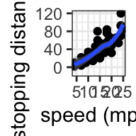
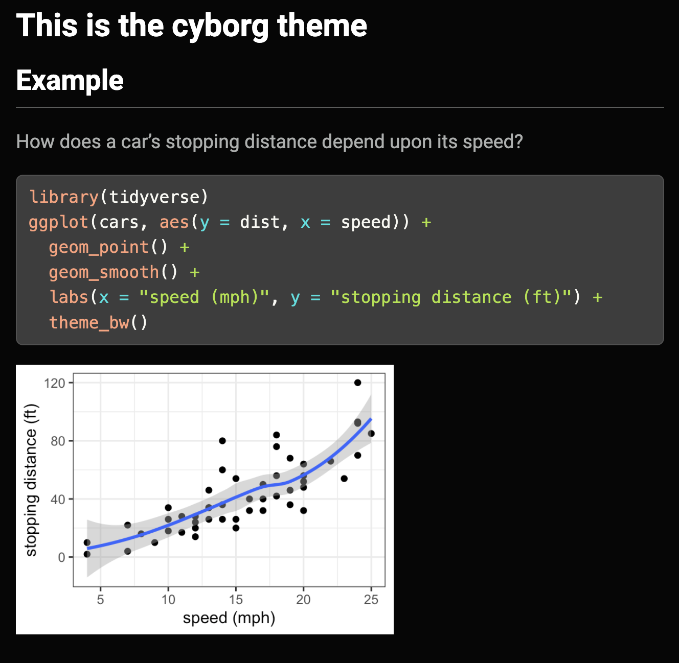
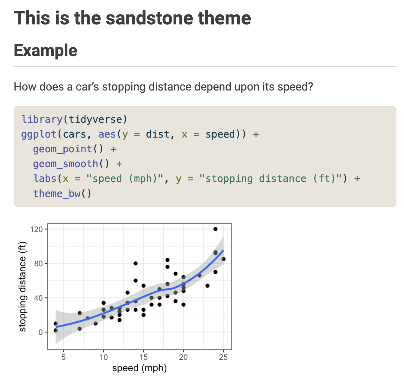
EXAMPLE 3: Plot themes
In addition to using meaningful color blind friendly palettes, meaningful axis labels (and altogether avoiding the use of R variable names) and captions or titles, we can also change the theme of our ggplots:
CAVEAT: I haven’t played around with this, so you’d be teaching and troubleshooting on your own!
Aesthetics: do’s and don’ts
Do NOT
Print out code messages and warnings.
Print anything long (eg: entire datasets).
A reader shouldn’t have to scroll to find the relevant pieces of your report!
Many reporting outlets (eg: newspapers, magazines, blogs) have size limits.
Include plots that are either too small or too big – some plots should be different sizes!
Use gratuitous, distracting themes or change up the aesthetics throughout the report.
DO
At the top of your qmd, before any text, include a setup chunk similar to this one which sets up some general aesthetics:
```{r include = FALSE} # Don't show readers this chunkknitr::opts_chunk$set( warning = FALSE, # Don't print out warnings message = FALSE, # Don't print out messages collapse = TRUE, # Show code & output in a single block fig.height = 3, # By default make plots 3" tall fig.width = 5, # By default make plots 5" wide fig.align = 'center') # By default center plots on the page```
When necessary, change any plot size at the top of the chunk with the plot code by replacing the ??? with the number of inches. Eg: fig.width = 4 would make the plot 4in wide.
{r fig.width = ???, fig.height = ???}
Make sure that your aesthetic choices have a purpose and use them consistently.
Report: Writing about data
More important than the aesthetics is how we write about data!
NOTE: The below text and examples are adapted from Communicating with Data by Nolan and Stoudt.
EXAMPLE 5: Fix it
Clear, concise language is important when discussing data. Consider some examples:
Example 1
Bad: “In this part of our analysis, we assume that flight delays that last shorter than 15.155598 minutes have minimal effects on passengers, and so we reduce our large dataset into a smaller subset in which all departure delays are at least fifteen minutes long.”
Better: “Since short departure delays have minimal impact on travelers, we analyzed only those flights where the delay was longer than 15 minutes.”
Example 2
Bad: “Thanks to my model’s output I was able to determine that there is a significant relationship between a child’s weight and their height.”
Better: “The model output showed a significant relationship between a child’s weight and height.”
Fix the phrases below.
This research paper has the aim to investigate the physical differences between penguin species.
It should be pointed out that, on average, Gentoo penguins have longer flippers than Adelie penguins.
These demonstrate that they weigh more on average.
Crafting sentences
No matter your audience, the following are just some basics to follow when writing about data:
Remove empty phrases that contain no information (e.g. “it should be pointed out that”).
Use active, strong verbs instead of passive verbs (e.g. “the research program has the aim to develop” to “the research program will pursue”).
Use concrete nouns (avoid imprecise pronouns “it” or “this”).
Don’t use long, convoluted sentences.
With data, only use precision when it matters. Otherwise, round.
Check for subject and verb agreement (eg: “the cats are” not “the cats is”).
Project Milestone 4 is due next Tuesday by 11:59pm.
Remember that attendance is critical to your collaborative efforts! If you miss class, you must discuss this with your group and make up for your lacking contribution to groupwork on your own time.