In presenting plots, it’s (of course) important to discuss what is going on. Weave comments on the following into a cohesive discussion:
variability / scale
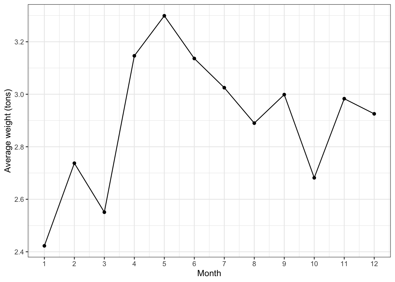
average monthly trash collection ranges from 2.4 to 3.3 tons
trend / patterns
trash collection peaks in spring and is lowest in winter months (at the beginning of the year)
outliers
no outliers of note here
It’s also important to discuss why. That is, observe and discuss. Make meaning of these observations. With that, why do you think Baltimore observes higher trash collection in its harbors in spring?
Enhancing a data story with viz
Deepen your discussion. Don’t just note what is happening. Explain why it might be happening, discuss any “interesting” observations (e.g. data points that don’t follow the trend), etc. Again, it’s your job to clarify what a reader should learn.
Fine tune the viz aesthetics.
Include external images / gifs. For example, if your analysis is about giraffes, include an image of a giraffe.
Think about your own growth in this course, and perhaps even enhance your viz (examples below).
EXAMPLE 2: Enhancing your viz
From least to most challenging…
Responsive plots
The plotly package allows you to hover over, and get info about, points, lines, etc. More examples (scatterplots) and more examples (line charts).
Animations
The gganimate package allows you to build animations, each frame being a ggplot. More examples.
Interactive plots
The shiny package allows users to change up the variables in an analysis, change up the data points, etc.
CAVEAT: I will not be teaching these tools! If you take these on, you’ll be committing to self-teaching (an important skill in DS and in general).
Project Milestone 4 is due next Tuesday by 11:59pm.
Remember that attendance is critical to your collaborative efforts! If you miss class, you must discuss this with your group and make up for your lacking contribution to groupwork on your own time.