4 Visualizing & modeling variability
4.1 Getting started
Find today’s notes at https://ajohns24.github.io/IMA_bootcamp_2020/visualizing-modeling-variability.html
Complete the following survey.
Download the “visualizing_modeling_variability_notes.Rmd” document from Canvas (Files > Statistics Material). Open in RStudio.
Open the group solutions document. This is where we’ll track solutions.
Knit your document. It’s helpful to do this early and often. If you get any errors, it’s likely because you haven’t yet installed the packages at the top of the document. If this is the case, return to Exercise 3.4 of the pre-bootcamp prep.
Overall workshop plan
The statistics & data science module, which will explore data analysis in the regression setting, can be centered within the broader machine learning workflow:
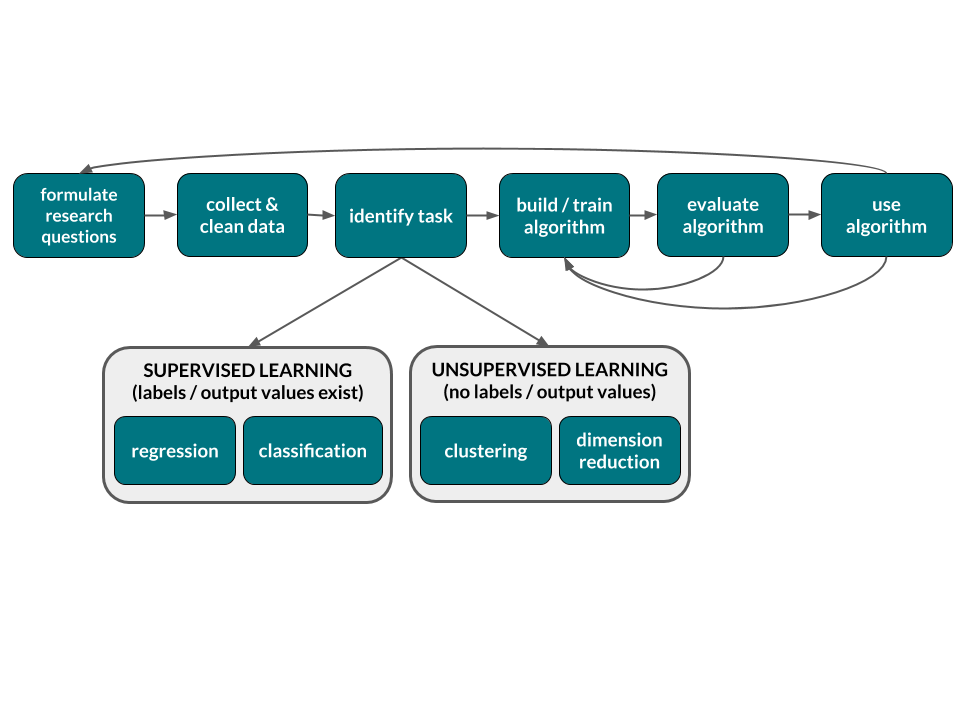
REGRESSION vs CLASSIFICATION vs CLUSTERING
| APPROACH | TASK | DATA | GOAL |
|---|---|---|---|
| Supervised | regression |
input: \(x = (x_1, x_2,..., x_k)\) output: quantitative \(y\) |
Model \(y\) by \(x\): \(y = f(x) + \varepsilon\) Use this model to (1) predict \(y\) for a new case; (2) explain variability in \(y\); (3) explore relationships between \(y\) and \(x\) |
| classification |
input: \(x = (x_1, x_2,..., x_k)\) output: categorical \(y\) |
||
| Unsupervised | clustering |
input: \(x = (x_1, x_2,..., x_k)\) output: none |
Examine similarities among cases with respect to their \(x_i\) values. That is, explore the structure in the data. |
NOTE: \(f(x)\) captures the trend and \(\varepsilon\) captures the error (deviations from trend)
Today’s plan
- Welcome / intros
- A motivating example with a pre-bootcamp recap
- Visualizing relationships
- Modeling relationships with linear regression
4.2 Pre-Bootcamp review
Statistics is the practice of using data from a sample to make inferences about some broader population of interest. Data is a key word here. In the pre-bootcamp prep, you explored the first simple steps of a statistical analysis: familiarizing yourself with the structure of your data and conducting some simple univariate analyses. We’ll build upon this foundation while getting to know each other a little better. To this end, read in data on the survey you just took:
survey <- read_csv("https://www.macalester.edu/~ajohns24/data/IMA/about_us_ima.csv")
names(survey) <- c("miles_away", "sleep", "activity", "star_wars", "birth_month")
Explore the structure of the data
Explore
activity(categorical)
Notice theeval = FALSEsyntax in your Rmd. If you knit the Rmd now, it would not evaluate this chunk (if you did, you’d get an error). Once you complete / fix this code, remove theeval = FALSEsyntax or replace it witheval = TRUE.
Explore
miles_away(quantitative)
(Remember to changeeval = FALSEonce you complete this code.)
Numerically summarize the trend & variability in miles_away
4.3 Visualizing relationships
There are more than 3000 counties in the U.S.:1
Since the 2016 election, people have examined the following questions:
- How did Trump’s support vary from county to county?
- How does this compare to trends in past elections?
- In what ways was Trump’s support associated with county demographics?
We’ll explore these questions using county-level election outcomes made available by Tony McGovern on github combined with county demographics from the df_county_demographics data set within the choroplethr package:
elect <- read.csv("https://www.macalester.edu/~ajohns24/Data/electionDemographics16.csv")

# There are more than 3000 counties in the U.S.
dim(elect)
## [1] 3112   34
head(elect)
##           county total_2008 dem_2008 gop_2008 oth_2008 total_2012 dem_2012
## 1  Walker County      28652     7420    20722      510      28497     6551
## 2 Bullock County       5415     4011     1391       13       5318     4058
## 3 Calhoun County      49242    16334    32348      560      46240    15500
## 4 Barbour County      11630     5697     5866       67      11459     5873
## 5 Fayette County       7957     1994     5883       80       7912     1803
## 6 Baldwin County      81413    19386    61271      756      84988    18329
##   gop_2012 oth_2012 total_2016 dem_2016 gop_2016 oth_2016 perdem_2016
## 1    21633      313      29243     4486    24208      549    15.34042
## 2     1250       10       4701     3530     1139       32    75.09041
## 3    30272      468      47376    13197    32803     1376    27.85588
## 4     5539       47      10390     4848     5431      111    46.66025
## 5     6034       75       8196     1358     6705      133    16.56906
## 6    65772      887      94090    18409    72780     2901    19.56531
##   perrep_2016 winrep_2016 perdem_2012 perrep_2012 winrep_2012 perdem_2008
## 1    82.78220        TRUE    22.98838    75.91325        TRUE    25.89697
## 2    24.22889       FALSE    76.30688    23.50508       FALSE    74.07202
## 3    69.23970        TRUE    33.52076    65.46713        TRUE    33.17087
## 4    52.27141        TRUE    51.25229    48.33755       FALSE    48.98538
## 5    81.80820        TRUE    22.78817    76.26390        TRUE    25.05970
## 6    77.35147        TRUE    21.56657    77.38975        TRUE    23.81192
##   perrep_2008 winrep_2008 region total_population percent_white percent_black
## 1    72.32305        TRUE   1127            66622            90             5
## 2    25.68790       FALSE   1011            10746            22            71
## 3    65.69189        TRUE   1015           117714            73            21
## 4    50.43852        TRUE   1005            27321            46            46
## 5    73.93490        TRUE   1057            17110            86            11
## 6    75.25948        TRUE   1003           187114            83             9
##   percent_asian percent_hispanic per_capita_income median_rent median_age
## 1             0                2             20698         402       41.8
## 2             0                6             18628         276       39.6
## 3             1                3             20828         422       38.7
## 4             0                5             16829         382       38.3
## 5             0                1             18494         287       43.5
## 6             1                4             26766         693       41.5
##   polyname abb StateColor
## 1  alabama  AL        red
## 2  alabama  AL        red
## 3  alabama  AL        red
## 4  alabama  AL        red
## 5  alabama  AL        red
## 6  alabama  AL        red
This data illuminates the following trends in Trump support from county to county:
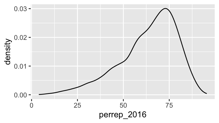
# Numerical summary
elect %>%
  summarize(mean(perrep_2016), sd(perrep_2016))
##   mean(perrep_2016) sd(perrep_2016)
## 1          63.62441        15.64131
The next natural question is this: what other variables (ie. county features) might explain some of this variability? Answering this question is one goal of statistical modeling. Specifically, statistical models illuminate relationships between a response variable and one or more predictors:
response variable
The variable whose variability we would like to explain or predict. eg: Trump’s vote percentpredictors
The variable(s) that might explain some of the variability in the response. eg: per capita income, state color, etc
Before building any models, the first crucial step in understanding relationships is to build informative visualizations.
Basic Rules for Constructing Visualizations
Instead of memorizing which plot is appropriate for which situation, it’s best to recognize patterns in constructing viz:
Each quantitative variable requires a new axis. If we run out of axes, we can illustrate the scale of a quantitative variable using color or discretize it into groups & treat it as categorical.
Each categorical variable requires a new way to “group” the graphic (eg: using colors, shapes, separate facets, etc to capture the grouping)
In breakout rooms:
Run through the following exercises which introduce different approaches to visualizing relationships. In doing so, for each plot:
- examine what the plot tells us about relationship trends & strength (degree of variability from the trend) as well as outliers or deviations from the trend.
- think: what’s the take-home message?
- where relevant, provide a descriptive comment (
#) to indicate the result of the syntax.
We’ll do the first exercise together.
Sketches
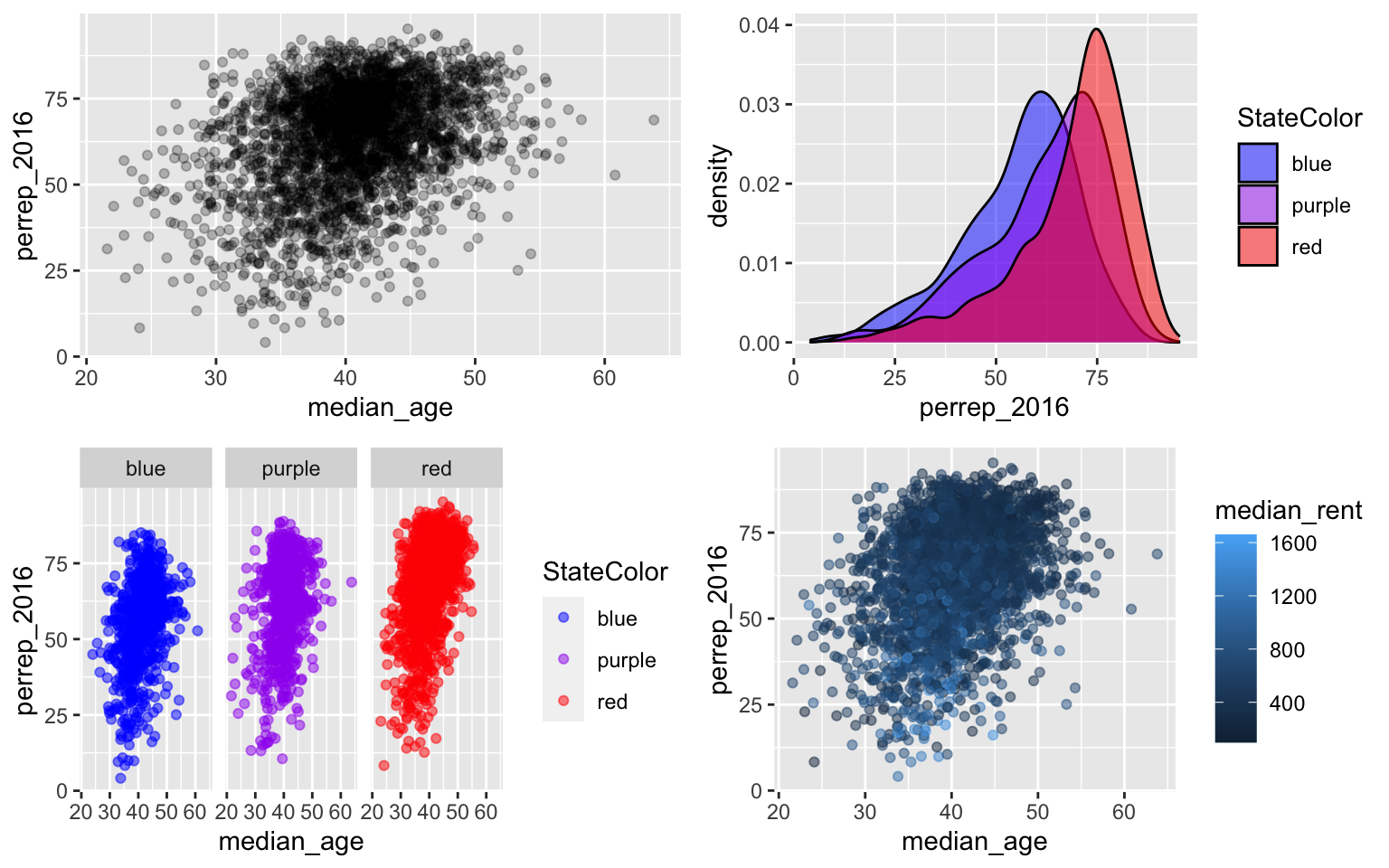
How might we visualize the relationships among the following pairs of variables? Checking out the structure on the just 4 counties might help:elect %>% filter(region %in% c(8039,28003,40129,29119)) %>% select(c(perrep_2016, perrep_2012, median_rent, StateColor, abb)) ## perrep_2016 perrep_2012 median_rent StateColor abb ## 1 73.52922 72.52198 948 blue CO ## 2 80.15304 72.84124 420 purple MO ## 3 79.94723 75.10557 391 red MS ## 4 87.94084 83.75149 367 red OKperrep_2016vsperrep_2012perrep_2016vsStateColorperrep_2016vsperrep_2012andStateColor(in 1 plot)perrep_2016vsperrep_2012andmedian_rent(in 1 plot)
Scatterplots of 2 quantitative variables
By default, the response variable (\(Y\)) goes on the y-axis and the predictor (\(X\)) goes on the x-axis.
Side-by-side plots of 1 quantitative variable vs 1 categorical variable
#
ggplot(elect, aes(x = perrep_2016, fill = StateColor)) +
    geom_density()

#
ggplot(elect, aes(x = perrep_2016, fill = StateColor)) +
    geom_density(alpha = 0.5)

#
ggplot(elect, aes(x = perrep_2016, fill = StateColor)) +
    geom_density()  +
    scale_fill_manual(values = c("blue","purple","red")) +
    facet_wrap( ~ StateColor)

#
ggplot(elect, aes(x = StateColor, y = perrep_2016)) +
    geom_boxplot()

# Practice: construct side-by-side boxplots of the perrep_2016 across counties in each state
Scatterplots of 1 quantitative variable vs 1 categorical & 1 quantitative variable
Ifpercent_whiteandStateColorboth explain some of the variability inperrep_2016, why not include both in our analysis?! Let’s.
Plots of 3 quantitative variables
Think back to our sketches. How might we include information about median_rent in these plots?
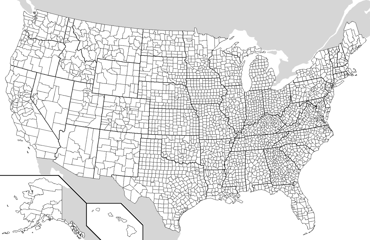
Extra: Maps!
There is, of course, a geographical component to these data. Though we won’t cover spatial models in bootcamp, the visuals still help us tell a story. If the required
choroplethrMapspackage isn’t working for you, work with a classmate (don’t spend too much time with this picky package).
4.4 Linear regression models
Just as when exploring single variables, there are limitations in relying solely on visualizations to analyze relationships among 2+ variables. Statistical models provide rigorous numerical summaries of relationship trends.
Example
Before going into details, examine the plots below and draw a model that captures the trend of the relationships being illustrated.
Linear regression can be used to model each of these relationships. “Linear” here indicates that the linear regression model of a response variable is a linear combination of explanatory variables. It does not mean that the relationship itself is linear!! In general, let \(Y\) be our response variable and (\(X_1, X_2, ..., X_k\)) be \(k\) explanatory variables. Then the (population) linear regression model of \(Y\) vs the \(X_i\) is
\[Y = \beta_0 + \beta_1 X_1 + \beta_2 X_2 + \cdots + \beta_k X_k + \varepsilon\]
where
\(\beta_0 + \beta_1 X_1 + \beta_2 X_2 + \cdots + \beta_k X_k\) describes the trend in the relationship
\(\varepsilon\) captures individual deviations from the trend (ie. residuals)
\(\beta_0\) = intercept coefficient
average \(Y\) value when \(X_1=X_2=\cdots=X_k=0\)\(\beta_i\) = \(X_i\) coefficient
when holding constant all other \(X_j\), the change \(Y\) when we increase \(X_i\) by 1
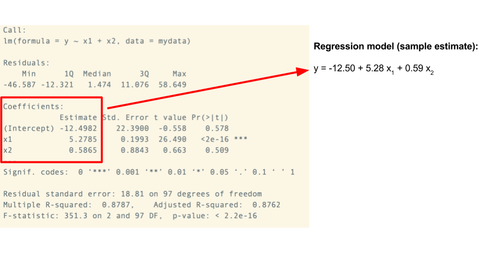
In RStudio, we construct sample estimates of linear regression models using the lm() (linear model) function. Consider a simple example:
Today we’ll focus on visualizing, constructing, and interpreting models. We’ll talk more tomorrow about model quality. IMPORTANT: Be sure to interpret the coefficients in a contextually meaningful way that tells the audience about the relationships of interest (as opposed to simply providing a definition).
Models with 1 quantitative predictor: perrep_2016 vs median_age
To begin, visualize the relationship:ggplot(elect, aes(x = median_age, y = perrep_2016)) + geom_point(alpha = 0.25) + geom_smooth(method = "lm")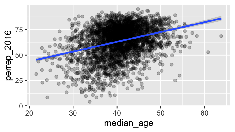
Build and summarize the regression model:
Write out the estimated model trend and interpret all coefficients: perrep_2016 = ___ + ___ median_age
What’s the model’s prediction of Trump’s vote percent in a county with a median age of 40? A median age of 22? Plug these into part b and check your work using a shortcut function in R:
Solution
# a
model_1 <- lm(perrep_2016 ~ median_age, data = elect)
summary(model_1)
##
## Call:
## lm(formula = perrep_2016 ~ median_age, data = elect)
##
## Residuals:
##     Min      1Q  Median      3Q     Max
## -52.976  -9.131   2.596  11.028  33.472
##
## Coefficients:
##             Estimate Std. Error t value Pr(>|t|)
## (Intercept) 24.48636    2.12404   11.53   <2e-16 ***
## median_age   0.96485    0.05195   18.57   <2e-16 ***
## ---
## Signif. codes:  0 '***' 0.001 '**' 0.01 '*' 0.05 '.' 0.1 ' ' 1
##
## Residual standard error: 14.84 on 3110 degrees of freedom
## Multiple R-squared:  0.09984,	Adjusted R-squared:  0.09955
## F-statistic: 344.9 on 1 and 3110 DF,  p-value: < 2.2e-16

# b
#perrep_2016 = 24.48636 + 0.96485 median_age
# The intercept doesn't have contextual meaning since a median_age value of 0 doesn't make sense!
# For every extra year of median_age in a county, Trump's support increases by 24.5 percentage points

# c
new_county <- data.frame(median_age = c(22,40))
predict(model_1, new_county)
##        1        2
## 45.71302 63.08029
Models with 1 categorical predictor: perrep_2016 vs StateColor
Visualize the relationship between these 2 variables and construct the model of this relationship.
Write out the estimated model formula:
perrep_2016 = ___ + ___ StateColorpurple + ___ StateColorred
Huh?! RStudio splits categorical predictors up into a reference group (the first alphabetically) and indicators for the other groups. Here,
bluestates are the reference group and \[\text{StateColorpurple} = \begin{cases} 1 & \text{ if purple} \\ 0 & \text{ otherwise} \\ \end{cases} \;\;\;\; \text{ and } \;\;\;\; \text{StateColorred} = \begin{cases} 1 & \text{ if red} \\ 0 & \text{ otherwise} \\ \end{cases}\] In other words, theStateColorvariable is turned into 3 “dummy variables”: \[\left(\begin{array}{c} \text{red} \\ \text{purple} \\ \text{purple} \\ \text{blue} \\ \text{red} \end{array}\right) \;\;\; \to \;\;\; \text{...blue} = \left(\begin{array}{c} 0 \\ 0 \\ 0 \\ 1 \\ 0 \end{array}\right), \;\; \text{...purple} = \left(\begin{array}{c} 0 \\ 1 \\ 1 \\ 0 \\ 0 \end{array}\right), \;\; \text{...red} = \left(\begin{array}{c} 1 \\ 0 \\ 0 \\ 0 \\ 1 \end{array}\right)\] Since these sum to 1, we only need to put 2 into our model and leave the other out as a reference level. With these ideas in mind, interpret all coefficients in your model. HINT: Plug in 0’s and 1’s to obtain 3 separate models for the blue, purple, and red states.How are the model coefficients related to the features of Trump’s support across counties in blue, purple, and red states? (That is, what’s the dual meaning of these coefficients?)
Solution
# a
model_2 <- lm(perrep_2016 ~ StateColor, data = elect)
summary(model_2)
##
## Call:
## lm(formula = perrep_2016 ~ StateColor, data = elect)
##
## Residuals:
##     Min      1Q  Median      3Q     Max
## -60.613  -7.385   3.299  10.266  29.446
##
## Coefficients:
##                  Estimate Std. Error t value Pr(>|t|)
## (Intercept)       55.6653     0.5034 110.579   <2e-16 ***
## StateColorpurple   6.4764     0.7247   8.937   <2e-16 ***
## StateColorred     13.2692     0.6304  21.047   <2e-16 ***
## ---
## Signif. codes:  0 '***' 0.001 '**' 0.01 '*' 0.05 '.' 0.1 ' ' 1
##
## Residual standard error: 14.62 on 3109 degrees of freedom
## Multiple R-squared:  0.1274,	Adjusted R-squared:  0.1268
## F-statistic: 226.9 on 2 and 3109 DF,  p-value: < 2.2e-16

# b
# perrep_2016 = 55.6653 + 6.4764 StateColorpurple + 13.2692 StateColorred

# c
# Based on the calculations below:
# - The typical Trump support in blue state counties was 55.6653%
# - The typical Trump support in purple state counties was 6.4764 percentage points HIGHER than in blue state counties
# - The typical Trump support in red state counties was 13.2692 percentage points HIGHER than in blue state counties
# blue state prediction
55.6653 + 6.4764*0 + 13.2692*0
## [1] 55.6653
# purple state prediction
55.6653 + 6.4764*1 + 13.2692*0
## [1] 62.1417
# red state prediction
55.6653 + 6.4764*0 + 13.2692*1
## [1] 68.9345

# d
# These are related to the MEAN Trump support in blue, purple, and red states
Models with 1 quantitative predictor & 1 categorical predictor: perrep_2016 vs median_age and StateColor
First, build and visualize the model.
Interpret all model coefficients by applying the techniques you learned above. These interpretations will differ from those in
model_1andmodel_2– coefficients are defined / interpreted differently depending upon what other predictors are in the model. HINT:First write out the estimated model formula:
perrep_2016 = ___ + ___ median_age + ___ StateColorpurple + ___ StateColorred
Then, notice that the presence of a categorical variable results in the separation of the model formula by group. To this end, plug in 0’s and 1’s to obtain 3 separate model formulas for the blue, purple, and red states:
perrep_2016 = ___ + ___ median_age.
Solution
# a
model_3 <- lm(perrep_2016 ~ median_age + StateColor, data = elect)
ggplot(elect, aes(x = median_age, y = perrep_2016, color = StateColor)) +
  geom_point(alpha = 0.25) +
  geom_line(aes(y = model_3$fitted.values)) +
  scale_color_manual(values=c("blue","purple","red"))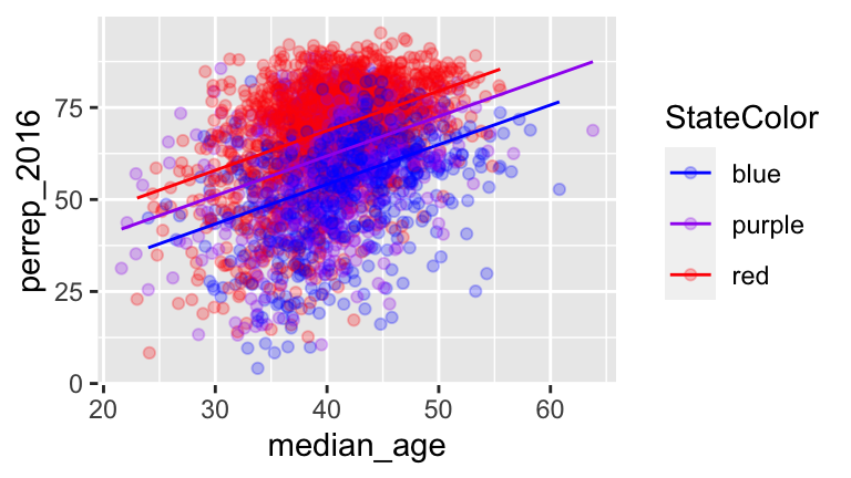
# b
summary(model_3)
##
## Call:
## lm(formula = perrep_2016 ~ median_age + StateColor, data = elect)
##
## Residuals:
##     Min      1Q  Median      3Q     Max
## -54.207  -7.179   2.295   9.409  35.252
##
## Coefficients:
##                  Estimate Std. Error t value Pr(>|t|)
## (Intercept)      11.02443    2.02889   5.434 5.95e-08 ***
## median_age        1.07768    0.04767  22.609  < 2e-16 ***
## StateColorpurple  7.67020    0.67376  11.384  < 2e-16 ***
## StateColorred    14.57953    0.58719  24.829  < 2e-16 ***
## ---
## Signif. codes:  0 '***' 0.001 '**' 0.01 '*' 0.05 '.' 0.1 ' ' 1
##
## Residual standard error: 13.55 on 3108 degrees of freedom
## Multiple R-squared:  0.2506,	Adjusted R-squared:  0.2499
## F-statistic: 346.5 on 3 and 3108 DF,  p-value: < 2.2e-16
# trend for blue states: perrep_2016 = 11.02443 + 1.07768median_age
# trend for purple states: perrep_2016 = (11.02443 + 7.67020) + 1.07768median_age
# trend for red states: perrep_2016 = (11.02443 + 14.57953) + 1.07768median_age
# 11.02443 = intercepts for blue states
# 1.07768 = shared slope = no matter the state color, Trump support tends to increase by 1.07768 percentage points for every extra 1 year in median_age
# 7.67020 = how we CHANGE the intercept for purple states = when controlling for median_age, Trump support tends to be 7.67020 HIGHER in purple states than in blue states
# 14.57953 = how we CHANGE the intercept for red states = when controlling for median_age, Trump support tends to be 7.67020 HIGHER in purple states than in blue states
Models with 2 quantitative predictors: perrep_2016 vs median_age and median_rent
Visualize & construct a model of this relationship.
If you were to draw this model, what would it look like?
Interpret the
median_agecoefficient.
Solution
# a
model_4 <- lm(perrep_2016 ~ median_age + median_rent, data = elect)
summary(model_4)
##
## Call:
## lm(formula = perrep_2016 ~ median_age + median_rent, data = elect)
##
## Residuals:
##     Min      1Q  Median      3Q     Max
## -59.411  -6.969   1.904   8.843  41.137
##
## Coefficients:
##              Estimate Std. Error t value Pr(>|t|)
## (Intercept) 57.160793   2.175080   26.28   <2e-16 ***
## median_age   0.625687   0.047275   13.23   <2e-16 ***
## median_rent -0.036905   0.001244  -29.66   <2e-16 ***
## ---
## Signif. codes:  0 '***' 0.001 '**' 0.01 '*' 0.05 '.' 0.1 ' ' 1
##
## Residual standard error: 13.11 on 3109 degrees of freedom
## Multiple R-squared:  0.2984,	Adjusted R-squared:  0.2979
## F-statistic: 661.1 on 2 and 3109 DF,  p-value: < 2.2e-16
ggplot(elect, aes(x = median_age, y = perrep_2016, color = median_rent)) +
  geom_point(alpha = 0.25)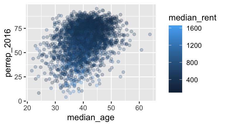
Models with 2 categorical predictors: perrep_2016 vs StateColor and income_bracet
For illustration’s sake, let’s split countyper_capita_income(in $) into 2 income brackets: above or below $25,000:# Define income brackets elect <- elect %>% mutate(income_bracket = cut(per_capita_income, breaks = c(0, 25000, 65000), labels = c("low","high")))Visualize the relationship.
Construct the model & interpret all coefficients.
How many possible combinations are there of these two explanatory variables? Which combination has the highest predicted
perrep_2016? The lowest?
Solution
# a (two of many options)
ggplot(elect, aes(y = perrep_2016, x = StateColor, color = income_bracket)) +
  geom_boxplot()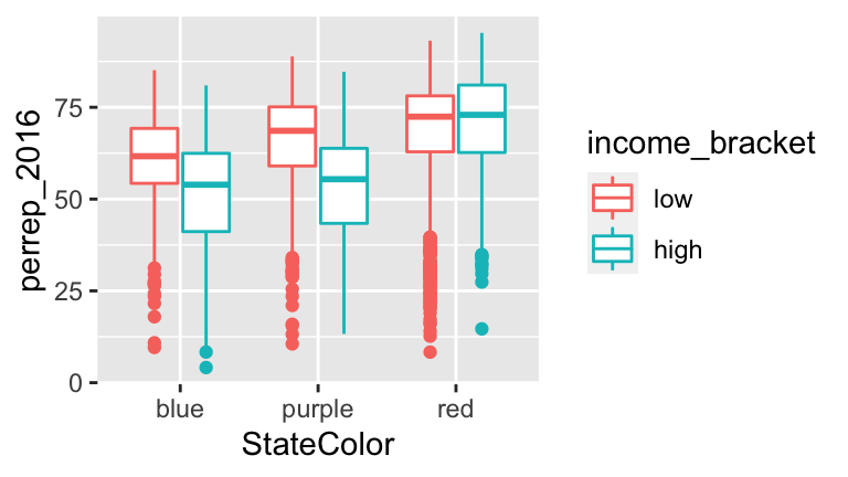
ggplot(elect, aes(x = perrep_2016, fill = StateColor)) +
  geom_density(alpha = 0.5) +
  facet_grid(~ income_bracket)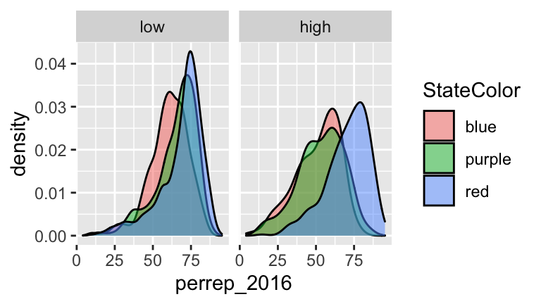
# b
model_5 <- lm(perrep_2016 ~ StateColor + income_bracket, data = elect)
summary(model_5)
##
## Call:
## lm(formula = perrep_2016 ~ StateColor + income_bracket, data = elect)
##
## Residuals:
##     Min      1Q  Median      3Q     Max
## -61.925  -7.388   3.076  10.154  30.146
##
## Coefficients:
##                    Estimate Std. Error t value Pr(>|t|)
## (Intercept)         58.3134     0.5772 101.036  < 2e-16 ***
## StateColorpurple     5.1963     0.7294   7.124  1.3e-12 ***
## StateColorred       11.9331     0.6398  18.651  < 2e-16 ***
## income_brackethigh  -5.1200     0.5673  -9.025  < 2e-16 ***
## ---
## Signif. codes:  0 '***' 0.001 '**' 0.01 '*' 0.05 '.' 0.1 ' ' 1
##
## Residual standard error: 14.43 on 3108 degrees of freedom
## Multiple R-squared:  0.1497,	Adjusted R-squared:  0.1488
## F-statistic: 182.3 on 3 and 3108 DF,  p-value: < 2.2e-16
#  58.3134 = typical Trump support in counties that are in BLUE states and LOWER income bracket
#  5.1963: When controlling for income bracket, the typical Trump support in purple state counties tends to be 5.1963 percentage points higher than in blue state counties.
#  11.9331: When controlling for income bracket, the typical Trump support in red state counties tends to be 11.9331 percentage points higher than in blue state counties.
#  -5.1200: When controlling for state color, the typical Trump support in counties with higher avg income tends to be 5.1200 percentage points lower than counties with lower avg income.

#c
# There are 6 combos.
# Trump's support tends to be highest among counties in RED states that have LOWER average income
58.3134 + 11.9331
## [1] 70.2465
# Trump's support tends to be lowest among counties in BLUE states that have HIGHER average income
58.3134 - 5.1200
## [1] 53.1934
4.5 Wrapping up
If you finish early:
The
electdata set was actually compiled from 3 different sources:- the
county_election_resultsdata at https://www.macalester.edu/~dshuman1/ima/bootcamp/data/county_election_results.csv contains the 2016 county-level election results
- the
df_county_demographicsdata set within thechoroplethrpackage contains county level demographic data
- the
red_blueStatesdata at https://www.macalester.edu/~ajohns24/Data/red_bluePurple.csv categorizes each county as belonging to a blue/red/purple state based on state categorizations at http://www.270towin.com/
It’s common to have to combine multiple data sources for an analysis. Let’s practice here:
# Load the 3 separate data sources politics <- read.csv("https://www.macalester.edu/~dshuman1/ima/bootcamp/data/county_election_results.csv") data("df_county_demographics") red_blue <- read.csv("https://www.macalester.edu/~ajohns24/Data/RedBluePurple.csv") # Check them out dim(politics) head(politics, 3) dim(df_county_demographics) head(df_county_demographics, 3) dim(red_blue) head(red_blue, 3) # Join politics and df_county_demographics by their shared region variable elect <- left_join(df_county_demographics, politics, by = c("region" = "region")) # Join elect with red_blue elect <- left_join(elect, red_blue, by = c("region" = "region")) # Check it out dim(elect) head(elect, 3)- the
Start Homework 1. You should attempt to complete this homework before we meet again tomorrow.
.png)