22 Cautions in hypothesis testing – II
Announcements
Quiz 3 is one week from today. It is naturally cumulative, but will be tilted toward the most recent material (sampling distributions, confidence intervals, and hypothesis tests). It is the same structure as Quizzes 1 & 2 EXCEPT Part 2 will be due by 10pm on the same day.
Homework 7 (last homework!) & Mini-project Phase 2 are due Thursday. There will be class time to work on these today and all day Thursday. Please use this time to minimize stress outside class!
Homework 7 is longer than usual (hence why you’ll have so much class time to consider it). It is an important broad, though not exhaustive, review for Quiz 3. For this reason, it’s important that you hand this in on Thursday so that you can focus on studying for the quiz.
You’ll need to fill in some chunks before you’ll be able to knit your notes.
22.1 Getting started
The whole point
We can use sample data to estimate features of the population.
There’s error in this estimation.
Taking this error into account, we want to make some sort of conclusion about the population.
There is some gray area in this conclusion and we might be wrong. NOTE: This includes but is not limited to the chance of making a Type I or Type II error (not because we did anything wrong, but because we got unlucky data which led to an incorrect conclusion).
REVIEW
A researcher makes a claim: songs in the latin genre are longer than those in the pop / edm genres. Thus they’re interested in the population model of song duration (in seconds) by latin_genre:
duration = \(\beta_0\) + \(\beta_1\) latin_genreTRUE
where population coefficients \(\beta_0\) and \(\beta_1\) are unknown. Consider their analysis:
# Load the data
spotify_big <- read.csv("https://www.macalester.edu/~ajohns24/data/spotify_example_big.csv") %>%
  select(track_artist, track_name, duration_ms, latin_genre) %>%
  mutate(duration = duration_ms / 1000)

# Plot the relationship
ggplot(spotify_big, aes(x = duration, color = latin_genre)) +
    geom_density()
# Construct the model
spotify_model_2 <- lm(duration ~ latin_genre, spotify_big)
coef(summary(spotify_model_2))
##                   Estimate Std. Error   t value   Pr(>|t|)
## (Intercept)     212.673908  0.4165491 510.56143 0.00000000
## latin_genreTRUE   1.555355  0.7435700   2.09174 0.03647731
Question 1
We have statistically significant evidence that songs in the latin genre are, on average, longer. Why?
Question 2
But these results are not practically significant. Why?
Question 3
Why did this happen?
22.2 Exercises
Directions
Explore common abuses of hypothesis testing so that (1) you don’t make these mistakes yourself; and (2) you can read others’ work with a healthy critical eye.
Review. The exercises focus on new concepts, yet they require the understanding of “old” material. Though you won’t be required to do so, make sure you could write down model formulas, make predictions, interpret coefficients, etc if asked.
Run this chunk to define a special function you’ll need for these exercises:
# Define a function you'll need later
birthtest <- function(n){
  foods <- read.csv("https://www.macalester.edu/~ajohns24/data/food_list.csv")
  nleft <- rbinom(132, size = n, prob = 0.1)
  nright = n - nleft
  data <- data.frame(food = foods[,1], left = nleft, right = nright)
  pvals = rep(0,132)
  nleft = data$left
  for(i in 1:132){
    pvals[i] = prop.test(x = nleft[i], n, p = 0.1)$p.value
  }
  data %>%
    mutate(p_value = pvals)
}
Don’t forget about multicollinearity
Consider the following relationship of daily bike share ridership among “casual” riders (non-members) with the “feels like” temperature and actual temperature:# Load the data bikes <- read.csv("https://www.macalester.edu/~dshuman1/data/155/bike_share.csv") # Plot the relationship ggplot(bikes, aes(x = temp_feel, y = riders_casual, color = temp_actual)) + geom_point()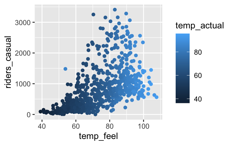
# Construct a model bike_model <- lm(riders_casual ~ temp_feel + temp_actual, bikes) summary(bike_model) ## ## Call: ## lm(formula = riders_casual ~ temp_feel + temp_actual, data = bikes) ## ## Residuals: ## Min 1Q Median 3Q Max ## -1076.7 -343.0 -141.1 142.7 2518.1 ## ## Coefficients: ## Estimate Std. Error t value Pr(>|t|) ## (Intercept) -1057.60 110.83 -9.542 <2e-16 *** ## temp_feel 14.41 11.32 1.273 0.203 ## temp_actual 12.10 12.29 0.985 0.325 ## --- ## Signif. codes: 0 '***' 0.001 '**' 0.01 '*' 0.05 '.' 0.1 ' ' 1 ## ## Residual standard error: 576.6 on 728 degrees of freedom ## Multiple R-squared: 0.2967, Adjusted R-squared: 0.2948 ## F-statistic: 153.6 on 2 and 728 DF, p-value: < 2.2e-16Which of the following null hypotheses corresponds to the p-value reported in the
temp_feelrow of the model summary table?- \(H_0\): there’s an association between ridership and “feels like” temperature
- \(H_0\): there’s no association between ridership and “feels like” temperature
- \(H_0\): when controlling for actual temperature, there’s an association between ridership and “feels like” temperature
- \(H_0\): when controlling for actual temperature, there’s no association between ridership and “feels like” temperature
- \(H_0\): there’s an association between ridership and “feels like” temperature
Your friend makes an easy mistake. Noting its large p-value, they conclude that ridership isn’t associated with “feels like” temperature. Construct a new model that illustrates your friend’s mistake.
Explain why this happened, i.e. why the original model and your new model provide two different insights into the relationship between ridership and “feels like” temperature. Support your argument with a visualization.
A new kind of test
Reexamine the summary for our originalbike_model:summary(bike_model) ## ## Call: ## lm(formula = riders_casual ~ temp_feel + temp_actual, data = bikes) ## ## Residuals: ## Min 1Q Median 3Q Max ## -1076.7 -343.0 -141.1 142.7 2518.1 ## ## Coefficients: ## Estimate Std. Error t value Pr(>|t|) ## (Intercept) -1057.60 110.83 -9.542 <2e-16 *** ## temp_feel 14.41 11.32 1.273 0.203 ## temp_actual 12.10 12.29 0.985 0.325 ## --- ## Signif. codes: 0 '***' 0.001 '**' 0.01 '*' 0.05 '.' 0.1 ' ' 1 ## ## Residual standard error: 576.6 on 728 degrees of freedom ## Multiple R-squared: 0.2967, Adjusted R-squared: 0.2948 ## F-statistic: 153.6 on 2 and 728 DF, p-value: < 2.2e-16Whereas the test statistics / p-values in the coefficient table test the significance of individual predictors, the
F-statisticrow at the bottom of the model summary tests:H0: none of the predictors are significant
Ha: at least one of the predictors is significantWhat is the conclusion of this test and why is it actually helpful here? For example, how might it have prevented your friend’s mistake?
Doing lots of tests can be dangerous – 1
Suppose researchers asked pregnant people about their consumption of 132 different foods. For each food, they then tested for an association of that food with having child that grows up to be left-handed (a figure which is roughly 10% among the general population):H0: proportion of children that are left-handed = 0.1
Ha: proportion of children that are left-handed \(\ne\) 0.1(Seem silly? This scenario is based on a real article “You are what your mother eats” in the reputable journal, Proceedings of the Royal Society B - Biological Sciences, which asserted that eating cereal during pregnancy is associated with having a male baby.)
In reality, NONE of these 132 foods are truly linked to handedness – H0 is true in all 132 cases. With this in mind, let’s simulate what results the researchers might find using the special
birthtestfunction. Specifically, for each of the 132 foods, we’ll simulate the handedness of children born to 100 pregnant people that eat those foods. Set your random number seed to your own phone number:set.seed(___) handedness_tests <- birthtest(n = 100) head(handedness_tests)Your
handedness_testsdata contains 132 rows, each corresponding to a different food. Scan yourhandedness_testsdata. We’d expect roughly 10 of 100 children to be left-handed. Which food deviates the most from this expectation?
- Doing lots of tests can be dangerous – 2
For each food, we’ll use our sample data to test whether left-handedness significantly differs from 0.1. In doing so we might make a Type I error. What does this mean in our setting?
- Conclude that a food is linked to handedness when it’s not.
- Conclude that a food is not linked to handedness when it is.
- Conclude that a food is linked to handedness when it’s not.
The p-values associated with each food are reported in
handedness_tests. Identify the foods that correspond to Type I errors, ie. have a p-value < 0.05 despite the fact that H0 is true (ie. there’s actually no association with handedness).handedness_testsFor each food you identified in part b, can you imagine a fake headline trumpeting your findings?
Multiple testing
Let’s explore the math behind this phenomenon. Assume we conduct each hypothesis test at the 0.05 significance level. Thus in any one test, there’s a 0.05 probability of making a Type I error when H0 is true. What if we conduct two tests? Assuming H0 is true for both, there are 4 possible combinations of conclusions we might make:Test 1 Test 2 Probability not significant not significant 0.95*0.95 = 0.9025not significant significant 0.95*0.05 = 0.0475significant not significant 0.95*0.05 = 0.0475significant significant 0.05*0.05 = 0.0025TOTAL 1
Based on the above table, if we conduct two tests and H0 is actually true for both, what’s the probability we make at least one Type I error?
In general, suppose we conduct “g” tests and that H0 is true for each one. The probability of getting at least one Type I error is
1 - 0.95^g. (NOTE: You neither need to prove nor memorize this, but you can if you have extra time!) This is called the overall or family-wise Type I error rate. Use this formula to calculate the following:- overall Type I error rate when g = 1
- overall Type I error rate when g = 10
- overall Type I error rate when g = 100
- overall Type I error rate when g = 1
- Reflection
- Related to our above experiment, explain why this cartoon is funny.
- Later, you can read more about how this silly experiment is not that far-fetched.
- Related to our above experiment, explain why this cartoon is funny.
p-hacking
fivethirtyeight put together a nice (but scary) simulation that highlights the dangers of fishing for significance and the importance of always questioning: how many things did people test? can I replicate these results? what data did people use? what was their motivation? how did they measure their variables? might their results have changed if they used different measurements?Use this simulation to “prove” 2 different claims. For both, be sure to indicate what response variable (eg: Employment rate) and data (eg: senators) you used:
- the economy is significantly better when Republicans are in power
- the economy is significantly better when Democrats are in power
- the economy is significantly better when Republicans are in power
OPTIONAL: Bonferroni
NOTE: If you are a Bio major, you should give this a peak.As the number of tests increase, we’ve seen that the chance of observing at least one Type I error increases. One solution is to inflate the observed p-value from each test. For example, the Bonferroni method penalizes for testing “too many” hypotheses by artificially inflating the p-value:
Bonferroni-adjusted p-value = observed p-value
*total # of testsCalculate the Bonferroni-adjusted p-values for our 132 tests:
handedness_tests <- handedness_tests %>% mutate(bonferroni_p = p_value * 132)Of your 132 tests, what percent are still significant? That is, what is the overall Type I error rate?
handedness_tests %>% filter(bonferroni_p < 0.05)This is better than making a bunch of errors. But can you think of any trade-offs of using the Bonferroni correction?
22.3 Solutions
Don’t forget about multicollinearity
# Load the data
bikes <- read.csv("https://www.macalester.edu/~dshuman1/data/155/bike_share.csv")

# Plot the relationship
ggplot(bikes, aes(x = temp_feel, y = riders_casual, color = temp_actual)) +
    geom_point()
# Construct a model bike_model <- lm(riders_casual ~ temp_feel + temp_actual, bikes) summary(bike_model) ## ## Call: ## lm(formula = riders_casual ~ temp_feel + temp_actual, data = bikes) ## ## Residuals: ## Min 1Q Median 3Q Max ## -1076.7 -343.0 -141.1 142.7 2518.1 ## ## Coefficients: ## Estimate Std. Error t value Pr(>|t|) ## (Intercept) -1057.60 110.83 -9.542 <2e-16 *** ## temp_feel 14.41 11.32 1.273 0.203 ## temp_actual 12.10 12.29 0.985 0.325 ## --- ## Signif. codes: 0 '***' 0.001 '**' 0.01 '*' 0.05 '.' 0.1 ' ' 1 ## ## Residual standard error: 576.6 on 728 degrees of freedom ## Multiple R-squared: 0.2967, Adjusted R-squared: 0.2948 ## F-statistic: 153.6 on 2 and 728 DF, p-value: < 2.2e-16\(H_0\): when controlling for actual temperature, there’s no association between ridership and “feels like” temperature
It is significant!
bike_model_2 <- lm(riders_casual ~ temp_feel, bikes) coef(summary(bike_model_2)) ## Estimate Std. Error t value Pr(>|t|) ## (Intercept) -1053.57907 110.753349 -9.512842 2.636006e-20 ## temp_feel 25.46135 1.455055 17.498549 1.665312e-57temp_feel and temp_actual are multicollinear (see plot below). temp_feel is a significant predictor of ridership, but not if we already have temp_actual in our model.
ggplot(bikes, aes(x = temp_actual, y = temp_feel)) + geom_point()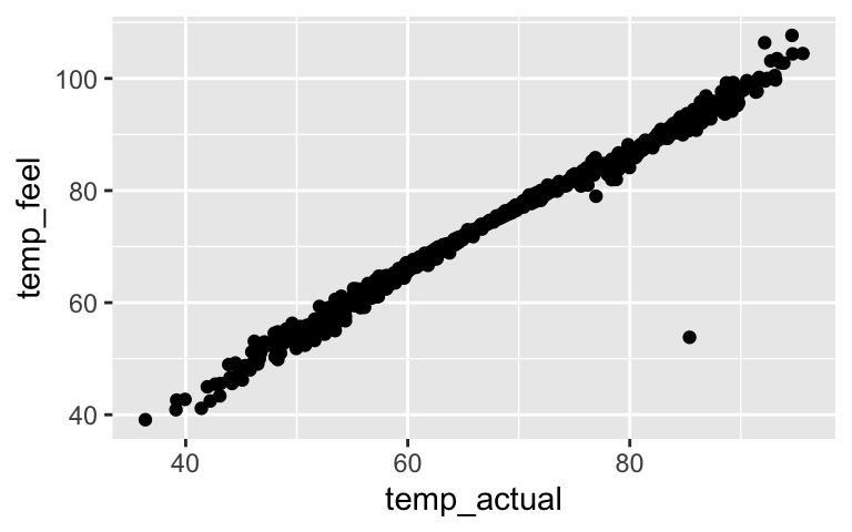
- A new kind of test
- At least one of the predictors is significant.
- This is helpful since neither of the predictors alone are significant. This test indicates that something is useful here, thus the non-significant results are likely due to multicollinearity.
- At least one of the predictors is significant.
Doing lots of tests can be dangerous – 1
set.seed(123456) handedness_tests <- birthtest(n = 100) head(handedness_tests) ## food left right ## 1 Beef, ground, regular, pan-cooked 12 88 ## 2 Shredded wheat cereal 12 88 ## 3 BF, cereal, rice w/apples, dry, prep w/ water 9 91 ## 4 BF, sweet potatoes 9 91 ## 5 Pear, raw (w/ peel) 9 91 ## 6 Celery, raw 7 93 ## p_value ## 1 0.6170751 ## 2 0.6170751 ## 3 0.8676323 ## 4 0.8676323 ## 5 0.8676323 ## 6 0.4046568For me, these are the foods most significantly associated with handedness:
handedness_tests %>% arrange(p_value) %>% head() ## food left right ## 1 Fruit cocktail, canned in light syrup 18 82 ## 2 BF, arrowroot cookies 2 98 ## 3 Apricots, canned in heavy/light syrup 17 83 ## 4 BF, cereal, oatmeal w/ fruit, prep w/ water 3 97 ## 5 Salmon, steaks/fillets, baked 16 84 ## 6 Bread, cracked wheat 4 96 ## p_value ## 1 0.01241933 ## 2 0.01241933 ## 3 0.03026028 ## 4 0.03026028 ## 5 0.06675302 ## 6 0.06675302
- Doing lots of tests can be dangerous – 2
Conclude that a food is linked to handedness when it’s not.
.
handedness_tests %>% filter(p_value < 0.05) ## food left right ## 1 Apricots, canned in heavy/light syrup 17 83 ## 2 Fruit cocktail, canned in light syrup 18 82 ## 3 BF, cereal, oatmeal w/ fruit, prep w/ water 3 97 ## 4 BF, arrowroot cookies 2 98 ## p_value ## 1 0.03026028 ## 2 0.01241933 ## 3 0.03026028 ## 4 0.01241933Will vary.
- Multiple testing
- 0.0475 + 0.0475 + 0.0025 = 0.0975
- .
- overall Type I error rate when g = 1: 0.05
- overall Type I error rate when g = 10: 0.40
- overall Type I error rate when g = 100: 0.99
- overall Type I error rate when g = 1: 0.05
- 0.0475 + 0.0475 + 0.0025 = 0.0975
- Reflection
- p-hacking
Will vary. There are lots of possibilities.
OPTIONAL: Bonferroni
handedness_tests <- handedness_tests %>% mutate(bonferroni_p = p_value * 132)None are still significant. The overall Type I error rate is 0.
handedness_tests %>% filter(bonferroni_p < 0.05) ## [1] food left right p_value bonferroni_p ## <0 rows> (or 0-length row.names)It’s pretty conservative, making it tough to establish statistical significance (the p-value would have to be very, very low). Thus this might increase the Type II error rate, i.e. we might make more false positives.