12 Interaction
Announcements
Homework 4 and Checkpoint 10 are due next Tuesday. By popular demand, starting with Homework 4, I’ll provide a homework-specific template. You can find this template in the Homework 4 link on Moodle. It includes the questions and you should type your answer in it. Using this template is an important homework requirement – points will be deducted otherwise.
We won’t have a regular class on Thursday. Instead, each student is expected to attend 2 MSCS Capstone talks.
Find the schedule here.
AMS = applied math & statistics, STAT = the new statistics major, DS = data science, CS = computer science, and MATH = math :)On Homework 4, you’ll be asked 4 things about both talks:
- The speaker name and presentation title.
- A 1 sentence take-away message of the presentation. This has to go beyond what somebody might learn from reading the abstract / advertisement.
- 1 thing that the speaker did well. For example: Was the presentation appropriate for a broad audience? Was the speaker prepared and confident in their work? Were the slides clean and engaging?
- 1 question you did or would like to ask the speaker about their work.
- The speaker name and presentation title.
Based on the questions you’ll be asked, there’s no need to take notes. Just go and be a good listener!
12.1 Getting started
WHERE ARE WE?
We’ve been talking about building models and how this is impacted by our research questions, research goals, and the relationships among our possible predictors. Along these last lines, we’ll talk about when predictors interact.
REVIEW: INTERACTION
Let \(y\) be a response variable and \(x_1\) and \(x_2\) be two predictors. Our previous multivariate models have assumed that the relationship between \(y\) and \(x_1\) is independent of or unrelated to \(x_2\). In contrast, if the relationship between \(y\) and \(x_1\) differs depending upon the values / categories of \(x_2\), we say that our 2 predictors interact. In this case we can include an interaction term in our model. Mathematically, this is the product of the 2 predictors:
\[y = \beta_0 + \beta_1 x_1 + \beta_2 x_2 + \beta_3 x_1*x_2\]
EXAMPLE
Let’s explore the relationship between wage and education for workers in the management and transportation sectors:
# Load packages and data
library(ggplot2)
library(dplyr)
CPS_2018 <- read.csv("https://www.macalester.edu/~ajohns24/data/CPS_2018.csv")

# Get data on just the management and transportation sectors
CPS_sub <- CPS_2018 %>%
  filter(industry %in% c("management", "transportation"))
Our original model (without an interaction term) assumes that the relationship between wage and education is the same in both industries:
# Plot and model the relationship WITHOUT an interaction term
# NOTE: the use of geom_line forces the lines to match our model
wage_model_1 <- lm(wage ~ education + industry, CPS_sub)
ggplot(CPS_sub, aes(y = wage, x = education, color = industry)) +
    geom_line(aes(y = wage_model_1$fitted.values))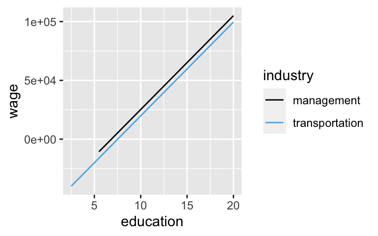
Our new model (with an interaction term) acknowledges that the impact of a formal education on wages might differ by sector. NOTE: Be sure to check out the new syntax.
# Model 2: Plot and model the relationship WITH an interaction term
ggplot(CPS_sub, aes(y = wage, x = education, color = industry)) +
    geom_smooth(method = "lm", se = FALSE)
wage_model_2 <- lm(wage ~ education * industry, CPS_sub)
coef(summary(wage_model_2))
##                                    Estimate Std. Error   t value     Pr(>|t|)
## (Intercept)                      -65590.606   7611.498 -8.617306 9.218848e-18
## education                          8678.274    478.344 18.142326 3.646579e-71
## industrytransportation            90232.230  20117.859  4.485181 7.457878e-06
## education:industrytransportation  -7580.228   1568.831 -4.831768 1.396075e-06
Model formulas:
wage = -65590.606 + 8678.274 education + 90232.230 transportation - 7580.228 education * transportation
Broken down by industry:
Management:
wage = -65590.606 + 8678.274 education
Transportation:
wage = (-65590.606 + 90232.230) + (8678.274 - 7580.228)education
= 24641.62 + 1098.046education
EXAMPLE 1
To what property of the lines does the intercept coefficient, -65590.606, correspond:
- management intercept
- transportation intercept
- how the transportation intercept compares to the management intercept
Thus how can we interpret this coefficient in the context of the wage analysis?
EXAMPLE 2
To what property of the lines does the transportation coefficient, 90232.230, correspond:
- management intercept
- transportation intercept
- how the transportation intercept compares to the management intercept
Thus how can we interpret this coefficient in the context of the wage analysis?
EXAMPLE 3
To what property of the lines does the education coefficient, 8678.274, correspond:
- management slope
- transportation slope
- how the transportation slope compares to the management slope
Thus how can we interpret this coefficient in the context of the wage analysis?
EXAMPLE 4
To what property of the lines does the interaction coefficient, -7580.228, correspond:
- management slope
- transportation slope
- how the transportation slope compares to the management slope
Thus how can we interpret this coefficient in the context of the wage analysis?
12.2 Exercises
Getting started:
You’ll be using various data sets throughout the exercises. So that you can focus on some new concepts, most code is provided. So that you can apply this code in new settings, make sure to pause and check it out as you go.
Votes vs incumbency & spending
What role does campaign spending play in elections? Do candidates that spend more money tend to get more votes? How might this depend upon whether a candidate is an incumbent (they are running for RE-election) or a challenger (they are challenging the incumbent)? We’ll examine these questions using data collected by Benoit and Marsh (2008) on the campaign spending of 464 candidates in the 2002 Irish Dail elections, Ireland’s version of the U.S. House of Representatives:# Load data campaigns <- read.csv("http://www.macalester.edu/~ajohns24/data/campaign_spending.csv") %>% select(wholename, district, votes, incumbent, spending) %>% mutate(spending = spending / 1000) %>% filter(!is.na(spending))Plot the number of
votesa candidate receives by our predictors: a candidate’sincumbentstatus and their total campaignspending(in thousands of Euros):ggplot(campaigns, aes(y = votes, x = spending, color = incumbent)) + geom_point() + geom_smooth(method = "lm", se = FALSE)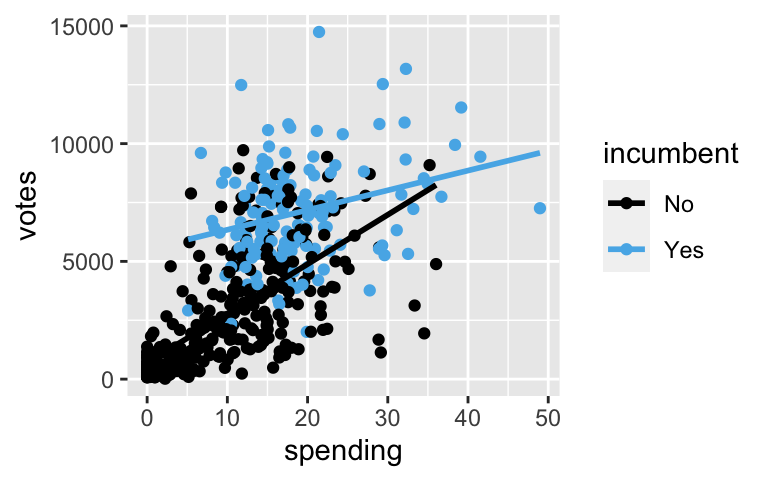
- Who tends to receive more votes, incumbents or challengers?
- Do votes tend to increase or decrease with campaign spending?
- Notice that the slopes of the lines above are meaningfully different. This illustrates an interaction between the campaign spending & incumbency status predictors – the relationship between votes (y) & spending (x1) differs by incumbency status (x2). How can we describe this interaction in words?
- Incumbents enjoy the same return on campaign spending, ie. the rate of increase in votes with campaign spending is the same for incumbents and challengers.
- Incumbents have a larger return on spending, ie. the rate of increase in votes with campaign spending is greater for incumbents than for challengers.
- Incumbents have a smaller return on spending, ie. the rate of increase in votes with campaign spending is smaller for incumbents than for challengers.
- Incumbents enjoy the same return on campaign spending, ie. the rate of increase in votes with campaign spending is the same for incumbents and challengers.
Incorporating an interaction term
To dig deeper, let’s modelvotesbyspendingandincumbentstatus including an interaction between the 2 predictors:vote_model <- lm(votes ~ spending * incumbent, campaigns) coef(summary(vote_model)) ## Estimate Std. Error t value Pr(>|t|) ## (Intercept) 690.5169 168.60193 4.095546 4.978190e-05 ## spending 209.6578 13.54984 15.473080 9.189028e-44 ## incumbentYes 4813.8932 472.40711 10.190137 4.042033e-22 ## spending:incumbentYes -125.8706 25.63343 -4.910409 1.265704e-06Use this model to predict the number of votes received in the following scenarios. Revisit the plot to check whether your answers are reasonable.
# Predict the votes for a challenger that spends 10000 Euros (hence spending = 10) # 691 + 209.7*___ + 4814*___ - 125.9*___*___ # Predict the votes for an incumbent that spends 10000 Euros # 691 + 209.7*___ + 4814*___ - 125.9*___*___# After calculating the predictions by hand, check your work predict(vote_model, newdata = data.frame(spending = 10, incumbent = "No")) ## 1 ## 2787.095 predict(vote_model, newdata = data.frame(spending = 10, incumbent = "Yes")) ## 1 ## 6342.282
Non-parallel lines
vote_modelis represented by two non-parallel lines: one for incumbents and one for challengers. Use the modelsummary()below to specify the formulas of the trend lines for incumbents and challengers:
challengers: votes = ___ + ___ spending
incumbents: votes = ___ + ___ spendingcoef(summary(vote_model)) ## Estimate Std. Error t value Pr(>|t|) ## (Intercept) 690.5169 168.60193 4.095546 4.978190e-05 ## spending 209.6578 13.54984 15.473080 9.189028e-44 ## incumbentYes 4813.8932 472.40711 10.190137 4.042033e-22 ## spending:incumbentYes -125.8706 25.63343 -4.910409 1.265704e-06
- Interpretations
- Interpret the
spendingcoefficient of209.7in the context of this analysis. Remember that spending is measured in thousands of Euros. - Interpret the interaction term
spending:incumbentYescoefficient of-125.87. Hot tip: first focus on what it means for the coefficient to be negative, then focus on the number.
- Interpret the
Wages
The plot below illustrates the relationship between wage and education for different industries:CPS_2018 <- read.csv("https://www.macalester.edu/~ajohns24/data/CPS_2018.csv") # Plot ggplot(CPS_2018, aes(y = wage, x = education, color = industry)) + geom_smooth(method = "lm", se = FALSE)
To capture the different wage vs education relationships across industries (ie. the different slopes), we incorporate an interaction term between
educationandindustry:wage_model <- lm(wage ~ education * industry, CPS_2018) coef(summary(wage_model)) ## Estimate Std. Error t value ## (Intercept) 31475.87521 22370.504 1.40702574 ## education 61.95396 2039.257 0.03038065 ## industryconstruction -14427.01189 25740.953 -0.56046923 ## industryinstallation_production -33208.72359 25346.017 -1.31021469 ## industrymanagement -97066.48097 23305.235 -4.16500759 ## industryservice -55462.76415 23229.134 -2.38763810 ## industrytransportation -6834.25066 27495.549 -0.24855844 ## education:industryconstruction 2295.51232 2297.659 0.99906577 ## education:industryinstallation_production 3759.05906 2244.792 1.67456904 ## education:industrymanagement 8616.31984 2080.190 4.14208220 ## education:industryservice 4384.72036 2092.523 2.09542317 ## education:industrytransportation 1036.09210 2409.093 0.43007562 ## Pr(>|t|) ## (Intercept) 1.594509e-01 ## education 9.757641e-01 ## industryconstruction 5.751720e-01 ## industryinstallation_production 1.901533e-01 ## industrymanagement 3.139604e-05 ## industryservice 1.697551e-02 ## industrytransportation 8.037075e-01 ## education:industryconstruction 3.177870e-01 ## education:industryinstallation_production 9.405013e-02 ## education:industrymanagement 3.470009e-05 ## education:industryservice 3.615851e-02 ## education:industrytransportation 6.671499e-01- In what industry do wages increase the most per additional year of education? And what is this increase?
- Similarly, in what industry do wages increase the least per additional year of education? And what is this increase?
Interaction between categorical predictors
Using ourbikesdata, we’ll examine the relationship between daily ridership (our response variable) and 2 categorical predictors: whether auseris a casual or registered rider, and whether the day falls on aweekend. Let’s plot this relationship:bikes <- read.csv("https://www.macalester.edu/~dshuman1/data/155/bike_share.csv") # Don't worry about this syntax! library(tidyr) new_bikes <- bikes %>% filter(year == 2011) %>% select(riders_casual, riders_registered, weekend, temp_actual) %>% pivot_longer(!c(weekend, temp_actual), names_to = "user", names_prefix = "riders_", values_to = "rides") ggplot(new_bikes, aes(fill = weekend, y = rides, x = user)) + geom_boxplot()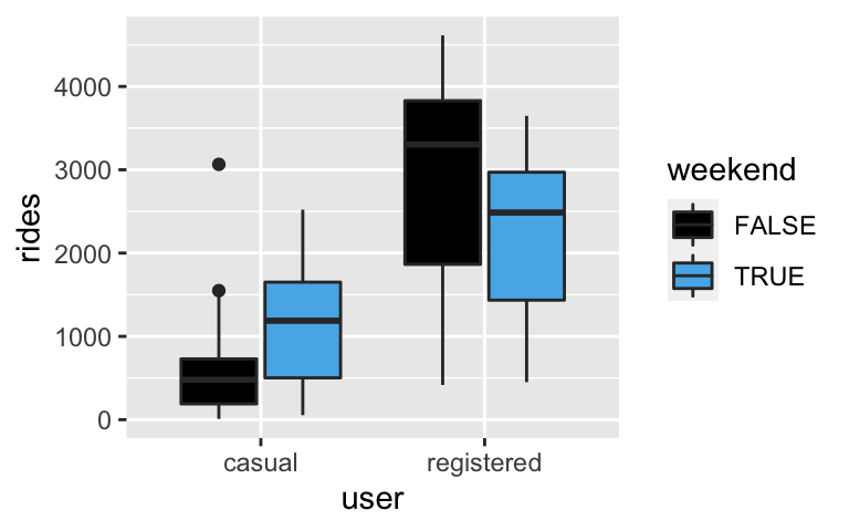
- Is the relationship between ridership and weekend status the same for both registered and casual users?
- Yes. Both casual and registered users tend to ride less on weekends.
- No. Casual users tend to ride more on weekends, and registered users tend to ride less on weekends.
- Based on your answer to part a, do the user and weekend predictors interact?
- Is the relationship between ridership and weekend status the same for both registered and casual users?
Modeling bikes
To reflect the patterns observed in the boxplots, we can incorporate an interaction term betweenweekendanduserin our model of ridership:bike_model <- lm(rides ~ weekend * user, new_bikes) summary(bike_model)$coefficients ## Estimate Std. Error t value Pr(>|t|) ## (Intercept) 492.7000 49.31308 9.991264 4.125570e-22 ## weekendTRUE 642.0619 91.94200 6.983337 6.520148e-12 ## userregistered 2423.3923 69.73923 34.749342 1.408913e-156 ## weekendTRUE:userregistered -1294.6590 130.02562 -9.956953 5.590889e-22# Predict casual ridership on weekdays # Predict registered ridership on weekends
Interaction?
Suppose we wished to model registered ridership by weather and weekend status:ggplot(bikes, aes(fill = weather_cat, y = riders_registered, x = weekend)) + geom_boxplot()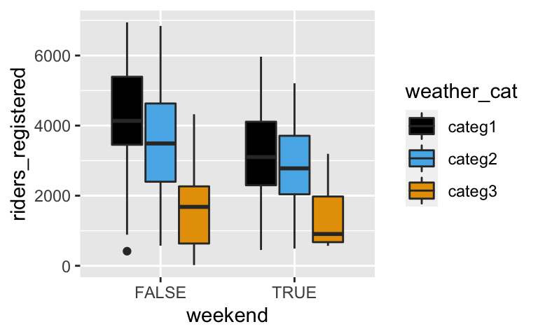
- Is the relationship between ridership and weather status roughly similar on both weekends and weekdays?
- Yes. No matter whether it’s a weekend or weekday, ridership decreases as the weather becomes more severe (and at roughly similar rates).
- No. As weather becomes more severe, ridership increases on weekdays but decreases on weekends.
- Based on your answer to part a, do the weather and weekend predictors interact?
- Is the relationship between ridership and weather status roughly similar on both weekends and weekdays?
CHALLENGE: another bikes example
In their relationship withrides,temp_actualandweekendappear to interact. What are the appropriate signs on the coefficients (a, b, c, d) which represents this relationship and why? Note: you can always check your work by actually building thelm()model.
rides = a + b*weekendTRUE + c*temp_actual + d*weekendTRUE*temp_actualbike_sub <- new_bikes %>% filter(user == "casual") ggplot(bike_sub, aes(x = temp_actual, y = rides, color = weekend)) + geom_smooth(method = "lm", se = FALSE)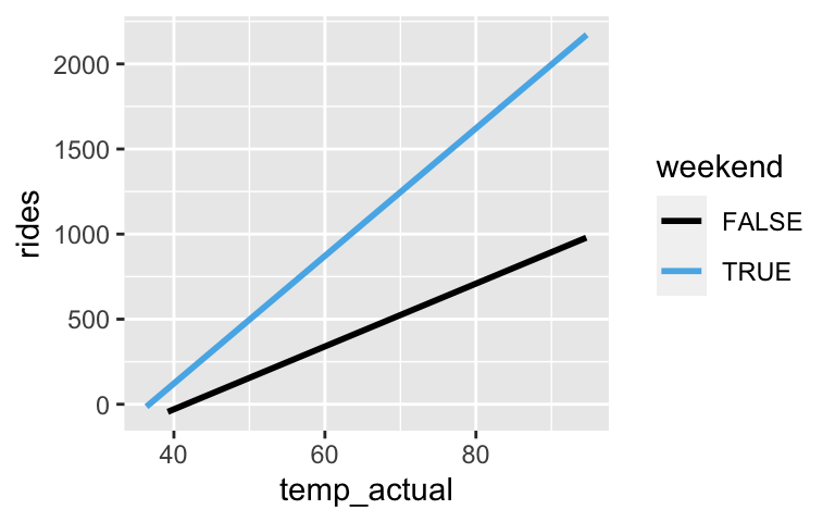
Interactions between 2 quantitative predictors
In homework, you’ll see that in the model ofPrice, theMileageandAgeof a used car interact: the relationship between mileage and price differs depending upon the age of the car. Below, the yellow lines represent the relationship between price and mileage for 1 year old, 5 year old, and 10 year old used cars.
What do you anticipate: In this model, what do you think the signs of the coefficients will be?
Price = a + b*Age + c*Mileage + d*Age*Mileage
12.3 Solutions
- Votes vs incumbency & spending
- incumbents
- Incumbents have a smaller return on spending, ie. the rate of increase in votes with campaign spending is smaller for incumbents than for challengers.
Incorporating an interaction term
vote_model <- lm(votes ~ spending * incumbent, campaigns) coef(summary(vote_model)) ## Estimate Std. Error t value Pr(>|t|) ## (Intercept) 690.5169 168.60193 4.095546 4.978190e-05 ## spending 209.6578 13.54984 15.473080 9.189028e-44 ## incumbentYes 4813.8932 472.40711 10.190137 4.042033e-22 ## spending:incumbentYes -125.8706 25.63343 -4.910409 1.265704e-06 # Predict the votes for a challenger that spends 10000 Euros 691 + 209.7*10 + 4814*0 - 125.9*10*0 ## [1] 2788 # Predict the votes for an incumbent that spends 10000 Euros 691 + 209.7*10 + 4814*1 - 125.9*10*1 ## [1] 6343
Non-parallel trend lines
challengers: votes = 690.52 + 209.66 spending
incumbents: votes = 5504.41 + 83.79 spending
- Interpretations
- On average, for every extra 1000 Euros spent, we expect a challenger’s vote count to increase by 210.
- This is the difference in slopes - incumbents vs challengers. Thus the increase in vote count per extra 1000 Euros spent is 126 less for incumbents than for challengers.
Wages
CPS_2018 <- read.csv("https://www.macalester.edu/~ajohns24/data/CPS_2018.csv") ggplot(CPS_2018, aes(y = wage, x = education, color = industry)) + geom_smooth(method = "lm", se = FALSE)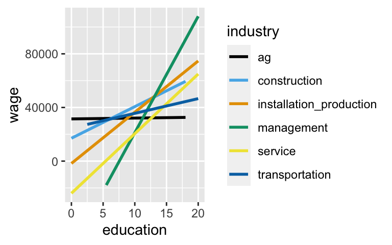
wage_model <- lm(wage ~ education * industry, CPS_2018) coef(summary(wage_model)) ## Estimate Std. Error t value ## (Intercept) 31475.87521 22370.504 1.40702574 ## education 61.95396 2039.257 0.03038065 ## industryconstruction -14427.01189 25740.953 -0.56046923 ## industryinstallation_production -33208.72359 25346.017 -1.31021469 ## industrymanagement -97066.48097 23305.235 -4.16500759 ## industryservice -55462.76415 23229.134 -2.38763810 ## industrytransportation -6834.25066 27495.549 -0.24855844 ## education:industryconstruction 2295.51232 2297.659 0.99906577 ## education:industryinstallation_production 3759.05906 2244.792 1.67456904 ## education:industrymanagement 8616.31984 2080.190 4.14208220 ## education:industryservice 4384.72036 2092.523 2.09542317 ## education:industrytransportation 1036.09210 2409.093 0.43007562 ## Pr(>|t|) ## (Intercept) 1.594509e-01 ## education 9.757641e-01 ## industryconstruction 5.751720e-01 ## industryinstallation_production 1.901533e-01 ## industrymanagement 3.139604e-05 ## industryservice 1.697551e-02 ## industrytransportation 8.037075e-01 ## education:industryconstruction 3.177870e-01 ## education:industryinstallation_production 9.405013e-02 ## education:industrymanagement 3.470009e-05 ## education:industryservice 3.615851e-02 ## education:industrytransportation 6.671499e-01- management: 61.954 + 8616.320 = $8678.274 increase per extra year of education
- agriculture: $61.954 increase per extra year of education
Back to bikes
ggplot(new_bikes, aes(fill = weekend, y = rides, x = user)) + geom_boxplot()
- No.
- Yes. That is the definition of interaction.
modeling bikes
bike_model <- lm(rides ~ weekend * user, new_bikes)
summary(bike_model)$coefficients
##                              Estimate Std. Error   t value      Pr(>|t|)
## (Intercept)                  492.7000   49.31308  9.991264  4.125570e-22
## weekendTRUE                  642.0619   91.94200  6.983337  6.520148e-12
## userregistered              2423.3923   69.73923 34.749342 1.408913e-156
## weekendTRUE:userregistered -1294.6590  130.02562 -9.956953  5.590889e-22
# Predict casual ridership on weekdays 492.7 + 642.0619*0 + 2423.3923*0 - 1294.6590*0*0 ## [1] 492.7 # Predict registered ridership on weekends 492.7 + 642.0619*1 + 2423.3923*1 - 1294.6590*1*1 ## [1] 2263.495
Interaction?
ggplot(bikes, aes(fill = weather_cat, y = riders_registered, x = weekend)) +
  geom_boxplot()
- Yes. No matter whether it’s a weekend or weekday, ridership decreases as the weather becomes more severe (and at roughly similar rates).
- Not significantly.
- CHALLENGE: another bikes example
- a < 0. the weekday intercept is below 0
- b < 0. the weekend intercept is below that of weekdays
- c > 0. the weekday slope is positive
- d > 0. the weekend slope is greater than the weekday slope
bike_sub <- new_bikes %>%
  filter(user == "casual")

ggplot(bike_sub, aes(x = temp_actual, y = rides, color = weekend)) +
  geom_smooth(method = "lm", se = FALSE)