17 Sampling distributions + Central Limit Theorem
Announcements
As you settle in:
- Talk with the people at the tables next to yours! Introduce yourselves, chat about how you’re doing, chat about what you like doing, etc.
- Install the
mosaicpackage. Go to the Packages tab at right, then click install, type mosaic in the text box, and click install.
- If you haven’t yet, fill out this survey about mini-project groups TODAY.
- Talk with the people at the tables next to yours! Introduce yourselves, chat about how you’re doing, chat about what you like doing, etc.
Checkpoint 14 is due next Tuesday and Homework 6 is due next Thursday. Homework 6 will be shorter than usual to free up time to think about the project.
Quiz 2 is Thursday.
I’m hoping to hear from more and more students today!
17.1 Getting started
Where are we?
Our ultimate goal is to be able to use our sample data to make conclusions about the broader population. To this end, we need some tools to understand the potential error in our sample estimates:
- sampling distributions
- Central Limit Theorem (which provides assumptions about a sampling distribution)
Getting Started
We’ll again be using the elections data from our previous activity:
# Load packages
library(dplyr)
library(ggplot2)
library(mosaic)

# Import & process data
elections <- read.csv("https://www.macalester.edu/~ajohns24/data/election_2020.csv") %>%
  mutate(per_gop_2020 = 100*per_gop_2020,
         per_gop_2012 = 100*per_gop_2012) %>%
  select(state_name, county_name, per_gop_2012, per_gop_2020)
This data provides complete population (census) data on Trump’s vote percentage in each county outside Alaska. Thus, we know that the relationship trend between Trump’s 2020 support and Romney’s 2012 support is as follows:
# Model per_gop_2020 by per_gop_2012
population_mod <- lm(per_gop_2020 ~ per_gop_2012, data = elections)
summary(population_mod)$coefficients
##              Estimate  Std. Error   t value     Pr(>|t|)
## (Intercept)  5.179393 0.486313057  10.65033 4.860116e-26
## per_gop_2012 1.000235 0.007896805 126.66328 0.000000e+00

# Visualize the model
ggplot(elections, aes(x = per_gop_2012, y = per_gop_2020)) +
  geom_point() +
  geom_smooth(method = "lm", se = FALSE)
FORGET THAT YOU KNOW ALL OF THE ABOVE.
Let’s pretend that we’re working within the typical scenario - we don’t have access to the entire population of interest. Instead, we need to estimate population trends using data from a randomly selected sample of counties. We did just this in the previous activity. Each student took a sample of 10 counties and estimated the trend from their sample data:
# Import our experiment data
results <- read.csv("https://www.macalester.edu/~ajohns24/data/election_simulation.csv")
names(results) <- c("time", "sample_mean", "sample_intercept", "sample_slope")

# Plot our sample estimates vs the actual trend (red)
ggplot(elections, aes(x = per_gop_2012, y = per_gop_2020)) +
  geom_abline(data = results, aes(intercept = sample_intercept, slope = sample_slope), color = "gray") +
  geom_smooth(method = "lm", color = "red", se = FALSE)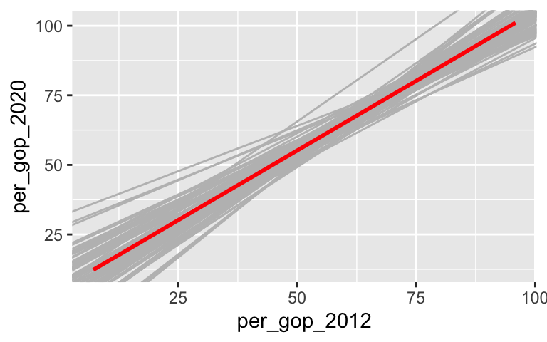
From these, we checked out the sampling distributions of the sample intercepts and slopes:
# Check out how the intercepts of these lines vary from student to student
ggplot(results, aes(x = sample_intercept)) +
  geom_density()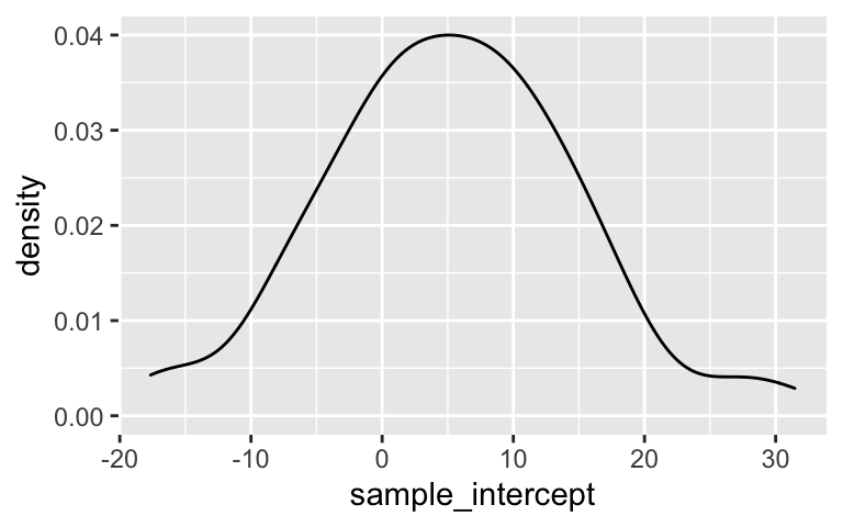
# Check out how the slopes of these lines vary from student to student
ggplot(results, aes(x = sample_slope)) +
  geom_density()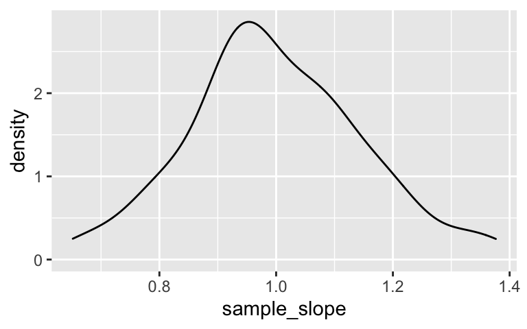
Why we care:
Sampling distributions help us understand the potential error in our sample estimates.
The sampling distribution of one of our sample estimates (eg: our sample slope) is a collection of all possible estimates we could observe based on all possible samples of the same size n from the population. A sampling distribution captures the degree to which a sample estimate can vary from the actual population value, hence the potential error in a sample estimate.The snag: we can’t know exactly how wrong our estimate is.
In practice, we only take ONE sample, thus can’t actually observe the sampling distribution.Though we can’t observe the sampling distribution, we can APPROXIMATE it using the Central Limit Theorem.
So long as we have enough data (i.e. our sample size n is big enough), then the sampling distribution of an estimate \(\hat{\beta}\) is Normally distributed around the actual population value with some standard error:\[\hat{\beta} \sim N(\beta, \text{(standard error)}^2)\]
The standard error, i.e. standard deviation among all possible estimates \(\hat{\beta}\), measures the typical estimation error (i.e. the typical difference between \(\hat{\beta}\) and \(\beta\)).
17.2 Exercises
Our little experiment reflects very few of the more than \(_{3109}C_{10} > 2.3*10^{28}\) different samples of 10 counties that we could get from the entire population of 3109 counties!! In this activity, you’ll:
- run a simulation to study just how different these estimates could be, and how this can be impacted by sample size;
- use these simulation results to approximate sampling distributions; and
- compare these approximations to the theoretical Central Limit Theorem.
This will require some new syntax – don’t let it be a distraction. We won’t use it often, but just like ggplot(), familiarity would come with repeated use.
Taking multiple samples
Recall that we can take a sample of, say, 10 counties usingsample_n():# Run this chunk a few times to see the different samples you get elections %>% sample_n(size = 10, replace = FALSE)We can also take a sample of 10 counties and then use the data to build a model:
# Run this chunk a few times to see the different sample models you get elections %>% sample_n(size = 10, replace = FALSE) %>% with(lm(per_gop_2020 ~ per_gop_2012))But to better understand how our sample estimates can vary from sample to sample, we want to take multiple unique samples and build a sample model from each. We don’t have to do this one by one, or have to survey the different student results in the room! We can use the handy
do()function in themosaicpackage. For example, use the code below to do the following 2 separate times: (1) take a sample of size 10; and then (2) use the sample to build a model.# Run this chunk a few times to see the different sets of sample models you get mosaic::do(2)*( elections %>% sample_n(size = 10, replace = FALSE) %>% with(lm(per_gop_2020 ~ per_gop_2012)) )
- Pause
- What’s the point of the
do()function?!? - What is stored in the
Intercept,per_gop_2012, andr.squaredcolumns of the results?
- What’s the point of the
500 samples of size 10
To get a sense for the wide variety of sample models we might get, suppose we wanted to take 500 samples of size n = 10, and use each to build a sample model.set.seed(155) models_10 <- mosaic::do(500)*( elections %>% sample_n(size = 10, replace = FALSE) %>% with(lm(per_gop_2020 ~ per_gop_2012)) )Check it out. Convince yourself that we’ve built and stored 500 sample models.
# Check it out head(models_10) dim(models_10)Plot these 500 sample model estimates on the same frame:
ggplot(elections, aes(x = per_gop_2012, y = per_gop_2020)) + geom_smooth(method = "lm", se = FALSE) + geom_abline(data = models_10, aes(intercept = Intercept, slope = per_gop_2012), color = "gray", size = 0.25)
- 500 sample slopes
Let’s focus on the slopes of these 500 sample models.Construct a histogram of the 500 sample estimates of the
per_gop_2012coefficient (slope). This histogram approximates a sampling distribution of the sample slopes.ggplot(models_10, aes(x = per_gop_2012)) + geom_histogram(color = "white") + xlim(0.2, 1.8)Describe the sampling distribution: What’s its general shape? Where is it centered? Roughly what’s its spread / i.e. what’s the range of estimates you observed?
- Increasing sample size
Suppose we increased our sample size from n = 10 to n = 50. What impact do you anticipate this having on the sample models:- Do you expect there to be more or less scatter among the sample model lines?
- Around what value would you expect the sampling distribution of sample slopes to be centered?
- What general shape would you expect that sampling distribution to have?
- In comparison to estimates based on the samples of size 10, do you think the estimates based on samples of size 50 will be closer to or farther from the true slope (on average)?
- Do you expect there to be more or less scatter among the sample model lines?
500 samples of size 50
Test your intuition. Fill in the blanks to repeat the simulation process with samples of size n = 50.# Take 500 samples of size n = 50 # And build a sample model from each set.seed(155) models_50 <- mosaic::do(___)*( elections %>% ___(size = ___, replace = FALSE) %>% ___(___(per_gop_2020 ~ per_gop_2012)) ) # Plot the 500 sample model estimates ggplot(elections, aes(x = per_gop_2012, y = per_gop_2020)) + geom_smooth(method = "lm", se = FALSE) + geom_abline(data = models_50, aes(intercept = Intercept, slope = per_gop_2012), color = "gray", size = 0.25) # Construct a histogram of the 500 per_gop_2012 slope estimates ggplot(models_50, aes(x = per_gop_2012)) + geom_histogram(color = "white") + xlim(0.2, 1.8)
500 samples of size 200
Finally, repeat the simulation process from the previous exercise with samples of size n = 200.# Take 500 samples of size n = 200 # And build a sample model from each set.seed(155) models_200 <- mosaic::do(___)*( elections %>% ___(size = ___, replace = FALSE) %>% ___(___(per_gop_2020 ~ per_gop_2012)) ) # Plot the 500 sample model estimates ggplot(elections, aes(x = per_gop_2012, y = per_gop_2020)) + geom_smooth(method = "lm", se = FALSE) + geom_abline(data = models_200, aes(intercept = Intercept, slope = per_gop_2012), color = "gray", size = 0.25) # Construct a histogram of the 500 per_gop_2012 slope estimates ggplot(models_200, aes(x = per_gop_2012)) + geom_histogram(color = "white") + xlim(0.2, 1.8)
Impact of sample size: Part 1
Compare and contrast the 500 sets of sample models when using samples of size 10, 50, and 200.# Samples of size 10 ggplot(elections, aes(x = per_gop_2012, y = per_gop_2020)) + geom_smooth(method = "lm", se = FALSE) + geom_abline(data = models_10, aes(intercept = Intercept, slope = per_gop_2012), color = "gray", size = 0.25)# Samples of size 50 ggplot(elections, aes(x = per_gop_2012, y = per_gop_2020)) + geom_smooth(method = "lm", se = FALSE) + geom_abline(data = models_50, aes(intercept = Intercept, slope = per_gop_2012), color = "gray", size = 0.25)# Samples of size 200 ggplot(elections, aes(x = per_gop_2012, y = per_gop_2020)) + geom_smooth(method = "lm", se = FALSE) + geom_abline(data = models_200, aes(intercept = Intercept, slope = per_gop_2012), color = "gray", size = 0.25)
- Impact of sample size: Part 2
Compare the sampling distributions of the sample slopes for the estimates based on sizes 10, 50, and 200 by plotting them on the same frame:
# Combine the estimates & sample size into a new data set simulation_data <- data.frame( estimates = c(models_10$per_gop_2012, models_50$per_gop_2012, models_200$per_gop_2012), sample_size = rep(c("10","50","200"), each = 500)) # Construct density plot ggplot(simulation_data, aes(x = estimates, color = sample_size)) + geom_density() + labs(title = "SAMPLING Distributions")Calculate and compare the mean and standard deviation in sample slopes calculated from samples of size 10, 50, and 200.
simulation_data %>% group_by(sample_size) %>% summarize(mean(estimates), sd(estimates))Recall: The standard deviation of sample estimates is called a “standard error”. It measures the typical distance of a sample estimate from the actual population value. Interpret and compare the three standard errors. For example, when using samples of size 10, how far is the typical sample slope from the actual population slope it’s estimating? What about when using samples of size 200?
Properties of sampling distributions
In light of your these investigations, complete the following statements about the sampling distribution of the sample slope.- For all sample sizes, the shape of the sampling distribution is roughly ___ and the sampling distribution is roughly centered around ___, the true population slope.
- As sample size increases:
The average sample slope estimate INCREASES / DECREASES / IS FAIRLY STABLE.
The standard error of the sample slopes INCREASES / DECREASES / IS FAIRLY STABLE.
- Thus, as sample size increases, our sample slopes become MORE RELIABLE / LESS RELIABLE.
- For all sample sizes, the shape of the sampling distribution is roughly ___ and the sampling distribution is roughly centered around ___, the true population slope.
- Central Limit Theorem (CLT)
Recall that the CLT assumes that, so long as our sample size is big enough, the sampling distribution of the sample slope will be Normal. Specifically, all possible sample slopes will vary Normally around the population slope. Do your simulation results support this assumption?
Using the CLT
Suppose we take a sample of 200 counties and use these to estimate our model slope \(\beta\). In exercise 9, you showed that this estimate has a standard error of roughly 0.03. Thus the sampling distribution of the slope estimate \(\hat{\beta}\) is:\[\hat{\beta} \sim N(\beta, 0.03^2)\]
Let’s use this result with the 68-95-99.7 property of the Normal model to understand the potential error in a slope estimate.
There are many possible samples of 200 counties that we might get. What percent of these will produce a sample slope that’s within 0.03, i.e. 1 standard error, of the actual population slope \(\beta\)?
Within 0.06, i.e. 2 standard errors of \(\beta\)?
More than 2 standard errors from \(\beta\)?
17.3 Solutions
Taking multiple samples
# Run this chunk a few times to see the different samples you get elections %>% sample_n(size = 10, replace = FALSE) ## state_name county_name per_gop_2012 per_gop_2020 ## 1 South Dakota Deuel County 54.12252 72.29787 ## 2 Montana Lincoln County 68.15876 73.82310 ## 3 Minnesota Scott County 56.46329 52.14801 ## 4 Maryland Worcester County 58.44410 58.60023 ## 5 Washington Island County 46.59116 42.18081 ## 6 Louisiana Grant Parish 81.72167 86.42462 ## 7 Indiana Steuben County 62.45522 70.08415 ## 8 North Carolina Rockingham County 60.25897 65.47094 ## 9 Mississippi Pontotoc County 76.14998 80.33665 ## 10 Utah Box Elder County 88.26553 79.72768 # Run this chunk a few times to see the different sample models you get elections %>% sample_n(size = 10, replace = FALSE) %>% with(lm(per_gop_2020 ~ per_gop_2012)) ## ## Call: ## lm(formula = per_gop_2020 ~ per_gop_2012) ## ## Coefficients: ## (Intercept) per_gop_2012 ## 13.3747 0.8772 # Run this chunk a few times to see the different sets of sample models you get mosaic::do(2)*( elections %>% sample_n(size = 10, replace = FALSE) %>% with(lm(per_gop_2020 ~ per_gop_2012)) ) ## Intercept per_gop_2012 sigma r.squared F numdf dendf .row .index ## 1 3.896063 1.0589108 4.962910 0.795387 31.0982 1 8 1 1 ## 2 8.076049 0.9801005 3.589547 0.946211 140.7292 1 8 1 2
- Pause
- do(n)() repeats the process within the () n times.
- These are the estimates of the intercept, slope, and r-squared calculated from the different samples.
- do(n)() repeats the process within the () n times.
500 samples of size 10
set.seed(155) set.seed(155) models_10 <- mosaic::do(500)*( elections %>% sample_n(size = 10, replace = FALSE) %>% with(lm(per_gop_2020 ~ per_gop_2012)) ) # a: Check it out head(models_10) ## Intercept per_gop_2012 sigma r.squared F numdf dendf .row .index ## 1 8.470096 0.9739414 5.532906 0.9047680 76.00539 1 8 1 1 ## 2 -1.533967 1.1458568 6.200312 0.9349131 114.91255 1 8 1 2 ## 3 -4.537355 1.1129730 7.534707 0.9100424 80.93075 1 8 1 3 ## 4 11.822108 0.9050763 7.266860 0.7092911 19.51894 1 8 1 4 ## 5 3.127883 1.0729944 6.622232 0.9090730 79.98269 1 8 1 5 ## 6 19.813595 0.8270876 3.747611 0.9175736 89.05632 1 8 1 6 dim(models_10) ## [1] 500 9 # Plot the 500 sample models ggplot(elections, aes(x = per_gop_2012, y = per_gop_2020)) + geom_smooth(method = "lm", se = FALSE) + geom_abline(data = models_10, aes(intercept = Intercept, slope = per_gop_2012), color = "gray", size = 0.25)
500 sample slopes
# a ggplot(models_10, aes(x = per_gop_2012)) + geom_histogram(color = "white") + xlim(0.2, 1.8)
# b. # This is roughly Normal and centered around 1, with estimates # ranging from roughly 0.25 to 1.75
- Increasing sample size
Answers will vary.
500 samples of size 50
# Take 500 samples of size n = 50 # And build a sample model from each set.seed(155) models_50 <- mosaic::do(500)*( elections %>% sample_n(size = 50, replace = FALSE) %>% with(lm(per_gop_2020 ~ per_gop_2012)) ) # Plot the 500 sample model estimates ggplot(elections, aes(x = per_gop_2012, y = per_gop_2020)) + geom_smooth(method = "lm", se = FALSE) + geom_abline(data = models_50, aes(intercept = Intercept, slope = per_gop_2012), color = "gray", size = 0.25)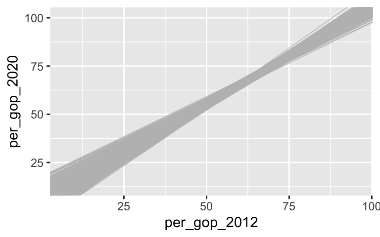
# Construct a histogram of the 500 per_gop_2012 slope estimates ggplot(models_50, aes(x = per_gop_2012)) + geom_histogram(color = "white") + xlim(0.2, 1.8)
500 samples of size 200
# Take 500 samples of size n = 200 # And build a sample model from each set.seed(155) models_200 <- mosaic::do(500)*( elections %>% sample_n(size = 200, replace = FALSE) %>% with(lm(per_gop_2020 ~ per_gop_2012)) ) # Plot the 500 sample model estimates ggplot(elections, aes(x = per_gop_2012, y = per_gop_2020)) + geom_smooth(method = "lm", se = FALSE) + geom_abline(data = models_200, aes(intercept = Intercept, slope = per_gop_2012), color = "gray", size = 0.25)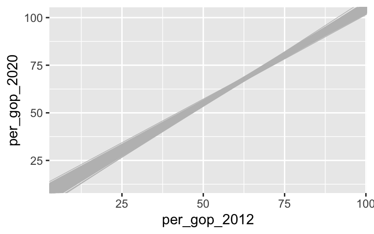
# Construct a histogram of the 500 per_gop_2012 slope estimates ggplot(models_200, aes(x = per_gop_2012)) + geom_histogram(color = "white") + xlim(0.2, 1.8)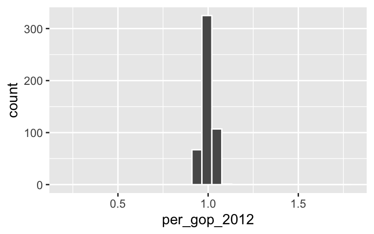
Impact of sample size: Part 1
The sets of sample models become narrower and narrower as sample size increases.# Samples of size 10 g1 <- ggplot(elections, aes(x = per_gop_2012, y = per_gop_2020)) + geom_smooth(method = "lm", se = FALSE) + geom_abline(data = models_10, aes(intercept = Intercept, slope = per_gop_2012), color = "gray", size = 0.25) # Samples of size 10 g2 <- ggplot(elections, aes(x = per_gop_2012, y = per_gop_2020)) + geom_smooth(method = "lm", se = FALSE) + geom_abline(data = models_50, aes(intercept = Intercept, slope = per_gop_2012), color = "gray", size = 0.25) # Samples of size 10 g3 <- ggplot(elections, aes(x = per_gop_2012, y = per_gop_2020)) + geom_smooth(method = "lm", se = FALSE) + geom_abline(data = models_200, aes(intercept = Intercept, slope = per_gop_2012), color = "gray", size = 0.25) library(gridExtra) ggarrange(g1, g2, g3, ncol = 3)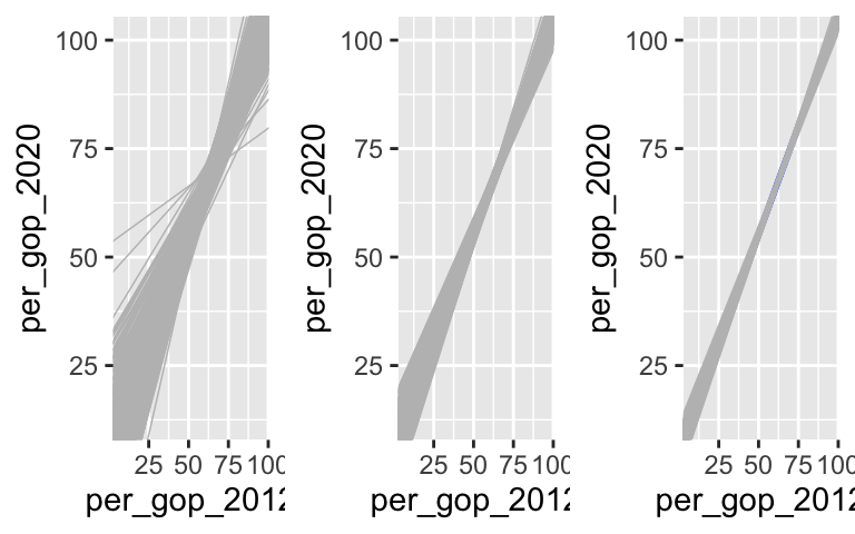
- Impact of sample size: Part 2
.
# Combine the estimates & sample size into a new data set
simulation_data <- data.frame(
  estimates = c(models_10$per_gop_2012, models_50$per_gop_2012, models_200$per_gop_2012),
  sample_size = rep(c("10","50","200"), each = 500))

# Construct density plot
ggplot(simulation_data, aes(x = estimates, color = sample_size)) +
  geom_density() +
  labs(title = "SAMPLING Distributions")
.
simulation_data %>% group_by(sample_size) %>% summarize(mean(estimates), sd(estimates)) ## # A tibble: 3 × 3 ## sample_size `mean(estimates)` `sd(estimates)` ## <chr> <dbl> <dbl> ## 1 10 0.992 0.161 ## 2 200 0.998 0.0298 ## 3 50 0.997 0.0682When using samples of size 10, the typical sample slope falls 0.161 from the from the population slope. That distance is smaller for samples of size 200 (0.03). NOTE: The units here are 2020 votes per 2016 vote.
- Properties of sampling distributions
- For all sample sizes, the shape of the sampling distribution is roughly NORMAL and the sampling distribution is roughly centered around 1ish, the true population slope.
- As sample size increases:
The average sample slope estimate IS FAIRLY STABLE.
The standard error of the sample slopes DECREASES.
- Thus, as sample size increases, our sample slopes become MORE RELIABLE.
- For all sample sizes, the shape of the sampling distribution is roughly NORMAL and the sampling distribution is roughly centered around 1ish, the true population slope.
- Central Limit Theorem (CLT)
Yep.
- Using the CLT
- 68%
- 95%
- 5%