3 Exploring univariate patterns
3.1 Getting started
DIRECTIONS
Open today’s Rmd file linked on the day-to-day schedule. This is where you should take notes. You won’t hand in notes, so do so in whatever way is best for your learning.
Name and save the file.
Ignoring past advice, do not knit until the end. The chunks in this Rmd are meant to be run and examined one at a time! In fact, you’ll get an error if you try to knit right away.
GOALS
Statistical Modeling is the art and science of turning data into information. We’ll start today with a univariate exploratory data analysis. This is like stretching before a marathon – if we don’t build up this basic understanding of our data before a deeper analysis, that analysis will suffer. Specifically, focusing on one variable at a time, we’ll use graphical and numerical summaries to understand:
- what are the typical values of our variables?
- how much variability is there within each variable?
- are there any outliers?
- what are the typical values of our variables?
To learn from data, we need software. Learning how to use software will thus be an important part of this course – without it, we could learn about statistics but couldn’t do statistics. Our goal will be to do both, starting today.
You’ll use two different packages to construct visual and numerical univariate summaries:
- For visual summaries, you’ll use the
ggplot2package.ggis short for “grammar of graphics”. The best way to learn aboutggplot()is to just play around. You can find this handy cheat sheet in the course manual appendix.
- For numerical summaries, you’ll use the
dplyrpackage.
- For visual summaries, you’ll use the
VOCABULARY: tidyverse
The ggplot2 and dplyr packages are part of the broader tidyverse. The tidyverse is a set of packages that share a similar grammar / syntax, thus making it easier to transition between the packages.
REMINDERS
You will make mistakes throughout this activity. This is a natural part of learning any new language.
We’re working in groups for a reason. Remember:
- You all have different experiences, both personal and academic.
- Be a good listener and be supportive when others make mistakes.
- Stay in sync with one another while respecting that everybody works at different paces.
- Don’t rush.
If you don’t finish the activity during class, you are expected to complete it outside of class.
If you get stuck, take the following steps in this order:
- Talk with your group members – you should be discussing each exercise in any case.
- Ask me.
- If it’s after class, or I’m not able to get to your room within a few minutes, consult the solutions at the bottom of the activity in the online manual.
- Talk with your group members – you should be discussing each exercise in any case.
3.2 Exercises
In this activity, we’ll analyze data on the daily weather in Perth, Australia. The data originally comes from the weatherAUS dataset in the rattle R package. The following is the codebook. For each day in the dataset, we have the following variables (and more!):
| variable | meaning |
|---|---|
mintemp |
minimum temperature (degrees Celsius) |
maxtemp |
maximum temperature (degrees Celsius) |
rainfall |
rainfall (mm) |
windgustdir |
direction of strongest wind gust |
windgustspeed |
speed of strongest wind gust (km/h) |
humidity3pm |
humidity level at 3pm (percent) |
raintoday |
whether or not it rained today (Yes or No) |
- Hello!
- Introduce yourselves.
- What are your feelings on winter? Any hobbies that get you outside? Any indoor hobbies that you do more during winter than summer?
- Decide who will share their screen, and start sharing now.
Import the data
Import the data from my website and store it asweather:
Exploring the data structure
Check out the basic features of theweatherdata set.# Examine the first six cases # Find the dimensions of the data
Loading ggplot2
To makeggplot()visualizations, you need to have theggplot2package loaded in your Rmd:# Load the ggplot2 package library(ggplot2)
Visualizing a categorical variable: bar plots
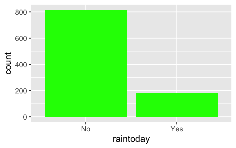
Let’s explore how often it rains in Perth.- The
raintodayvariable is categorical, thus we can visualize its patterns using a bar plot. Separately run each chunk below and add a comment (#) about what you see. The goal isn’t to memorize the code but to start observing patterns in how the code works.
- Subsequently, summarize what you learn about rain in Perth.
# ???
ggplot(weather, aes(x = raintoday))
# ??? ggplot(weather, aes(x = raintoday)) + geom_bar()- The
Numerical summaries
Let’s follow up the bar plot of rain with a simple numerical summary. Whereas the
ggplot2package is great for visualizations,dplyris great for numerical summaries.- Construct a table of the number of days on which it rained and didn’t rain.
- Make sure that these numerical summaries match up with what you saw in the bar plot.
# Load package
library(dplyr)

# Construct a table of counts
weather %>%
  count(raintoday)
- Visualizing a quantitative variable: boxplots
Let’s learn about daily temperatures in Perth.- The
maxtempvariable is quantitative. There are multiple approaches to visualizing its patterns. We’ll start with a bar plot. As above, separately run each chunk below and add a comment (#) about what you see.
- Subsequently, summarize what you learn about temperatures in Perth.
# ???
ggplot(weather, aes(x = maxtemp))
# ??? ggplot(weather, aes(x = maxtemp)) + geom_boxplot() - The
- Visualizing a quantitative variable: histograms & density plots (part 1)
CHALLENGE: Based on what you learned above, take 3 minutes to try and adjust to code to visualizemaxtempusing a histogram and/or density plot.
- Visualizing a quantitative variable: histograms & density plots (part 2)
- Separately run each chunk below and add a comment (
#) about what the code does. - Subsequently, summarize what you learn about temperatures in Perth. Remember to comment on: what’s typical? how much spread / variability is there? what’s the shape of the distribution?
# ???
ggplot(weather, aes(x = maxtemp)) +
  geom_density()
# ??? ggplot(weather, aes(x = maxtemp)) + geom_histogram()# ??? ggplot(weather, aes(x = maxtemp)) + geom_histogram(color = "white") - Separately run each chunk below and add a comment (
Box plots vs histograms vs density plots
We took 3 different approaches to plotting the quantitative temperature variable above. They all have pros and cons.- What is one pro about the boxplot in comparison to the histogram and density plot?
- What is one con about the boxplot in comparison to the histogram and density plots?
- In this example, which plot do you prefer and why?
Goldilocks!
We can further tweak the histogram. Check out and comment on the 3 versions below:# The "default" histogram ggplot(weather, aes(x = maxtemp)) + geom_histogram(color = "white")# ??? ggplot(weather, aes(x = maxtemp)) + geom_histogram(color = "white", binwidth = 15)# ??? ggplot(weather, aes(x = maxtemp)) + geom_histogram(color = "white", binwidth = 0.2)These different histograms visualized the same data but look quite different. Which of the histograms provided you with the “best” insights into temperatures in Perth? Why? That is, what are the trade-offs in using small vs large bins?
Fun fact: Choosing bin widths is an example of what we call a “goldilocks problem” in statistics. Just like the Goldilocks character in the strange Goldilocks & the 3 bears fairy tale doesn’t want porridge that’s too hot or too cold, we don’t want bins that are too wide or too narrow – we want bins that are just right.
 Wikimedia commons
- Numerical summaries
Let’s follow up our visual summaries with some numerical summaries.- Play around with the code below and comment (
#) on what it produces.
- Interpret what the calculations tell us about temperatures in Perth. In doing so, be sure to revisit the visualizations to place the numerical summaries in context.
# ???
weather %>%
  summarize(mean(maxtemp))
# ??? weather %>% summarize(mean(maxtemp), median(maxtemp))# ??? weather %>% summarize(min(maxtemp), max(maxtemp)) weather %>% summarize(sd(maxtemp)) - Play around with the code below and comment (
Your turn!
Construct and interpret visual and numerical summaries of some other variables in the data set:# Construct a plot of rainfall # Construct another plot of rainfall using a different technique # Construct yet another plot of rainfall using yet a different technique # Calculate summaries of the typical daily rainfall in Perth # Calculate summaries of the variability in rainfall from day to day # Construct a plot of windgustdir
Challenge: Customizing!
Though you will naturally absorb some RStudio code throughout the semester, being an effective statistical thinker and “programmer” does not require that we memorize all code. That would be impossible. In contrast, using the foundation you built today, do some digging online to learn how to customize your visualizations.For the histogram below, add a title and more meaningful axis labels. Specifically, title the plot “My nice histogram”, change the x-axis label to “maximum temperature” and y-axis label to “number of days”. HINT: Do a Google search for something like “add axis labels ggplot”.
# Add a title and axis labels
ggplot(weather, aes(x = maxtemp)) +
    geom_histogram()
Adjust the code below in order to color the bars green. NOTE: Color can be an effective tool, but here it is simply gratuitous.
# Make the bars green
ggplot(weather, aes(x = raintoday)) +
    geom_bar()
Check out the
ggplot2cheat sheet in the course manual appendix. Try making some of the other kinds of univariate plots outlined there.What else would you like to change about your plot? Try it!
Different ways to think about data visualization
In working with and visualizing data, it’s important to keep in mind what a data point represents. It can reflect the experience of a real person. It might reflect the sentiment in a piece of art. It might reflect history. We’ve taken one very narrow and technical approach to data visualization. Check out the following examples.
- Clean, knit, and save your work! Then reflect.
- If you’re using Mac’s RStudio server, you should now download your activity Rmd and html files to the STAT 155 folder on your computer.
- Then all students should move on to the reflection section below. Though you don’t have to write anything down, reflection is just as important as the exercises above.
3.3 Reflection
On top of learning how to construct and interpret some univariate summaries, we learned a lot about RStudio today. In order for any of this to stick, it’s important to step back and reflect on the details. First, you started exploring the grammar of graphics, i.e. how ggplot() works:
- Line 1 of the code specifies the name of our data and the variable of interest within that data:
ggplot(MY DATA, aes(x = VARIABLE ON X AXIS)) aesis short foraesthetics- Ending lines with
+tells RStudio that we’re not done with the plot code yet – we want to add more layers to the plot. - The second row of the code indicates what kind of plot (geometry) we want to make:
geom_bar,geom_histogram,geom_density.
You also learned the grammar behind using the dplyr package to calculate univariate numerical summaries:
- Line 1 of the code is the name of our dataset.
- Ending lines with
%>%, the “pipe” symbol, pipes the data into a function. - The
summarize()function calculates numerical summaries for any given column / variable in the data.
For example, our dplyr code might look something like this:
data %>%
  summarize(mean(x), median(x))
3.4 Solutions
…
.
weather <- read.csv("https://www.macalester.edu/~ajohns24/data/weather_perth.csv").
head(weather)
##   mintemp maxtemp rainfall windgustdir windgustspeed winddir9am winddir3pm
## 1    19.6    32.3      0.0           E            31          E         SW
## 2    18.4    34.7      0.0         ENE            37          E         SE
## 3    11.7    19.8      0.6         WNW            48        WNW        WNW
## 4    13.0    24.9      0.0          SW            44          S        SSW
## 5    17.8    28.5      0.0         SSW            39          S         SW
## 6     9.7    21.6      2.2          SW            24         NE          W
##   windspeed9am windspeed3pm humidity9am humidity3pm pressure9am pressure3pm
## 1            7           15          55          44      1009.8      1007.1
## 2           17           15          43          16      1010.9      1006.5
## 3           15           15          62          85      1013.8      1012.1
## 4            9           24          53          46      1019.3      1015.5
## 5           15           20          65          51      1012.8      1010.8
## 6            7           11          84          59      1024.7      1022.4
##   temp9am temp3pm raintoday risk_mm raintomorrow year month day_of_year
## 1    25.3    30.0        No     0.0           No 2014     2          45
## 2    24.6    33.7        No     0.0           No 2011     1          11
## 3    17.4    16.5        No     3.4          Yes 2013     9         261
## 4    19.7    22.8        No     0.0           No 2014    12         347
## 5    24.2    26.8        No     0.0           No 2011    12         357
## 6    15.4    20.3       Yes     0.0           No 2014     9         254
dim(weather)
## [1] 1000   21
.
library(ggplot2).
# This creates an empty canvas w weather cats on x-axis
ggplot(weather, aes(x = raintoday))
# The second line adds bars
ggplot(weather, aes(x = raintoday)) +
  geom_bar()
In our sample, it rained on 184 days and didn’t rain on 816 days.
# Load package
library(dplyr)

# Construct a table of counts
weather %>%
  count(raintoday)
##   raintoday   n
## 1        No 816
## 2       Yes 184
The max temp is typically around 24 degrees, but often ranges between 21 and 30 degrees (roughly). At the extremes, the max temp was as low as ~13 degrees and as high as ~43 degrees.
# This creates an empty canvas w maxtemp scale on x-axis
ggplot(weather, aes(x = maxtemp))
# This adds boxplots
ggplot(weather, aes(x = maxtemp)) +
  geom_boxplot()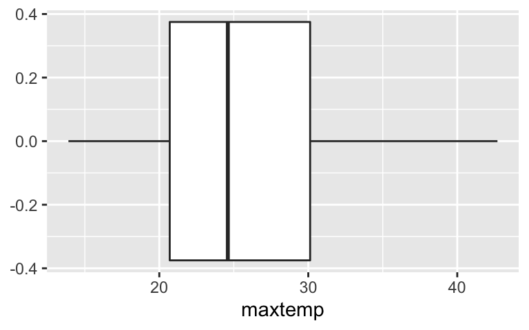
.
As seen in the boxplot, the max temp is typically around 24 degrees and ranges from ~13 degrees to ~43 degrees. It also appears that there are two groupings (the plots are bimodal). These might be explained by different seasons (winter, spring, summer, fall).
# Density plot
ggplot(weather, aes(x = maxtemp)) +
  geom_density()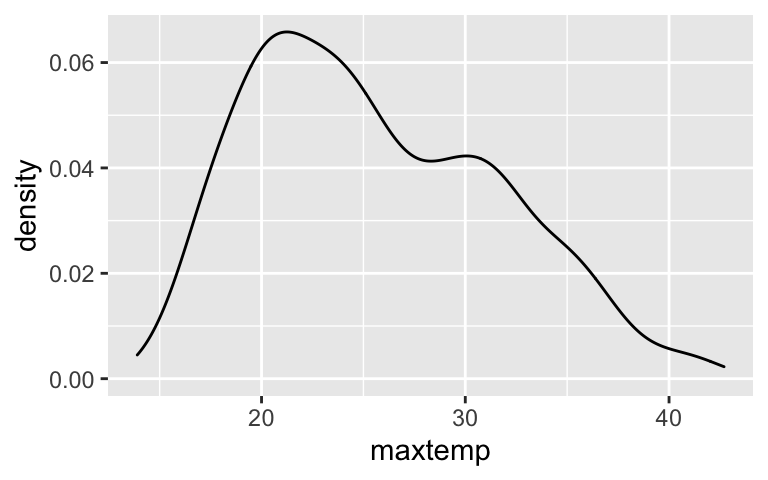
# Histogram
ggplot(weather, aes(x = maxtemp)) +
  geom_histogram()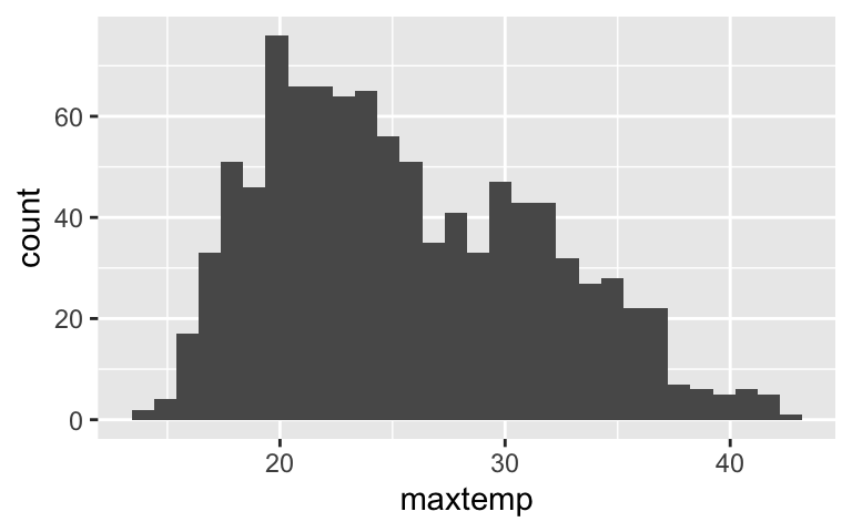
# Outline boxes in white
ggplot(weather, aes(x = maxtemp)) +
  geom_histogram(color = "white")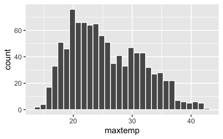
- .
- box plots are more simple, boiling the data down to just 5 important summary statistics. thus they can be easier to interpret
- box plots can oversimplify the picture / lose important details
- box plots are more simple, boiling the data down to just 5 important summary statistics. thus they can be easier to interpret
When the bins are too wide, we lose too much detail. When the bins are too narrow, we lose the general patterns.
# Default plot
ggplot(weather, aes(x = maxtemp)) +
  geom_histogram(color = "white")
# Make bins that are 15 degrees wide
ggplot(weather, aes(x = maxtemp)) +
  geom_histogram(color = "white", binwidth = 15)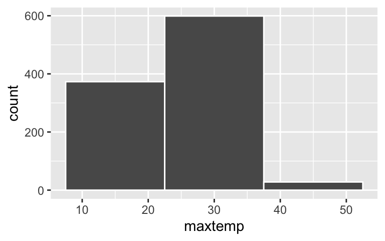
# Make bins that are 0.2 degrees wide
ggplot(weather, aes(x = maxtemp)) +
  geom_histogram(color = "white", binwidth = 0.2)
The typical max temperature is around 25 degrees (with an average of 25.58 and a median of 24.6 degrees). The max temperatures ranged from 13.9 to 42.7 degrees. Finally, on the typical day, the max temp fall 6.05 degrees from the mean (25.58 degrees).
# Load package
library(dplyr)

# Calculate the mean daily temperature
weather %>%
  summarize(mean(maxtemp))
##   mean(maxtemp)
## 1       25.5802

# Calculate the mean AND median daily temperature
weather %>%
  summarize(mean(maxtemp), median(maxtemp))
##   mean(maxtemp) median(maxtemp)
## 1       25.5802            24.6

# Calculate the min, max, and standard deviation in daily temperatures
weather %>%
  summarize(min(maxtemp), max(maxtemp))
##   min(maxtemp) max(maxtemp)
## 1         13.9         42.7
weather %>%
  summarize(sd(maxtemp))
##   sd(maxtemp)
## 1    6.050007
.
# Construct a plot of rainfall
ggplot(weather, aes(x = rainfall)) +
  geom_histogram(color = "white")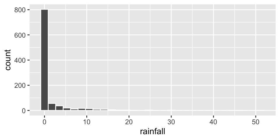
# Construct another plot of rainfall using a different technique
ggplot(weather, aes(x = rainfall)) +
  geom_boxplot()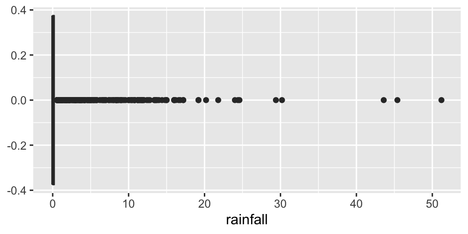
# Construct yet another plot of rainfall using yet a different technique
ggplot(weather, aes(x = rainfall)) +
  geom_density()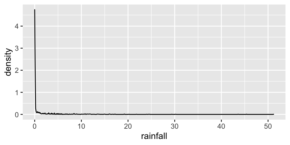
# Calculate summaries of the typical daily rainfall in Perth
weather %>%
  summarize(mean(rainfall), median(rainfall))
##   mean(rainfall) median(rainfall)
## 1         1.4954                0

# Calculate summaries of the variability in rainfall from day to day
weather %>%
  summarize(min(rainfall), max(rainfall), sd(rainfall))
##   min(rainfall) max(rainfall) sd(rainfall)
## 1             0          51.2     4.465575

# Construct a plot of windgustdir
ggplot(weather, aes(x = windgustdir)) +
  geom_bar()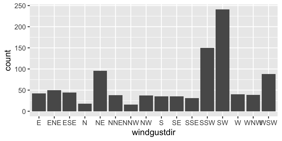
Note that there’s more than one way to answer these questions!
# Add a title and axis labels
ggplot(weather, aes(x = maxtemp)) +
  geom_histogram(color = "white") +
  labs(x = "maximum temperature", y = "number of days", title = "My nice histogram")
# Make the bars green
ggplot(weather, aes(x = raintoday)) +
  geom_bar(fill = "green")