5 Modeling bivariate relationships: Part 2
When you get to class
Open today’s Rmd file linked on the day-to-day schedule. Name and save the file.
Do not knit until the end. The chunks in this Rmd are meant to be run and examined one at a time!
5.1 Getting started
Where are we?
- We’re exploring our sample data.
- We’ve learned how to create visual and numerical summaries that describe, hence help us understand, one variable at a time.
- We now want to study the relationships among two variables (and eventually more). For example, in the previous activity we studied how bike ridership (a quantitative response variable) might be explained by windspeed (a quantitative predictor):
# Load packages & import data
library(ggplot2)
library(dplyr)
bikes <- read.csv("https://www.macalester.edu/~dshuman1/data/155/bike_share.csv")

# Visualize this relationship
ggplot(bikes, aes(x = windspeed, y = riders_registered)) +
  geom_point() +
  geom_smooth(method = "lm", se = FALSE)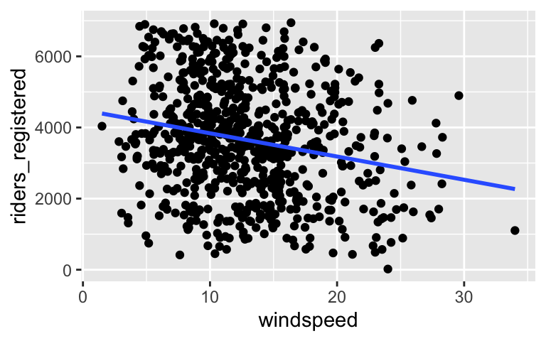
# Construct a model of this relationship
bike_model_2 <- lm(riders_registered ~ windspeed, data = bikes)

# Get a short summary of this model
coef(summary(bike_model_2))
##               Estimate Std. Error   t value      Pr(>|t|)
## (Intercept) 4490.09761  149.65992 30.002005 2.023179e-129
## windspeed    -65.34145   10.86299 -6.015053  2.844453e-09
Thus our estimated model of the relationship between ridership and windspeed is:
\[\text{ridership} = \hat{\beta}_0 + \hat{\beta}_1 \text{windspeed} = 4490.098 - 65.341 \text{windspeed}\]
What’s next?
Predictors aren’t always quantitative. What if we wish to model how ridership varies by weekends vs weekdays?
bikes %>%
  select(riders_registered, weekend) %>%
  head()
##   riders_registered weekend
## 1               654    TRUE
## 2               670    TRUE
## 3              1229   FALSE
## 4              1454   FALSE
## 5              1518   FALSE
## 6              1518   FALSE
5.2 Exercises
Goals
- Explore how to visualize, model, and interpret bivariate relationships between a quantitative response variable y and categorical predictor x.
- Continue to focus on interpretation and communication. It’s critical that we interpret and communicate our statistical plots and models in a contextually meaningful way. Without this, a statistical analysis is meaningless. Always ask yourself: If I were writing a report, what is important for the audience to understand?
Reminders & directions
One new thing you’ll see are R chunks labeled
HINT CODE. These are here to provide some code hints. Don’t type in or change these in any way.You will make mistakes throughout this activity. This is a natural part of learning any new language.
We’re sitting in groups for a reason. Remember:
- You all have different experiences, both personal and academic.
- Be a good listener and be supportive when others make mistakes.
- Stay in sync with one another while respecting that everybody works at different paces.
- Don’t rush.
If you don’t finish the activity during class, you are expected to complete it outside of class.
- Hello!
Who are you, how are you, and what’s the next book you want to read?
Step 1: Visualizations
As in the video, we’ll start by visualizing our relationship of interest, that betweenriders_registeredandweekend.The appropriate plot depends upon the type of variables we’re plotting. When exploring the relationship between a quantitative response (ridership) and a quantitative predictor (temperature), a scatterplot was an effective choice. After running the code below, explain why a scatterplot is not effective for exploring the relationship between ridership and our categorical weekend predictor.
# Try a scatterplot
ggplot(bikes, aes(y = riders_registered, x = weekend)) +
  geom_point()
Separately run each chunk below, with two plots. Comment (
#) on what changes in the code / output.# Univariate boxplot ggplot(bikes, aes(y = riders_registered)) + geom_boxplot() # ??? ggplot(bikes, aes(y = riders_registered, x = weekend)) + geom_boxplot()# Univariate density plot ggplot(bikes, aes(x = riders_registered)) + geom_density() # ??? ggplot(bikes, aes(x = riders_registered, color = weekend)) + geom_density()# Univariate histogram ggplot(bikes, aes(x = riders_registered)) + geom_histogram(color = "white") # ??? ggplot(bikes, aes(x = riders_registered)) + geom_histogram(color = "white") + facet_wrap(~ weekend)
Numerical summaries of univariate trend
Let’s follow up the viz with some numerical summaries. Calculate the meanriders_registeredvalue across all days.# HINT CODE: don't change this bikes %>% ___(mean(___))# Your solution
Numerical summaries of bivariate trend
To summarize the trends we observed in the grouped plots above, we can calculate the mean ofriders_registeredvalues on weekends vs weekdays. This requires the inclusion of thegroup_by()function:# HINT CODE # Calculate mean riders_registered by group bikes %>% group_by(weekend) %>% ___(mean(___))# Your solution
- Pause and reflect
- Examine and interpret the group mean measurements. Make sure that you can match these numbers up with what you see in the plots.
- Further, note that
riders_registeredmeasures ridership for bikeshare members (as opposed to casual riders). Explain why it thus makes sense that ridership tends to be lower on weekends.
Modeling trend
The plots and mean calculations provide some insight into the relationship betweenriders_registeredandweekend. Next, let’s model the trend in this relationship. After examining the summary table below, complete the model formula:
riders_registered = ___ - ___ weekendTRUE
# Construct the model
bike_model_3 <- lm(riders_registered ~ weekend, data = bikes)

# Summarize the model
coef(summary(bike_model_3))
##              Estimate Std. Error   t value      Pr(>|t|)
## (Intercept) 3925.5298    65.8219 59.638661 1.260262e-282
## weekendTRUE -937.6202   122.8060 -7.634974  7.096708e-14
PAUSE: Categorical predictors
Notice that our weekend variable shows up as weekendTRUE in the model. This is a numerical indicator of whether the observed day fell on a weekend:
- weekendTRUE = 1 if the day is on a weekend (weekend = TRUE)
- weekendTRUE = 0 otherwise (weekend = FALSE)
NOTE: We do not see weekendFALSE in the model output. This is because FALSE is the reference level of the weekend variable (it’s first alphabetically). You’ll see below that it is, indeed, still in the model. You’ll also see why the term “reference level” makes sense!
Making sense of the model
Recall our model: riders_registered = 3925.5298 - 937.6202 weekendTRUEUse the model formula to calculate the typical
riders_registeredon weekend days. HINT: plug inweekendTRUE = 1.Similarly, calculate the typical
riders_registeredon weekdays. HINT: plug inweekendTRUE = 0.Re-examine these 2 calculations. Where have you seen these numbers before?!
- Challenge: interpreting coefficients
Recall that our model formula, riders_registered = 3925.5298 - 937.6202 weekendTRUE, is not a formula for a line. Thus we can’t interpret the coefficients as we did in the model ofriders_registeredvs the quantitative predictortemp_feel. Taking this into account and reflecting upon your calculations above…- Interpret the intercept coefficient (
3925.5298) in a newspaper-appropriate way.
- Interpret the
weekendTRUEcoefficient (-937.6202) in a newspaper-appropriate way. Think: where did you use this value in the prediction calculations above?
- Interpret the intercept coefficient (
You try: weather_cat
Consider modelingriders_registeredbyweather_cat, a categorical predictor with three categories:categ1(pleasant weather),categ2(moderate weather), andcateg3(severe weather).# Construct 2 separate visualizations of the relationship between riders_registered and weather_cat # Calculate the mean riders_registered for each of the three weather_cat groups # Use lm to construct a model of riders_registered vs weather_cat # Save this as bike_model_4 # Get a short summary of this model
- Interpreting the results: Part I
- Summarize your observations from the visualizations.
- Write out a formula for the model trend.
- Which of the three
weather_catcategories is the reference level? HINT: Which category is first alphabetically and does not show up in the model formula?
Interpreting the results: Part II
In a newspaper-appropriate way, interpret each of the 3 coefficients in the model. To do so, take note that:weather_catcateg2is 1 for days with category 2 weather & 0 otherwise
weather_catcateg3is 1 for days with category 3 weather & 0 otherwise
With this in mind, before interpreting the coefficients, it might help to use the model to predict…
riders_registeredfor days with category 1 weather;
riders_registeredfor days with category 2 weather; and
riders_registeredfor days with category 3 weather.
- One more time
Visualize and model the relationship betweenriders_registeredandday_of_week. Use these to identify the day of the week on which we expect the lowest ridership / highest ridership.
- Reflection
Through the exercises above, you learned how to build and interpret models that incorporate a categorical predictor variable. For the benefit of your future self, summarize how one can interpret the coefficients for a categorical predictor.
- Clean, knit, and save your work!
5.3 Solutions
- .
.
# Univariate boxplot
ggplot(bikes, aes(y = riders_registered)) +
  geom_boxplot()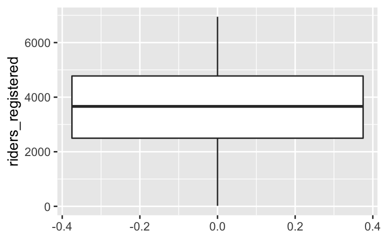
# Separate boxes by category
ggplot(bikes, aes(y = riders_registered, x = weekend)) +
  geom_boxplot()
# Univariate density plot
ggplot(bikes, aes(x = riders_registered)) +
  geom_density()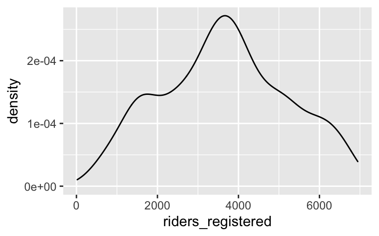
# Separate density plots by category
ggplot(bikes, aes(x = riders_registered, color = weekend)) +
  geom_density()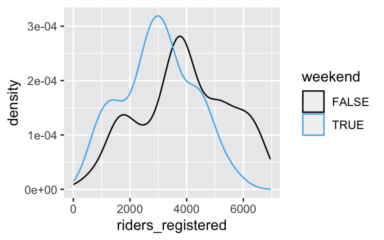
# Univariate histogram
ggplot(bikes, aes(x = riders_registered)) +
  geom_histogram(color = "white")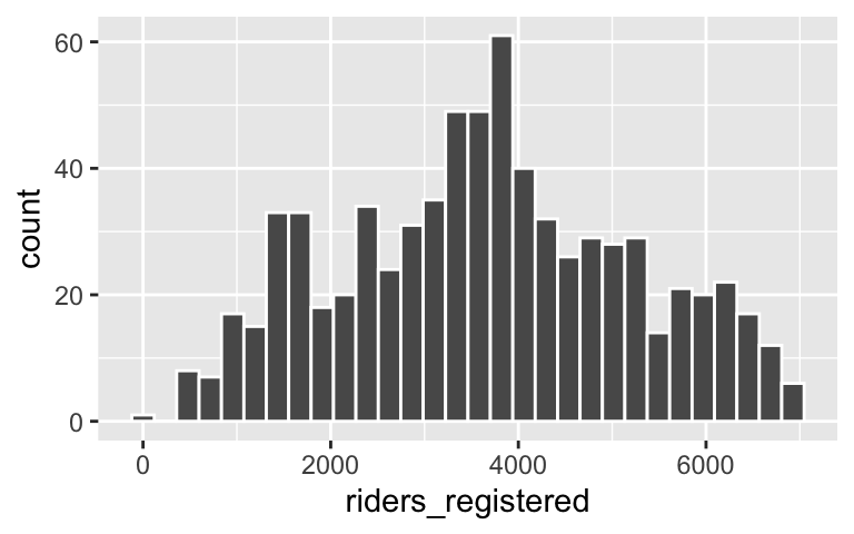
# Separate histograms by category
ggplot(bikes, aes(x = riders_registered, color = weekend)) +
  geom_histogram(color = "white") +
  facet_wrap(~ weekend)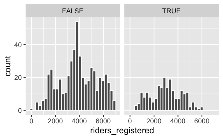
.
bikes %>%
  summarize(mean(riders_registered))
##   mean(riders_registered)
## 1                3656.172
.
bikes %>%
    group_by(weekend) %>%
    summarize(mean(riders_registered))
## # A tibble: 2 × 2
##   weekend `mean(riders_registered)`
##   <lgl>                       <dbl>
## 1 FALSE                       3926.
## 2 TRUE                        2988.
- .
- yes it matches up
- members might use the bikes in a more utilitarian way (eg: for commuting to school / work). thus ridership is higher during traditional school / work days.
riders_registered = 3925.5298 - 937.6202 weekendTRUE
# Construct the model
bike_model_3 <- lm(riders_registered ~ weekend, data = bikes)

# Summarize the model
coef(summary(bike_model_3))
##              Estimate Std. Error   t value      Pr(>|t|)
## (Intercept) 3925.5298    65.8219 59.638661 1.260262e-282
## weekendTRUE -937.6202   122.8060 -7.634974  7.096708e-14
.
# a
3925.5298 - 937.6202 * 1
## [1] 2987.91

# b
3925.5298 - 937.6202 * 0
## [1] 3925.53

# c
# these are the means for the 2 groups
- .
- 3925.5298 = the typical ridership on weekends
- -937.6202: the typical ridership on weekdays is 938 riders less than that on weekends
.
# Construct 2 separate visualizations of the relationship between riders_registered and weather_cat
ggplot(bikes, aes(x = weather_cat, y = riders_registered)) +
  geom_boxplot()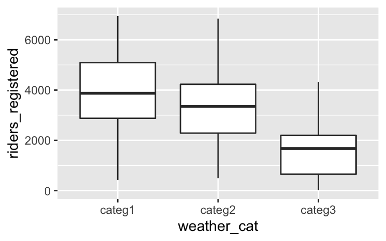
ggplot(bikes, aes(color = weather_cat, x = riders_registered)) +
  geom_density()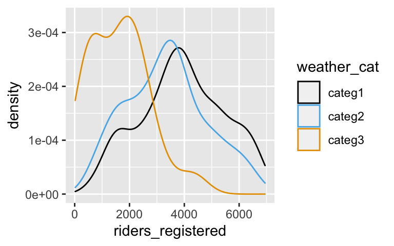
# Calculate the mean riders_registered for each of the three weather_cat groups
bikes %>%
  group_by(weather_cat) %>%
  summarize(mean(riders_registered))
## # A tibble: 3 × 2
##   weather_cat `mean(riders_registered)`
##   <chr>                           <dbl>
## 1 categ1                          3913.
## 2 categ2                          3349.
## 3 categ3                          1618.

# Use lm to construct a model of riders_registered vs weather_cat
# Save this as bike_model_4
bike_model_4 <- lm(riders_registered ~ weather_cat, data = bikes)

# Get a short summary of this model
coef(summary(bike_model_4))
##                     Estimate Std. Error   t value      Pr(>|t|)
## (Intercept)        3912.7559   69.66827 56.162665 8.041096e-267
## weather_catcateg2  -564.2458  118.11791 -4.776971  2.152677e-06
## weather_catcateg3 -2294.9464  334.46300 -6.861585  1.457558e-11
- .
- Ridership tends to be highest on pleasant days and lowest on severe days.
- riders_registered = 3912.7559 - 564.2458weather_catcateg2 - 2294.9464weather_catcateg3
categ_1
.
- 3912.7559: on days with category 1 weather, there are typically 3913 riders
- -564.2458: the typical ridership on days with category 2 weather is 564 riders lower than that on days with category 1 weather
- -2294.9464: the typical ridership on days with category 3 weather is 2294.9464 riders lower than that on days with category 1 weather
In general, ridership tends to be lowest on Sundays (on average, 1048 fewer riders than on Fridays) and highest on Thursdays (on average, 138 riders more than on Fridays).
ggplot(bikes, aes(x = day_of_week, y = riders_registered)) +
  geom_boxplot()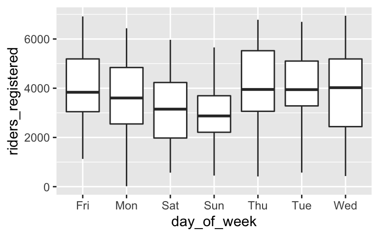
bike_model_5 <- lm(riders_registered ~ day_of_week, data = bikes)
coef(summary(bike_model_5))
##                   Estimate Std. Error     t value      Pr(>|t|)
## (Intercept)     3938.00000   147.2835 26.73755308 4.383743e-110
## day_of_weekMon  -274.00952   207.7938 -1.31866085  1.876995e-01
## day_of_weekSat  -852.71429   207.7938 -4.10365643  4.529133e-05
## day_of_weekSun -1047.46667   207.7938 -5.04089517  5.860283e-07
## day_of_weekThu   138.29808   208.2903  0.66396791  5.069222e-01
## day_of_weekTue    16.48077   208.2903  0.07912404  9.369558e-01
## day_of_weekWed    59.39423   208.2903  0.28515121  7.756099e-01