6 Model evaluation: Part 1
When you get to class
Open today’s Rmd file linked on the day-to-day schedule. Name and save the file.
Announcements
- Checkpoint 6 is due Thursday (in 2 days) at 930am.
- Homework 2 is due next Tuesday (in 7 days) at 930am. Homework 2 is a lot like Homework 1, but shorter. It’s designed for additional practice. You will have time to work on it during class on Thursday.
- Most importantly, I am here to support you, both in and outside class. Please reach out to me if you need to take a step back from the pace of our class in order to care for yourself or others in light of recent events. We will figure it out together.
6.1 Getting started
WHERE ARE WE?
Turning data into information, we’ve been using statistical models to explore the relationships between two (or more) variables. For example, consider a plot and model of the relationship between ridership and day of the week:
# Load packages & import data
library(ggplot2)
library(dplyr)
bikes <- read.csv("https://www.macalester.edu/~dshuman1/data/155/bike_share.csv")
# Visualize this relationship
ggplot(bikes, aes(x = day_of_week, y = riders_registered)) +
geom_boxplot()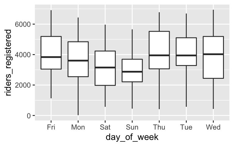
ggplot(bikes, aes(x = riders_registered, color = day_of_week)) +
  geom_density()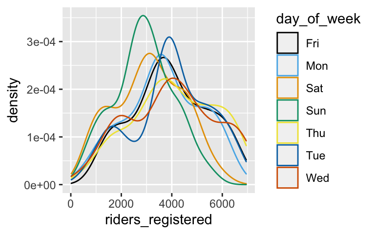
ggplot(bikes, aes(x = riders_registered, fill = day_of_week)) +
  geom_density(alpha = 0.5)
# Model this relationship
new_bike_model <- lm(riders_registered ~ day_of_week, data = bikes)

# Summarize the model
coef(summary(new_bike_model))
##                   Estimate Std. Error     t value      Pr(>|t|)
## (Intercept)     3938.00000   147.2835 26.73755308 4.383743e-110
## day_of_weekMon  -274.00952   207.7938 -1.31866085  1.876995e-01
## day_of_weekSat  -852.71429   207.7938 -4.10365643  4.529133e-05
## day_of_weekSun -1047.46667   207.7938 -5.04089517  5.860283e-07
## day_of_weekThu   138.29808   208.2903  0.66396791  5.069222e-01
## day_of_weekTue    16.48077   208.2903  0.07912404  9.369558e-01
## day_of_weekWed    59.39423   208.2903  0.28515121  7.756099e-01
Thus the estimated model formula is:
ridership = 3938 - 274.00952day_of_weekMon - 852.714day_of_weekSat … (it’s too long to write out!)
Questions:
Which day of the week is the reference level?
Complete this interpretation of the intercept: We expect there to be 3938 riders on ___.
Complete this interpretation of the Wednesday coefficient: We expect there to be 59 ___ riders on Wednesday than on ___.
On which day of the week do we expect ridership to be the highest? And what is the expected ridership?
WHAT’S NEXT?
Just as we should always question the safety of a foraged mushroom, and just as medications come with warning labels, we should always evaluate the quality of our model before trusting, using, or reporting it. To this end, there are 3 important questions to ask. You’ll explore the 1st and 3rd today:
Is it wrong?
We can explore this question using context and residual plots.Is it strong?
Is it fair?
Data analysis can be a powerful source for good. It can foster just policies, effective medicines, etc. It can also do the opposite. In general, data collection and analyses inherently have an embedded world view – the data we collect, the questions we ask, etc are driven by our individual and collective experiences. In fact, modern statistics itself has some dubious roots. Thus it’s important to question whether a model is fair. This is a big question that you’ll explore through short case studies below. Some of these case studies cover sensitive topics. You can skip over any case studies you choose.
6.2 Exercises
6.2.1 Hello
Check in with your group members. Who are you? How are you?
6.2.2 Is the model wrong?
The MN_temp dataset includes simulated (ie. made up, but realistic-ish) daily temperatures in Minnesota. Our goal will be to model temp by day_of_year. Make sure to run this code before starting the exercises.
# Load packages
library(ggplot2)
library(dplyr)
library(fivethirtyeight)

# Load data
MN_temp <- read.csv("https://www.macalester.edu/~ajohns24/data/MN_temp_simulation.csv")

# Build a model of temp by day_of_year
temp_model_1 <- lm(temp ~ day_of_year, data = MN_temp)
coef(summary(temp_model_1))
##                Estimate  Std. Error   t value      Pr(>|t|)
## (Intercept) 55.90103690 1.768060006 31.617160 3.010299e-113
## day_of_year  0.04451023 0.008685916  5.124414  4.556222e-07
This model is wrong
You learned in the video that the abovetemp_model_1oftempbyday_of_yearis wrong. To remind yourself why, and to practice some plotting, plot the model trend on top of a scatterplot of the data. Explain what evidence from this plot convinces you that this model is wrong.# HINT CODE (don't write in this chunk) # Plot temp vs day_of_year with a model trend ___(___, aes(x = ___, y = ___)) + geom___() + geom___(method = "lm", se = FALSE)
Fixing the model
In STAT 155 we have and will continue to build “linear” regression models. “Linear” means we have a linear combination of predictors. It does not mean that the models themselves must look linear! It’s possible to include “transformations” in our models in order to better match the trend. Convince yourself that this works. (Don’t worry about the syntax or interpreting the coefficients – this would require algebra.)# Fit a quadratic model temp_model_2 <- lm(temp ~ poly(day_of_year, 2, raw = TRUE), data = MN_temp) coef(summary(temp_model_2)) # Plot the model ggplot(MN_temp, aes(x = day_of_year, y = temp)) + geom_point() + geom_smooth(method = "lm", formula = y ~ poly(x, 2), se = FALSE)
Residual plots
Plotting the residuals vs the predictions or “fitted values” of each case can help us assess how wrong our model is. Recall that this will be an especially important tool when evaluating models with multiple predictors that are tough to check using visualizations of the data alone. Construct the residual plots for our two temperature models. Do these suggest thattemp_model_1is wrong? What abouttemp_model_2? Explain.NOTE: Information about the residuals (
.resid) and predictions (.fitted) are stored within our model, thus we start ourggplot()with the model name as opposed to the raw dataset. We will rarely startggplot()with a model instead of the data.# Check out the residual plot for temp_model_1 (the wrong model) ggplot(temp_model_1, aes(x = .fitted, y = .resid)) + geom_point() + geom_hline(yintercept = 0) # Construct the residual plot for temp_model_2 (the good model)
There are so many ways to be wrong
Let’s use thebechdeldata from Homework 1 to model the relationship betweenintgrossandbudgetfor films made in 1997.# Import the data data(bechdel) # Get only 1997 movies movies_1997 <- bechdel %>% filter(year == 1997) # Construct the model bechdel_model <- lm(intgross ~ budget, movies_1997)Construct two plots:
# Scatterplot with the bechdel_model trend


# Residual plot for bechdel_model
These two plots confirm that our model is wrong. What’s wrong and how might we fix it?
Identify which movie is causing the problem. Hint:
filter()according tobudget. Also, note that we could, but won’t, take that film out of the data set and re-build the model.# HINT CODE (do not write in this chunk) # NOTE: Many numbers could go in the ___ movies_1997 %>% filter(budget > ___)
More outliers
As you saw above, outliers can “mess up” a model. However, this sometimes reveals something meaningful. In the 2000 presidential election between George W Bush and Al Gore, Bush was declared the winner. Check out the Florida county-level returns for Bush and Buchanan, a third-party candidate, below. The outlier is Palm Beach where voters used the infamous butterfly ballot. What’s the historical significance of this outlier?# Import the data florida <- read.csv("https://www.macalester.edu/~ajohns24/data/Florida2000.csv") # Plot the data ggplot(florida, aes(x = Bush, y = Buchanan, label = County)) + geom_text()
6.2.3 Is the model fair?
Recall that, in general, we cannot evaluate fairness with graphical or numerical summaries. Rather, we must ask ourselves a series of questions, including but not limited to:
- Who collected the data and how was the collection funded?
- How & why did they collect the data?
- What are the power dynamics between the people that collected / analyzed the data and those that are impacted by the data collection / analysis?
- What are the implications of the analysis on individuals and society, ethical or otherwise?
The best way to explore model fairness is through several case studies. Discuss the case studies below with your group. You might not get through all of the examples, or you might skip around, and that’s ok. The hope is to simply start thinking about model fairness.
- Biased data, biased results: example 1
DATA ARE NOT NEUTRAL. Data can reflect personal biases, institutional biases, power dynamics, societal biases, the limits of our knowledge, and so on. In turn, biased data can lead to biased analyses. Consider an example.- Do a Google image search for “statistics professor.” What do you observe?
- These search results are produced by a search algorithm / model. Explain why the data used by this model are not neutral.
- What are the potential implications, personal or societal, of the search results produced from this biased data?
- Do a Google image search for “statistics professor.” What do you observe?
Biased data, biased results: example 2
Consider the example of a large company that developed a model / algorithm to review the résumés of applicants for software developer & other tech positions. The model then gave each applicant a score indicating their hireability or potential for success at the company. You can think of this model as something like:
\[\text{potential for success } = \beta_0 + \beta_1 (\text{features from the résumé})\]Skim this Reuter’s article about the company’s résumé model.
- Explain why the data used by this model are not neutral.
- What are the potential implications, personal or societal, of the results produced from this biased data?
- Rigid data collection systems
When working with categorical variables, we’ve seen that our units of observation fall into neat groups. Reality isn’t so discrete. For example, check out questions 6 and 9 on page 2 of the 2020 US Census. With your group, discuss the following:- What are a couple of issues you see with these questions?
- What impact might this type of data collection have on a subsequent analysis of the census responses and the policies it might inform?
- Can you think of a better way to write these questions while still preserving the privacy of respondents?
Presenting data: “Elevating emotion and embodiment”
NOTE: The following example highlights work done by W.E.B. Du Bois in the late 1800s / early 1900s. His work uses language common to that time period and addresses the topic of slavery.The types of visualizations we’ve been learning in this course are standard practice, hence widely understood. Yet these standard visualizations can also suppress the lived experiences of people represented in the data, hence can miss the larger point. W.E.B. Du Bois (1868–1963), a “sociologist, socialist, historian, civil rights activist, Pan-Africanist, author, writer, and editor”3, was a pioneer in elevating emotion and embodiment in data visualization. For the Paris World Fair of 1900, Du Bois and his team of students from Atlanta University presented 60 data visualizations of the Black experience in America, less than 50 years after the abolishment of slavery. To this end, Du Bois noted that “I wanted to set down its aim and method in some outstanding way which would bring my work to notice by the thinking world.” That is, he wanted to increase the impact of his work by partnering technical visualizations with design that better connects to lived experiences. Check out:
- An article by Allen Hillery (@AlDatavizguy).
- A complete set of the data visualizations provided by Anthony Starks (@ajstarks).
Discuss your observations. In what ways do you think the W.E.B. Du Bois visualizations might have been more effective at sharing his work than, say, plainer bar charts?
FOR A DEEPER DISCUSSION AND MORE MODERN EXAMPLES: Read Chapter 3 of Data Feminism on the principle of elevating emotion and embodiment, i.e. the value of “multiple forms of knowledge, including the knowledge that comes from people as living, feeling bodies in the world.”
- An article by Allen Hillery (@AlDatavizguy).
6.3 Solutions
The model line doesn’t follow the curved trend of the data.
# Plot temp vs day_of_year with a model trend
ggplot(MN_temp, aes(y = temp, x = day_of_year)) +
  geom_point() +
  geom_smooth(method = "lm", se = FALSE)
The model curve now matches the curved trend of the data. I’m convinced.
# Fit a quadratic model
temp_model_2 <- lm(temp ~ poly(day_of_year, 2, raw = TRUE), data = MN_temp)
coef(summary(temp_model_2))
##                                       Estimate   Std. Error    t value
## (Intercept)                       10.267457638 2.045040e+00   5.020664
## poly(day_of_year, 2, raw = TRUE)1  0.693690115 2.521505e-02  27.510952
## poly(day_of_year, 2, raw = TRUE)2 -0.001777348 6.746897e-05 -26.343194
##                                       Pr(>|t|)
## (Intercept)                       7.623890e-07
## poly(day_of_year, 2, raw = TRUE)1 5.200790e-96
## poly(day_of_year, 2, raw = TRUE)2 5.390397e-91

# Plot the model
ggplot(MN_temp, aes(x = day_of_year, y = temp)) +
  geom_point() +
  geom_smooth(method = "lm", formula = y ~ poly(x, 2), se = FALSE)
Residual plots
# Check out the residual plot for temp_model_1 (the wrong model)
# We see a pattern here, thus evidence this model is wrong
ggplot(temp_model_1, aes(x = .fitted, y = .resid)) +
  geom_point() +
  geom_hline(yintercept = 0)
# Construct the residual plot for temp_model_2 (the good model)
# Looks nice and random!
ggplot(temp_model_2, aes(x = .fitted, y = .resid)) +
  geom_point() +
  geom_hline(yintercept = 0)
- .
Construct two plots:
# Scatterplot with the bechdel_model trend
ggplot(movies_1997, aes(y = intgross, x = budget)) +
  geom_point() +
  geom_smooth(method = "lm", se = FALSE)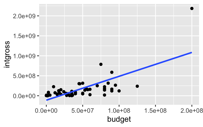
# Residual plot for bechdel_model
ggplot(bechdel_model, aes(x = .fitted, y = .resid)) +
  geom_point() +
  geom_hline(yintercept = 0)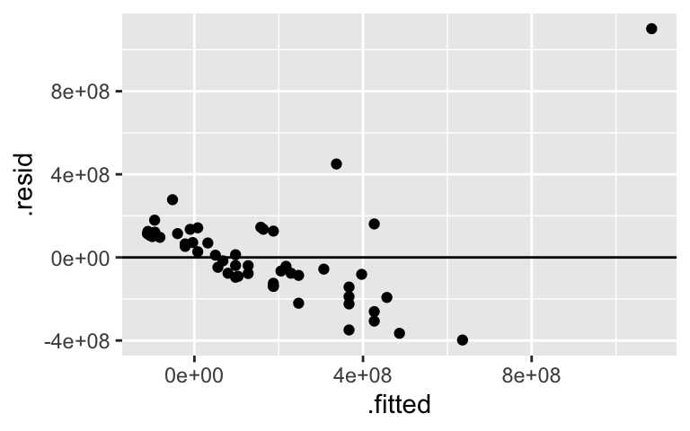
There’s an outlier that’s pulling the model toward it and away from the trend exhibited in the other movies.
The outlier is the Titanic:
# One of many ways to filter out the correct movie!
movies_1997 %>%
  filter(intgross > 2000000000)
## # A tibble: 1 × 15
##    year imdb      title   test  clean_test binary budget domgross intgross code
##   <int> <chr>     <chr>   <chr> <ord>      <chr>   <int>    <dbl>    <dbl> <chr>
## 1  1997 tt0120338 Titanic ok    ok         PASS      2e8   6.59e8   2.19e9 1997…
## # … with 5 more variables: budget_2013 <int>, domgross_2013 <dbl>,
## #   intgross_2013 <dbl>, period_code <int>, decade_code <int>
.
# Remove Titanic
without_titanic <- movies_1997 %>%
  filter(intgross < 2000000000)

# Plot both models
ggplot(movies_1997, aes(y = intgross, x = budget)) +
  geom_point() +
  geom_smooth(method = "lm", se = FALSE) +      # (with Titanic)
  geom_smooth(data = without_titanic, method = "lm", se = FALSE, color = "red")    # (without Titanic)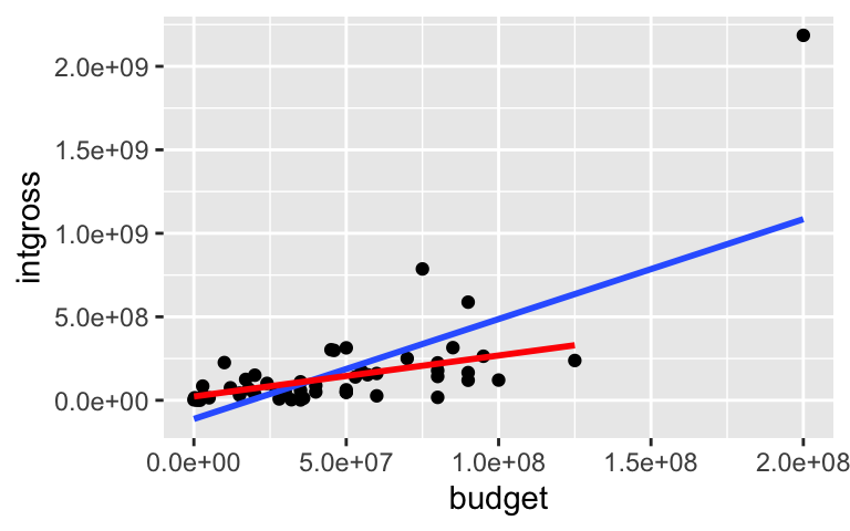
More outliers
Bush had a very narrow electoral college win. One of the deciding factors was Bush’s victory in Florida. Some saw this data as evidence that the ballot in Palm Beach led to people voting for the incorrect candidates, thus evidence that the outcome in Florida should be reviewed.# Import the data florida <- read.csv("https://www.macalester.edu/~ajohns24/data/Florida2000.csv") # Plot the data ggplot(florida, aes(x = Bush, y = Buchanan, label = County)) + geom_text()
NOTE: There are no solutions for the remaining exercise. These require longer discussions, not discrete answers.