16 Normal model + random samples
in experiment exercises, first plot the model lines, then the sampling distributions of the intercepts and slopes
Announcements
Sit with at least a couple new people today! Introduce yourselves.
Checkpoint 13 is due Tuesday. There’s no homework next week, but if you haven’t yet handed in Homework 5, it’s due Tuesday by 9:30am.
If you don’t yet have a group for the mini-project, it’s important to figure that out soon. Working alone is not an option. If you’re stumped, reach out to me this week.
Quiz 2 is next Thursday. It is the same format as Quiz 1, it is (necessarily) cumulative, and it will cover material up through logistic regression (not today’s material!). The following are some of the bigger concepts on the quiz: Normal vs logistic regression, multicollinearity, interaction (what it means and how to interpret an interaction coefficient), interpreting model coefficients (Normal and logistic), making predictions (Normal and logistic), evaluating logistic regression models, R-squared.
I’m appreciative of the people who have been speaking up in class and am hoping that more start feeling comfortable sharing their thoughts. It’s important to hear from more of you! Just a heads up that if this doesn’t happen naturally, I’ll call on different tables (not individuals) to share their thoughts.
16.1 Getting started
Today marks a significant shift in the semester. Thus far, we’ve focused on exploratory analysis: visualizations, numerical summaries, and models that capture the patterns in our sample data. Today, we’ll move on to inference: using our data to make conclusions about the broader population from which it was taken:

Goals for today
Explore the Normal probability model, a tool we’ll need to turn information in our sample data into inferences about the broader population.
Run a little class experiment to consider the ideas of randomness, sample estimation, and how they connect to the Normal model.
16.2 Experiment
Github user Tony McGovern has compiled and made available presidential election results for the population of all 3000+ U.S. counties (except Alaska). (Image: Wikimedia Commons)
.png)

Import the combined and slightly wrangled data:
# Load packages and import and wrangle data
library(dplyr)
library(ggplot2)
elections <- read.csv("https://www.macalester.edu/~ajohns24/data/election_2020.csv") %>%
  mutate(per_gop_2020 = 100*per_gop_2020,
    per_gop_2016 = 100*per_gop_2016, per_gop_2012 = 100*per_gop_2012)
The Republican (or “GOP”) candidate for president was Donald Trump in 2020 and Mitt Romney in 2012. Our goal will be to understand how Trump’s 2020 vote percentage (per_gop_2020) relates to Romney’s 2012 vote percentage (per_gop_2012). BUT let’s pretend that we’re working within the typical scenario - we don’t have access to the entire population of interest. Instead, we need to estimate population trends using data from a randomly selected sample of counties.
Sampling & randomness in RStudio
We’ll be taking some random samples of counties throughout this activity. The underlying random number generator plays a role in the random sample we happen to get:# Try the following chunk A FEW TIMES sample_n(elections, size = 2, replace = FALSE)# Try the following FULL chunk A FEW TIMES set.seed(155) sample_n(elections, size = 2, replace = FALSE)NOTE: If we
set.seed(some positive integer)before taking a random sample, we’ll get the same results. This reproducibility is important:- we get the same results every time we knit the Rmd
- we can share our work with others & ensure they get our same answers
- it wouldn’t be great if you submitted your work to, say, a journal and weren’t able to back up / confirm / reproduce your results!
- we get the same results every time we knit the Rmd
- Take your own sample
Set your own random number seed to your own phone number – just the numbers so that you have a 7-digit or 10-digit integer. (The number isn’t important. What’s important is that your number is different than other students’.)
set.seed(YOURSEED)Take a random sample of 10 counties:
my_sample <- sample_n(elections, size = 10, replace = FALSE)
my_sample
Calculate the average percentage of votes that Trump won in your 10 sample counties.
my_sample %>%
  summarize(mean(per_gop_2020))
Construct and plot your model of Trump’s 2020 vs 2012 vote percentage:
ggplot(my_sample, aes(x = per_gop_2012, y = per_gop_2020)) +
  geom_point() +
  geom_smooth(method = "lm", se = FALSE)

my_model <- lm(per_gop_2020 ~ per_gop_2012, my_sample)
coef(summary(my_model))
- Report your work
Indicate your sample mean, intercept, and slope estimates in this survey. You’ll come back to analyze this experiment data later in the activity!
16.3 Exercises: Normal model
In this section you will practice the concepts you explored in today’s video. First, run the following code which defines a shaded_normal() function which is specialized to this activity alone:
shaded_normal <- function(mean, sd, a = NULL, b = NULL){
  min_x <- mean - 4*sd
  max_x <- mean + 4*sd
  a <- max(a, min_x)
  b <- min(b, max_x)
  ggplot() +
    scale_x_continuous(limits = c(min_x, max_x), breaks = c(mean - sd*(0:3), mean + sd*(1:3))) +
    stat_function(fun = dnorm, args = list(mean = mean, sd = sd)) +
    stat_function(geom = "area", fun = dnorm, args = list(mean = mean, sd = sd), xlim = c(a, b), fill = "blue") +
    labs(y = "density")
}
- A Normal model
Suppose that the speeds of cars on a highway, in miles per hour, can be reasonably represented by the following model: N(55, 52).What are the mean speed and standard deviation in speeds from car to car?
Plot this Normal model.
# shaded_normal(mean = ___, sd = ___)
- 68-95-99.7 Rule
Provide the range of the middle 68% of speeds and shade in the corresponding region on your Normal curve. NOTE:
ais the lower end of the range andbis the upper end.# shaded_normal(mean = ___, sd = ___, a = ___, b = ___)Repeat part a for the middle 95%.
Repeat part a for the middle 99.7%.
- Calculate probabilities
We can also use the 68-95-99.7 Rule to calculate probabilities!Calculate the probability that a car’s speed exceeds 60mph. The following plot can provide some intuition:
shaded_normal(mean = 55, sd = 5, a = 60)Calculate the probability that a car will be traveling at less than 45mph.
shaded_normal(mean = 55, sd = 5, b = 45)Calculate the probability that a car will be traveling at less than 40mph.
shaded_normal(mean = 55, sd = 5, b = 40)
- Approximate probabilities
Speeds don’t always fall exactly in increments of 5mph (the standard deviation) from the mean of 55mph. Though we can use other tools to calculate probabilities in these scenarios, the 68-95-99.7 Rule can still provide insight. For each scenario below, indicate which range the probability falls into: less than 0.0015, between 0.0015 and 0.025, between 0.025 and 0.16, or greater than 0.16.the probability that a car’s speed exceeds 57mph
shaded_normal(mean = 55, sd = 5, a = 57)the probability that a car’s speed exceeds 67mph
shaded_normal(mean = 55, sd = 5, a = 67)the probability that a car’s speed exceeds 71mph
shaded_normal(mean = 55, sd = 5, a = 71)
Z scores
Inherently important to all of our calculations above is how many standard deviations a value “X” is from the mean. This distance is called a Z-score and can be calculated as follows:(X - mean) / sd
For example, if I’m traveling 40 miles an hour, my Z-score is -3. That is, my speed is 3 standard deviations below the average speed:
(40 - 55) / 5
## [1] -3
Driver A is traveling at 60mph on the highway where speeds are N(55, 52) and the speed limit is 55mph. Calculate and interpret their Z-score.
Driver B is traveling at 36mph on a residential road where speeds are N(30, 32) and the speed limit is 30mph. Calculate and interpret their Z-score.
Both drivers are speeding, though in different scenarios (highway vs residential). Who is speeding more? Explain. NOTE: The following plots might provide some insights:
# Driver A
shaded_normal(mean = 55, sd = 5) +
  geom_vline(xintercept = 60)

# Driver B
shaded_normal(mean = 30, sd = 3) +
  geom_vline(xintercept = 36)
16.4 Exercises: Random samples
The Normal exercises above are directly relevant to using our sample data to learn about the broader population of interest. Let’s see where these two ideas connect!
Comparing mean estimates (part 1)
Recall that each student took a sample of 10 U.S. counties. From this sample, you each estimated Trump’s mean 2020 support and the relationship between Trump’s 2020 results and Romney’s 2012 results. Import the resultingsample_mean,sample_intercept, andsample_slopevalues:results <- read.csv("https://www.macalester.edu/~ajohns24/data/election_simulation.csv") names(results) <- c("time", "sample_mean", "sample_intercept", "sample_slope")Construct and describe a density plot of the
sample_meanvalues, i.e. each student’s sample estimate of Trump’s average support. What’s the typical estimate? The range in estimates? The shape of the density plot (does it look Normal-ish)?ggplot(results, aes(x = sample_mean)) + geom_density()For more specific insight into the typical estimate of Trump’s mean support and the variability in the estimates from student to student, calculate the mean and standard deviation of the
sample_meanvalues:#results %>% # ___(mean(sample_mean), sd(sample_mean))Based on parts a and b, what do you think is the actual mean Trump support among all counties? What’s your reasoning?
Check your intuition. Calculate the mean Trump support across all counties. How does this compare to the typical sample estimate?
#elections %>% # ___(mean(per_gop_2020))
- Comparing mean estimates (part 2)
In the previous exercise, you observed that the collection of our sample mean estimates is Normally distributed around Trump’s actual mean support.- What was your sample estimate of Trump’s mean support?
- How many percentage points was your estimate from Trump’s actual mean support?
- How many standard deviations was your estimate from Trump’s actual mean support? That is, what’s your Z-score?
- What was your sample estimate of Trump’s mean support?
Comparing model estimates
Next, let’s examine how our sample estimates of the relationship between Trump’s 2020 support and Romney’s 2012 support varied from student to student.Construct and describe density plots of the
sample_interceptandsample_slopevalues. (Do these look Normal-ish?)ggplot(results, aes(x = sample_intercept)) + geom_density() ggplot(results, aes(x = sample_slope)) + geom_density()Plot the sample model lines. How do these compare to the actual trend among all counties (red)?
ggplot(elections, aes(x = per_gop_2012, y = per_gop_2020)) + geom_abline(data = results, aes(intercept = sample_intercept, slope = sample_slope), color = "gray") + geom_smooth(method = "lm", color = "red", se = FALSE)
- Reflection
Reflect upon the exercises above. Summarize what you’ve learned about using sample data to estimate features of a broader population. For example:- What model might describe how estimates behave from sample to sample?
- Though estimates can vary from sample to sample, around what value do the estimates center?
- What model might describe how estimates behave from sample to sample?
Data drill!
# What was Trump's lowest vote percentage? # The highest? # Show the state_name, county_name, and per_gop_2020 of the 6 counties where Trump had the lowest support # Show the state_name, county_name, and per_gop_2020 of the 6 counties where Trump had the highest support # What was Trump's lowest vote percentage in Minnesota? In what county was this? # The highest? # Construct and comment on a plot of voter turnout # in 2020 (total_votes_2020) vs 2016 (total_votes_2016) # For reference, add on a geom_abline(intercept = 0, slope = 1) # What other questions do you have?
16.5 Optional: mapping!
Visualizing the election results on an actual map can provide some intuition for our work. To make maps, load the following package. NOTE: You’ll likely need to install this package first.
library(socviz)Now process the data to include mapping info (eg: latitude and longitude coordinates):
mapping_data <- elections %>%
dplyr::rename(id = county_fips) %>%
mutate(id = as.character(id)) %>%
mutate(id = ifelse(nchar(id) == 4, paste0("0",id), id)) %>%
left_join(county_map, elections, by = "id")Now make some maps!
ggplot(mapping_data, aes(x = long, y = lat, fill = per_gop_2020, group = group)) +
coord_equal() +
geom_polygon(color = NA)ggplot(mapping_data, aes(x = long, y = lat, fill = per_gop_2020, group = group)) +
coord_equal() +
geom_polygon(color = NA) +
scale_fill_gradientn(colours = c("blue", "purple", "red"))mn <- mapping_data %>%
filter(state_name == "Minnesota")
ggplot(mn, aes(x = long, y = lat, fill = per_gop_2020, group = group)) +
coord_equal() +
geom_polygon(color = NA) +
scale_fill_gradientn(colours = c("blue", "purple", "red"), values = scales::rescale(seq(0, 100, by = 10)))
Play around!
- Check out another state.
- Plot the results of a different election.
- Define and map a new variable that looks at the difference between
per_gop_2020andper_gop_2016(ie. how did Trump’s support shift from 2016 to 2020?).
16.6 Solutions
Sampling & randomness in RStudio
# Try the following chunk A FEW TIMES # NOTE: This is different every time sample_n(elections, size = 2, replace = FALSE) ## state_name state_abbr county_name county_fips votes_gop_2020 ## 1 Iowa IA Clarke County 19039 3144 ## 2 Kansas KS Mitchell County 20123 2454 ## votes_dem_2020 total_votes_2020 per_gop_2020 per_dem_2020 per_point_diff_2020 ## 1 1466 4670 67.32334 0.3139186 0.3593148 ## 2 547 3039 80.75025 0.1799934 0.6275090 ## votes_dem_2016 votes_gop_2016 total_votes_2016 per_dem_2016 per_gop_2016 ## 1 1463 2706 4405 0.3321226 61.43019 ## 2 469 2216 2824 0.1660765 78.47025 ## per_point_diff_2016 total_votes_2012 votes_dem_2012 votes_gop_2012 ## 1 -0.2821793 4398 2187 2124 ## 2 -0.6186261 2923 576 2293 ## per_dem_2012 per_gop_2012 per_point_diff_2012 ## 1 0.4972715 48.29468 0.01432469 ## 2 0.1970578 78.44680 -0.58741020# Try the following FULL chunk A FEW TIMES # NOTE: This is the same different every time set.seed(155) sample_n(elections, size = 2, replace = FALSE) ## state_name state_abbr county_name county_fips votes_gop_2020 ## 1 Texas TX Baylor County 48023 1494 ## 2 Indiana IN Dearborn County 18029 19528 ## votes_dem_2020 total_votes_2020 per_gop_2020 per_dem_2020 per_point_diff_2020 ## 1 183 1702 87.77908 0.1075206 0.7702703 ## 2 5446 25383 76.93338 0.2145530 0.5547808 ## votes_dem_2016 votes_gop_2016 total_votes_2016 per_dem_2016 per_gop_2016 ## 1 191 1267 1492 0.1280161 84.91957 ## 2 4883 18110 23910 0.2042242 75.74237 ## per_point_diff_2016 total_votes_2012 votes_dem_2012 votes_gop_2012 ## 1 -0.7211796 1592 267 1297 ## 2 -0.5531995 22352 6527 15391 ## per_dem_2012 per_gop_2012 per_point_diff_2012 ## 1 0.1677136 81.46985 -0.6469849 ## 2 0.2920097 68.85737 -0.3965641
- Take your own sample
Answers will vary
- Report your work
- A Normal model
mean = 55mph, sd = 5mph
.
shaded_normal(mean = 55, sd = 5)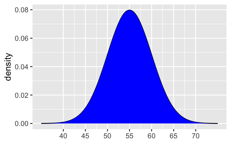
- 68-95-99.7 Rule
55 \(\pm\) 5 = (50, 60)
shaded_normal(mean = 55, sd = 5, a = 50, b = 60)
95%: 55 \(\pm\) 25 = (45, 65)
99.7%: 55 \(\pm\) 35 = (40, 70)shaded_normal(mean = 55, sd = 5, a = 45, b = 65)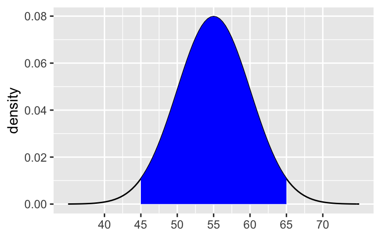
shaded_normal(mean = 55, sd = 5, a = 40, b = 70)
Calculate probabilities
0.16. NOTE: There’s a 32% chance that a speed is outside the 50 to 60 range, split evenly between the 2 tails.
shaded_normal(mean = 55, sd = 5, a = 60)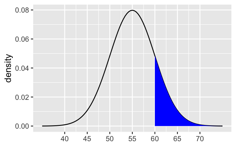
0.025. NOTE: There’s a 5% chance that a speed is outside the 45 to 65 range, split evenly between the 2 tails.
shaded_normal(mean = 55, sd = 5, b = 45)0.0015. NOTE: There’s a 0.3% chance that a speed is outside the 40 to 70 range, split evenly between the 2 tails.
shaded_normal(mean = 55, sd = 5, b = 40)
- Approximate probabilities
greater than 0.16. 57 is less than 1sd away from 55 (between 55 and 60).
shaded_normal(mean = 55, sd = 5, a = 57)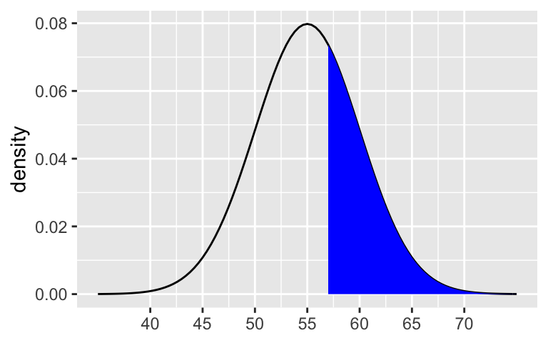
between 0.0015 and 0.025. 67 is between 2sd and 3sd away from 55 (between 65 and 70).
shaded_normal(mean = 55, sd = 5, a = 67)
less than 0.0015. 71 is more than 3sd away from 55 (greater than 70).
shaded_normal(mean = 55, sd = 5, a = 71)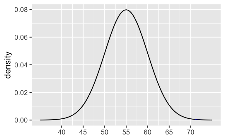
- Z scores
Driver A is going 1sd above the speed limit.
(60 - 55) / 5 ## [1] 1Driver B is going 2sd above the speed limit.
(36 - 30) / 3 ## [1] 2Driver B. They’re going 2sd above the limit.
# Driver A shaded_normal(mean = 55, sd = 5) + geom_vline(xintercept = 60)
# Driver B shaded_normal(mean = 30, sd = 3) + geom_vline(xintercept = 36)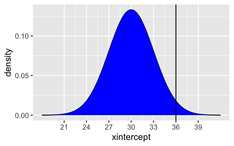
Comparing mean estimates (part 1)
results <- read.csv("https://www.macalester.edu/~ajohns24/data/election_simulation.csv") names(results) <- c("time", "sample_mean", "sample_intercept", "sample_slope")These are roughly Normal (bell-shaped) centered around 65 and ranging from roughly 51 to 75.
ggplot(results, aes(x = sample_mean)) +
  geom_density()
.
results %>% summarize(mean(sample_mean), sd(sample_mean)) ## mean(sample_mean) sd(sample_mean) ## 1 64.61347 5.470135Will vary.
The actual mean is close to the center of the sample mean estimates.
elections %>% summarize(mean(per_gop_2020)) ## mean(per_gop_2020) ## 1 64.99124
- Comparing mean estimates (part 1)
Will vary depending upon your sample mean estimate.
- Comparing model estimates
These look Normal-ish.
ggplot(results, aes(x = sample_intercept)) + geom_density()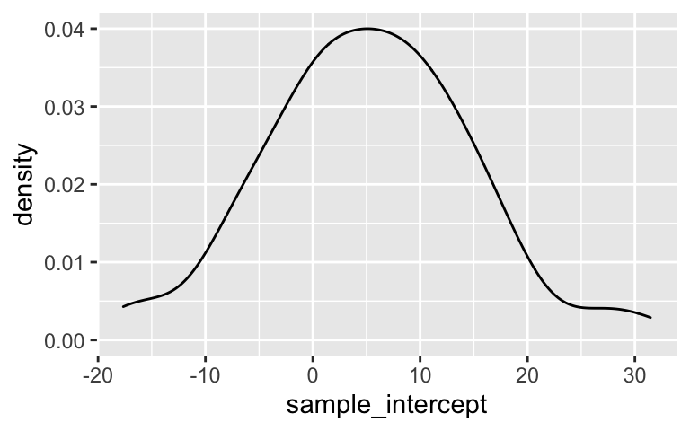
ggplot(results, aes(x = sample_slope)) + geom_density()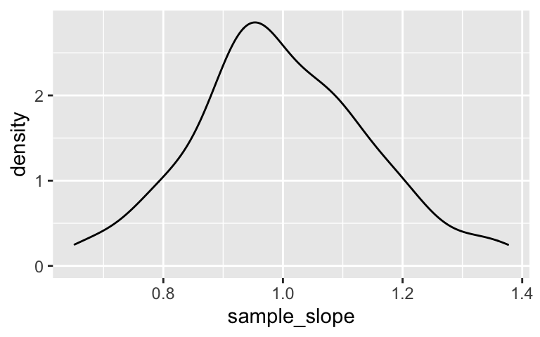
The actual trend is in the “middle” of the sample trends.
ggplot(elections, aes(x = per_gop_2012, y = per_gop_2020)) +
  geom_abline(data = results, aes(intercept = sample_intercept, slope = sample_slope), color = "gray") +
  geom_smooth(method = "lm", color = "red", se = FALSE)
Will vary.
actual_trend <- lm(per_gop_2020 ~ per_gop_2012, elections) coef(summary(actual_trend)) ## Estimate Std. Error t value Pr(>|t|) ## (Intercept) 5.179393 0.486313057 10.65033 4.860116e-26 ## per_gop_2012 1.000235 0.007896805 126.66328 0.000000e+00
- Reflection
Optional but encouraged data drill
# What was Trump's lowest vote percentage? elections %>% summarize(min(per_gop_2020)) ## min(per_gop_2020) ## 1 5.397321 # The highest? elections %>% summarize(max(per_gop_2020)) ## max(per_gop_2020) ## 1 96.18182 # Show the state_name, county_name, and per_gop_2020 of the 6 counties where Trump had the lowest support elections %>% arrange(per_gop_2020) %>% select(state_name, county_name, per_gop_2020) %>% head() ## state_name county_name per_gop_2020 ## 1 District of Columbia District of Columbia 5.397321 ## 2 Maryland Prince George's County 8.730037 ## 3 Maryland Baltimore city 10.685544 ## 4 Virginia Petersburg city 11.219720 ## 5 New York New York County 12.258528 ## 6 California San Francisco County 12.722062 # Show the state_name, county_name, and per_gop_2020 of the 6 counties where Trump had the highest support elections %>% arrange(desc(per_gop_2020)) %>% select(state_name, county_name, per_gop_2020) %>% head() ## state_name county_name per_gop_2020 ## 1 Texas Roberts County 96.18182 ## 2 Texas Borden County 95.43269 ## 3 Texas King County 94.96855 ## 4 Montana Garfield County 93.97294 ## 5 Texas Glasscock County 93.56815 ## 6 Nebraska Grant County 93.28358 # What was Trump's lowest vote percentage in Minnesota? In what county was this? elections %>% filter(state_name == "Minnesota") %>% arrange(per_gop_2020) %>% select(state_name, county_name, per_gop_2020) %>% head(1) ## state_name county_name per_gop_2020 ## 1 Minnesota Ramsey County 26.14257 # The highest? elections %>% filter(state_name == "Minnesota") %>% arrange(desc(per_gop_2020)) %>% select(state_name, county_name, per_gop_2020) %>% head(1) ## state_name county_name per_gop_2020 ## 1 Minnesota Morrison County 75.77973 # Construct and comment on a plot of voter turnout # in 2020 (total_votes_2020) vs 2016 (total_votes_2016) # For reference, add on a geom_abline(intercept = 0, slope = 1) ggplot(elections, aes(x = total_votes_2016, y = total_votes_2020)) + geom_point() + geom_abline(intercept = 0, slope = 1)
OPTIONAL MAPS
library(socviz)
mapping_data <- elections %>%
  dplyr::rename(id = county_fips) %>%
  mutate(id = as.character(id)) %>%
  mutate(id = ifelse(nchar(id) == 4, paste0("0",id), id)) %>%
  left_join(county_map, elections, by = "id")
ggplot(mapping_data, aes(x = long, y = lat, fill = per_gop_2020, group = group)) +
  coord_equal() +
  geom_polygon(color = NA)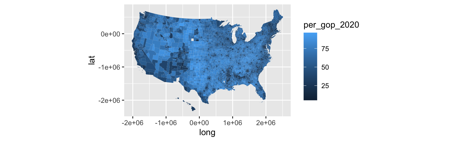
ggplot(mapping_data, aes(x = long, y = lat, fill = per_gop_2020, group = group)) +
  coord_equal() +
  geom_polygon(color = NA) +
  scale_fill_gradientn(colours = c("blue", "purple", "red"))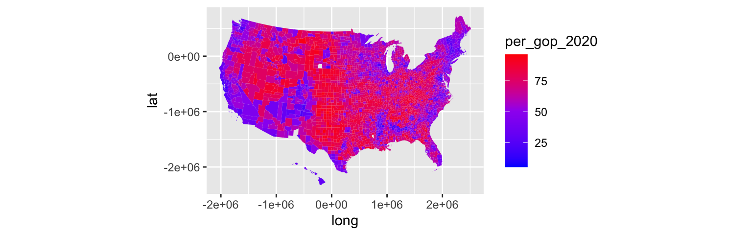
mn <- mapping_data %>%
  filter(state_name == "Minnesota")
ggplot(mn, aes(x = long, y = lat, fill = per_gop_2020, group = group)) +
  coord_equal() +
  geom_polygon(color = NA) +
  scale_fill_gradientn(colours = c("blue", "purple", "red"), values = scales::rescale(seq(0, 100, by = 10)))