18 A first hierarchical model
BIGGER PICTURE
Hierarchical models are a powerful tool for analyzing grouped data. Where does this fit within the broader modeling landscape?
Hierarchical models are sometimes referred to as multilevel, mixed effects, or random effects models. However, these terms mean different things to different people. To avoid confusion, we’ll simply stick with “hierarchical models.”
In grouped data, the rows of a data set are correlated within different groups. This isn’t the only type of correlated data. Rows might also be correlated over time or space (eg: each row represents a different day or location). Take STAT 452 to learn more!
GOALS
- Build our first hierarchical Bayesian model of \(Y\) (one without any predictors \(X\)).
- Implement the hierarchical model in R.
- Explore shrinkage and the bias-variance trade-off.
RECOMMENDED READING
Bayes Rules! Chapter 16.
18.1 Warm-up
Let \(Y\) be the popularity of a song on Spotify. Then we want to explore:
- the typical song popularity
- how popularity varies from song to song within artist
- how popularity varies from artist to artist
To this end, we’ll use data grouped by artist:
# Load packages
library(bayesrules)
library(tidyverse)
library(rstanarm)
library(broom.mixed)
library(tidybayes)
library(forcats)
library(bayesplot)

# Load & reorder artist levels
data(spotify)
spotify <- spotify %>%
  select(artist, title, popularity) %>%
  mutate(artist = fct_reorder(artist, popularity, .fun = 'mean'))

# Check out the data
head(spotify, 3)
## # A tibble: 3 x 3
##   artist title        popularity
##   <fct>  <chr>             <dbl>
## 1 Alok   On & On              79
## 2 Alok   All The Lies         56
## 3 Alok   Hear Me Now          75

# Number of songs
nrow(spotify)
## [1] 350

# Number of artists
spotify %>%
  summarize(nlevels(artist))
## # A tibble: 1 x 1
##   `nlevels(artist)`
##               <int>
## 1                44

# Calculate the mean popularity & number of songs for each artist
artist_means <- spotify %>%
  group_by(artist) %>%
  summarize(count = n(), popularity = mean(popularity))

# Check out the 2 most & 2 least popular
artist_means %>%
  slice(1:2, 43:44)
## # A tibble: 4 x 3
##   artist        count popularity
##   <fct>         <int>      <dbl>
## 1 Mia X             4       13.2
## 2 Chris Goldarg    10       16.4
## 3 Lil Skies         3       79.3
## 4 Camilo            9       81
Let \(Y_{ij}\) denote the popularity of the \(i\)th song for artist \(j\). Recall the complete pooled and no pooled models of \(Y_{ij}\).
Complete pooled model
\[\begin{array}{ll} \text{Layer 1:} & \text{variability from song to song within the population (ignoring artist)} \\ & Y_{ij} | \mu, \sigma \stackrel{ind}{\sim} N(\mu, \sigma^2) \\ & \\ \text{Layer 2:} & \text{priors on global parameters} \\ & \mu \sim N(m, s^2) \\ & \sigma \sim \text{Exp}(l) \\ \end{array}\]
where
- \(\mu\) = global mean song popularity (across all songs and artists)
- \(\sigma\) = global standard deviation in song popularity (across all songs and artists)
No pooled model
For artist \(j\) alone:
\[\begin{array}{ll} \text{Layer 1:} & \text{variability from song to song within artist j} \\ & Y_{ij} | \mu_j, \sigma \stackrel{ind}{\sim} N(\mu_j, \sigma^2) \\ & \\ \text{Layer 2:} & \text{priors on artist-specific parameters} \\ & \mu_j \sim N(m, s^2) \\ & \sigma \sim \text{Exp}(l) \\ \end{array}\]
where
- \(\mu_j\) = mean song popularity for artist \(j\)
- \(\sigma\) = standard deviation in song popularity within artist \(j\)
WARM-UP: A HIERARCHICAL MODEL
Our hierarchical model, a balance between the complete and no pooled models, has 3 layers:
\[\begin{array}{rll} Y_{ij} | \mu_j, \sigma_y & \sim N(\mu_j, \sigma_y^2) & \text{Layer 1} \\ \mu_j | \mu, \sigma_\mu & \stackrel{ind}{\sim} N(\mu, \sigma_\mu^2) & \text{Layer 2}\\ \mu & \sim N(m, s^2) & \text{Layer 3} \\ \sigma_y & \sim \text{Exp}(l_y) & \\ \sigma_\mu & \sim \text{Exp}(l_{\mu}) & \\ \end{array}\]
Interpret each layer as well as the model parameters (\(\mu_j, \sigma_y, \mu, \sigma_\mu\)). The following images might be handy.


Our first hierarchical model: “One-way Analysis of Variance (ANOVA)”
Suppose we have multiple data points on each of multiple groups. For each group \(j\), let \(Y_{ij}\) denote the \(i\)th observation. Then the one-way ANOVA model of \(Y_{ij}\) is:
\[\begin{array}{rll} Y_{ij} | \mu_j, \sigma_y & \sim N(\mu_j, \sigma_y^2) & \text{model of individual observations within group $j$} \\ \mu_j | \mu, \sigma_\mu & \stackrel{ind}{\sim} N(\mu, \sigma_\mu^2) & \text{model of how parameters vary between groups}\\ \mu & \sim N(m, s^2) & \text{prior models on global parameters} \\ \sigma_y & \sim \text{Exp}(l_y) & \\ \sigma_\mu & \sim \text{Exp}(l_{\mu}) & \\ \end{array}\]
The 3 layers here address the smallest to the biggest units: individual observations, groups, and the broader population. It depends upon group-specific parameters:
- \(\mu_j\) is the typical \(Y\) value in group \(j\)
and global parameters:
- \(\mu\) is the mean of the group means \(\mu_j\), i.e. the typical \(Y\) value for the typical group
- \(\sigma_{\mu}\) is the standard deviation in means \(\mu_j\) from group to group, i.e. a measure of between-group variability
- \(\sigma_y\) is the standard deviation in \(Y\) within each group, i.e. a measure of within-group variability
18.2 Exercises
Goals
- Don’t be a no pooled table. You get much less out of an activity if you go through the exercises alone and don’t discuss them with your group. That’s why we sit in a group formation! Today, be sure to discuss each exercise with your group. Before asking the instructor a question, first discuss with your group.
- To get a sense for how hierarchical modeling results compare to complete and no pooled modeling results, we’ll focus on their posterior predictions. We’ll go into more detail about how to interpret the model and its parameters in the next activity.
18.2.1 The complete pooled model
- Check in with your group
How are you doing? What classes are you planning to take next semester?
Check out the data
We’ll start our analysis with the complete pooled model which assumes that, ignoring artist,popularityvaries normally from song to song:\[Y_{ij} | \mu, \sigma \sim N(\mu, \sigma^2)\]
Construct a plot using the
spotifydata that allows you to assess whether this assumption is reasonable.
Simulate the complete pooled posterior model
Combining weakly informative priors with thespotifydata, simulate the complete pooled posterior model. Interpret the posterior median estimate of the(Intercept)parameter (\(\mu\)).# Simulate the posterior complete pooled model # popularity ~ 1 indicates we're modeling Y without predictors complete_pooled <- stan_glm( popularity ~ 1, data = spotify, family = gaussian, chains = 4, iter = 5000*2, seed = 84735, refresh = 0) # Summary tidy(complete_pooled, effects = c("fixed", "aux"), conf.int = TRUE, conf.level = 0.8)
- Complete pooled posterior predictions: intuition
Consider three different artists:- Mia X has the lowest mean popularity in our sample (13).
- Beyoncé has nearly the highest mean popularity in our sample (70).
- Macalester Beats is a musical group that we didn’t observe in our sample.
- Complete pooled posterior predictions: implementation
Let’s check your intuition.Simulate and plot the posterior predictive models for Macalester Beats and Beyoncé. Was your intuition right?
# Simulate the posterior predictive models
set.seed(84735)
complete_predictions <- posterior_predict(
  complete_pooled,
  newdata = data.frame(artist = c("Macalester Beats", "Beyoncé")))

# Plot the posterior predictive models
mcmc_areas(complete_predictions, prob = 0.8) +
  xlab("popularity") +
  ggplot2::scale_y_discrete(labels = c("Mac Beats", "Beyoncé"))
Use the code below to:
- simulate the posterior predictive models for each artist in our sample; and
- plot summaries of these predictive models along with the observed mean popularity levels.
Describe the behavior of these predictions and why they’re a bummer.
# Simulate posterior predictive model of song popularity for each artist
set.seed(84735)
predictions_complete <-  posterior_predict(
  complete_pooled, newdata = artist_means)

# Plot posterior prediction intervals for each artist
ppc_intervals(artist_means$popularity, yrep = predictions_complete,
              prob_outer = 0.80) +
  ggplot2::scale_x_continuous(
    labels = artist_means$artist,
    breaks = 1:nrow(artist_means)) +
    xaxis_text(angle = 90, hjust = 1)
18.2.2 The no pooled model
Check out the data again
Next, consider the no pooled model which assumes that, within eachartist,popularityvaries normally from song to song:\[Y_{ij} | \mu_j, \sigma \sim N(\mu_j, \sigma^2)\]
Construct a plot using the
spotifydata that allows you to assess whether this assumption is reasonable. NOTE: Keep in mind that some artists have very few songs, thus this assumption is difficult to assess.
Simulate the no pooled posterior model
Technically, the no pooled model would simulate a separate posterior model for each of the 44 artists. This would take too long. Instead, simulate the single “no pooled” model which gives us a sense of how these 44 models would behave. Interpret the posterior median estimate of theartistMia Xparameter (\(\mu_1\)). NOTE: The- 1in the formula removes the comparison to a reference artist.Optional detail: This model allows each artist to have a unique mean popularity level, but pools the data on artists to approximate the standard deviation within each artist.
# Simulate the posterior no pooled model
no_pooled <- stan_glm(
  popularity ~ artist - 1, data = spotify,
  family = gaussian,
  chains = 4, iter = 5000*2, seed = 84735, refresh = 0)

# Summary
tidy(no_pooled, effects = c("fixed", "aux"),
     conf.int = TRUE, conf.level = 0.8)
- No pooled posterior predictions: intuition
Consider three different artists:- Mia X has the lowest mean popularity in our sample (13).
- Beyoncé has nearly the highest mean popularity in our sample (70).
- Macalester Beats is a musical group that we didn’t observe in our sample.
- No pooled posterior predictions: implementation
Let’s check your intuition.When we try to simulate the posterior predictive model for Macalester Beats, why do we get an error and why is this a bummer?
set.seed(84735)
mac_no <- posterior_predict(
  no_pooled,
  newdata = data.frame(artist = "Macalester Beats"))
mcmc_areas(mac_no, prob = 0.8) +
  xlab("popularity")
Next, use the code below to simulate and plot the posterior predictive models for each artist in our sample, along with the observed mean popularity levels. Describe the behavior of these predictions. We’ll see later why these are a bummer.
# Simulate posterior predictive model of song popularity for each artist
set.seed(84735)
predictions_no <-  posterior_predict(
  no_pooled, newdata = artist_means)

# Plot posterior prediction intervals for each artist
ppc_intervals(artist_means$popularity, yrep = predictions_no,
              prob_outer = 0.80) +
  ggplot2::scale_x_continuous(
    labels = artist_means$artist,
    breaks = 1:nrow(artist_means)) +
    xaxis_text(angle = 90, hjust = 1)
18.2.3 The hierarchical model
Get to know the data some more
Next, consider the hierarchical model which, in addition to assuming thatpopularityvaries normally from song to song within each artist:\[Y_{ij} | \mu_j, \sigma_y \sim N(\mu_j, \sigma_y^2)\]
assumes that the mean popularity level varies normally from artist to artist, i.e. between artists:\[\mu_j | \mu, \sigma_\mu \sim N(\mu, \sigma_\mu^2)\]
Recall that the
artist_meansdata includes the sample mean popularity level for each artist. Use this data to assess whether this second assumption is reasonable. (We already checked the first assumption for the no pooled model.)head(artist_means) ## # A tibble: 6 x 3 ## artist count popularity ## <fct> <int> <dbl> ## 1 Mia X 4 13.2 ## 2 Chris Goldarg 10 16.4 ## 3 Soul&Roll 5 24.2 ## 4 Honeywagon 3 31.7 ## 5 Röyksopp 4 33.2 ## 6 Freestyle 3 33.7
Simulate the hierarchical model
Combining weakly informative priors with thespotifydata, simulate the hierarchical posterior model using a new function,stan_glmer(), with the following formula:popularity ~ (1 | artist). This syntax indicates that we’re modeling song popularity \(Y_{ij}\) without any predictors, whereartistis a grouping variable, i.e. our data points are grouped by artist.# Simulate the posterior hierarchical model hierarchical_model <- stan_glmer( popularity ~ (1 | artist), data = spotify, family = gaussian, chains = 4, iter = 5000*2, seed = 84735, refresh = 0)
- Hierarchical posterior predictions: intuition
Multiple choice: How do you think the hierarchical posterior predictive models of song popularity will compare to those from the complete pooled and no pooled models:- they’ll be the same as the complete pooled predictions
- they’ll be the same as the no pooled predictions
- they’ll be somewhere in between the complete pooled and no pooled predictions
Hierarchical posterior predictions: implementation part 1
Let’s check your intuition. First, simulate and plot the posterior predictive model for Macalester Beats and Beyoncé.- It wasn’t possible to make a prediction for Macalester Beats with the no pooled model. Is it possible with the hierarchical model?
- The complete pooled model gave the same posterior predictions for Mac Beats and Beyoncé. How do the hierarchical posterior predictions compare for these 2 artists? Are they centered around the same value? Are they similarly variable? Why does this all make sense?
set.seed(84735) two_predictions <- posterior_predict( hierarchical_model, newdata = data.frame(artist = c("Macalester Beats", "Beyoncé"))) mcmc_areas(two_predictions, prob = 0.8) + xlab("popularity") + ggplot2::scale_y_discrete(labels = c("Mac Beats", "Beyoncé"))
Hierarchical posterior predictions: implementation part 2 Next, simulate and plot the posterior predictive models for each artist in our sample. The dashed horizontal line at 58.4 represents the posterior median prediction from the complete pooled model. Describe how these predictions compare to those from the complete and no pooled models.
# Simulate posterior predictive model of song popularity for each artist set.seed(84735) predictions_hierarchical <- posterior_predict( hierarchical_model, newdata = artist_means) # Plot posterior prediction intervals for each artist ppc_intervals( artist_means$popularity, yrep = predictions_hierarchical, prob_outer = 0.80) + geom_hline(yintercept = 58.4, linetype = "dashed") + ggplot2::scale_x_continuous( labels = artist_means$artist, breaks = 1:nrow(artist_means)) + xaxis_text(angle = 90, hjust = 1)
- Shrinkage
The pattern in the plot above is called shrinkage. In a hierarchical model, posterior predictions are shrunk away from the observed local group trends and toward the global trend. Let’s unpack this.- For which artists are the posterior predictions shrunk the most toward the global mean: those with typical popularity levels or those with more extreme popularity levels?
- Toward the higher end of the popularity scale, check out the posterior prediction models for Frank Ocean and Sean Kingston. Though Ocean had the lower sample mean popularity, Kingston’s posterior median is shrunk more toward the global mean, hence lower than Ocean’s. Why do you think this happened? Support your answer with some numerical evidence.
- Why is shrinkage a good thing?
- You noticed above that shrinkage is greater for groups with fewer data points. In general, why is this a good thing?
- You noticed above that shrinkage is greater for groups at the extremes. In general, why is this a good thing?
Optional: To convince yourself this is a good thing, you might also consider a famous example in which baseball players’ batting averages were predicted using data on just their first 45 at bats of a season (which is relatively little data). This plot exhibits the the “Observed” averages in the first 45 at bats vs the hierarchical “Estimated” batting averages for the remainder of the season. This article provides more detail.
- OPTIONAL: Bias-variance trade-off
Hierarchical models also strike a balance in the bias-variance trade-off. Check your intuition.- Suppose different researchers were to conduct their own Spotify analyses using different samples of artists and songs. Which approach would be the most variable from sample to sample: complete pooled, no pooled, or hierarchical? The least variable?
- Which approach would tend to be the most biased in estimating artists’ mean popularity levels? That is, which model’s posterior mean estimates will tend to be the furthest from the observed means? Which would tend to be the least biased?
- Suppose different researchers were to conduct their own Spotify analyses using different samples of artists and songs. Which approach would be the most variable from sample to sample: complete pooled, no pooled, or hierarchical? The least variable?
18.3 Solutions
- Check in
Check out the data
Looks pretty reasonable (though the data’s a bit left skewed).ggplot(spotify, aes(x = popularity)) + geom_density()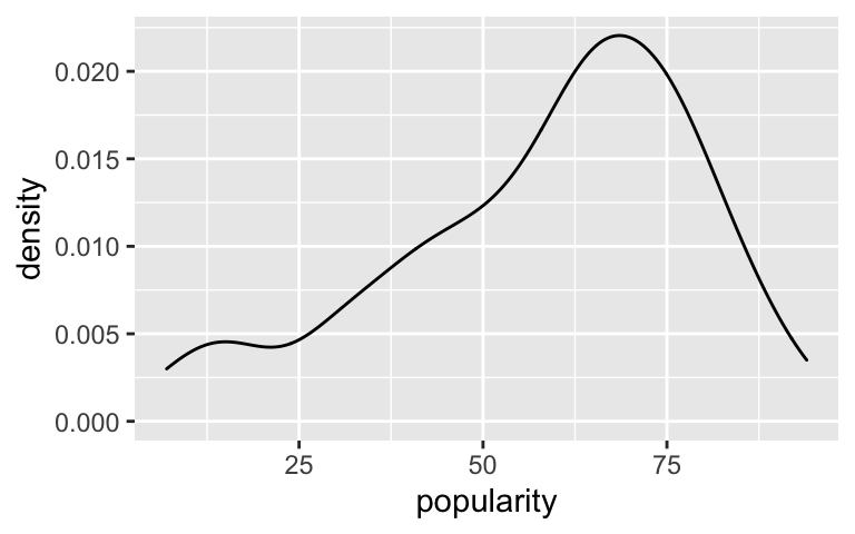
Simulate the complete pooled posterior model
The average popularity of all songs on Spotify is near 58.4.# Simulate the posterior complete pooled model complete_pooled <- stan_glm( popularity ~ 1, data = spotify, family = gaussian, chains = 4, iter = 5000*2, seed = 84735, refresh = 0) # Summary tidy(complete_pooled, effects = c("fixed", "aux"), conf.int = TRUE, conf.level = 0.8) ## # A tibble: 3 x 5 ## term estimate std.error conf.low conf.high ## <chr> <dbl> <dbl> <dbl> <dbl> ## 1 (Intercept) 58.4 1.11 57.0 59.8 ## 2 sigma 20.7 0.781 19.7 21.7 ## 3 mean_PPD 58.4 1.56 56.4 60.4
- Complete pooled posterior predictions: intuition
Answers will vary.
Complete pooled posterior predictions: implementation
- Our best guess is that the popularity will be around 58.4, but we’re not very sure.
- The posterior predictive models are the same for each artist, thus entirely ignore the fact that some artists are more popular than others (bummer).
set.seed(84735) complete_predictions <- posterior_predict( complete_pooled, newdata = data.frame(artist = c("Macalester Beats", "Beyoncé"))) mcmc_areas(complete_predictions, prob = 0.8) + xlab("popularity") + ggplot2::scale_y_discrete(labels = c("Mac Beats", "Beyoncé"))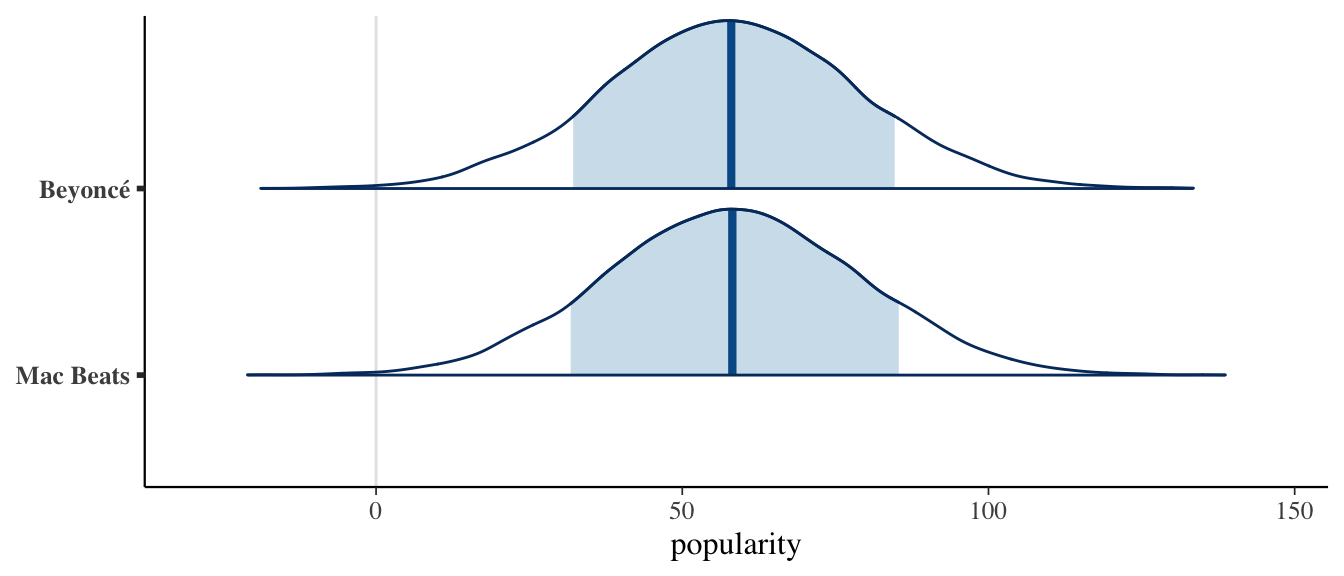
# Simulate posterior predictive model of song popularity for each artist set.seed(84735) predictions_complete <- posterior_predict( complete_pooled, newdata = artist_means) # Plot posterior prediction intervals for each artist ppc_intervals(artist_means$popularity, yrep = predictions_complete, prob_outer = 0.80) + ggplot2::scale_x_continuous( labels = artist_means$artist, breaks = 1:nrow(artist_means)) + xaxis_text(angle = 90, hjust = 1)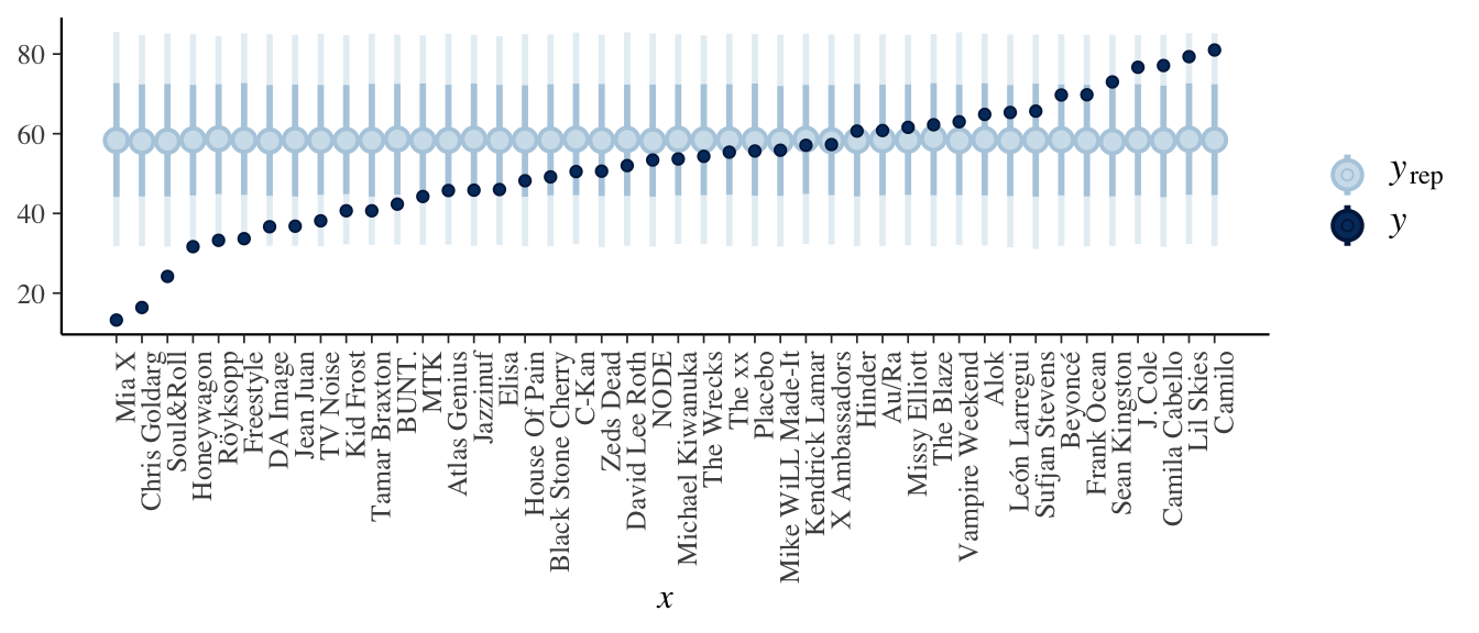
- Our best guess is that the popularity will be around 58.4, but we’re not very sure.
Check out the data again
Seems reasonable – though some plots aren’t very normal / symmetric, these might be based on very few songs.ggplot(spotify, aes(x = popularity, group = artist)) + geom_density()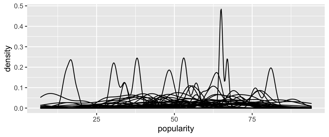
Simulate the no pooled posterior model
Mia X’s typical song popularity is around 13.3.# Simulate the posterior no pooled model no_pooled <- stan_glm( popularity ~ artist - 1, data = spotify, family = gaussian, chains = 4, iter = 5000*2, seed = 84735, refresh = 0) # Summary tidy(no_pooled, effects = c("fixed", "aux"), conf.int = TRUE, conf.level = 0.8) ## # A tibble: 46 x 5 ## term estimate std.error conf.low conf.high ## <chr> <dbl> <dbl> <dbl> <dbl> ## 1 artistMia X 13.3 7.01 4.39 22.2 ## 2 artistChris Goldarg 16.4 4.35 10.8 22.0 ## 3 artistSoul&Roll 24.2 6.35 16.1 32.3 ## 4 artistHoneywagon 31.7 8.03 21.3 42.0 ## 5 artistRöyksopp 33.3 6.89 24.4 42.2 ## 6 artistFreestyle 33.7 8.00 23.3 44.0 ## 7 artistDA Image 36.7 8.08 26.3 47.1 ## 8 artistJean Juan 36.8 6.42 28.8 45.0 ## 9 artistTV Noise 38.1 3.75 33.3 42.9 ## 10 artistKid Frost 40.7 8.05 30.3 50.9 ## # … with 36 more rows
- No pooled posterior predictions: intuition
Will vary.
- No pooled posterior predictions: implementation
The no pooled model can’t be used to study or make predictions for any artist outside our sample. This is a bummer because we don’t necessarily care about these particular artists, but the broader population of artists.
Each artist’s posterior predictive model is centered around their observed mean popularity level.
# Simulate posterior predictive model of song popularity for each artist set.seed(84735) predictions_no <- posterior_predict( no_pooled, newdata = artist_means) # Plot posterior prediction intervals for each artist ppc_intervals(artist_means$popularity, yrep = predictions_no, prob_outer = 0.80) + ggplot2::scale_x_continuous( labels = artist_means$artist, breaks = 1:nrow(artist_means)) + xaxis_text(angle = 90, hjust = 1)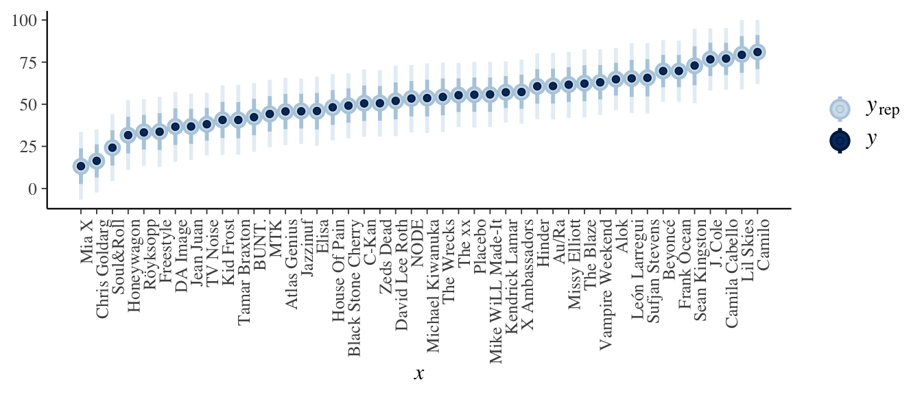
Get to know the data some more
Pretty reasonable.ggplot(artist_means, aes(x = popularity)) + geom_density()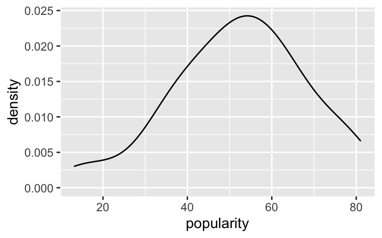
Simulate the hierarchical model
# Simulate the posterior hierarchical model
hierarchical_model <- stan_glmer(
  popularity ~ (1 | artist), data = spotify,
  family = gaussian,
  chains = 4, iter = 5000*2, seed = 84735, refresh = 0)
- Hierarchical posterior predictions: intuition
will vary
Hierarchical posterior predictions: implementation part 1
The posterior predictions differ for these 2 artists. As one of the most popular artists in our sample, the posterior predictive model is higher for Beyoncé. Further, since we didn’t observe any data on Macalester Beats, the posterior predictive model is more variable / less certain.set.seed(84735) two_predictions <- posterior_predict( hierarchical_model, newdata = data.frame(artist = c("Macalester Beats", "Beyoncé"))) mcmc_areas(two_predictions, prob = 0.8) + xlab("popularity") + ggplot2::scale_y_discrete(labels = c("Mac Beats", "Beyoncé"))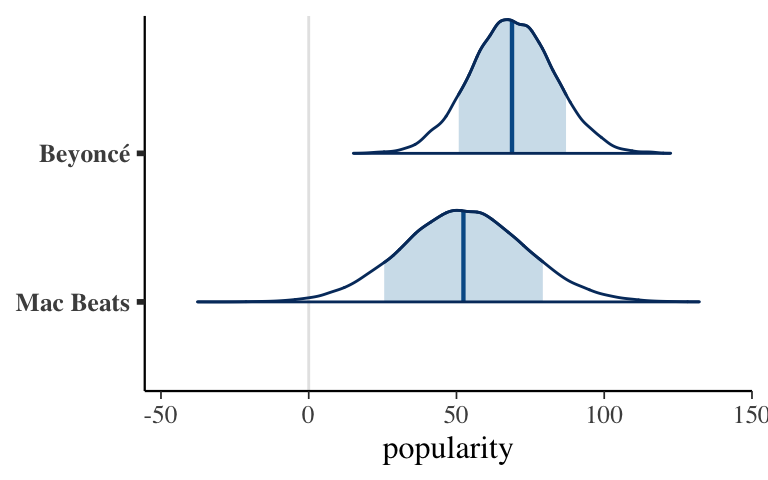
Hierarchical posterior predictions: implementation part 2
The hierarchical predictive models are centered somewhere between the complete pooled models (centered at 58.4) and no pooled models (centered at the observed sample means).# Simulate posterior predictive model of song popularity for each artist set.seed(84735) predictions_hierarchical <- posterior_predict( hierarchical_model, newdata = artist_means) # Plot posterior prediction intervals for each artist ppc_intervals(artist_means$popularity, yrep = predictions_hierarchical, prob_outer = 0.80) + geom_hline(yintercept = 58.4, linetype = "dashed") + ggplot2::scale_x_continuous( labels = artist_means$artist, breaks = 1:nrow(artist_means)) + xaxis_text(angle = 90, hjust = 1)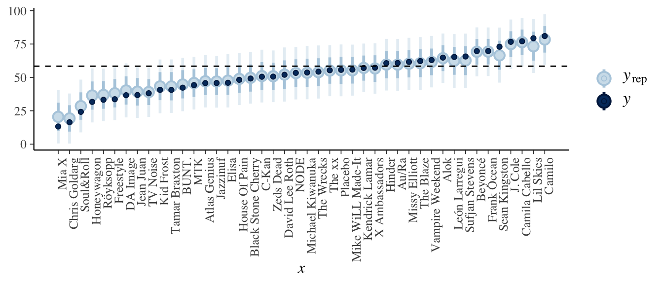
- Shrinkage
Those with more extreme popularity levels. The hierarchical predictions for these artists draw strength and information from the other data, thus are drawn closer to the global center.
Kingston has a much smaller sample size (2 songs), thus we’ll take the data on other artists into greater account than we did for Ocean (40 songs).
artist_means %>%
  filter(artist %in% c("Sean Kingston", "Frank Ocean"))
## # A tibble: 2 x 3
##   artist        count popularity
##   <fct>         <int>      <dbl>
## 1 Frank Ocean      40       69.8
## 2 Sean Kingston     2       73
- Why is shrinkage a good thing?
- It allows us to learn from other artists when trying to understand another artist for whom we have little data.
- If observations are very extreme (hence possibly just due to randomness), our understanding of the extremes will be modified by the more typical groups.
- OPTIONAL: Bias-variance trade-off
- most variable: no pooled. least variable: complete pooled
- most biased: complete pooled. least biased: no pooled
- most variable: no pooled. least variable: complete pooled