20 Hierarchial regression
GOALS
To model \(Y\) by some predictors \(X\) when our data is grouped, we can combine two modeling paradigms:
- (un-hierarchical) Bayesian Normal regression models of \(Y\) vs \(X\)
- hierarchical models of \(Y\) (without any predictors \(X\))
NOTE: We can similarly build hierarchical versions of the Poisson, Negative Binomial, and logistic regression models. The ideas are the same.
RECOMMENDED READING
- Chapter 17: hierarchical Normal regression
- Chapter 18: hierarchical Poisson, Negative Binomial, and logistic regression
20.1 Warm-up
Suppose we’re interested in whether runners in their 50s and 60s tend to slow down with age. To this end, we’ll supplement weakly informative priors with data on the annual 10-mile “Cherry Blossom Race” in Washington, D.C.:
# Load packages
library(bayesrules)
library(tidyverse)
library(rstanarm)
library(broom.mixed)
library(tidybayes)
library(bayesplot)

# Load & simplify the data
data(cherry_blossom_sample)
running <- cherry_blossom_sample %>%
  select(runner, age, net) %>%
  na.omit()

# There are 185 different race outcomes
dim(running)
## [1] 185   3

# These are observed on 36 runners
head(running, 10)
## # A tibble: 10 x 3
##    runner   age   net
##    <fct>  <int> <dbl>
##  1 1         53  84.0
##  2 1         54  74.3
##  3 1         55  75.2
##  4 1         56  74.2
##  5 1         57  74.2
##  6 2         52  82.7
##  7 2         53  80.0
##  8 2         54  88.1
##  9 2         55  80.9
## 10 2         56  88.1
running %>%
  summarize(nlevels(runner))
## # A tibble: 1 x 1
##   `nlevels(runner)`
##               <int>
## 1                36
Given this group structured data, consider the following notation:
\[\begin{split} Y_{ij} & = \text{ith observation of Y for group j} \\ & \;\;\;\;\; \text{i.e. the net running time for runner j in their ith race} \\ X_{ij} & = \text{ith observation of X for group j} \\ & \;\;\;\;\; \text{i.e. the age of runner j in their ith race} \\ \end{split}\]
A COMPLETE POOLED MODEL
Suppose we incorrectly ignore the grouping structure:
\[\begin{split} Y_{ij} | \beta_0, \beta_1, \sigma & \stackrel{ind}{\sim} N(\mu_{ij}, \sigma^2) \;\; \text{ where } \mu_{ij} = \beta_0 + \beta_1 X_{ij} \\ \beta_{0c} & \sim N(m_0, s_0^2) \\ \beta_1 & \sim N(m_1, s_1^2) \\ \sigma & \sim \text{Exp}(l) \\ \end{split}\]
Then we’re unable to detect a relationship between running time and age:
# Simulate the posterior
complete_model <- stan_glm(
  net ~ age, data = running,
  family = gaussian,
  prior_PD = FALSE,
  chains = 4, iter = 5000*2, seed = 84735, refresh = 0)

# Plot 200 posterior plausible model lines
running %>%
  add_fitted_draws(complete_model, n = 200) %>%
  ggplot(aes(x = age, y = net)) +
    geom_line(aes(y = .value, group = .draw), alpha = 0.15) +
    geom_point(data = running)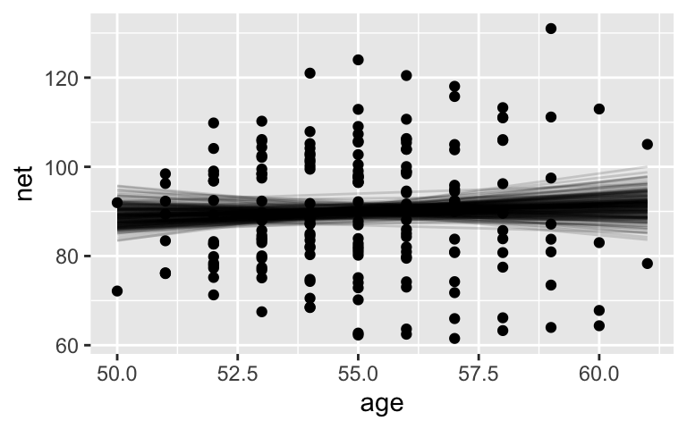
# Posterior summary statistics
tidy(complete_model, conf.int = TRUE, conf.level = 0.95)
## # A tibble: 2 x 5
##   term        estimate std.error conf.low conf.high
##   <chr>          <dbl>     <dbl>    <dbl>     <dbl>
## 1 (Intercept)   75.1      24.4     27.1      124.
## 2 age            0.269     0.444   -0.629      1.15
A HIERARHICAL “RANDOM INTERCEPTS” MODEL
Instead, consider a hierarchical random intercepts model, the spirit of which is captured by this plot:
ggplot(running, aes(x = age, y = net, group = runner)) +
    geom_line(aes(y = c(predict(lm(net ~ age + runner, running)))))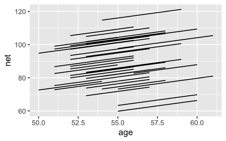
This model will:
- acknowledge the grouped structure of the data (i.e. observations within the same runner are correlated)
- allow each runner to have a unique intercept
- assume that each runners’ speeds change at the same rate over time (i.e. that they have the same slope)
Here’s the model:
\[\begin{split} \text{Relationship within runners:} & \\ Y_{ij} | \beta_{0j}, \beta_1, \sigma_y & \sim N(\mu_{ij}, \sigma_y^2) \;\; \text{ where } \mu_{ij} = \beta_{0j} + \beta_1 X_{ij} \\ & \\ \text{Variability between runners:} & \\ \beta_{0j} & \stackrel{ind}{\sim} N(\beta_0, \sigma_0^2) \\ & \\ \text{Prior information about running vs age:} & \\ \beta_{0c} & \sim N(m_0, s_0^2) \\ \beta_1 & \sim N(m_1, s_1^2) \\ \sigma_y & \sim \text{Exp}(l_y) \\ \sigma_0 & \sim \text{Exp}(l_0) \\ \end{split}\]
where
- \(\beta_{0j}\) = intercept for runner \(j\) (i.e. their baseline speed)
- \(\beta_0\) = global average intercept (i.e. the average runner’s baseline speed)
- \(\beta_1\) = global slope (i.e. typical change in running time per year for all runners)
- \(\sigma_y\) = variability from the regression line within each runner (hence a measure of the strength in the relationship between running speed and age within runner)
- \(\sigma_0\) = variability in intercepts between runners (i.e. the extent to which baseline speeds vary from runner to runner)
WARM-UP EXERCISE 1
We can relax the assumption that the change in speed per year is the same for all runners. To this end, adjust the notation above to define a hierarchical random intercepts and slopes model.
ggplot(running, aes(x = age, y = net, group = runner)) +
    geom_smooth(method = "lm", se = FALSE)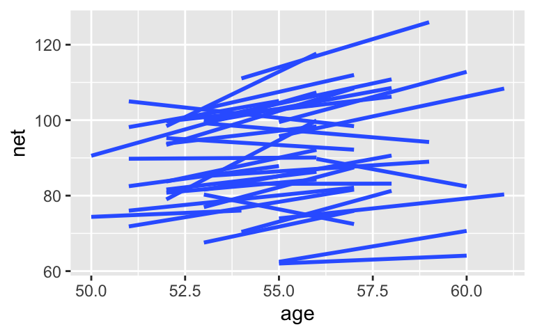
AN ASIDE
We could but won’t take this even further! We could alter the structure of our model to reflect the fact that race outcomes in subsequent years are likely more correlated than race outcomes that are multiple years apart. Take Correlated Data :)
WARM-UP EXERCISE 2
Grouped data can be powerful. However, not every categorical variable is a grouping variable. Rather, it might be a potential predictor. In general, let \(X\) be a categorical variable.
If the observed data on \(X\) covers all categories of interest, it’s likely not a grouping variable, but rather a potential predictor.
If the observed categories on \(X\) are merely a random sample from many of interest, it is a potential grouping variable.
Consider some examples.
In a model of
rides, is theweekendvariable a potential grouping variable or predictor?data(bikes) bikes %>% select(rides, weekend) %>% head(3) ## rides weekend ## 1 654 TRUE ## 2 1229 FALSE ## 3 1454 FALSE bikes %>% count(weekend) ## weekend n ## 1 FALSE 359 ## 2 TRUE 141In a model of students’ vocabulary scores (
score_a2), is theschool_idvariable a potential grouping variable or predictor?data(big_word_club) big_word_club <- big_word_club %>% select(score_a2, school_id) %>% na.omit() big_word_club %>% slice(1:2, 602:603) ## score_a2 school_id ## 1 28 1 ## 2 25 1 ## 3 31 47 ## 4 34 47
20.2 Exercises
20.2.1 Random intercepts model
We’ll start our analysis with the random intercepts model.
Prior simulation
Before incorporating any data, let’s explore what our weakly informative priors about the relationship between running time and age look like. SYNTAX NOTE: To simulate the prior, the formula isnet ~ age + (1 | runner). This reflects the fact that we’re modeling net time by age (net ~ age) and allowing for random intercepts by runner ((1 | runner)):# Simulate the prior model model_1_prior <- stan_glmer( net ~ age + (1 | runner), data = running, family = gaussian, chains = 4, iter = 5000*2, seed = 84735, prior_PD = TRUE) # Check out the prior specifications prior_summary(model_1_prior)Run this chunk a few times and discuss:
running %>%
  add_fitted_draws(model_1_prior, n = 4) %>%
  ggplot(aes(x = age, y = net)) +
    geom_line(aes(y = .value, group = paste(runner, .draw))) +
    facet_wrap(~ .draw)
Run this chunk a few times and discuss:
running %>%
  add_predicted_draws(model_1_prior, n = 100) %>%
  ggplot(aes(x = net)) +
    geom_density(aes(x = .prediction, group = .draw)) +
    xlim(-100,300)
- Posterior simulation
Next, simulate the posterior model and perform app_check()to confirm we’re on the right track! Name thismodel_1.
Global parameters: \(\beta_0\) and \(\beta_1\)
Our model tells us about both runners in and outside our sample. Let’s start with a posterior analysis of the relationship between running time and age for the typical runner, \(\beta_0 + \beta_1 X\).Plot and discuss 200 posterior plausible global model lines, \(\beta_0 + \beta_1 X\). SYNTAX NOTE:
re_formula = NAspecifies our interest in the global, not runner-specific, model.running %>% add_fitted_draws(model_1, n = 200, re_formula = NA) %>% ggplot(aes(x = age, y = net)) + geom_point(data = running, size = 0.5, alpha = 0.5) + geom_line(aes(y = .value, group = .draw), alpha = 0.2)Interpret the 80% posterior credible interval for \(\beta_1\).
tidy(model_1, effects = "fixed", conf.int = TRUE, conf.level = 0.80)Recall that the complete pooled model suggested that there’s no significant association between running time and age. Based on parts a and b, what conclusion do you make from the hierarchical model? NOTE: This result is a BIG DEAL. It provides concrete evidence that it’s a bad idea to ignore grouped data!
Comparing within vs between variability
As with our hierarchical Spotify model, we can decompose the total variability in race times across all runners and races into: (1) the variability explained by differences between runners (\(\sigma_0\)); and (2) the variability within each runner (\(\sigma_y\)):\[\text{Var}(Y_{ij}) = \sigma_0^2 + \sigma_y^2\]
For plots (a) and (b) below, identify whether \(\sigma_0 > \sigma_y\) or \(\sigma_0 < \sigma_y\).

Posterior summaries are provided below for \(\sigma_0\) (
sd_(Intercept).runner) and \(\sigma_y\) (sd_Observation.Residual). What accounts for more of the variability in race outcomes: differences between runners or fluctuations within runners? That is, are our data more like scenario (a) or (b) in the above plot? Support your answer by calculating and comparing the proportion of total variability accounted for by these 2 sources.
tidy(model_1, effects = "ran_pars")
- Runner-specific models
Next, consider some posterior conclusions about the runners in our sample.Interpret the posterior median estimates related to runners 4 and 5. NOTE: As with the Spotify analysis, these summaries regard tweaks or comparisons to the global intercept:
\[b_{0j} = \beta_{0j} - \beta_j\]tidy(model_1, effects = "ran_vals", conf.int = TRUE, conf.level = 0.8)Plot and discuss 100 posterior plausible regression lines \(\beta_{0j} + \beta_1 X\) for both runners 4 and 5. SYNTAX NOTE: Since we’re interested in runner-specific trends, we leave
re_formula = NAout ofadd_fitted_draws.
running %>%
filter(runner %in% c("4", "5")) %>%
add_fitted_draws(model_1, n = 100) %>%
ggplot(aes(x = age, y = net)) +
geom_line(
aes(y = .value, group = paste(runner, .draw), color = runner),
alpha = 0.1) +
geom_point(aes(color = runner))
Check out all the sample runners
It’s possible to examine the posterior models for all 36 runners, but the syntax is tedious. Focus on the ideas over the syntax here. First, calculate posterior summaries of the 36 runner-specific models:runner_summaries_1 <- model_1 %>% spread_draws(`(Intercept)`, b[,runner], `age`) %>% mutate(runner_intercept = `(Intercept)` + b) %>% select(-`(Intercept)`, -b) %>% median_qi(.width = 0.80) # Check out the posterior medians runner_summaries_1 %>% select(runner, runner_intercept, age) %>% head()Next, plot the posterior median model for each runner (gray) along with the observed relationships in the data. What in this plot reflects the shrinkage induced by our hierarchical model?
ggplot(running, aes(y = net, x = age, group = runner)) + geom_line(aes(y = c(predict(lm(net ~ age + runner, running))))) + geom_abline( data = runner_summaries_1, color = "gray", aes(intercept = runner_intercept, slope = age)) + lims(x = c(50, 61), y = c(50, 135))
20.2.2 Random intercepts and slopes model
Recall that our hierarchical random intercepts model assumes that the change in running speed over time is the same for each runner. In contrast, the random intercepts and slopes model allows both the intercepts and slopes to vary by runner:
\[\begin{split} Y_{ij} | \beta_{0j}, \beta_{1j}, \sigma_y & \sim N(\mu_{ij}, \sigma_y^2) \;\; \text{ where } \; \mu_{ij} = \beta_{0j} + \beta_{1j} X_{ij} \\ & \\ \beta_{0j} & \sim N(\beta_0, \sigma_0^2) \\ \beta_{1j} & \sim N(\beta_1, \sigma_1^2) \\ & \\ \beta_{0c} & \sim N(m_0, s_0^2) \\ \beta_1 & \sim N(m_1, s_1^2) \\ \sigma_y & \sim \text{Exp}(l_y) \\ \sigma_0, \sigma_1, ... & \sim \text{(something a bit complicated)}. \\ \end{split}\]
Some details of this model are eliminated for simplicity for now. Please see Sections 17.3.1 and 17.3.2 for details. Essentially, \(\beta_{0j}\) and \(\beta_{1j}\) are correlated, hence this correlation factor is an additional parameter to our model that requires a specialized prior.
Posterior simulation
Import the posterior simulation results for this random intercepts and slopes model:model_2 <- readRDS(url("https://www.macalester.edu/~ajohns24/data/stat454/running_model_2.rds"))Code is provided for running this simulation on your own. However, due to the model structure and data, this is too slow to run during class. SYNTAX NOTES:
- The formula is
net ~ age + (age | runner). This reflects the fact that we’re modeling net time by age (net ~ age) and allowing for both random intercepts and slopes by runner ((age | runner)).
- Notice the argument
adapt_delta = 0.99999. Simply put, this is a very technical tuning parameter for the underlying MCMC algorithm. This will make the simulation slooooow. However, leaving it out produces an unstable simulation with “divergent transitions.”
# Simulate the posterior model model_2 <- stan_glmer( net ~ age + (age | runner), data = running, family = gaussian, chains = 4, iter = 5000*2, seed = 84735, adapt_delta = 0.99999)- The formula is
Check out all the sample runners
Again focusing on the ideas over the syntax, calculate and plot posterior summaries of the 36 runner-specific models:runner_summaries_2 <- model_2 %>% spread_draws(`(Intercept)`, b[term, runner], `age`) %>% pivot_wider(names_from = term, names_glue = "b_{term}", values_from = b) %>% mutate(runner_intercept = `(Intercept)` + `b_(Intercept)`, runner_age = age + b_age) %>% select(-`(Intercept)`, -age, -`b_(Intercept)`, -b_age) %>% median_qi(.width = 0.80) # Check out the posterior median intercepts and slopes runner_summaries_2 %>% select(runner, runner_intercept, runner_age) %>% head()Next, plot the posterior median model for each runner as well as the posterior median models along with the observed relationships in the data. What in these plots reflects the shrinkage induced by our hierarchical model? NOTE: There would be less shrinkage if we had more data per runner, if we had additional information (predictors) on the runners, etc!
# Plot the posterior median models ggplot(running, aes(y = net, x = age, group = runner)) + geom_abline( data = runner_summaries_2, color = "gray", aes(intercept = runner_intercept, slope = runner_age)) + lims(x = c(50, 61), y = c(50, 135)) # Plot the posterior median models along with the observed relationships new_summaries <- runner_summaries_2 %>% mutate(runner = str_remove(runner, "runner:")) ggplot(running, aes(y = net, x = age, group = runner)) + geom_smooth(method = "lm", se = FALSE) + geom_abline( data = new_summaries, color = "gray", aes(intercept = runner_intercept, slope = runner_age)) + facet_wrap(~ runner) + lims(x = c(50, 61), y = c(50, 135))
- Pause
Based on the plots above, what do you think about including the random slope terms? That is, do you thinkmodel_2is “better” thanmodel_1?
Evaluate and compare
So which is better at predicting running times:model_1ormodel_2? To this end calculate and compare the posterior prediction summaries. Comment on which model you prefer.NOTE: For simplicity, we’ll take a non-cross-validated approach here, thus interpret the results with caution. WHY? Cross-validation is a complicated concept for hierarchical models. In some settings, it might make sense to define test sets by combinations of different runners. In others, it might make sense to define test sets by combinations of individual race outcomes across multiple runners. In yet others, it might make more sense to define a test set by the last observation on each runner. If you utilize hierarchical models in your project, you should adjust your prediction summaries accordingly.
set.seed(84735) prediction_summary(model = model_1, data = running) prediction_summary(model = model_2, data = running)
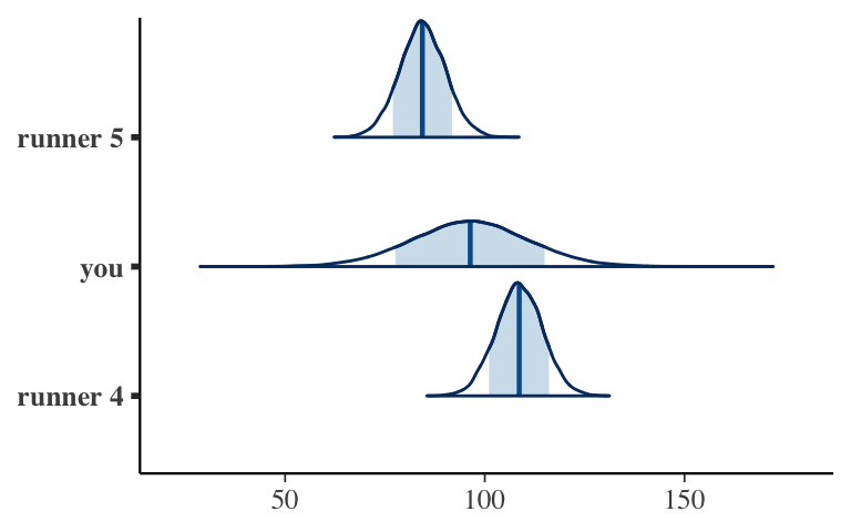
- OPTIONAL: prediction
Use your models to predict how many minutes it will take 3 different people to run 10 miles at the age of 60: runner 4, you, and runner 5. Plot and compare the posterior prediction models.
20.3 Solutions
Prior simulation
The priors are quite vague.# Simulate the prior model model_1_prior <- stan_glmer( net ~ age + (1 | runner), data = running, family = gaussian, chains = 4, iter = 5000*2, seed = 84735, refresh = 0, prior_PD = TRUE) # Check out the prior specifications prior_summary(model_1_prior) ## Priors for model 'model_1_prior' ## ------ ## Intercept (after predictors centered) ## Specified prior: ## ~ normal(location = 90, scale = 2.5) ## Adjusted prior: ## ~ normal(location = 90, scale = 35) ## ## Coefficients ## Specified prior: ## ~ normal(location = 0, scale = 2.5) ## Adjusted prior: ## ~ normal(location = 0, scale = 15) ## ## Auxiliary (sigma) ## Specified prior: ## ~ exponential(rate = 1) ## Adjusted prior: ## ~ exponential(rate = 0.072) ## ## Covariance ## ~ decov(reg. = 1, conc. = 1, shape = 1, scale = 1) ## ------ ## See help('prior_summary.stanreg') for more details running %>% add_fitted_draws(model_1_prior, n = 4) %>% ggplot(aes(x = age, y = net)) + geom_line(aes(y = .value, group = paste(runner, .draw))) + facet_wrap(~ .draw)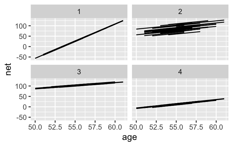
running %>% add_predicted_draws(model_1_prior, n = 100) %>% ggplot(aes(x = net)) + geom_density(aes(x = .prediction, group = .draw)) + xlim(-100,300)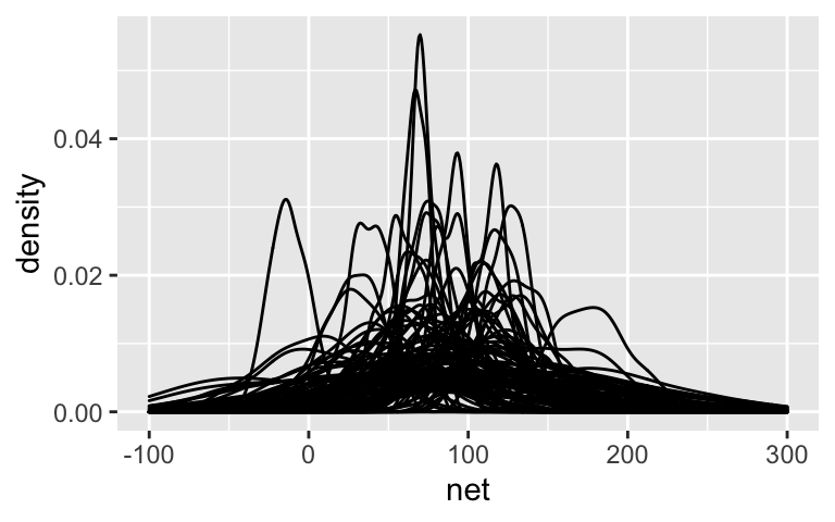
Posterior simulation
model_1 <- update(model_1_prior, prior_PD = FALSE, refresh = 0) pp_check(model_1)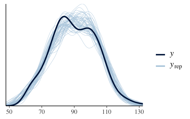
- Global parameters: \(\beta_0\) and \(\beta_1\)
These are have a moderately positive slope.
running %>%
  add_fitted_draws(model_1, n = 200, re_formula = NA) %>%
  ggplot(aes(x = age, y = net))  +
    geom_point(data = running, size = 0.5, alpha = 0.5) +
    geom_line(aes(y = .value, group = .draw), alpha = 0.2)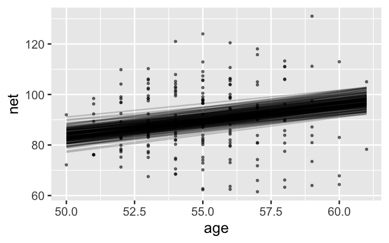
There’s an 80% chance that for every 1 year increase in age, the increase in time to run 10 miles is somewhere btwn 0.955 and 1.52.
tidy(model_1, effects = "fixed", conf.int = TRUE, conf.level = 0.80) ## # A tibble: 2 x 5 ## term estimate std.error conf.low conf.high ## <chr> <dbl> <dbl> <dbl> <dbl> ## 1 (Intercept) 21.9 12.4 6.07 37.9 ## 2 age 1.24 0.223 0.955 1.52The CI is above 0 and all lines are positivel. We have ample evidence that the typical runner slows down with age.
- Comparing within vs between variability
- For plot (a), \(\sigma_0 > \sigma_y\). For plot (b), \(\sigma_0 < \sigma_y\).
- Differences between runners account for the majority (87%) of variability in race outcomes.
tidy(model_1, effects = "ran_pars") ## # A tibble: 2 x 3 ## term group estimate ## <chr> <chr> <dbl> ## 1 sd_(Intercept).runner runner 13.3 ## 2 sd_Observation.Residual Residual 5.25 13.3^2 / (13.3^2 + 5.25^2) ## [1] 0.8651887
- Runner-specific models
At any age, runner 4 tends to be 12.3 minutes slower and runner 5 tends to be 11.9 minutes faster than the typical runner.
tidy(model_1, effects = "ran_vals", conf.int = TRUE, conf.level = 0.8) ## # A tibble: 36 x 7 ## level group term estimate std.error conf.low conf.high ## <chr> <chr> <chr> <dbl> <dbl> <dbl> <dbl> ## 1 1 runner (Intercept) -13.3 3.19 -17.5 -9.21 ## 2 2 runner (Intercept) -4.70 3.18 -8.88 -0.665 ## 3 3 runner (Intercept) 1.64 3.08 -2.32 5.60 ## 4 4 runner (Intercept) 12.3 3.22 8.06 16.4 ## 5 5 runner (Intercept) -11.9 3.09 -15.9 -7.93 ## 6 6 runner (Intercept) -16.1 3.40 -20.5 -11.7 ## 7 7 runner (Intercept) 13.5 3.23 9.35 17.7 ## 8 8 runner (Intercept) 13.7 3.38 9.33 18.1 ## 9 9 runner (Intercept) 7.46 3.29 3.27 11.6 ## 10 10 runner (Intercept) 25.2 3.24 21.1 29.3 ## # … with 26 more rows.
running %>%
  filter(runner %in% c("4", "5")) %>%
  add_fitted_draws(model_1, n = 100) %>%
  ggplot(aes(x = age, y = net)) +
    geom_line(
      aes(y = .value, group = paste(runner, .draw), color = runner),
      alpha = 0.1) +
    geom_point(aes(color = runner))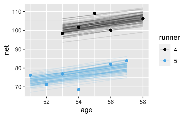
Check out all the sample runners
The gray lines are drawn closer to the center, whereas the black lines are slightly more spread out.runner_summaries_1 <- model_1 %>% spread_draws(`(Intercept)`, b[,runner], `age`) %>% mutate(runner_intercept = `(Intercept)` + b) %>% select(-`(Intercept)`, -b) %>% median_qi(.width = 0.80) # Check out the posterior medians runner_summaries_1 %>% select(runner, runner_intercept, age) %>% head() ## # A tibble: 6 x 3 ## runner runner_intercept age ## <chr> <dbl> <dbl> ## 1 runner:1 8.54 1.24 ## 2 runner:10 47.1 1.24 ## 3 runner:11 22.4 1.24 ## 4 runner:12 4.17 1.24 ## 5 runner:13 14.3 1.24 ## 6 runner:14 27.1 1.24 ggplot(running, aes(y = net, x = age, group = runner)) + geom_line(aes(y = c(predict(lm(net ~ age + runner, running))))) + geom_abline( data = runner_summaries_1, color = "gray", aes(intercept = runner_intercept, slope = age)) + lims(x = c(50, 61), y = c(50, 135))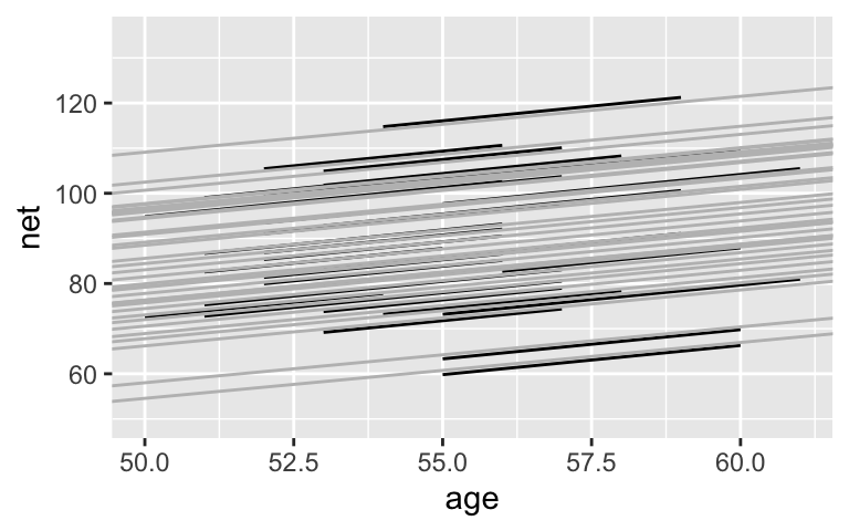
Posterior simulation
model_2 <- readRDS(url("https://www.macalester.edu/~ajohns24/data/stat454/running_model_2.rds"))
Check out all the sample runners
Again, the models are drawn closer toward the typical runner. This is especially pronounced for runners for which we observed negative slopes – the posterior hierarchical model estimates that their underlying slopes are actually negative. Further, there appears to be little difference in the slopes.runner_summaries_2 <- model_2 %>% spread_draws(`(Intercept)`, b[term, runner], `age`) %>% pivot_wider(names_from = term, names_glue = "b_{term}", values_from = b) %>% mutate(runner_intercept = `(Intercept)` + `b_(Intercept)`, runner_age = age + b_age) %>% select(-`(Intercept)`, -age, -`b_(Intercept)`, -b_age) %>% median_qi(.width = 0.80) # Check out the posterior median intercepts and slopes runner_summaries_2 %>% select(runner, runner_intercept, runner_age) %>% head() ## # A tibble: 6 x 3 ## runner runner_intercept runner_age ## <chr> <dbl> <dbl> ## 1 runner:1 21.8 0.999 ## 2 runner:10 21.7 1.70 ## 3 runner:11 21.7 1.26 ## 4 runner:12 21.7 0.920 ## 5 runner:13 21.7 1.11 ## 6 runner:14 21.8 1.33 # Plot the posterior median models ggplot(running, aes(y = net, x = age, group = runner)) + geom_abline( data = runner_summaries_2, color = "gray", aes(intercept = runner_intercept, slope = runner_age)) + lims(x = c(50, 61), y = c(50, 135))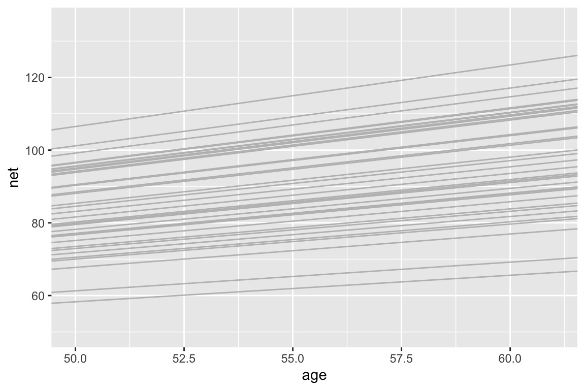
# Plot the posterior median models along with the observed relationships
new_summaries <- runner_summaries_2 %>%
  mutate(runner = str_remove(runner, "runner:"))
ggplot(running, aes(y = net, x = age, group = runner)) +
        geom_smooth(method = "lm", se = FALSE) +
        geom_abline(
    data = new_summaries, color = "gray",
    aes(intercept = runner_intercept, slope = runner_age)) +
    facet_wrap(~ runner) +
        lims(x = c(50, 61), y = c(50, 135))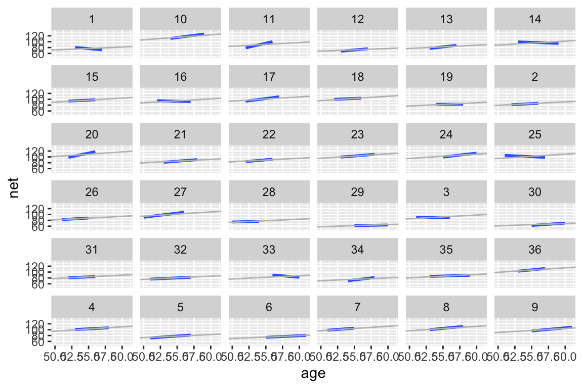
- Pause
Answers will vary. Personally, since there’s very little apparent difference in the slopes, it seems that the additional complication to our model might not be worth it.
Evaluate and compare
The metrics are similar, thus I’d choosemodel_1as it’s much simpler. Formodel_1, the predicted race times tend to be off by 2.6 minutes and 97% of observed race outcomes fall within their 95% interval.set.seed(84735) prediction_summary(model = model_1, data = running) ## mae mae_scaled within_50 within_95 ## 1 2.59808 0.4516575 0.6864865 0.972973 prediction_summary(model = model_2, data = running) ## mae mae_scaled within_50 within_95 ## 1 2.486599 0.4403833 0.7135135 0.972973
OPTIONAL: prediction
# Simulate posterior predictive models for the 3 runners
predict_next_race <- posterior_predict(
  model_1,
  newdata = data.frame(runner = c("4", "you", "5"),
                       age = c(60, 60, 60)))

# Plot the posterior predictions
mcmc_areas(predict_next_race, prob = 0.8) +
  ggplot2::scale_y_discrete(labels = c("runner 4", "you", "runner 5"))