17 Get excited about hierarchical models
GOALS
Hierarchies aren’t always bad. A hierarchical model is a powerful tool for exploring grouped data. In these exercises, you’ll learn what grouped data is and why our current toolbox can produce misleading outcomes for grouped data. The goal is to understand why we need hierarchical models – you won’t get into the details of this tool until the next activity.
RECOMMENDED READING
Bayes Rules! Chapter 15.
17.1 Warm-up
Throughout STAT 155 and 253 (as well as other STAT courses), we work with data sets where each row is independent of the other rows. Yet in practice, grouped data is quite common. For example, suppose we’re interested in whether runners in their 50s and 60s tend to slow down with age. To this end, we’ll supplement weakly informative priors with data on the annual 10-mile “Cherry Blossom Race” in Washington, D.C.:
# Load packages
library(bayesrules)
library(tidyverse)
library(rstanarm)
library(broom.mixed)
library(tidybayes)

# Load & simplify the data
data(cherry_blossom_sample)
running <- cherry_blossom_sample %>%
  select(runner, age, net) %>%
  na.omit()
This data set includes 185 different race outcomes, including the net running time to complete the race (in minutes) and age of the runner. Further, there are 36 runners represented in the data:
dim(running)
## [1] 185   3
head(running, 10)
## # A tibble: 10 x 3
##    runner   age   net
##    <fct>  <int> <dbl>
##  1 1         53  84.0
##  2 1         54  74.3
##  3 1         55  75.2
##  4 1         56  74.2
##  5 1         57  74.2
##  6 2         52  82.7
##  7 2         53  80.0
##  8 2         54  88.1
##  9 2         55  80.9
## 10 2         56  88.1
running %>%
  summarize(nlevels(runner))
## # A tibble: 1 x 1
##   `nlevels(runner)`
##               <int>
## 1                36
Given this group structured (or repeated measures) data we need to use 2 subscripts in our notation:
\[\begin{split} Y_{ij} & = \text{ith observation of Y for group j} \\ & \;\;\;\;\; \text{i.e. the net running time for runner j in their ith race} \\ X_{ij} & = \text{ith observation of X for group j} \\ & \;\;\;\;\; \text{i.e. the age of runner j in their ith race} \\ \end{split}\]
WARM-UP 1
This is our first time using 2 subscripts. As practice, what does \(Y_{4,10}\) represent? NOTE: We use commas between the subscripts when 1 or both are more than single digits.
- the 10th racing outcome for the 4th runner
- the 4th racing outcome for the 10th runner
- the racing outcome for the 4th and 10th runners
WARM-UP 2
Why shouldn’t we assume that each row in running is independent? And what’s the grouping variable in the running data set, i.e. the variable which reflects the grouping structure?
head(running, 10)
## # A tibble: 10 x 3
##    runner   age   net
##    <fct>  <int> <dbl>
##  1 1         53  84.0
##  2 1         54  74.3
##  3 1         55  75.2
##  4 1         56  74.2
##  5 1         57  74.2
##  6 2         52  82.7
##  7 2         53  80.0
##  8 2         54  88.1
##  9 2         55  80.9
## 10 2         56  88.1
WARM-UP 3
In terms of learning about running patterns, what’s an advantage of using this grouped data vs data on 185 separate runners?
WARM-UP 4
Before looking at any data, what do you anticipate? Do you think that runners in their 50s and 60s slow down, get faster, or stay the same?
17.2 Exercises part 1: a complete pooled model
The first (wrong) approach we’ll take to analyzing the relationship between running time and age will be to ignore the grouping structure of the data. Specifically, we’ll analyze the complete pooled Normal regression model of net running times by age. This is just our usual Normal regression model, thus has the following data structure (in addition to weakly informative priors which we won’t write out):
\[Y_{ij} | \beta_0, \beta_1, \sigma \stackrel{ind}{\sim} N(\mu_i, \sigma^2) \;\; \text{ where } \mu_i = \beta_0 + \beta_1 X_{ij}\]
Data
To check our intuition about this relationship, plotnetrunning times vsage. Does it appear that runners in their 50s and 60s slow down, get faster, or stay the same?ggplot(running, aes(x = age, y = net)) + geom_point()
Posterior simulation
Simulate the posterior and check out some graphical and numerical posterior summaries. Do we have enough posterior evidence to conclude that runners in their 50s and 60s tend to slow down with age?# Simulate the posterior complete_model <- stan_glm( net ~ age, data = running, family = gaussian, prior_PD = FALSE, chains = 4, iter = 5000*2, seed = 84735, refresh = 0) # Plot 200 posterior plausible model lines running %>% add_fitted_draws(complete_model, n = 200) %>% ggplot(aes(x = age, y = net)) + geom_line(aes(y = .value, group = .draw), alpha = 0.15) + geom_point(data = running) # Posterior summary statistics tidy(complete_model, conf.int = TRUE, conf.level = 0.95)
Odd
This seems surprising. Experience suggests that the typical runner might slow down a bit after their peak fitness level. It turns out that this intuition is correct, but our model is wrong. What exactly is wrong about our model assumption that\[Y_i | \beta_0, \beta_1, \sigma \stackrel{ind}{\sim} N(\mu_i, \sigma^2) \;\; \text{ where } \mu_i = \beta_0 + \beta_1 X_i\]
(The answer is revealed in the next question.)
Complete pooled mistake
Our “complete pooled” model incorrectly assumes that the race outcomes are independent (\(\stackrel{ind}{\sim}\)), thus puts all race outcomes into a single pool. This would be an ok assumption if we had 185 race outcomes from 185 unique runners, but we have multiple race outcomes per runner. How quickly an individual runs next year depends upon, or is related to, how quickly they run this year. The plot below frames our complete pooled posterior median model (blue) against the observed relationship between running time and age for the 36 runners in our sample (gray). Use this to discuss the following:- Do most runners tend to slow down or get faster with age?
- In light of this answer, how is it that the complete pooled model suggests that there’s effectively no relationship between speed and age?
# Plot of the posterior median model (blue) # vs plots for each individual runner ggplot(running, aes(x = age, y = net, group = runner)) + geom_smooth(method = "lm", se = FALSE, color = "gray", size = 0.5) + geom_abline(aes(intercept = 75.2, slope = 0.268), color = "blue")- Do most runners tend to slow down or get faster with age?
Making predictions
In addition to not being able to detect a relationship between speed and age, let’s consider how a complete pooled model produces goofy predictions.- Use the plots below to approximate the posterior median prediction of running time at age 60 for 4 subjects: subjects 1, 20, and 22 from our sample, and you (who weren’t in our sample).
- What is unfortunate about these predictions?
# Select an example subset
examples <- running %>%
  filter(runner %in% c("1", "20", "22")) %>%
    add_row(runner = "you", age = NA)

ggplot(examples, aes(x = age, y = net)) +
  geom_point() +
  facet_wrap(~ runner) +
  geom_abline(aes(intercept = 75.2242, slope = 0.2678),
              color = "blue") +
  xlim(52, 60)
17.3 Exercises part 2: a no pooled model
OK. The complete pooled model was no good. By putting all runners into the same pool, it violated the assumption of independence, thus produced a misleading conclusion about the relationship between running time and age as well as posterior predictions that didn’t take into account that some runners are faster than others. Instead, consider a no pooled model which essentially builds a separate model for each of our 36 runners. Specifically, the model for any runner \(j\) is built using only the data for runner \(j\) (\(Y_{ij}, X_{ij}\)) and has its own unique intercept and slope (\(\beta_{0j}, \beta_{1j}\)):
\[Y_{ij} | \beta_{0j}, \beta_{1j}, \sigma \stackrel{ind}{\sim} N(\mu_{ij}, \sigma^2) \;\; \text{ where } \mu_{ij} = \beta_{0j} + \beta_{1j} X_{ij}\]
Posterior predictions
We won’t take the time to simulate the 36 posterior models, 1 for each runner. Instead, let’s consider the idea using pictures. When using weakly informative priors, the posterior median models would closely match the patterns in the observed data. These are plotted for just 3 of our 36 runners:ggplot(examples, aes(x = age, y = net)) + geom_point() + geom_smooth(method = "lm", se = FALSE, fullrange = TRUE) + facet_wrap(~ runner) + xlim(52, 62)These models appear pretty great, but some bummers lurk beneath. For example, consider using these no pooled models for prediction.
- Use the plots above to approximate the posterior median prediction of running time at age 62 for 3 subjects from our sample: subjects 1, 20, and 22.
- Which of these 3 predictions seems the goofiest to you? Why?
- Can you use these no pooled models to predict the running time at age 62 for you or any other person that isn’t part of our sample?
- Reflection
Reflecting on the exercise above, name 2 drawbacks of taking a no pooled approach to modeling running by age.
Hierarchical models (from Bayes Rules! Chapter 15)
When we have more than one observation per group:
Complete pooled models = no room for individuality
By assuming the data points are independent and that a universal model is appropriate for all groups, these models can produce misleading conclusions about the relationship of interest as well as about the significance of this relationship.No pooled models = every group for themselves
This approach build a separate model for each group, assuming that one group’s model doesn’t tell us anything about another’s. This approach underutilizes the data and cannot be generalized to groups outside our sample.Hierarchical (or partial pooled) models = let’s learn from one another while celebrating our individuality
Hierarchical models provide a middle ground. They acknowledge that, though each individual group might have its own model, one group can provide valuable information about another.
17.4 Solutions
Data
stays the same-ishggplot(running, aes(x = age, y = net)) + geom_point()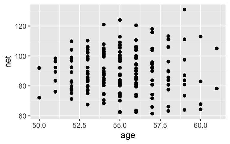
Posterior simulation
No. A 0-slope line falls within the realm of posterior possibilities and 0 is in the credible interval for theagecoefficient.# Simulate the posterior complete_model <- stan_glm( net ~ age, data = running, family = gaussian, prior_PD = FALSE, chains = 4, iter = 5000*2, seed = 84735, refresh = 0) # Plot 200 posterior plausible model lines running %>% add_fitted_draws(complete_model, n = 200) %>% ggplot(aes(x = age, y = net)) + geom_line(aes(y = .value, group = .draw), alpha = 0.15) + geom_point(data = running)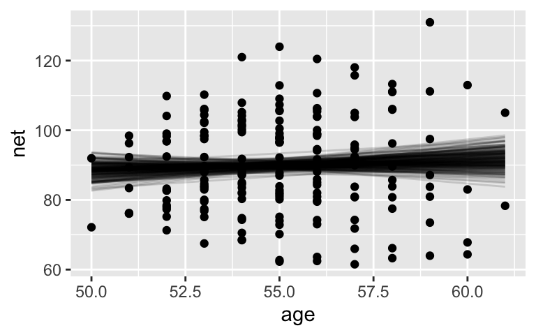
# Posterior summary statistics tidy(complete_model, conf.int = TRUE, conf.level = 0.95) ## # A tibble: 2 x 5 ## term estimate std.error conf.low conf.high ## <chr> <dbl> <dbl> <dbl> <dbl> ## 1 (Intercept) 75.1 24.4 27.1 124. ## 2 age 0.269 0.444 -0.629 1.15
- Odd
see next question
- Complete pooled mistake
- Most runners tend to slow down with age
- Essentially, the positive trends are masked by a few negative trends, as well as overlapping positive trends.
# Plot of the posterior median model (blue) # vs plots for each individual runner ggplot(running, aes(x = age, y = net, group = runner)) + geom_smooth(method = "lm", se = FALSE, color = "gray", size = 0.5) + geom_abline(aes(intercept = 75.2, slope = 0.268), color = "blue")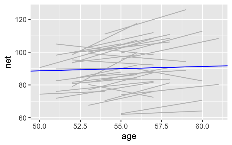
- Most runners tend to slow down with age
- Making predictions
- the posterior median prediction is the same for all 4 subjects: roughly 91–92 minutes
- these predictions ignore the observed differences between the runners, for example, subject 1 is much faster than subject 20
# Select an example subset examples <- running %>% filter(runner %in% c("1", "20", "22")) %>% add_row(runner = "you", age = NA) ggplot(examples, aes(x = age, y = net)) + geom_point() + facet_wrap(~ runner) + geom_abline(aes(intercept = 75.2242, slope = 0.2678), color = "blue") + xlim(52, 60)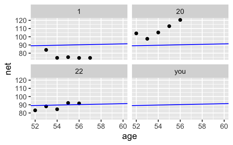
Posterior predictions
ggplot(examples, aes(x = age, y = net)) +
  geom_point() +
  geom_smooth(method = "lm", se = FALSE, fullrange = TRUE) +
  facet_wrap(~ runner) +
  xlim(52, 62)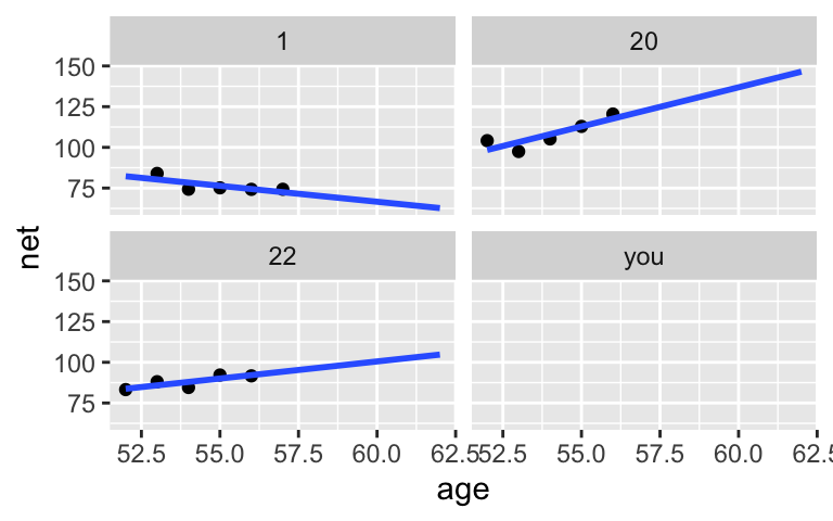
- subject 1: roughly 62 minutes; subject 20: roughly 145 minutes; subject 22: roughly 105 minutes.
- probably subject 1. their model assumes they’ll continue to slow down which, based on data from other runners, is unlikely to be the case
- no. they are subject-specific
- Reflection
- it ignores data on other subjects
- it can’t be applied to subjects outside our sample