# Load packages and import data
# Shorten the "riders_registered" variable to "rides"
# Keep only certain columns / variables
library(tidyverse)
bikes <- read_csv("https://mac-stat.github.io/data/bikeshare.csv") %>%
  rename(rides = riders_registered) %>%
select(date, day_of_week, weekend, temp_feel, humidity, windspeed, rides)3 Simple linear regression
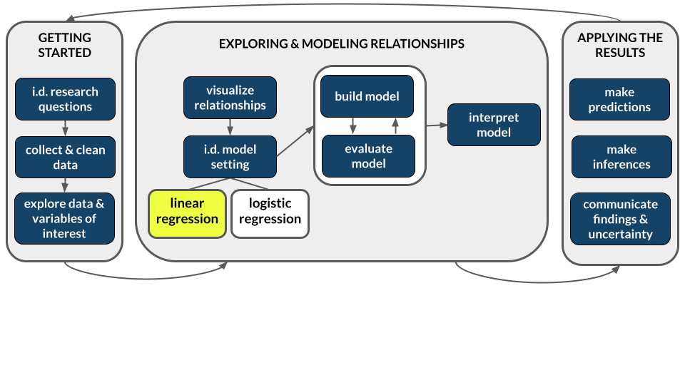
Announcements etc
SETTLING IN
- Put away your cell phones and clear your laptops of anything not related to STAT 155.
- Sit with new people and meet each other! Be ready to introduce each other when I walk around the room. (Take notes if you need to.)
- Help each other get ready to take notes!
- Open the online manual to the “Course Schedule” and click on today’s activity. That brings you here!
- Download “03-slr-intro-and-formalization.qmd” and open it in RStudio. Read the “Organizing your files” directions at the top of the file!!
WRAPPING UP
- General
- Finish the activity and check the solutions in the online manual.
- Visit office hours!
- Consider joining the MSCS community listserv (directions here).
- Starting Thursday, you will sit in assigned groups. You will be in these groups for ~2 weeks.
- Due Thursday
- CP 3 (10 minutes before your section)
- PP 1. Start today if you haven’t already!
- Course highlight: Pro tips + AI policies for PPs
Organize your files
This qmd file is where you’ll type notes, code, etc. Directions:
- Take notes in whatever way is best for you. You won’t hand them in.
- Save this file in the “Activities” sub-folder of the “STAT 155” folder you created before today’s class. Use a file name related to the activity number and/or today’s date (eg: “activity 3” or “3 simple linear regression”).
Learning goals
Explore numerical and visual summaries for the relationship between a quantitative response (aka outcome) variable and a quantitative predictor (aka explanatory variable):
- Construct and interpret a scatterplot visualization of the relationship.
- Compute and interpret the linear correlation between the 2 variables.
- Analyze and apply a simple linear regression model of the relationship:
- obtain and write a model formula
- interpret the model’s intercept and slope coefficients in context
- compute and interpret predictions (aka expected or fitted values) and residuals in context
- explain the connection between residuals and the least squares criterion
Additional resources
Required videos
- Simple linear regression Part 1: motivation & scatterplots (slides)
- Simple linear regression Part 2: correlation (slides)
- Simple linear regression Part 3: simple linear regression models (slides)
Optional
- Reading: Sections 2.8, 3.1-3.3, 3.6 in the STAT 155 Notes
- Videos:
- R Code for Fitting a Linear Model (Time: 11:07)
References
Correlation
A numerical measure of the strength and direction of the linear relationship between two quantitative variables, Y and X. Properties:
- \(-1 \le r \le 1\)
- the sign of \(r\) indicates the direction of a linear relationship
- the magnitude of \(r\) indicates the strength of a linear relationship. Consider the extremes:
- \(r = 0\) indicates no linear relationship
- \(r = 1\) indicates a perfect positive linear relationship
- \(r = -1\) indicates a perfect negative linear relationship
OPTIONAL MATH BOX: Correlation
The correlation \(r\) of 2 quantitative variables \(Y\) and \(X\) is the (almost) average of products of their z-scores:
\[r = \frac{\sum z_x z_y}{n - 1} = \frac{\left(\frac{y_1 - \overline{y}}{s_y}\right)\left(\frac{x_1 - \overline{x}}{s_x}\right) + \left(\frac{y_2 - \overline{y}}{s_y}\right)\left(\frac{x_2 - \overline{x}}{s_x}\right) + \cdots + \left(\frac{y_n - \overline{y}}{s_y}\right)\left(\frac{x_n - \overline{x}}{s_x}\right)}{n - 1}\] where \((y_1, y_2, ..., y_n)\) are the observed data points of \(Y\) with mean \(\overline{y}\) and standard deviation \(s_y\) (similarly for the \(X\) terms).
Population simple linear regression model
Let
\(Y\) = a quantitative response variable
\(X\) = a quantitative predictor variable
Then the (population) simple linear regression model of the relationship of \(Y\) with \(X\) is:
\[E[Y | X] = \beta_0 + \beta_1 X\]
where
- \(E[Y | X]\) is the expected or average value of \(Y\) at a given \(X\) value
- \(\beta_0\) (“beta 0”) is the y-intercept. It describes the typical value of \(Y\) when \(X = 0\).
- \(\beta_1\) (“beta 1”) is the slope. It describes the change in expected or average value of \(Y\) associated with a 1-unit increase in \(X\).
Sample simple linear regression model
In practice, we don’t observe the entire population, thus don’t know the population model. Instead, we estimate this model using sample data. The result is the (sample) simple linear regression model:
\[E[Y | X] = \hat{\beta}_0 + \hat{\beta}_1 X\]
where the \(\hat{\beta}\) (“beta hat”) terms are estimates of the actual \(\beta\) values.
Least squares estimation
We calculate the sample estimates \(\hat{\beta}_0\) and \(\hat{\beta}_1\) using the least squares criterion: Choose the line that produces the smallest collection / sum of squared residuals, i.e. the “least squares”.
OPTIONAL MATH BOX: Least squares estimates
Let
- \((y_1, y_2, ..., y_n)\) = observed data
- \(E[Y|X] = \hat{\beta}_0 + \hat{\beta}_1 X\) = a possible sample model
- \((\hat{y}_1, \hat{y}_2, ..., \hat{y}_n)\) = model predictions, e.g. \(\hat{y}_1 = \hat{\beta}_0 + \hat{\beta}_1 x_1\)
- \((y_1 - \hat{y}_1, y_2 - \hat{y}_2, ..., y_n - \hat{y}_n)\) = model residuals
- \(\sum_{i=1}^n (y_i-\hat{y}_i)^2\) = sum of squared residuals
Then the \(\hat{\beta}_0\) and \(\hat{\beta}_1\) that minimize the sum of squared residuals are:
\[\begin{split} \hat{\beta}_1 & = \frac{\sum_{i=1}^n(y_i - \overline{y})(x_i - \overline{x})}{\sum_{i=1}^n(x_i - \overline{x})^2} \\ \hat{\beta}_0 & = \overline{y} - \hat{\beta}_1 \overline{x} \\ \end{split}\]
Warm-up
Guiding question
How is bikeshare ridership related to various weather factors?
Context
We’ll explore data from Capital Bikeshare, a company in Washington DC. Our main goal will be to explore daily ridership among registered users, as measured by rides.
EXAMPLE 1: Get to know the data
# Check out the first 6 rows
# What does a case represent, i.e. what's the unit of observation?


# How much data do we have?
NOTE
It’s important to think about the “who, what, when, where, why, and how” of a dataset. In this example, the where and when are particularly relevant. These data were collected in D.C. in 2011-12. The patterns we observe may not extend to other places and/or time periods!
EXAMPLE 2: Explore ridership
Let’s get acquainted with the rides variable. Remember: Code = communication. Pay special attention to formatting / readability.
# Calculate the average (central tendency) and standard deviation (variability) in daily ridership
bikes %>%
  ___(mean(___), sd(___))
# Construct a plot of how ridership varies from day to dayFollow-up
Summarize, in words, what you learned from the plot and numerical summaries.
EXAMPLE 3: Relationships
Now that we better understand ridership (rides), let’s explore whether it’s related to or might be predicted by various weather factors such as windspeed in miles per hour (mph), or the “feels like” temperature in degrees Fahrenheit (temp_feel). In this setting:
- response variable Y =
rides - potential predictors X =
windspeed,temp_feel
Let’s start with the relationship of rides with windspeed. We can visualize the relationship between these 2 quantitative variables using a scatterplot. Suppose 4 friends have observed the scatterplot and describe it to you. For each, discuss what the description is lacking! What important info doesn’t it tell you about the relationship?
“There’s a weak association between ridership and wind speed.” (Don’t worry about the numbers on the x and y axis.)
“There’s a weak, negative association between ridership and wind speed.” (Don’t worry about the numbers on the x and y axis.)
“There’s a negative linear association between ridership and wind speed.” (Don’t worry about the numbers on the x and y axis.)
EXAMPLE 4: Ridership vs temperature
Next, let’s explore the relationship of rides with temp_feel.
- Let’s build a scatterplot! This will require some new code, but let’s start with what we know.
- Add the following two lines to your plot and describe what you observe.
# Add a blue simple linear regression line (line of best fit)
# and a orange *curve* of best fit
PUT YOUR PLOT HERE +
  geom_smooth(method = "lm", se = FALSE) +
  geom_smooth(color = "orange", se = FALSE)
EXAMPLE 5: Filtering our data
Though we’ll soon learn techniques for handling nonlinear relationships, right now let’s focus on days with feels-like temperatures below 80 degrees (where the relationship is linear). In the tidyverse package, whereas select() subsets our data to include only certain columns / variables of interest, filter() subsets our data to include only certain rows / cases of interest. Let’s practice:
bikes %>%
  filter(rides > 6911)
bikes %>%
filter(rides >= 6911)bikes %>%
filter(rides == 6911)Your turn: create a new dataset called bikes_sub that only keeps cases where temp_feel is under 80 degrees.
# Pro tip: First convince yourself that your filter code is correct.
# THEN store the results as bikes_sub.
bikes %>%
filter(temp_feel ___)
EXAMPLE 6: Correlation
bikes_sub %>%
ggplot(aes(y = rides, x = temp_feel)) +
geom_point() +
geom_smooth(method = "lm", se = FALSE)Guess the correlation between ridership and temperature. (You’ll calculate this in the exercises below.)
EXAMPLE 7: Simple linear regression (Part 1)
bikes_sub %>%
ggplot(aes(y = rides, x = temp_feel)) +
geom_point() +
geom_smooth(method = "lm", se = FALSE)Consider the sample linear regression model of this relationship, i.e. the formula for the line in the scatterplot:
E[ridership | temperature] = \(\hat{\beta}_0\) + \(\hat{\beta}_1\) temperature
In the exercises, you’ll show that:
E[ridership | temperature] = -2486.41 + 86.49 temperature
Consider the intercept coefficient -2486.41. Physically, this is the y-intercept of our model line (where it crosses the y-axis). What’s the contextual meaning?
- A 1 degree increase in temperature is associated with a 2486.41 decrease in average ridership.
- On 0-degree days, we expect -2486.41 riders. (This is “correct” but doesn’t make sense here since it extrapolates our model far beyond the range of our observed data.)
EXAMPLE 8: Simple linear regression (Part 2)
Consider the temperature coefficient 86.49. Physically, this is the slope of our model line (rise over run). Pick the most effective / correct interpretation of this slope below. For each other option, indicate what’s wrong with the interpretation.
- Increasing X by 1 is associated with a 86.49 increase in Y.
- A 1 degree increase in temperature is associated with a 86.49 increase in average ridership.
- Warmer weather encourages ridership. A 1 degree increase in temperature produces 86.49 more riders on average.
- If tomorrow is 1 degree warmer than today, we should expect 86.49 more riders.
- A temperature change of 1 is associated with a 86.49 increase in average ridership.
Interpreting model coefficients
When interpreting model coefficients, remember to:
- interpret in context
- use non-causal language
- include units
- talk about averages rather than individual cases
Exercises
DIRECTIONS
You’ll work on these exercises in your groups. Collaboration is a key learning goal in this course.
Why? Discussion & collaboration deepens your understanding of a topic while also improving confidence, communication, community, & more. (eg: Deeply learning a new language requires more than working through Duolingo alone. You need to talk with and listen to others!)
How? You are expected to:
- Use your group members’ names & pronouns. It’s ok to ask if you don’t remember!
- Actively contribute to discussion. Don’t work on your own.
- Actively include all other group members in discussion.
- Create a space where others feel comfortable sharing ideas & questions.
We won’t discuss these exercises as a class. With that, when you get stuck:
- Carefully re-read the problem. Make sure you didn’t miss any directions – it can be tempting to skip words and go straight to an R chunk, but don’t :).
- Discuss any questions you have with your group.
- If the question is unresolved by the group, be sure to ask the instructor!
- Remember that there are solutions in the online manual, at the bottom of the activity.
Exercise 1: Correlation
In the warm-up, you took a guess at the correlation between ridership and temperature:
bikes_sub %>%
ggplot(aes(y = rides, x = temp_feel)) +
geom_point() +
geom_smooth(method = "lm", se = FALSE)Let’s check your intuition! Fill in the code below to calculate the correlation.
# HINT: What function is useful for calculating statistics (eg: means)?
bikes_sub %>%
___(cor = cor(rides, temp_feel))
Exercise 2: Build the model
You were told above that our (sample) simple linear regression model was:
E[ridership | temperature] = -2486.41 + 86.49 temperature
Verify this using the code below. Step through code chunk slowly, make note of new code.
# Construct and save the model as bike_model_1
# What's the purpose of "rides ~ temp_feel"?
# What's the purpose of "data = bikes_sub"?
bike_model_1 <- lm(rides ~ temp_feel, data = bikes_sub)# A long summary of the model stored in bike_model_1
summary(bike_model_1)# A simplified model summary
coef(summary(bike_model_1))
Exercise 3: Predictions and residuals
On August 17, 2012, the temp_feel was 53.816 degrees and there were 5665 riders:
# Note the use of filter() and select()!
bikes_sub %>%
filter(date == "2012-08-17") %>%
select(rides, temp_feel) Part a
In the scatterplot below, locate the point that corresponds to August 17, 2012 (by eye, not using code). Is it close to the trend? Were there more riders than expected or fewer than expected?
bikes_sub %>%
ggplot(aes(y = rides, x = temp_feel)) +
geom_point() +
geom_smooth(method = "lm", se = FALSE)Part b
Using the model formula below, calculate how many riders we would have expected or predicted on August 17, 2012 based on its temperature:
E[ridership | temperature] = -2486.41 + 86.49 temperature
# Calculate the prediction
# (Convince yourself that you can connect this to the scatterplot)Part c
Check your prediction using the predict() function.
# What is the purpose of including bike_model_1?
# What is the purpose of newdata = ___???
predict(bike_model_1, newdata = data.frame(temp_feel = 53.816))Part d
How far does the observed ridership on August 17, 2012 fall from its model prediction? Calculate the residual or prediction error:
# Recall: residual = observed Y - predicted YPart e
Are positive residuals above or below the trend line?
When we have positive residuals, does the model over- or under-estimate ridership?
Are negative residuals above or below the trend line?
When we have negative residuals, does the model over- or under-estimate ridership?
Exercise 4: Ridership vs windspeed (visualization)
Your turn! Let’s practice what you’ve learned in the preceding exercises to investigate the relationship between rides and windspeed. Go back to using the bikes dataset (instead of bikes_sub) because we no longer need to only keep days less than 80 degrees!!!
Part a
# Construct a visualization of this relationship
# Include a representation of the relationship trend
# Remember to use the bikes data!!!Part b
Summarize, in words, your findings from the plot.
Exercise 5: Ridership vs windspeed (model)
Part a
# Use lm() to construct a model of rides vs windspeed
# Save this as bike_model_2
# Remember to use the bikes data!!!# Get a short summary of bike_model_2Part b
Write out a formula for the model trend.
Part c
Interpret the intercept and the windspeed coefficients.
Part d
# Identify the windspeed on August 17, 2012
# Predict ridership on this date using bike_model_2
# NOTE: Use predict() but also convince yourself you could do this from scratch
# Calculate the residual
Exercise 6: Exploring correlation
When analyzing data, it’s important to: (1) understand the limitations and meaning of the tool we’re applying; and (2) to visualize our data. Calculating and using correlations are a perfect example.
For this exercise, we’ll work with the anscombe dataset, which is built in to R:
# Load anscombe data
data("anscombe")
# Check it out
head(anscombe)Note that the anscombe dataset contains four different pairs of quantitative variables. Below are the correlations between these pairs:
# Correlation between x1, y1
anscombe %>%
summarize(cor(x1, y1))
# Correlation between x2, y2
anscombe %>%
summarize(cor(x2, y2))
# Correlation between x3, y3
anscombe %>%
summarize(cor(x3, y3))
# Correlation between x4, y4
anscombe %>%
summarize(cor(x4, y4))Part a
What do you notice about each of these correlations?
Part b
Discuss what you think the scatterplots for these pairs of variables might look like.
Part c
Check out separate scatterplots for each of the 4 pairs of variables. Is this what you expected? What is the message of this last exercise as it relates to the limits of correlation?
# Ignore this code!
# It wrangles the data to nicely put all scatterplots on the same frame
anscombe %>%
pivot_longer(cols = everything(),
names_to = c(".value", "group"),
names_pattern = "(.)(\\d)") %>%
ggplot(aes(y = y, x = x)) +
geom_smooth(method = "lm", se = FALSE) +
geom_point() +
facet_wrap(~ group)
Exercise 7: Data drill (filter, select, summarize)
This exercise is designed to help you practice your tidy data wrangling skills. We can’t do statistics or really understand data without these skills! We’ll work with a simpler set of 10 data points:
new_bikes <- bikes %>%
select(date, temp_feel, humidity, rides, day_of_week) %>%
head(10)Part a
Thus far, in the tidyverse grammar you’ve learned 3 verbs or action words: summarize(), select(), filter(). First, refresh your memory. Take note of the following code and the output it produces:
# First check out the data for a point of reference
new_bikes# summarize()
new_bikes %>%
summarize(mean(temp_feel), mean(humidity))# select()
new_bikes %>%
select(date, temp_feel)# select() again
new_bikes %>%
select(-date, -temp_feel)# filter()
new_bikes %>%
filter(rides > 850)# filter() again
new_bikes %>%
filter(day_of_week == "Sat")# filter() again
new_bikes %>%
filter(rides > 850, day_of_week == "Sat")Part b
Your turn. Use tidyverse verbs to complete each task below.
# Keep only information about the humidity and day of week
# Keep only information about the humidity and day of week using a different approach
# Calculate the maximum and minimum temperatures
# Keep only information for Sundays
# Keep only information for Sundays with temperatures below 50
# Calculate the median ridership on Sundays with temperatures below 50
Reflection
Learning goals
Go to the top of this file and review the learning goals for today’s activity.
Which do you have a good handle on?
Which are struggling with? What feels challenging right now?
What are some wins from the day?
Statistics is a particular kind of language and collection of tools for channeling curiosity to improve our world. How do the concepts we practiced today facilitate curiosity?
Code
In addition to exploring the learning goals, you learned some new code.
If you haven’t already, you’re highly encouraged to start tracking and organizing new code in a cheat sheet (eg: a Google doc). This will be a handy reference for you, and the act of making it will help deepen your understanding and retention.
Reflect upon the
lm()function. This function takes 2 arguments. What are they and what’s their purpose? Mainly, what information does R need in order to build a model?Reflect upon the
predict()function. This function takes 2 arguments. What are they and what’s their purpose? Mainly, what information does R need in order to make a prediction?
Solutions
EXAMPLE 1: Get to know the data
# Check out the first 6 rows
# A case represents a day of the year
head(bikes)
## # A tibble: 6 × 7
## date day_of_week weekend temp_feel humidity windspeed rides
## <date> <chr> <lgl> <dbl> <dbl> <dbl> <dbl>
## 1 2011-01-01 Sat TRUE 64.7 0.806 10.7 654
## 2 2011-01-02 Sun TRUE 63.8 0.696 16.7 670
## 3 2011-01-03 Mon FALSE 49.0 0.437 16.6 1229
## 4 2011-01-04 Tue FALSE 51.1 0.590 10.7 1454
## 5 2011-01-05 Wed FALSE 52.6 0.437 12.5 1518
## 6 2011-01-06 Thu FALSE 53.0 0.518 6.00 1518
# How much data do we have?
dim(bikes)
## [1] 731 7
EXAMPLE 2: Explore ridership
The distribution of ridership is fairly symmetric. On average there are about 3600 registered riders per day (mean = 3656). On any given day, the number of registered riders is about 1560 from the mean. There seem to be a small number of low outliers (minimum ridership was 20).
# Calculate the average (central tendency) and standard deviation (variability) in daily ridership
bikes %>%
summarize(mean(rides), sd(rides))
## # A tibble: 1 × 2
## `mean(rides)` `sd(rides)`
## <dbl> <dbl>
## 1 3656. 1560.
# Construct a plot of how ridership varies from day to day
# Could also do a boxplot or density plot!
bikes %>%
ggplot(aes(x = rides)) +
geom_histogram(color = "white")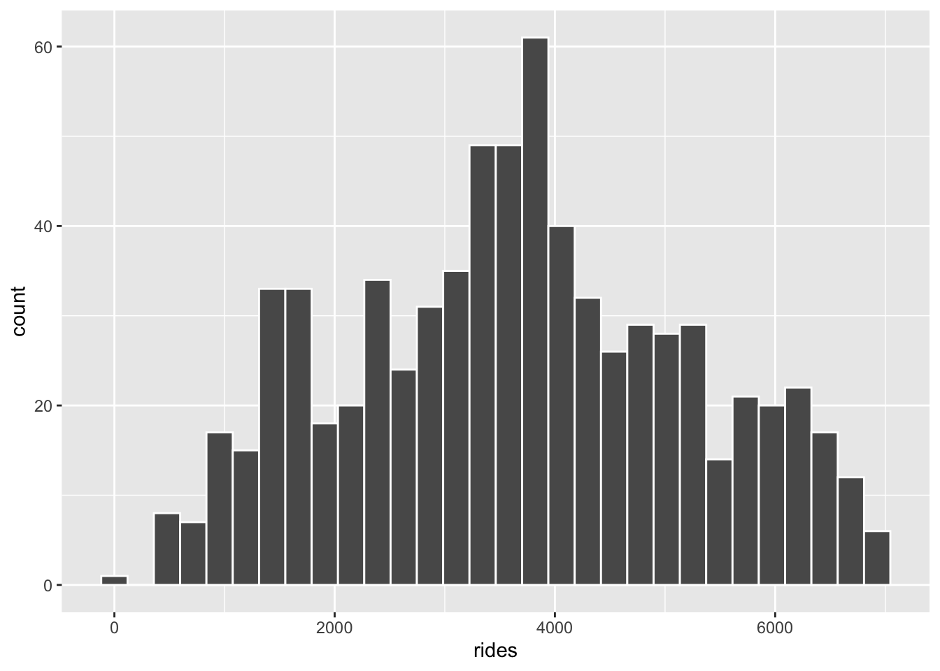
EXAMPLE 3: Relationships
- We can’t draw much here. There’s no info about the shape and direction of the relationship.
- We can draw a negatively associated point cloud with a lot of scatter, but it’s unclear whether the relationship is linear, curved, etc.
- We can draw a negatively sloped regression line, but it’s unclear what the point cloud would look like (no info about strength).
EXAMPLE 4: Ridership vs temperature
bikes %>%
ggplot(aes(x = temp_feel, y = rides)) +
geom_point()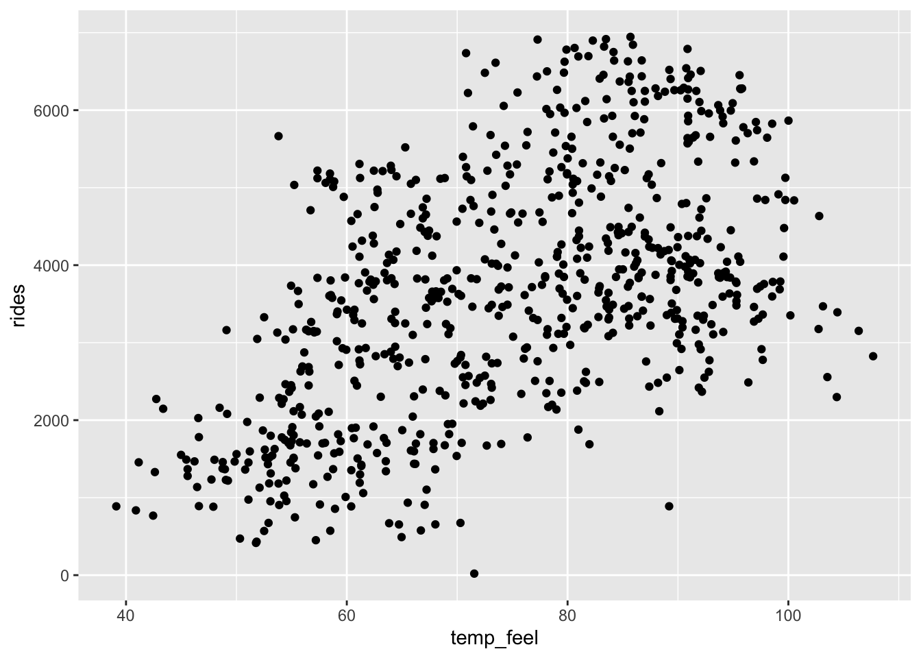
- If we only displayed the red line of best fit on the plot, we might miss the slight downward trend at the highest temperatures that we can see more clearly with the blue curve of best fit. A linear model is not appropriate if fit to the whole range of the data, but there does seem to be a linear relationship between ridership and temperature below 80 degrees Fahrenheit.
# Add a blue simple linear regression line (line of best fit)
# and a orange *curve* of best fit
bikes %>%
ggplot(aes(x = temp_feel, y = rides)) +
geom_point() +
geom_smooth(method = "lm", se = FALSE) +
geom_smooth(color = "orange", se = FALSE)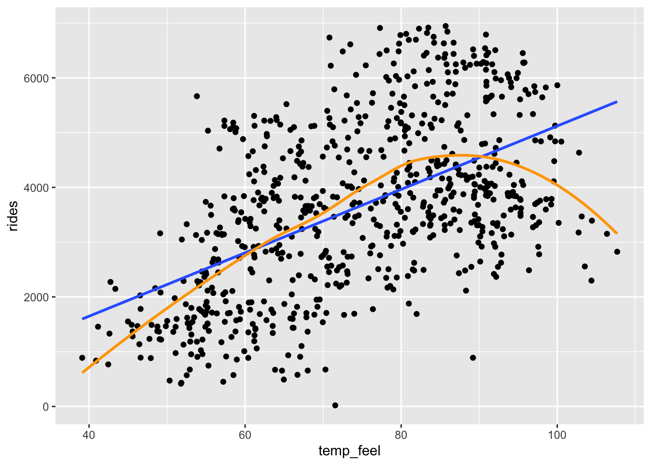
EXAMPLE 5: Filtering our data
# Keep only days / data points with ridership GREATER THAN 6911
bikes %>%
filter(rides > 6911)
## # A tibble: 2 × 7
## date day_of_week weekend temp_feel humidity windspeed rides
## <date> <chr> <lgl> <dbl> <dbl> <dbl> <dbl>
## 1 2012-09-21 Fri FALSE 83.5 0.669 10.3 6917
## 2 2012-09-26 Wed FALSE 85.7 0.631 16.4 6946
# Keep only days / data points with ridership of AT LEAST 6911
bikes %>%
  filter(rides >= 6911)
## # A tibble: 3 × 7
## date day_of_week weekend temp_feel humidity windspeed rides
## <date> <chr> <lgl> <dbl> <dbl> <dbl> <dbl>
## 1 2012-09-21 Fri FALSE 83.5 0.669 10.3 6917
## 2 2012-09-26 Wed FALSE 85.7 0.631 16.4 6946
## 3 2012-10-10 Wed FALSE 77.3 0.631 12.6 6911
# Keep only days / data points with ridership of EXACTLY 6911
bikes %>%
  filter(rides == 6911)
## # A tibble: 1 × 7
## date day_of_week weekend temp_feel humidity windspeed rides
## <date> <chr> <lgl> <dbl> <dbl> <dbl> <dbl>
## 1 2012-10-10 Wed FALSE 77.3 0.631 12.6 6911
# Create a new dataset called bikes_sub that only keeps cases where temp_feel is under 80 degrees
bikes_sub <- bikes %>%
filter(temp_feel < 80)
EXAMPLE 6: Correlation
will vary
EXAMPLE 7: Simple linear regression (Part 1)
b
EXAMPLE 8: Simple linear regression (Part 2)
- Doesn’t provide context.
- CORRECT
- Implies causation.
- The slope tells us about differences in averages, not individual days.
- Doesn’t include units.
Exercise 1: Correlation
bikes_sub %>%
summarize(cor = cor(rides, temp_feel))
## # A tibble: 1 × 1
## cor
## <dbl>
## 1 0.543
Exercise 2: Build the model
bike_model_1 <- lm(rides ~ temp_feel, data = bikes_sub)
summary(bike_model_1)
##
## Call:
## lm(formula = rides ~ temp_feel, data = bikes_sub)
##
## Residuals:
## Min 1Q Median 3Q Max
## -3681.8 -928.3 -98.6 904.9 3496.7
##
## Coefficients:
## Estimate Std. Error t value Pr(>|t|)
## (Intercept) -2486.412 421.379 -5.901 7.37e-09 ***
## temp_feel 86.493 6.464 13.380 < 2e-16 ***
## ---
## Signif. codes: 0 '***' 0.001 '**' 0.01 '*' 0.05 '.' 0.1 ' ' 1
##
## Residual standard error: 1267 on 428 degrees of freedom
## Multiple R-squared: 0.2949, Adjusted R-squared: 0.2933
## F-statistic: 179 on 1 and 428 DF, p-value: < 2.2e-16
coef(summary(bike_model_1))
## Estimate Std. Error t value Pr(>|t|)
## (Intercept) -2486.41180 421.379174 -5.900652 7.368345e-09
## temp_feel 86.49251 6.464247 13.380135 2.349753e-34
Exercise 3: Predictions and residuals
More riders than expected – the point is far above the trend line
-2486.41 + 86.49 * 53.816
## [1] 2168.136- Matches our calculation, within rounding.
predict(bike_model_1, newdata = data.frame(temp_feel = 53.816))
## 1
## 2168.269# Observed data
bikes_sub %>%
filter(date == "2012-08-17") %>%
select(rides, temp_feel)
## # A tibble: 1 × 2
## rides temp_feel
## <dbl> <dbl>
## 1 5665 53.8
# Residual
5665 - 2168.269
## [1] 3496.731- Positive residuals are above the trend line—we under-estimate ridership.
- Negative residuals are below the trend line—we over-estimate ridership.
Exercise 4: Ridership vs windspeed (visualization)
There’s a weak, negative relationship – ridership tends to be smaller on windier days.
ggplot(bikes, aes(x = windspeed, y = rides)) +
geom_point() +
geom_smooth(method = "lm", se = FALSE)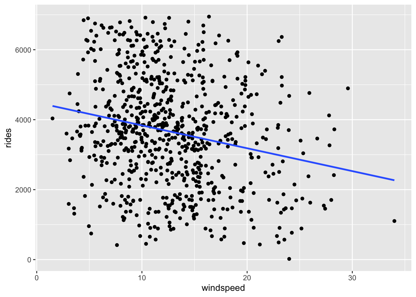
Exercise 5: Ridership vs windspeed (model)
bike_model_2 <- lm(rides ~ windspeed, data = bikes)
# Get a short summary of this model
coef(summary(bike_model_2))
## Estimate Std. Error t value Pr(>|t|)
## (Intercept) 4490.09761 149.65992 30.002005 2.023179e-129
## windspeed -65.34145 10.86299 -6.015053 2.844453e-09E[ridership | windspeed] = 4490.09761 - 65.34145 windspeed
- Intercept: On days with no wind, we’d expect around 4490 riders. (0 is a little below the minimum of the observed data, but not by much! So extrapolation in interpreting the intercept isn’t a huge concern.)
- Slope: Every 1mph increase in windspeed is associated with a decrease of 65 riders on average.
# Observed data
bikes %>%
filter(date == "2012-08-17") %>%
select(rides, windspeed)
## # A tibble: 1 × 2
## rides windspeed
## <dbl> <dbl>
## 1 5665 15.5
# prediction
predict(bike_model_2, newdata = data.frame(windspeed = 15.5))
## 1
## 3477.305
4490.09761 - 65.34145 * 15.50072
## [1] 3477.258
# Residual
5665 - 3477.258
## [1] 2187.742
Exercise 6: Exploring correlation
# Load anscombe data
data("anscombe")
head(anscombe)
## x1 x2 x3 x4 y1 y2 y3 y4
## 1 10 10 10 8 8.04 9.14 7.46 6.58
## 2 8 8 8 8 6.95 8.14 6.77 5.76
## 3 13 13 13 8 7.58 8.74 12.74 7.71
## 4 9 9 9 8 8.81 8.77 7.11 8.84
## 5 11 11 11 8 8.33 9.26 7.81 8.47
## 6 14 14 14 8 9.96 8.10 8.84 7.04
# Correlation between x1, y1
anscombe %>%
summarize(cor(x1, y1))
## cor(x1, y1)
## 1 0.8164205
# Correlation between x2, y2
anscombe %>%
summarize(cor(x2, y2))
## cor(x2, y2)
## 1 0.8162365
# Correlation between x3, y3
anscombe %>%
summarize(cor(x3, y3))
## cor(x3, y3)
## 1 0.8162867
# Correlation between x4, y4
anscombe %>%
summarize(cor(x4, y4))
## cor(x4, y4)
## 1 0.8165214They’re the same!
Will vary
It’s important to visualize the data before using correlation. In many cases correlation is misleading (eg: when the relationship is non-linear, when there are outliers, etc)
# Ignore this code!
# It wrangles the data to nicely put all scatterplots on the same frame
anscombe %>%
  pivot_longer(cols = everything(),
               names_to = c(".value", "group"),
               names_pattern = "(.)(\\d)") %>%
  ggplot(aes(y = y, x = x)) +
  geom_smooth(method = "lm", se = FALSE) +
  geom_point() +
  facet_wrap(~ group)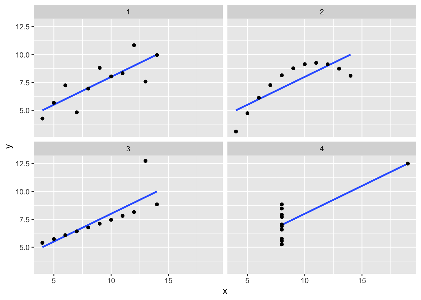
Exercise 7: Data drill (filter, select, summarize)
observe the code and output
# Keep only information about the humidity and day of week
new_bikes %>%
  select(humidity, day_of_week)
## Error: object 'new_bikes' not found

# Keep only information about the humidity and day of week using a different approach
new_bikes %>%
  select(-date, -temp_feel, -rides)
## Error: object 'new_bikes' not found

# Calculate the maximum and minimum temperatures
new_bikes %>%
  summarize(min(temp_feel), max(temp_feel))
## Error: object 'new_bikes' not found

# Keep only information for Sundays
new_bikes %>%
  filter(day_of_week == "Sun")
## Error: object 'new_bikes' not found

# Keep only information for Sundays with temperatures below 50
new_bikes %>%
  filter(day_of_week == "Sun", temp_feel < 50)
## Error: object 'new_bikes' not found

# Calculate the median ridership on Sundays with temperatures below 50
new_bikes %>%
  filter(day_of_week == "Sun", temp_feel < 50) %>%
  summarize(median(rides))
## Error: object 'new_bikes' not found