# Load data and packages
library(tidyverse)
climbers <- read.csv("https://mac-stat.github.io/data/climbers_sub.csv") %>%
select(peak_name, success, age, oxygen_used, year, season)13 Multiple logistic regression
Announcements etc
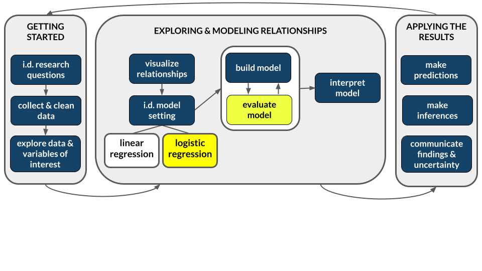
SETTLING IN
You can find the qmd here: “13-logistic-multivariate-evaluation-notes.qmd”.
Install the
janitorlibrary by typing the following in your CONSOLE. Do NOT put this in your qmd:install.packages("janitor")
WRAPPING UP
- Finish the activity.
- Thursday:
- PP 5 due
- Wrap up logistic regression + learn about the project + a little time to work on PP 5 (but not enough time to complete the PP before the deadline if you haven’t already started)
- Next Thursday (10/30): Quiz 2
This will focus on the Multiple Linear Regression and Logistic Regression units, but is naturally cumulative.
Learning goals
- Construct multiple logistic regression models in R.
- Interpret coefficients in multiple logistic regression models.
- Use multiple logistic regression models to make predictions.
- Evaluate the quality of logistic regression models by using predicted probability boxplots and by computing and interpreting accuracy, sensitivity, specificity, false positive rate, and false negative rate.
Additional resources
References
Logistic Regression
Let \(Y\) be a binary categorical response variable:
\[Y = \begin{cases} 1 & \; \text{ if event happens} \\ 0 & \; \text{ if event doesn't happen} \\ \end{cases}\]
Further define
\[\begin{split} p & = \text{ probability event happens} \\ 1-p & = \text{ probability event doesn't happen} \\ \text{odds} & = \text{ odds event happens} = \frac{p}{1-p} \\ \end{split}\]
Then a logistic regression model of \(Y\) by \(Y\) is
\[\log(\text{odds}) = \beta_0 + \beta_1 X\]
We can transform this to get (curved) models of odds and probability:
\[\begin{split} \text{odds} & = e^{\beta_0 + \beta_1 X} \\ p & = \frac{\text{odds}}{\text{odds}+1} = \frac{e^{\beta_0 + \beta_1 X}}{e^{\beta_0 + \beta_1 X}+1} \\ \end{split}\]
Coefficient interpretation for quantitative X
\[\begin{split} \beta_0 & = \text{ LOG(ODDS) when } X=0 \\ e^{\beta_0} & = \text{ ODDS when } X=0 \\ \beta_1 & = \text{ change in LOG(ODDS) per 1 unit increase in } X \\ e^{\beta_1} & = \text{ multiplicative change in ODDS per 1 unit increase in } X \text{ (ie. the odds ratio)} \\ \end{split}\]
Coefficient interpretation for categorical X
\[\begin{split} \beta_0 & = \text{ LOG(ODDS) at the reference category } \\ e^{\beta_0} & = \text{ ODDS at the reference category } \\ \beta_1 & = \text{ unit change in LOG(ODDS) relative to the reference} \\ e^{\beta_1} & = \text{ multiplicative change in ODDS relative to the reference } \text{ (ie. the odds ratio)} \\ \end{split}\]
Warm-up
We’ve learned two foundational modeling tools: “Normal” linear regression (when Y is quantitative) and logistic regression (when Y is binary).
- Normal linear regression examples
- model a person’s reaction time (Y) by how long they slept (X)
- model a person’s reaction time (Y) by whether or not they took a nap (X)
- logistic regression examples
- model whether or not a person believes in climate change (Y) based on their age (X)
- model whether or not a person believes in climate change (Y) based on their location (X)
EXAMPLE 1: Probability, odds, odds ratio review
In this and the previous activity, we’ll be modeling the success of a mountain climber. Consider the following example calculations:
| event | prob | odds |
|---|---|---|
| climber A is successful | 0.50 | 1 |
| climber B is successful | 0.66 (2/3) | 2 |
| climber C is successful | 0.75 | ? |
Calculate & interpret the conditional odds of success for climber C:
Odds(success | climber C) =
Calculate & interpret the odds ratio of success, comparing climber C to climber B:
Odds(success | Climber C) / Odds(success | Climber B) =
Calculate & interpret the odds ratio of success, comparing climber A to climber B:
Odds(success | Climber A) / Odds(success | Climber B) =
EXAMPLE 2: Success over time
Load the climbers data:
To better understand how climbing success rates have changed over time, let’s explore success by year:
# Bad plot!!
# Shows how year (X) varies by success (Y), not vice versa
climbers %>%
  ggplot(aes(x = year, y = success)) +
  geom_boxplot()
# Bad plot!! How to interpret this?!
climbers %>%
ggplot(aes(x = year, y = success)) +
geom_point() # Better plot!
climbers %>%
group_by(year) %>%
summarize(success_rate = mean(success)) %>%
ggplot(aes(x = year, y = success_rate)) +
geom_point() +
theme(axis.text.x = element_text(angle = 60, vjust = 1, hjust=1, size = 8))climbers %>%
mutate(year_bracket = cut(year, breaks = 10)) %>%
group_by(year_bracket) %>%
summarize(success_rate = mean(success)) %>%
ggplot(aes(x = year_bracket, y = success_rate)) +
geom_point() +
theme(axis.text.x = element_text(angle = 60, vjust = 1, hjust=1, size = 8))- Let’s now model that relationship…
# Build the model
success_by_year <- ___(success ~ year, data = climbers, ___)
# Get the model summary table
coef(summary(success_by_year))- Write out the model formula.
___ = -119.36215 + 0.05934year
- Interpret both model coefficients on the odds scale.
# Exponentiate the coefficients
EXAMPLE 3: Success by season
Next, let’s explore success rates by season:
# Visualize the relationship
# Bad plot! Shows dependence of season (X) on success (Y), not vice versa
climbers %>%
ggplot(aes(fill = season, x = success)) +
geom_bar(position = "fill")# Better plot!
# x = X, fill = Y
climbers %>%
ggplot(aes(x = season, fill = success)) +
geom_bar(position = "fill")# Model the relationship
success_by_season <- glm(success ~ season, data = climbers, family = "binomial")
coef(summary(success_by_season))Thus the estimated model formula is:
log(odds of success | season) = -0.6492953 + 0.3801896 seasonSpring + 14.2153618 seasonSummer - 1.0453004 seasonWinter
- Interpret the intercept coefficient on the odds scale.
exp(-0.6492953)- The odds of success are 0.52, i.e. success is roughly half as likely as failure.
- The odds of success are 0.52 in Autumn, i.e. success is roughly half as likely as failure in Autumn.
- The odds of success are roughly half (52%) as big in Autumn than in Summer.
- Interpret the
seasonWintercoefficient on the odds scale.
exp(-1.0453004)- The odds of success are 0.35 in Winter.
- The odds of success are 0.35 higher in Winter than in Autumn.
- The odds of success in Winter are 35% higher than the odds of success in Autumn.
- The odds of success in Winter are 35% as high as (i.e. 65% lower than) the odds of success in Autumn.
EXAMPLE 4: Predictions
Suppose your friend plans an expedition in Winter. Their probability of success is roughly 0.16:
# By hand
log_odds <- -0.6492953 - 1.0453004*1
log_odds
odds <- exp(log_odds)
odds
prob <- odds / (odds + 1)
prob# Check our work
# Note the use of type = "response"! If we left this off we'd get a prediction on the log(odds) scale
predict(success_by_season, newdata = data.frame(season = "Winter"), type = "response")Suppose we had to translate the probability calculation into a yes / no prediction. Yes or no: do you predict that your friend will be successful?
In logistic regression, we don’t measure the accuracy of a prediction by a residual. Our prediction is either right or wrong! For example, suppose that your friend does successfully summit their peak. Was our prediction right or wrong?
Exercises
In these exercises, you’ll explore how to:
- interpret multiple logistic regression models (with > 1 predictor)
- evaluate the quality of logistic regression predictions
Build 2 models that you’ll use below, the first of which you explored in the previous activity:
climb_model_1 <- glm(success ~ age, climbers, family = "binomial")
climb_model_2 <- glm(success ~ age + oxygen_used, climbers, family = "binomial")Exercise 1: climb_model_2
Part a
climb_model_1 uses only age as a predictor:
# Plot climb_model_1
climbers %>%
ggplot(aes(y = as.numeric(success), x = age)) +
geom_smooth(method = "glm", se = FALSE, method.args = list(family = "binomial")) +
labs(y = "probability of success")In contrast, the multiple logistic regression model climb_model_2 includes 2 predictors of success: age and oxygen_used. In comparison to the above plot of climb_model_1, what do you anticipate climb_model_2 looking like?
Part b
Check your intuition! Summarize, in words, what you learn about the relationship of success with age and oxygen use from the below plots.
# Plot climb_model_2
climbers %>%
ggplot(aes(y = as.numeric(success), x = age, color = oxygen_used)) +
geom_smooth(method = "glm", se = FALSE, method.args = list(family = "binomial")) +
labs(y = "probability of success")# Just for fun zoom out!
climbers %>%
ggplot(aes(y = as.numeric(success), x = age, color = oxygen_used)) +
geom_smooth(method = "glm", se = FALSE, method.args = list(family = "binomial"),
fullrange = TRUE) +
labs(y = "probability of success") +
lims(x = c(-300, 400))Part c
The estimated model formula is:
log(odds of success | age, oxygen_used) = -0.520 - 0.022 age + 2.896 oxygen_usedTRUE
# Get the model summary table
coef(summary(climb_model_2))# Exponentiated coefficients
exp(-0.520)
exp(-0.022)
exp(2.896)Interpret the age coefficient on the odds scale. Don’t forget to “control for…”!
Part d
Interpret the oxygen_usedTRUE coefficient on the odds scale. Don’t forget to “control for…”!
Exercise 2: Model evaluation using plots
Recall our 2 models of climbing success:
| model | predictors |
|---|---|
climb_model_1 |
age |
climb_model_2 |
age, oxygen_used |
Let’s compare the quality of these models. To begin, the code below calculates the probability of success for every climber in our dataset using climb_model_1, and stores it as the .fitted variable:
climbers %>%
mutate(.fitted = predict(climb_model_1, newdata = ., type = "response")) %>%
head()A visual way to evaluate the quality of our model is to compare the probability of success it assigns to climbers that were and were not actually successful:
# Compare the climb_model_1 probability of success calculations for those that were & weren't successful
climbers %>%
mutate(.fitted = predict(climb_model_1, newdata = ., type = "response")) %>%
ggplot(aes(x = success, y = .fitted)) +
geom_boxplot()Similarly, check out the probability calculations using climb_model_2:
# Compare the climb_model_2 probability of success calculations for those that were & weren't successful
climbers %>%
mutate(.fitted = predict(climb_model_2, newdata = ., type = "response")) %>%
ggplot(aes(x = success, y = .fitted)) +
geom_boxplot()Part a
Summarize what you learn from the plots about the ability of climb_model_1 and climb_model_2 to differentiate between those who were and were not actually successful. Comment on which model seems better, and why.
Part b
Focus on the plot for climb_model_2. Sometimes we may need to go beyond the probability calculations and make a binary prediction about whether a climber will succeed or fail. Suppose we used a 0.5 probability threshold: If the probability of success exceeds 0.5, then predict success. Otherwise, predict failure. In pictures:
climbers %>%
mutate(.fitted = predict(climb_model_2, newdata = ., type = "response")) %>%
ggplot(aes(x = success, y = .fitted)) +
geom_boxplot() +
geom_hline(yintercept = 0.5, color = "red")Discuss:
What do you think of the 0.5 threshold? Would it lead to good predictions? Would it do better at predicting when climbers will succeed or when they’ll fail?
If we used the 0.5 threshold, what would the specificity be: less than 25%, between 25% & 50%, between 50% & 75%, or above 75%? Answer this using only the plot.
If we used the 0.5 threshold, what would the sensitivity be: less than 25%, between 25% & 50%, between 50% & 75%, or above 75%? Answer this using only the plot.
If you don’t like the 0.5 threshold, what do you think would be a better option? Why?
Exercise 3: Model evaluation using evaluation metrics
Let’s explore using a probability threshold of 0.25 (25%) to make a binary prediction of success / failure for each climber in our dataset:
- If a model’s probability of success is greater than or equal to 25%, we’ll predict that they’ll succeed.
- If the probability is below 25%, we’ll predict that they’ll fail.
We can visualize this threshold on our predicted probability boxplots for our 2 models:
climbers %>%
mutate(.fitted = predict(climb_model_1, newdata = ., type = "response")) %>%
ggplot(aes(x = success, y = .fitted)) +
geom_boxplot() +
geom_hline(yintercept = 0.25, color = "red")
climbers %>%
mutate(.fitted = predict(climb_model_2, newdata = ., type = "response")) %>%
ggplot(aes(x = success, y = .fitted)) +
geom_boxplot() +
geom_hline(yintercept = 0.25, color = "red")To evaluate the quality of the resulting predictions, we essentially want to count up how many climbers fell on the “correct” side of the threshold, both overall and within both groups (successful and unsuccessful climbers). Let’s start with climb_model_1. Using the 0.25 threshold, this model predicted success for the first 6 climbers – 5 of these predictions were correct (5 of the 6 were actually successful) and 1 was wrong:
threshold <- 0.25
climbers %>%
mutate(.fitted = predict(climb_model_1, newdata = ., type = "response")) %>%
mutate(predictSuccess = .fitted >= threshold) %>%
select(success, age, oxygen_used, .fitted, predictSuccess) %>%
head()But that’s just the first 6 climbers! We can build a tabyl() to compare the observed success to the predictSuccess for all climbers in our dataset:
# Rows = actual / observed success (FALSE or TRUE)
# Columns = predicted success (FALSE or TRUE)
library(janitor)
climbers %>%
mutate(.fitted = predict(climb_model_1, newdata = ., type = "response")) %>%
mutate(predictSuccess = .fitted >= threshold) %>%
tabyl(success, predictSuccess) %>%
adorn_totals(c("row", "col"))Part a
Use the confusion matrix to prove that climb_model_1 has an overall accuracy rate of 40%. That is:
P(Predict Y Correctly) = 0.40
HINT: Divide the total number of correct predictions by the total number of climbers.
Part b
climb_model_1 has a sensitivity (aka true positive rate) of 99%, hence a false negative rate of 1%
Sensitivity: P(Predict Y = success | Actual Y = success) = 0.99
Among (conditioned on) successful climbers, the probability of the model correctly predicting success is 99%.False negative rate: P(Predict Y = failure | Actual Y = success) = 0.01 Among (conditioned on) successful climbers, the probability of the model INcorrectly predicting failure is 1%.
Prove these calculations using the confusion matrix:
Part c
climb_model_1 has a specificity (aka true negative rate) of only 2%, hence a false positive rate of 98%:
Specificity: P(Predict Y = failure | Actual Y = failure) = 0.02
Among (conditioned on) unsuccessful climbers, the probability of the model correctly predicting failure is only 2%.False positive rate: P(Predict Y = success | Actual Y = failure) = 0.98 Among (conditioned on) unsuccessful climbers, the probability of the model INcorrectly predicting success is 98%.
Prove these calculations using the confusion matrix:
Exercise 4: More confusion matrices
Obtain the confusion matrix, overall accuracy, sensitivity (true positive rate), and specificity (true negative rate) for climb_model_2 (with a 0.25 probability threshold). NOTE: The correct metrics are outlined in the next exercise if you want to check your work.
# Confusion matrix
# Overall accuracy
# Sensitivity
# Specificity
Exercise 5: Model comparison
We’ve now considered 2 models of climbing success, and evaluated their predictive performance using a 0.25 probability threshold:
| model | predictors | overall | sensitivity | specificity |
|---|---|---|---|---|
| 1 | age | 0.40 | 0.99 | 0.02 |
| 2 | age, oxygen_used | 0.75 | 0.69 | 0.79 |
Part a
Fill in the blanks with the model number.
Model ___ had the higher overall accuracy.
Model ___ was better at predicting when a climber would succeed.
Model ___ was better at predicting when a climber would not succeed.
Part b
Imagine that you are planning an expedition. Consider the consequences of incorrectly predicting whether or not you will be successful. What are the consequences of a false negative? What about a false positive? Which one is worse? With that in mind, which climbing model do you prefer?
Exercise 6: Reflection
What are some similarities and differences between how we interpret and evaluate linear and logistic regression models?
Exercise 7: Choose your own adventure
As a group, decide what to do next:
- Work on PP 5.
- Explore the impact of using a higher probability threshold of 0.5, instead of 0.25, to make binary predictions using our 2 models. Calculate the overall accuracy, sensitivity, and specificity for the 2 models.
Solutions
EXAMPLE 1: Probability, odds, odds ratio review
| event | prob | odds |
|---|---|---|
| climber A is successful | 0.50 | 1 |
| climber B is successful | 0.66 (2/3) | 2 |
| climber C is successful | 0.75 | 3 |
Calculate & interpret the conditional odds of success for climber C:
Odds(success | climber C) = P(success | climber C) / (1 - P(success | climber C)) = P(success | climber C) / P(failure | climber C) = 0.75 / (1 - 0.75) = 3
The odds of success for climber C is 3, i.e. they are 3x more likely to succeed than to fail.
Calculate & interpret the odds ratio of success, comparing climber C to climber B:
Odds(success | Climber C) / Odds(success | Climber B) = 3 / 2 = 1.5
The odds of success are one and a half times higher (50% higher) for climber C than climber B.
Calculate & interpret the odds ratio of success, comparing climber A to climber B:
Odds(success | Climber A) / Odds(success | Climber B) = 1 / 2 = 0.5
The odds of success are half as high (50% lower) for climber A than climber B.
EXAMPLE 2: Success over time
# Load data and packages
library(tidyverse)
climbers <- read_csv("https://mac-stat.github.io/data/climbers_sub.csv") %>%
select(peak_name, success, age, oxygen_used, year, season)
# Bad plot!!
# Shows how year (X) varies by success (Y), not vice versa
climbers %>%
ggplot(aes(x = year, y = success)) +
geom_boxplot() 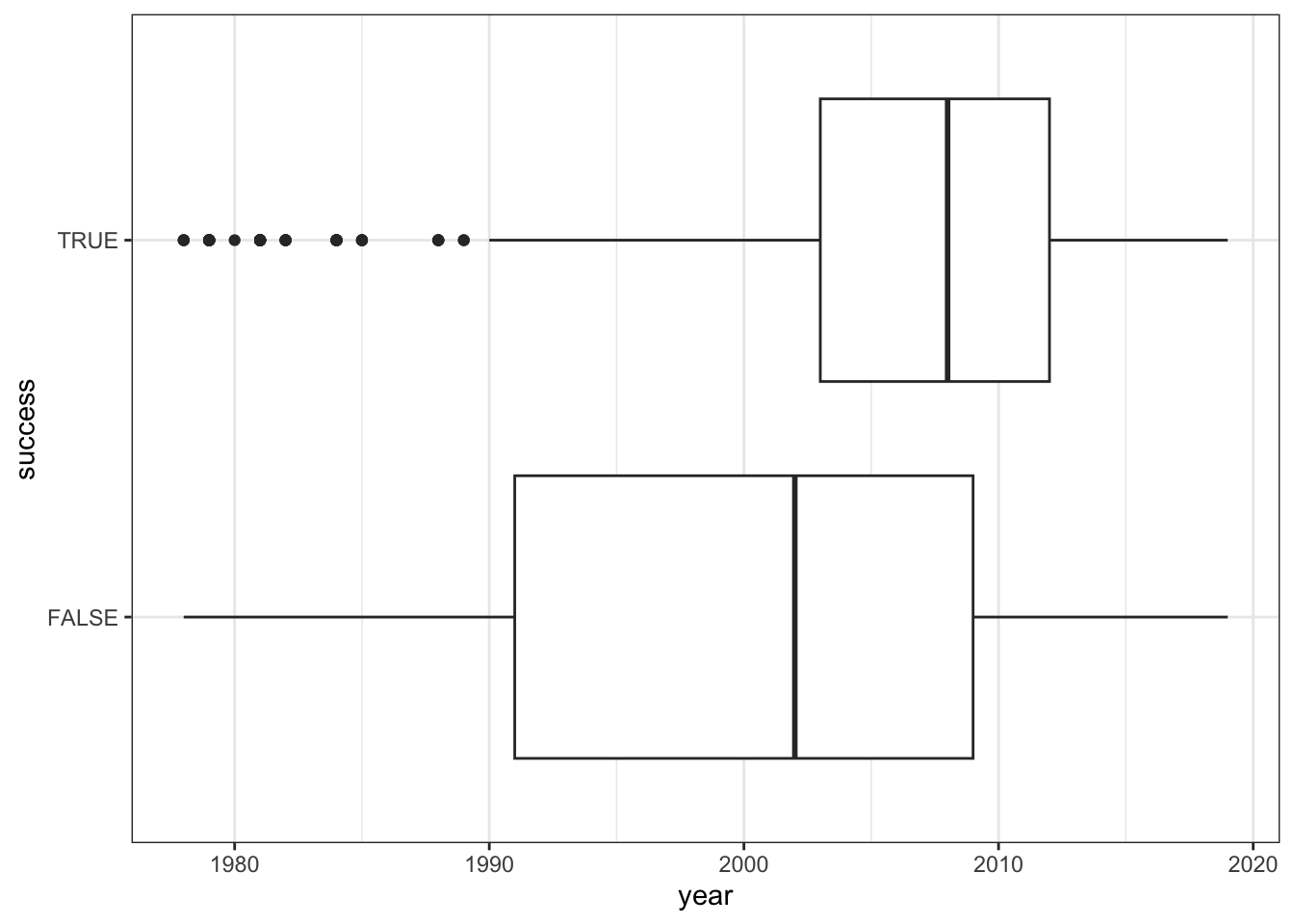
# Bad plot!! How to interpret this?!
climbers %>%
  ggplot(aes(x = year, y = success)) +
geom_point() 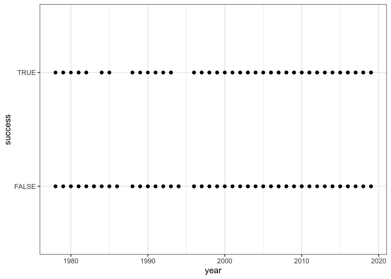
# Better plot
climbers %>%
group_by(year) %>%
summarize(success_rate = mean(success)) %>%
ggplot(aes(x = year, y = success_rate)) +
geom_point() +
theme(axis.text.x = element_text(angle = 60, vjust = 1, hjust=1, size = 8))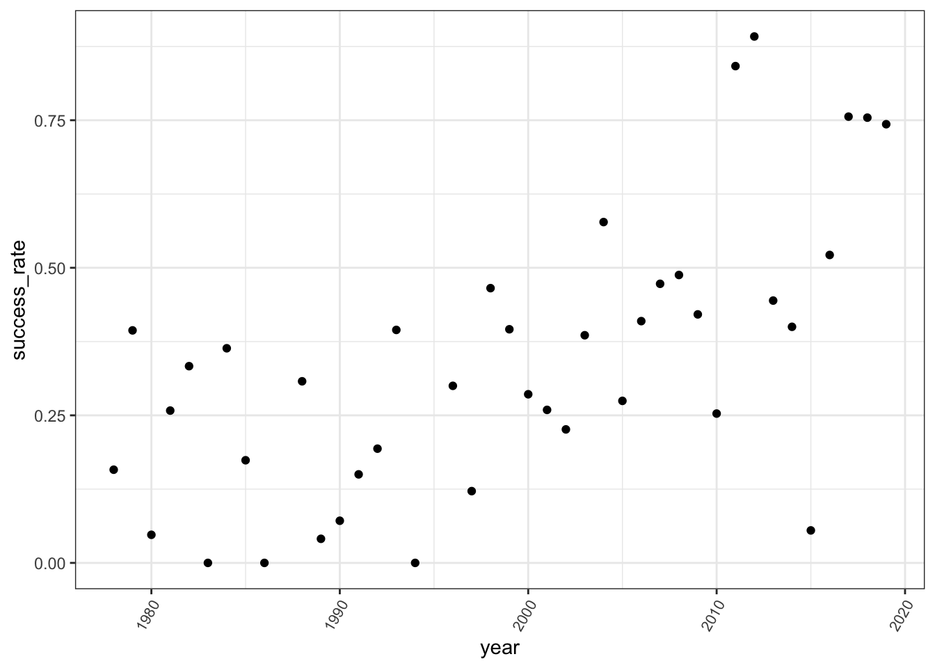
climbers %>%
  mutate(year_bracket = cut(year, breaks = 10)) %>%
  group_by(year_bracket) %>%
  summarize(success_rate = mean(success)) %>%
  ggplot(aes(x = year_bracket, y = success_rate)) +
  geom_point() +
  theme(axis.text.x = element_text(angle = 60, vjust = 1, hjust=1, size = 8))
.
# Build the model success_by_year <- glm(success ~ year, data = climbers, family = "binomial") # Get the model summary table coef(summary(success_by_year)) ## Estimate Std. Error z value Pr(>|z|) ## (Intercept) -119.36214950 9.560766495 -12.48458 9.062082e-36 ## year 0.05934127 0.004768784 12.44369 1.513454e-35log(odds of success | year) = -119.36215 + 0.05934year
.
# Exponentiate the coefficients exp(-119.36215) ## [1] 1.451032e-52 exp(0.05934) ## [1] 1.061136- The odds of success in year 0 (not contextually meaningful) were essentially 0.
- A 1-year increase in time is associated with a 6% increase (1.06 multiplicative increase) in the odds of success. That is, odds(success in year X + 1) / odds(success in year X) = 1.06
EXAMPLE 3: Success by season
# Visualize the relationship
# Bad plot! Shows dependence of season (X) on success (Y), not vice versa
climbers %>%
  ggplot(aes(fill = season, x = success)) +
  geom_bar(position = "fill")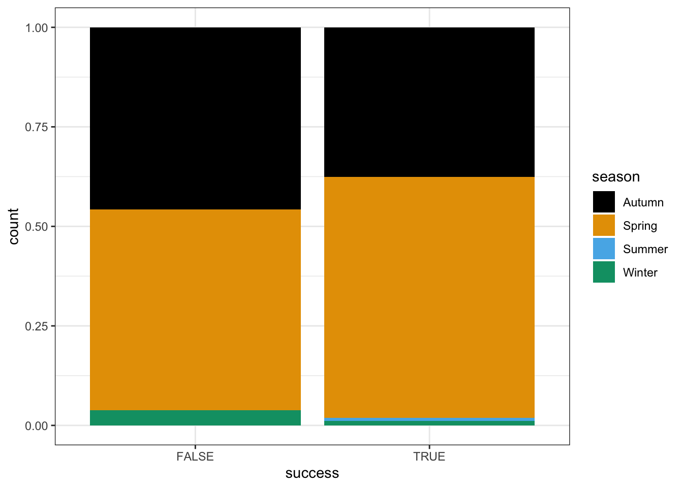
# Better plot!
# x = X, fill = Y
climbers %>%
  ggplot(aes(x = season, fill = success)) +
  geom_bar(position = "fill")
# Model the relationship
success_by_season <- glm(success ~ season, data = climbers, family = "binomial")
coef(summary(success_by_season))
## Estimate Std. Error z value Pr(>|z|)
## (Intercept) -0.6492953 0.07088348 -9.16003677 5.187964e-20
## seasonSpring 0.3801896 0.09290833 4.09209392 4.274954e-05
## seasonSummer 14.2153618 218.58070571 0.06503484 9.481463e-01
## seasonWinter -1.0453004 0.36951826 -2.82881942 4.672005e-03
# Exponentiate the coefficients
exp(-0.6492953)
## [1] 0.5224138
exp(-1.0453004)
## [1] 0.3515862- The odds of success are 0.52 in Autumn, i.e. success is roughly half as likely as failure in Autumn.
- The odds of success in Winter are 35% as high as (i.e. 65% lower than) the odds of success in Autumn. That is, odds(success in Winter) / odds(success in Autumn) = 0.35
EXAMPLE 4: Predictions
# By hand
log_odds <- -0.6492953 - 1.0453004*1
odds <- exp(log_odds)
prob <- odds / (odds + 1)
prob
## [1] 0.1551724
# Check our work
# Note the use of type = "response"! If we left this off we'd get a prediction on the log(odds) scale
predict(success_by_season, newdata = data.frame(season = "Winter"), type = "response")
## 1
## 0.1551724- No. They are more likely to fail than succeed (probability of success < 0.5).
- Wrong!
Exercise 1: climb_model_2
climb_model_1 <- glm(success ~ age, climbers, family = "binomial")
climb_model_2 <- glm(success ~ age + oxygen_used, climbers, family = "binomial")Part a
We should expect this to turn into 2 curves, 1 for each category of oxygen_used.
# Plot climb_model_1
climbers %>%
  ggplot(aes(y = as.numeric(success), x = age)) +
  geom_smooth(method = "glm", se = FALSE, method.args = list(family = "binomial")) +
  labs(y = "probability of success")
Part b
The probability of success decreases with age, both among climbers that use oxygen and among those that don’t. Further, at any age, the probability of success is higher among people that use oxygen.
# Plot climb_model_2
climbers %>%
  ggplot(aes(y = as.numeric(success), x = age, color = oxygen_used)) +
  geom_smooth(method = "glm", se = FALSE, method.args = list(family = "binomial")) +
  labs(y = "probability of success")
# Just for fun zoom out!
climbers %>%
  ggplot(aes(y = as.numeric(success), x = age, color = oxygen_used)) +
  geom_smooth(method = "glm", se = FALSE, method.args = list(family = "binomial"),
              fullrange = TRUE) +
  labs(y = "probability of success") +
  lims(x = c(-300, 400))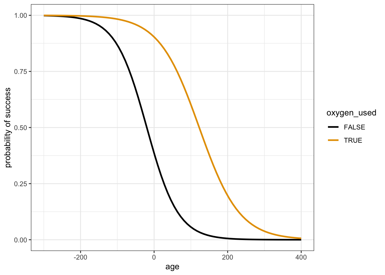
Part c
When controlling for oxygen use, the odds of success are 97.8% as high (2.2% lower) for every additional year in age, on average.
# Get the model summary table
coef(summary(climb_model_2))
## Estimate Std. Error z value Pr(>|z|)
## (Intercept) -0.51957247 0.207331212 -2.506002 1.221049e-02
## age -0.02197407 0.005459778 -4.024718 5.704361e-05
## oxygen_usedTRUE 2.89559690 0.126370801 22.913496 3.408591e-116
# Exponentiated coefficients
exp(-0.520)
## [1] 0.5945205
exp(-0.022)
## [1] 0.9782402
exp(2.896)
## [1] 18.10159Part d
When controlling for age, the odds of success are roughly 18 times higher for people that use oxygen.
Exercise 2: Model evaluation using plots
climbers %>%
  mutate(.fitted = predict(climb_model_1, newdata = ., type = "response")) %>%
  head()
## # A tibble: 6 × 7
## peak_name success age oxygen_used year season .fitted
## <chr> <lgl> <dbl> <lgl> <dbl> <chr> <dbl>
## 1 Ama Dablam TRUE 28 FALSE 1981 Spring 0.439
## 2 Ama Dablam TRUE 27 FALSE 1981 Spring 0.445
## 3 Ama Dablam TRUE 35 FALSE 1981 Spring 0.398
## 4 Ama Dablam TRUE 37 FALSE 1981 Spring 0.387
## 5 Ama Dablam TRUE 43 FALSE 1981 Spring 0.353
## 6 Ama Dablam FALSE 38 FALSE 1981 Spring 0.381
# Compare the climb_model_1 probability of success calculations for those that were & weren't successful
climbers %>%
  mutate(.fitted = predict(climb_model_1, newdata = ., type = "response")) %>%
  ggplot(aes(x = success, y = .fitted)) +
  geom_boxplot()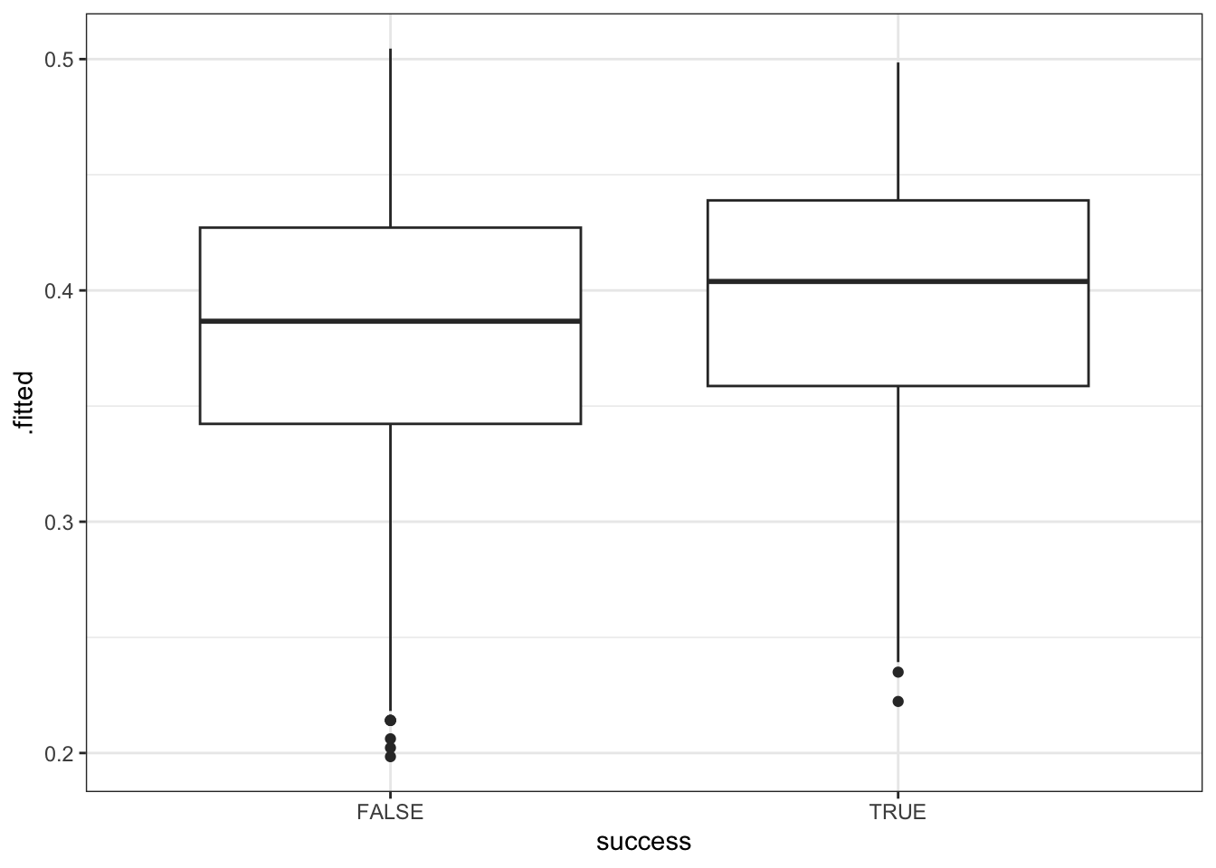
# Compare the climb_model_2 probability of success calculations for those that were & weren't successful
climbers %>%
  mutate(.fitted = predict(climb_model_2, newdata = ., type = "response")) %>%
  ggplot(aes(x = success, y = .fitted)) +
  geom_boxplot()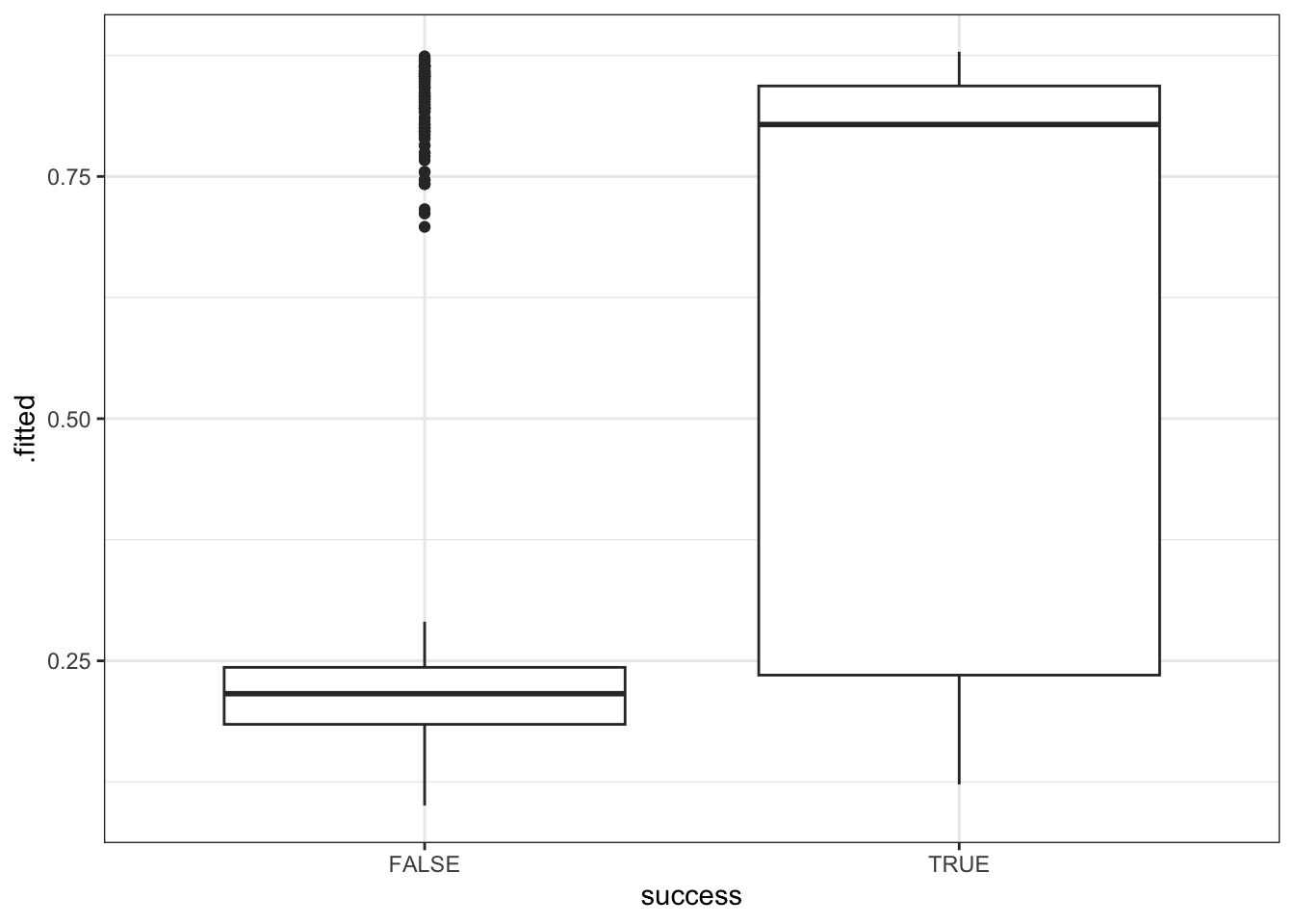
Part a
climb_model_2 does a better job differentiating between those who were and were not actually successful – it tends to predict higher probabilities of success for those that were actually successful. In contrast, climb_model_1 assigns pretty similar probabilities of success for both people that were actually successful and those that weren’t.
Part b
climbers %>%
  mutate(.fitted = predict(climb_model_2, newdata = ., type = "response")) %>%
  ggplot(aes(x = success, y = .fitted)) +
  geom_boxplot() +
  geom_hline(yintercept = 0.5, color = "red")
The 0.5 threshold would be bad. It would do a good job of predicting when climbers will fail, but will often predict failure for people that eventually succeed (i.e. it would have a high false negative rate).
The specificity be above 75% – the entire box is below the threshold, meaning at least 75% of failed climbers had predicted probability of success below 0.5.
The sensitivity would be between 50% & 75% – more than half of successful climbers but less than 75% had predicted probability of success above 0.5.
0.25ish better separates the 2 groups: Most climbers that failed had a probability prediction below 0.25, and most climbers that succeeded had a probability prediction above 0.25.
Exercise 3: Model evaluation using evaluation metrics
climbers %>%
  mutate(.fitted = predict(climb_model_1, newdata = ., type = "response")) %>%
  ggplot(aes(x = success, y = .fitted)) +
  geom_boxplot() +
  geom_hline(yintercept = 0.25, color = "red")
climbers %>%
  mutate(.fitted = predict(climb_model_2, newdata = ., type = "response")) %>%
  ggplot(aes(x = success, y = .fitted)) +
  geom_boxplot() +
  geom_hline(yintercept = 0.25, color = "red")
threshold <- 0.25
climbers %>%
  mutate(.fitted = predict(climb_model_1, newdata = ., type = "response")) %>%
  mutate(predictSuccess = .fitted >= threshold) %>%
  select(success, age, oxygen_used, .fitted, predictSuccess) %>%
  head()
## # A tibble: 6 × 5
## success age oxygen_used .fitted predictSuccess
## <lgl> <dbl> <lgl> <dbl> <lgl>
## 1 TRUE 28 FALSE 0.439 TRUE
## 2 TRUE 27 FALSE 0.445 TRUE
## 3 TRUE 35 FALSE 0.398 TRUE
## 4 TRUE 37 FALSE 0.387 TRUE
## 5 TRUE 43 FALSE 0.353 TRUE
## 6 FALSE 38 FALSE 0.381 TRUE
# Rows = actual / observed success (FALSE or TRUE)
# Columns = predicted success (FALSE or TRUE)
library(janitor)
climbers %>%
  mutate(.fitted = predict(climb_model_1, newdata = ., type = "response")) %>%
  mutate(predictSuccess = .fitted >= threshold) %>%
  tabyl(success, predictSuccess) %>%
  adorn_totals(c("row", "col"))
## success FALSE TRUE Total
## FALSE 25 1244 1269
## TRUE 7 800 807
## Total 32 2044 2076# a
# Total number of correct predictions / total number of climbers
(25 + 800) / 2076
## [1] 0.3973988
# b
# Number of successful climbers that were predicted to be successful / total number of successful climbers
800 / 807
## [1] 0.9913259
# c
# Number of unsuccessful climbers that were predicted to be unsuccessful / total number of unsuccessful climbers
25 / 1269
## [1] 0.01970055
Exercise 4: More confusion matrices
# Confusion matrix
climbers %>%
  mutate(.fitted = predict(climb_model_2, newdata = ., type = "response")) %>%
  mutate(predictSuccess = .fitted >= threshold) %>%
  tabyl(success, predictSuccess) %>%
  adorn_totals(c("row", "col"))
##  success FALSE TRUE Total
##    FALSE  1008  261  1269
##     TRUE   249  558   807
##    Total  1257  819  2076

# Overall accuracy
(1008 + 558) / 2076
## [1] 0.7543353

# Sensitivity
558 / 807
## [1] 0.6914498

# Specificity
1008 / 1269
## [1] 0.7943262
Exercise 5: Model comparison
| model | predictors | overall | sensitivity | specificity |
|---|---|---|---|---|
| 1 | age | 0.40 | 0.99 | 0.02 |
| 2 | age, oxygen_used | 0.75 | 0.69 | 0.79 |
Part a
- Model 2 had the higher overall accuracy.
- Model 1 was better at predicting when a climber would succeed. (it had higher sensitivity)
- Model 2 was better at predicting when a climber would not succeed. (it had higher specificity)
Part b
In my opinion, specificity is more important. Climbing can be dangerous and so maybe it’s better to anticipate when you might not succeed.