# Load packages and data
library(tidyverse)
peaks <- read_csv("https://mac-stat.github.io/data/high_peaks.csv")4 Model evaluation
Announcements etc
SETTLING IN
- Sit in your assigned groups & meet one another.
- Catch up and help each other get ready to take notes!
- Open the online manual to the “Course Schedule” and click on today’s activity. That brings you here!
- Download “04-slr-model-eval-notes.qmd” and open it in RStudio.
- Save it under a meaningful name in the “Activities” sub-folder of the “STAT 155” folder.
WRAPPING UP
- PP 1 is due tonight!
- Finish the activity and check the solutions in the online manual.
- We’ll take the pedal off the gas on Tuesday, so to speak.
- Upcoming due dates: let’s check out the course schedule!!
Learning goals
- Is it wrong?
Use residual plots to evaluate the correctness of a model - Is it strong?
- Explain the rationale for the R-squared metric of model strength
- Interpret the R-squared metric
- Is it fair?
Think about ethical implications of modeling by examining the impacts of biased data, power dynamics, the role of categorization, and the role of emotion and lived experience
Additional resources
Required videos
- Model evaluation: is the model wrong? (slides)
- Model evaluation: is the model strong? (slides)
- Model evaluation: is the model fair? (slides)
Optional
- Reading: Sections 1.7, 3.7, and 3.8 in the STAT 155 Notes
Note: You do not need to focus on the “Ladder of Power” in Section 3.8. Transformations in general will be the focus of the next activity we do.
References
Just as we should always question the safety of a foraged mushroom, and just as medications come with warning labels, we should always evaluate the quality of our model before trusting, using, or reporting it. To this end, there are 3 important questions to ask:
Is it correct? (Is it wrong?)
There are four assumptions. These spell out LINE:
Linearity
Residuals are balanced above & below 0 across the entire range. (The model accurately describes the “shape” of the relationship between Y and X.)Independence
Residuals are unrelated / independent of one another.Normality
Residuals are normally distributed or clustered around 0 across the entire range.Equal variance
The variability in residuals (thus how far observed outcomes fall from the model) is roughly equal across the entire range.
OPTIONAL Math Box: Model assumptions
In practice, the LINE assumptions for a (Normal) simple linear regression model are mathematically presented as follows:
\[Y_i = E[Y | X_i] + \varepsilon_i = \beta_0 + \beta_1 X_i + \varepsilon_i \;\;\;\; \text{ where } \;\;\;\; \varepsilon_i \stackrel{ind}{\sim} N(0, \sigma^2)\]
Equivalently,
\[Y_i \stackrel{ind}{\sim} N(\beta_0 + \beta_1 X_i, \sigma^2)\]
Is it strong?
Calculate R-squared (\(R^2\)).
\(0 \le R^2 \le 1\)
R2 measures the proportion of the variability in the observed response values that’s explained by the model. Thus 1 - R2 is the proportion of the variability in the observed response values that’s left UNexplained by the model.
The closer R2 is to 1, the better the model.
OPTIONAL Math Box: Calculating R-squared
Let \(y = (y_1, y_2, ..., y_n)\) denote our sample of observed \(Y\) values, \(\hat{y} = (\hat{y}_1, \hat{y}_2, ..., \hat{y}_n)\) denote the corresponding model predictions, and \(y - \hat{y} = (y_1-\hat{y}_1, y_2-\hat{y}_2, ..., y_n-\hat{y}_n)\) denote the corresponding model residuals. Then we can partition the variance in the observed outcomes:
\[Var(y) = Var(\hat{y}) + Var(y - \hat{y})\]
It follows that
\[R^2 = \frac{Var(\hat{y})}{Var(y)} = \frac{\sum (\hat{y}_i - \bar{y})^2}{\sum (y_i - \bar{y})^2}\]
Equivalently,
\[R^2 = 1 - \frac{Var(y - \hat{y})}{Var(y)} = \frac{\sum (y_i - \hat{y}_i)^2}{\sum (y_i - \bar{y})^2}\]
Is it fair?
There’s no mathematical measure or assumption here! Rather, we must evaluate the potential ethical implications of data collection and modeling.
Warm-up
Let’s explore the high_peaks data, which includes information on hiking trails in the 46 “high peaks” in the Adirondack mountains of northern New York state.1

EXAMPLE 1: Modeling review
Let’s begin by modeling the time (in hours) that it takes to complete each hike by the hike’s vertical ascent (in feet).
# Check out the data# Fit a model
peaks_model <- ___(___, ___)
# Check out a model summary table
# (the big one, not the simplified version!)Follow-up
Write out the model formula.
Interpreting model coefficients
When interpreting model coefficients, remember to:
- interpret in context
- use non-causal language
- include units
- talk about averages rather than individual cases
EXAMPLE 2: More modeling review
Interpret the 2 model coefficients.
EXAMPLE 3: Is it correct?
Let’s evaluate the quality of this model. First, is it correct (i.e. not wrong)? Comment on the LINE assumptions, using the below residual plot where relevant.
# Residual plot
# NOTE: We start our code with the MODEL not the DATA!!!
# That's where the residuals (`.resid`) & predictions (`.fitted`) are stored
# We'll RARELY do this.
peaks_model %>%
  ___(___(___ = .fitted, ___ = .resid)) +
  ___() +
  geom_hline(yintercept = 0)
EXAMPLE 4: Plot the data
Let’s go back and plot the data, specifically the relationship of time with ascent (which we should always do before building the model!). Include a representation of the linear regression model.
# NOTE: "lm" stands for "linear model"
___ %>%
  ___(aes(y = ___, x = ___)) +
  geom___() +
  geom___(method = "lm", se = FALSE)
EXAMPLE 5: Is it strong?
We can measure the strength of this model using R-squared (\(R^2\)). Report and interpret the R-squared value. HINT: No new R code needed! Just check out the model summary table.
summary(peaks_model)
EXAMPLE 6: Is the model fair?
Exercises
You’ll work with a variety of datasets & scenarios in these exercises. The goal is to explore the different ways that a model can be bad (or good!), not to work through 1 cohesive analysis.
DIRECTIONS
Work with your group:
Be kind to yourself and others. Engage yourself and engage others.When you get stuck:
Re-read the problem, discuss with your group, ask the instructor, check solutions in the online manual.
Exercise 1: Is the model wrong?
Let’s check out some weather data from Hobart, Australia, including the maxtemp (maximum temperature in degrees Celsius) and day_of_year (1–365):
# Import data
# Take note of the filter code!
weather <- read_csv("https://mac-stat.github.io/data/weather_3_locations.csv") %>%
  filter(location == "Hobart") %>%
  mutate(day_of_year = yday(date)) %>%
  select(maxtemp, day_of_year)

# Check it out
head(weather)
Let’s use this data to model maxtemp by day_of_year:
# Fit a linear model of
weather_model <- lm(maxtemp ~ day_of_year, data = weather)

# Check it out
summary(weather_model)
Part a
The estimated model formula is
E[maxtemp | day_of_year] = 20.105 - 0.012 day_of_year
Discuss the implications of the slope coefficient -0.012 in this context. Does this make sense (what do you think is the actual relationship between these 2 variables)?
Part b
Now plot the relationship of maxtemp with day_of_year with both a curved and linear trend line. This plot indicates that the simple linear regression model (blue) is wrong. Specify which LINE assumption it violates.
# Plot maxtemp vs day_of_year with...
# a linear regression model trend AND
# a smooth red curve (not necessarily linear)
___ %>%
  ___(aes(y = ___, x = ___)) +
  geom___() +
  geom___(method = "lm", se = FALSE) +
  geom___(se = FALSE, color = "red")
Part c
Check out the residual plot for this model. Convince yourself that you could come to the same conclusion from Part a using this plot alone.
# Check out the residual plot for weather_model
___ %>%
  ggplot(aes(x = .fitted, y = .resid)) +
  geom_point() +
  geom_hline(yintercept = 0) +
  geom_smooth(se = FALSE)
Exercise 2: What’s incorrect about this model?
Consider another example. The mammals data includes data on the average brain weight (g) and body weight (kg) for a variety of mammals:
# Import the data
mammals <- read_csv("https://mac-stat.github.io/data/mammals.csv")

# Check it out
head(mammals)
Fit a model of brain vs body weight:
# Construct the model
mammal_model <- lm(brain ~ body, mammals)

# Check it out
summary(mammal_model)
Part a
Construct two plots that will help us evaluate mammal_model:
# Scatterplot of brain weight (y) vs body weight (x)
# Include a model trend line (i.e. a representation of mammal_model)
# Residual plot for mammal_modelPart b
These two plots confirm that our model is wrong. What is wrong? Specifically, beyond the relationship maybe not being linear, which of the other LINE assumptions is violated? (NOTE: We again can fix this model by “transforming” one or both of the brain and body variables. We’ll discuss this idea in our next class.)
Part c
Just for fun, let’s dig into the mammals. Discuss what you observe.
# Label the points by the animal name!
# Discuss: What 2 things are new in this code?
mammals %>%
  ggplot(aes(x = body, y = brain, label = animal)) +
  geom_text() +
  geom_smooth(method = "lm", se = FALSE)
# Zoom in
# Discuss: What 1 thing is new in this code?
mammals %>%
ggplot(aes(x = body, y = brain, label = animal)) +
geom_text() +
lims(y = c(0, 1500), x = c(0, 600))# Zoom in more
mammals %>%
ggplot(aes(x = body, y = brain, label = animal)) +
geom_text() +
lims(y = c(0, 500), x = c(0, 200))
Exercise 3: Is the model strong?
Let’s revisit the bikes data, but focus just on MONDAY ridership:
# Take a peak at this code for review!
mondays <- read_csv("https://mac-stat.github.io/data/bikeshare.csv") %>%
rename(rides = riders_registered) %>%
filter(day_of_week == "Mon")
# Check it out
head(mondays)Check out the plot of rides vs temp_feel:
mondays %>%
ggplot(aes(y = rides, x = temp_feel)) +
geom_point() +
geom_smooth(method = "lm", se = FALSE)And the plot of rides vs windspeed:
mondays %>%
ggplot(aes(y = rides, x = windspeed)) +
geom_point() +
geom_smooth(method = "lm", se = FALSE)Part a
Obtain, interpret, and compare the R-squared values for the 2 models of interest.
# Fit the models
bike_model_1 <- lm(rides ~ temp_feel, data = mondays)
bike_model_2 <- lm(rides ~ windspeed, data = mondays)
# Obtain R-squared
___(bike_model_1)
___(bike_model_2)Part b
Since the relationships modeled by bike_model_1 and bike_model_2 both include a single quantitative predictor, we can calculate their correlations. Do that below and demonstrate how these correlations can be used to calculate the R-squared values from Part a.
# Calculate correlation
mondays %>%
___(___(rides, temp_feel), ___(rides, windspeed))
# Use the correlations to calculate the model R-squared values
# (within rounding)
Exercise 4: Calculating R-squared (Part 1)
Let’s dig into where the R-squared metric comes from!
Part a
Check out the model_1_info table below that, for each day in the dataset, includes info on the observed ridership, the predicted ridership using bike_model_1, and the residual. (You made similar calculations in the previous activity.) Discuss with each other how these 3 columns are related! For example, how can we get the rides column from the predicted and residual columns?
# Don't worry about this code!
model_1_info <- mondays %>%
select(rides) %>%
mutate(predicted = bike_model_1$fitted.values, residual = bike_model_1$residuals)
# Check it out
head(model_1_info)Part b
In Part a we observed that the observed rides, predicted values, and residual values all vary from day to day. Here, calculate the variance of the observed rides, predicted values, and residual values. Identify and discuss with each other how these 3 values are related! For example, how can we calculate var(rides) using var(predicted) and var(residual)?
model_1_info %>%
___(var(rides), var(predicted), var(residual))Part c
Recall that bike_model_1 had an R-squared of 0.3137. Challenge: How can you calculate this using the var(rides) and var(predicted) values from Part b? Hint: Remember that R-squared is the proportion of the variability in a response variable Y that is explained by its model (thus its predictions).
# Calculate R-squared
Exercise 5: Calculating R-squared (Part 2)
Your work for bike_model_1 is summarized below, along with additional calculations from bike_model_2.
| Model | Var(observed) | Var(predicted) | Var(residuals) | R-squared |
|---|---|---|---|---|
bike_model_1 |
2262666 | 709695 | 1552970 | 0.31 |
bike_model_2 |
2262666 | 65864 | 2196801 | 0.02 |
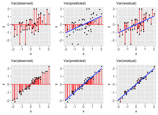
These results reflect 2 important facts:
- We can partition the variance of the observed response values into the variability that’s explained by the model (the variance of the predictions) and the variability that’s left unexplained by the model (the variance of the residuals):
\[\text{Var(observed) = Var(predicted) + Var(residuals)}\]
- It follows that R-squared, the proportion of the variance in the observed response values that’s explained the the model, can be calculated by:
\[R^2 = \frac{\text{Var(predicted)}}{\text{Var(observed)}} = 1 - \frac{\text{Var(residuals)}}{\text{Var(observed)}}\]
These properties are also reflected in the pictures below:
FOLLOW-UP QUESTIONS:
Reflecting on the above table of variances, R-squared formula, and plot…
In terms of obtaining higher R-squared / stronger model, do we want the variance of the residuals to be close to 0 or close to the variance of the observed Y values? Why does this make sense?
In terms of obtaining higher R-squared / stronger model, do we want the variance of the prediction to be close to 0 or close to the variance of the observed Y values? Why does this make sense?
Exercise 6: Biased data, biased results
In the above exercises, we focused on exploring our first 2 model evaluation questions: Is it wrong? Is it strong? In the next 3 exercises, let’s explore the third question: Is it fair?
Data are not neutral. Data can reflect personal biases, institutional biases, power dynamics, societal biases, the limits of our knowledge, etc. And biased data can lead to biased analyses. Consider the example of a large company that developed a model / algorithm to review the résumés of applicants for software developer & other tech positions. The model then gave each applicant a score indicating their hire-ability or potential for success at the company. You can think of this model as something like:
\[E[\text{potential | résumé features}] = \beta_0 + \beta_1 (\text{résumé features})\]
Skim this Reuter’s article about the company’s résumé model.
Explain why the data used by this model are not neutral.
What are the potential implications, personal or societal, of the results produced from this biased data? Hence why is this model not fair?
Exercise 7: Rigid data collection systems
When working with categorical variables, we’ve observed that our units of observation fall into neat groups. Reality isn’t so discrete. For example, check out questions 6 and 9 on page 2 of the 2020 US Census. With your group, discuss the following:
What are a couple of issues you observe with these questions?
What impact might this type of data collection have on a subsequent analysis of the census responses and the policies it might inform? That is, why might a resulting model not be fair?
Can you think of a better way to write these questions while still preserving the privacy of respondents?
FOR A DEEPER DISCUSSION: Read Chapter 4 of Data Feminism on “What gets counted counts”.
Exercise 8: Data drill
Part a
Let’s end by practicing some data wrangling with our peaks data. In addition to some basic functions (e.g. head()), use the tidyverse functions we’ve been accumulating: select(), summarize(), filter().
# How many hikes are in the data set?
# Show just the peak's name and its elevation for the first 6 hikes
___ %>%
___ %>%
head()
# Calculate the average hiking time
# Show data for the hikes that are *at least* 17 miles long
# Calculate the average hiking time for hikes that are at least 17 miles long
# HINT: You'll need to use 2 tidyverse functions!
___ %>%
___ %>%
___
# Calculate the average hiking time for hikes with an "easy" rating
# HINT: You'll need to use 2 tidyverse functions again!Part b
Let’s practice some visualization!
# Construct a visualization of hike rating
# Construct a visualization of hiking time
# Construct a visualization of the relationship between hiking time and length (distance)
Reflection
Learning goals
What has stuck with you most in our exploration of model evaluation? The least? Why?
Code
What new code did you learn today?
Remember that you’re highly encouraged to start tracking and organizing new code in a cheat sheet (eg: a Google doc).
Solutions
EXAMPLE 1: Modeling review
# Load packages and data
library(tidyverse)
peaks <- read_csv("https://mac-stat.github.io/data/high_peaks.csv")
# Check out the data
head(peaks)
## # A tibble: 6 × 7
## peak elevation difficulty ascent length time rating
## <chr> <dbl> <dbl> <dbl> <dbl> <dbl> <chr>
## 1 Mt. Marcy 5344 5 3166 14.8 10 moderate
## 2 Algonquin Peak 5114 5 2936 9.6 9 moderate
## 3 Mt. Haystack 4960 7 3570 17.8 12 difficult
## 4 Mt. Skylight 4926 7 4265 17.9 15 difficult
## 5 Whiteface Mtn. 4867 4 2535 10.4 8.5 easy
## 6 Dix Mtn. 4857 5 2800 13.2 10 moderate
# Fit a model
peaks_model <- lm(time ~ ascent, data = peaks)
# Check out a model summary table
# (the big one, not the simplified version!)
summary(peaks_model)
##
## Call:
## lm(formula = time ~ ascent, data = peaks)
##
## Residuals:
## Min 1Q Median 3Q Max
## -4.327 -2.075 -0.150 1.414 6.529
##
## Coefficients:
## Estimate Std. Error t value Pr(>|t|)
## (Intercept) 4.2100541 1.8661683 2.256 0.02909 *
## ascent 0.0020805 0.0005909 3.521 0.00101 **
## ---
## Signif. codes: 0 '***' 0.001 '**' 0.01 '*' 0.05 '.' 0.1 ' ' 1
##
## Residual standard error: 2.496 on 44 degrees of freedom
## Multiple R-squared: 0.2198, Adjusted R-squared: 0.2021
## F-statistic: 12.4 on 1 and 44 DF, p-value: 0.001014E[time | ascent] = 4.210 + 0.002 ascent
EXAMPLE 2: More modeling review
- 4.210: this would be the average (expected) hiking time in hours for a hike that has a 0ft ascent (i.e. a flat hike). There are no such hikes with this feature in our data, so we shouldn’t extrapolate!
- 0.002: for every 1 ft increase in vertical ascent, the expected hiking time increases by 0.002 hours. or, for every 1000 ft increase in vertical ascent, the expected hiking time increases by 2 hours (0.002*1000).
EXAMPLE 3: Is it correct?
The assumption of independence is ok (the residuals / outcomes for one hike are unrelated to another). Further, the residual plot looks random, hence good! That is, the linearity, normality, and equal variance assumptions appear to hold.
# Residual plot
# NOTE: We start our code with the MODEL not the DATA!!!
# That's where the residuals (`.resid`) & predictions (`.fitted`) are stored
# We'll RARELY do this.
peaks_model %>%
ggplot(aes(x = .fitted, y = .resid)) +
geom_point() +
geom_hline(yintercept = 0)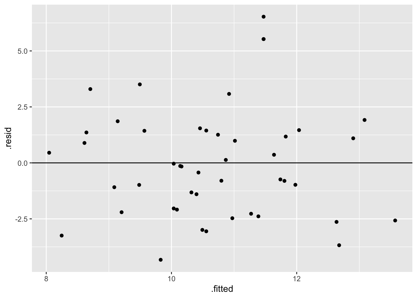
EXAMPLE 4: Plot the data
peaks %>%
ggplot(aes(y = time, x = ascent)) +
geom_point() +
geom_smooth(method = "lm", se = FALSE)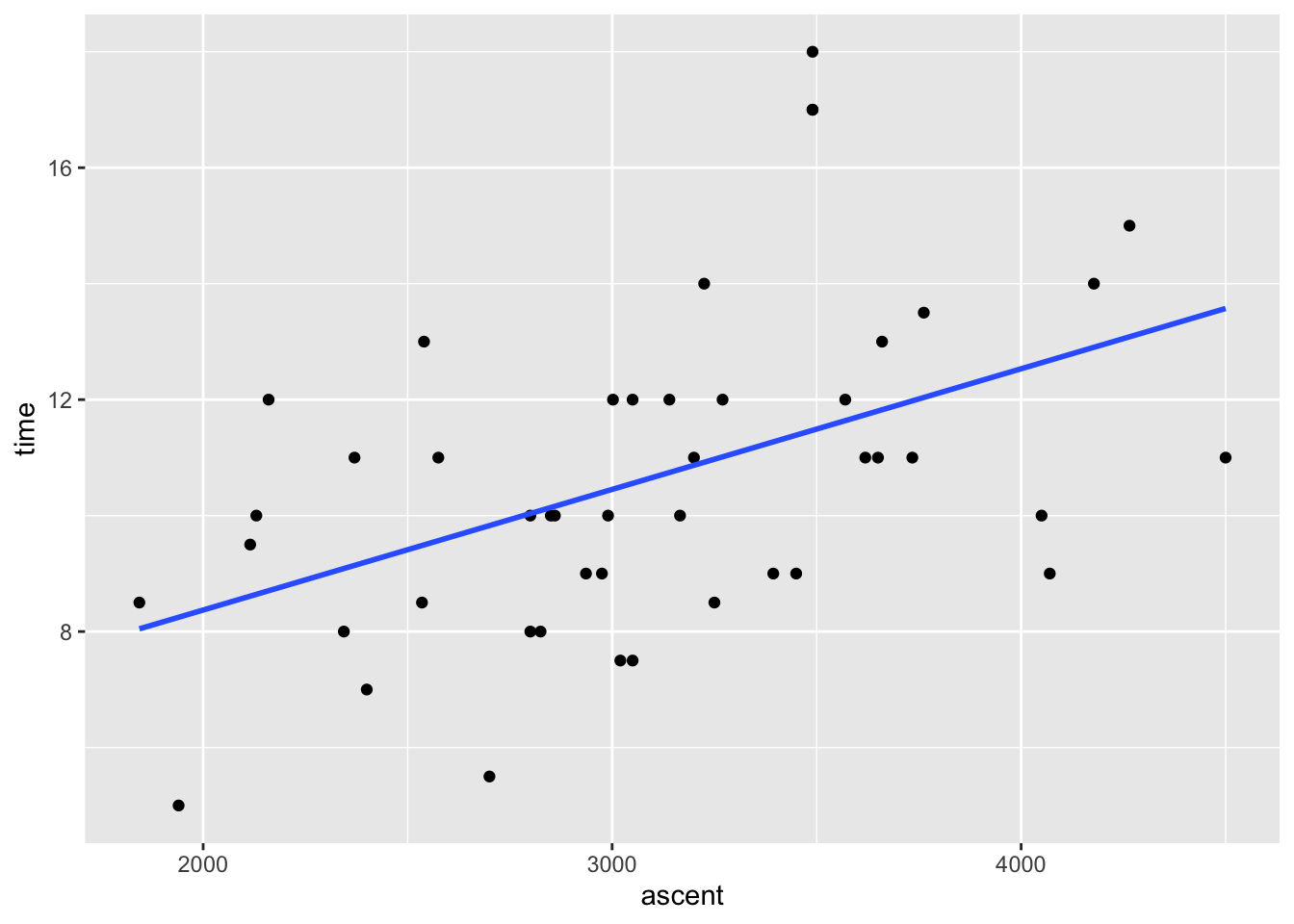
EXAMPLE 5: Is it strong?
The Multiple R-squared is 0.2198. Hence hikes’ vertical ascents explain roughly 22% of the variability in hiking time from hike to hike.
summary(peaks_model)
##
## Call:
## lm(formula = time ~ ascent, data = peaks)
##
## Residuals:
## Min 1Q Median 3Q Max
## -4.327 -2.075 -0.150 1.414 6.529
##
## Coefficients:
## Estimate Std. Error t value Pr(>|t|)
## (Intercept) 4.2100541 1.8661683 2.256 0.02909 *
## ascent 0.0020805 0.0005909 3.521 0.00101 **
## ---
## Signif. codes: 0 '***' 0.001 '**' 0.01 '*' 0.05 '.' 0.1 ' ' 1
##
## Residual standard error: 2.496 on 44 degrees of freedom
## Multiple R-squared: 0.2198, Adjusted R-squared: 0.2021
## F-statistic: 12.4 on 1 and 44 DF, p-value: 0.001014
EXAMPLE 6: Is the model fair?
Seems fair! It’s tough to imagine any bias here, or any negative consequences of this analysis or data collection.
Exercise 1: Is the model correct?
# Import data
# Take note of the filter code!
weather <- read_csv("https://mac-stat.github.io/data/weather_3_locations.csv") %>%
filter(location == "Hobart") %>%
mutate(day_of_year = yday(date)) %>%
select(maxtemp, day_of_year)
# Check it out
head(weather)
## # A tibble: 6 × 2
## maxtemp day_of_year
## <dbl> <dbl>
## 1 23.3 1
## 2 25.9 2
## 3 20.7 3
## 4 28.1 4
## 5 22.9 5
## 6 20.9 6Part a
The slope indicates that temperature decreases throughout the year. But this ignores seasons in Australia.
Part b
The red curved trend line shows a clear quadratic trend—it tends to be warmer at the beginning and end of the year in Hobart. This is not captured well by a straight line of best fit. Specifically, a simple linear regression model would violate the Linearity assumption.
weather %>%
ggplot(aes(x = day_of_year, y = maxtemp)) +
geom_point() +
geom_smooth(method = "lm", se = FALSE) +
geom_smooth(se = FALSE, color = "red")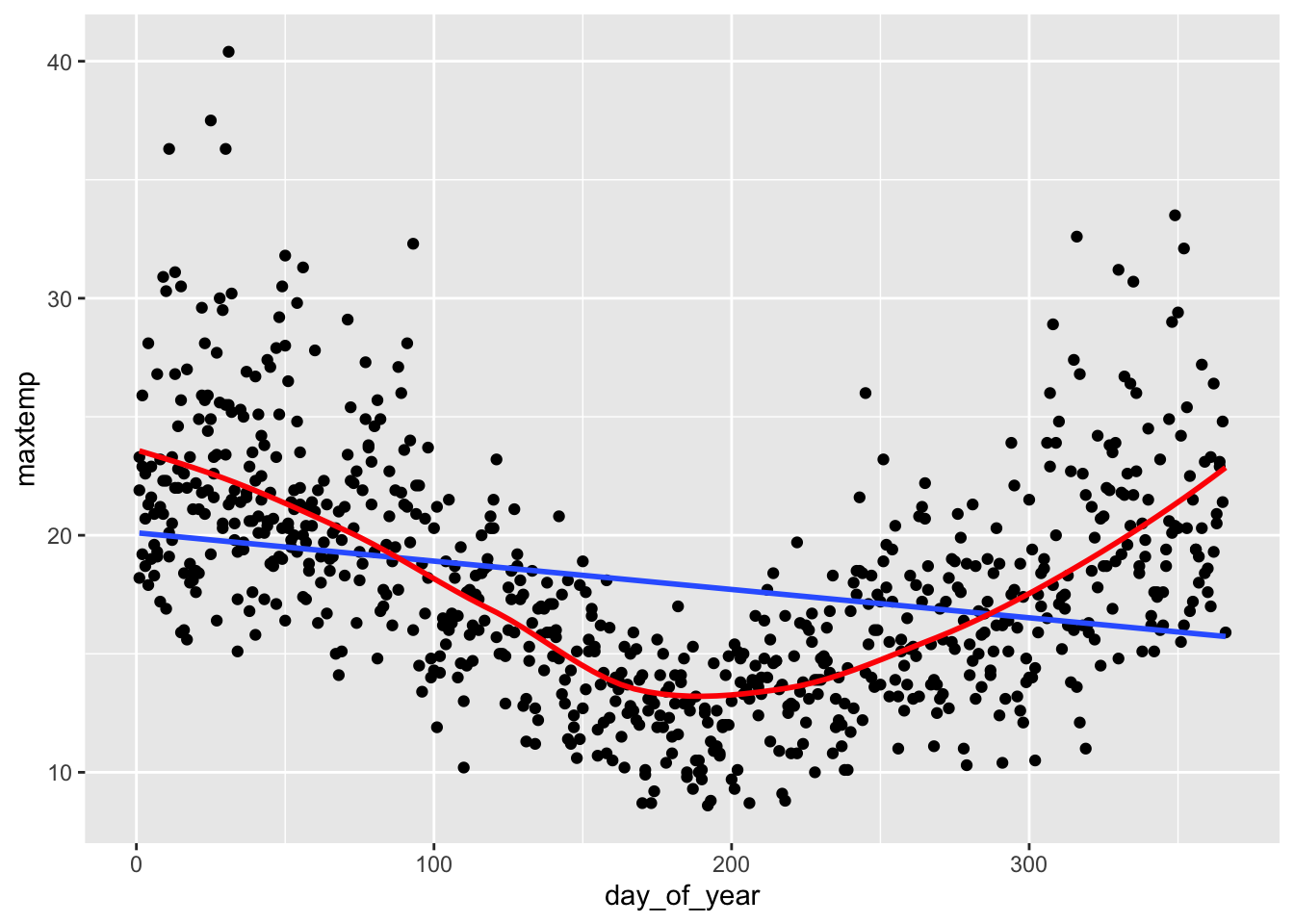
Part c
The residual plot shows a trend in the residuals—the blue curve traces the quadratic trend in the residuals, and it does not lie flat on the y = 0 line. This again suggests that the Linearity assumption is violated.
weather_model %>%
ggplot(aes(x = .fitted, y = .resid)) +
geom_point() +
geom_hline(yintercept = 0) +
geom_smooth(se = FALSE)
## Error: object 'weather_model' not found
Exercise 2: What’s incorrect about this model?
# Import the data
mammals <- read_csv("https://mac-stat.github.io/data/mammals.csv")
# Check it out
head(mammals)
## # A tibble: 6 × 4
## ...1 animal body brain
## <dbl> <chr> <dbl> <dbl>
## 1 1 Arctic fox 3.38 44.5
## 2 2 Owl monkey 0.48 15.5
## 3 3 Mountain beaver 1.35 8.1
## 4 4 Cow 465 423
## 5 5 Grey wolf 36.3 120.
## 6 6 Goat 27.7 115
# Construct the model
mammal_model <- lm(brain ~ body, mammals)
# Check it out
summary(mammal_model)
##
## Call:
## lm(formula = brain ~ body, data = mammals)
##
## Residuals:
## Min 1Q Median 3Q Max
## -810.07 -88.52 -79.64 -13.02 2050.33
##
## Coefficients:
## Estimate Std. Error t value Pr(>|t|)
## (Intercept) 91.00440 43.55258 2.09 0.0409 *
## body 0.96650 0.04766 20.28 <2e-16 ***
## ---
## Signif. codes: 0 '***' 0.001 '**' 0.01 '*' 0.05 '.' 0.1 ' ' 1
##
## Residual standard error: 334.7 on 60 degrees of freedom
## Multiple R-squared: 0.8727, Adjusted R-squared: 0.8705
## F-statistic: 411.2 on 1 and 60 DF, p-value: < 2.2e-16Part a
# Scatterplot of brain weight (y) vs body weight (x)
# Include a model trend line (i.e. a representation of mammal_model)
mammals %>%
ggplot(aes(y = brain, x = body)) +
geom_point() +
geom_smooth(method = "lm", se = FALSE)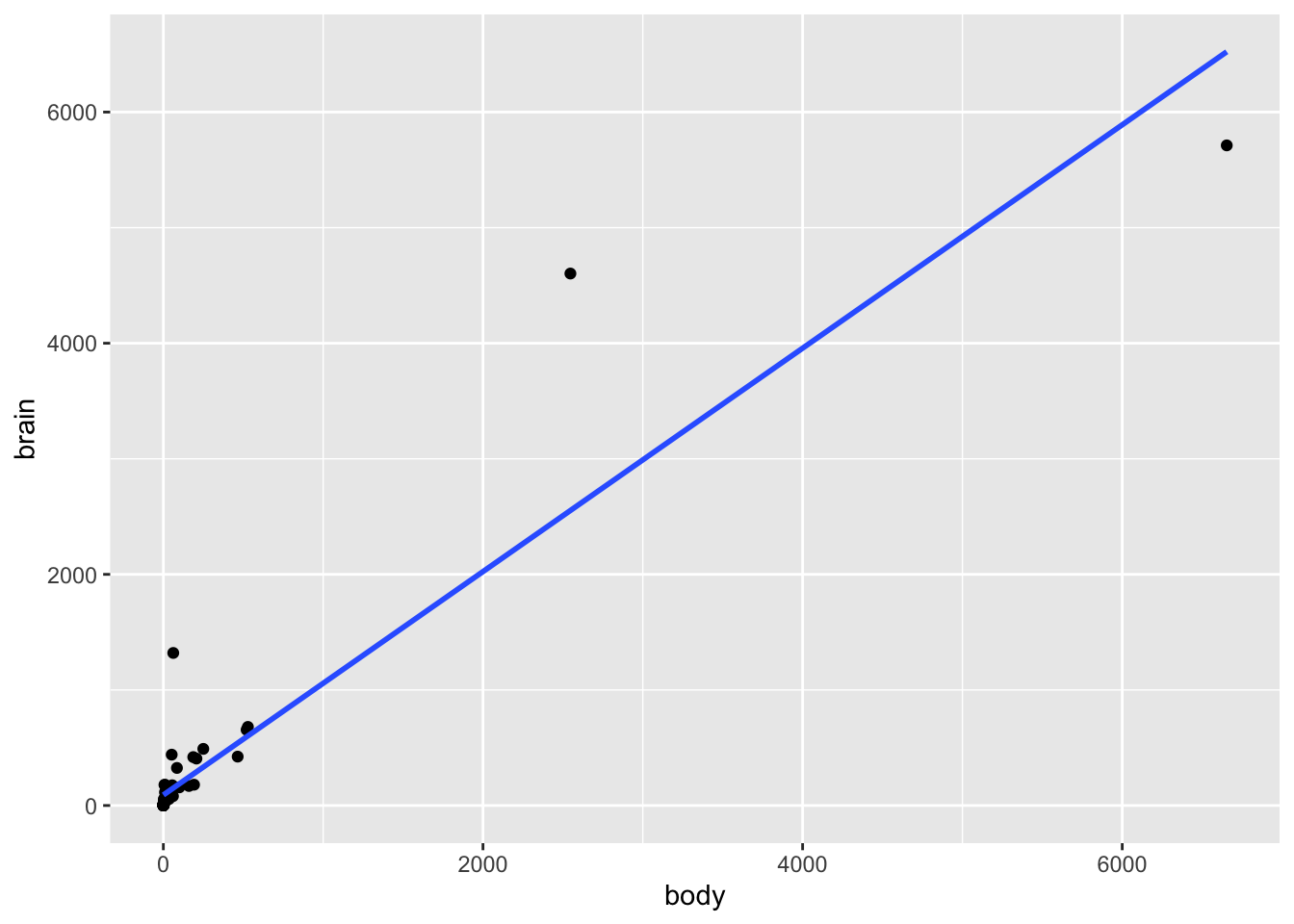
# Residual plot for mammal_model
mammal_model %>%
ggplot(aes(x = .fitted, y = .resid)) +
geom_point() +
geom_hline(yintercept = 0) +
geom_smooth(se = FALSE)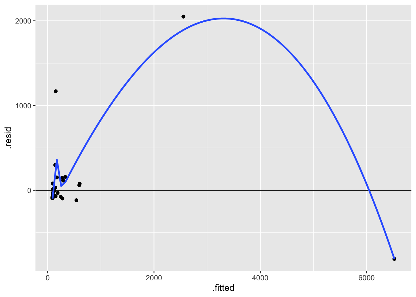
Part b
The biggest issue here is that the assumption of equal variance is violated. There’s much greater variability in the residuals as the predictions increase. This is because there’s much greater variability in the brain weights (y) as body weights (x) increase.
Part c
Answers will vary.
# Label the points by the animal name!
# Discuss: What 2 things are new in this code?
mammals %>%
ggplot(aes(x = body, y = brain, label = animal)) +
geom_text() +
geom_smooth(method = "lm", se = FALSE) 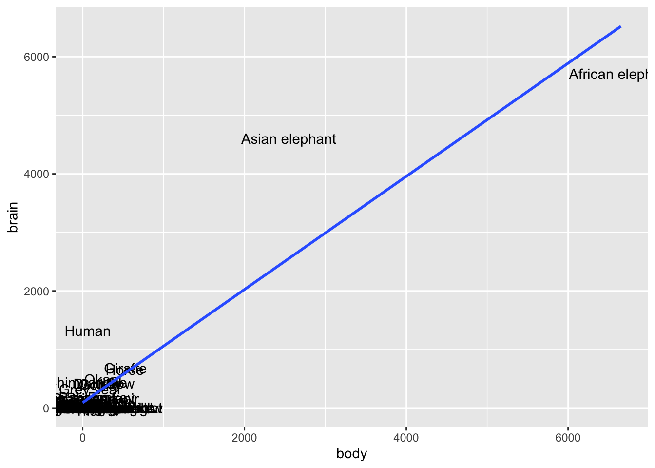
# Zoom in
mammals %>%
ggplot(aes(x = body, y = brain, label = animal)) +
geom_text() +
lims(y = c(0, 1500), x = c(0, 600))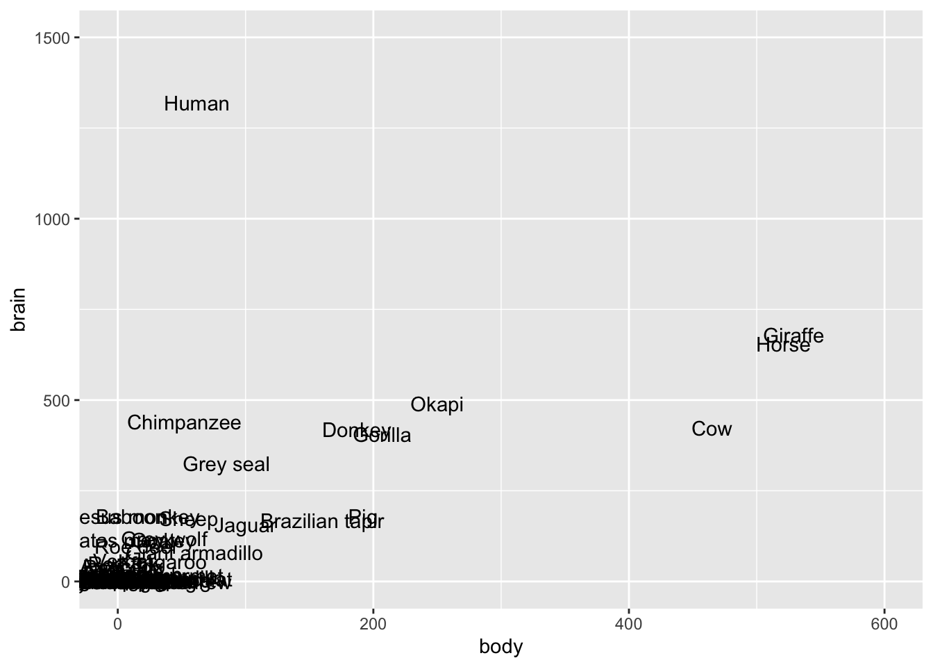
# Zoom in more
mammals %>%
  ggplot(aes(x = body, y = brain, label = animal)) +
  geom_text() +
  lims(y = c(0, 500), x = c(0, 200))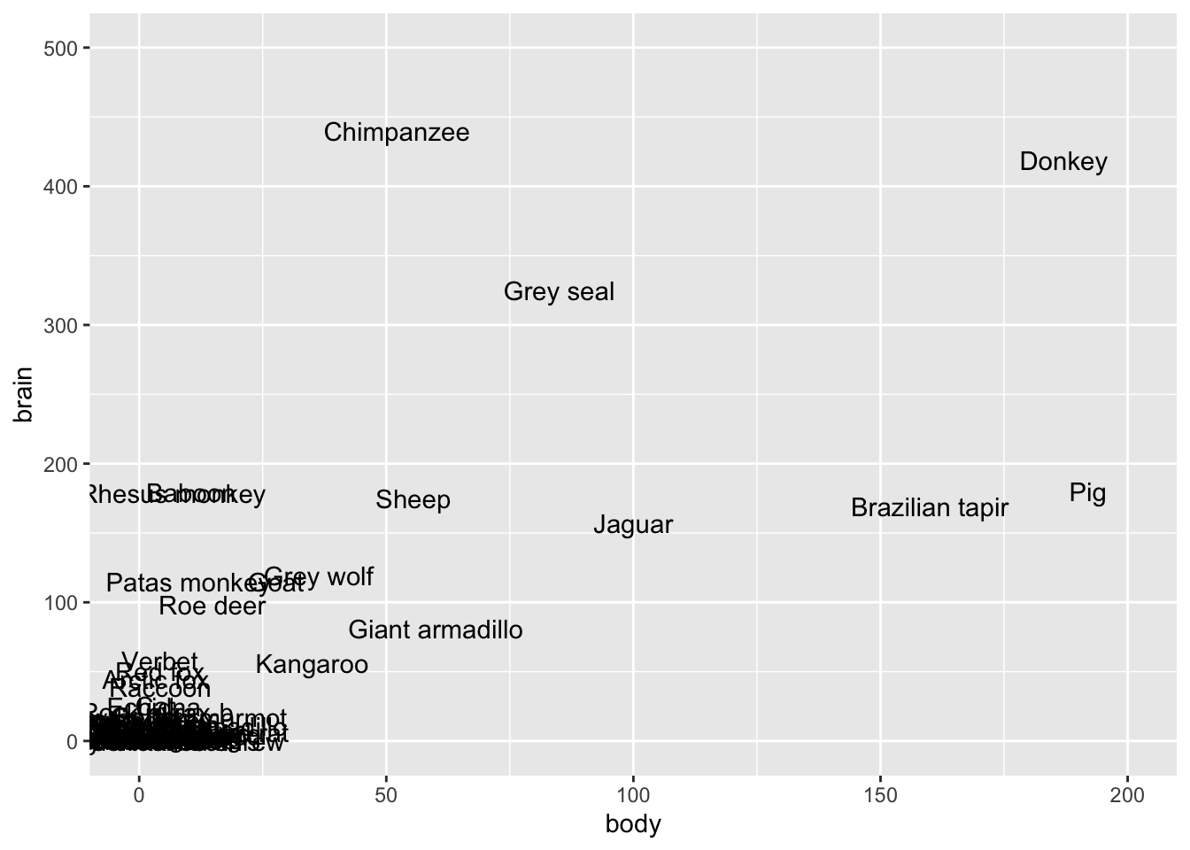
Exercise 3: Is the model strong?
# Take a peak at this code for review!
mondays <- read_csv("https://mac-stat.github.io/data/bikeshare.csv") %>%
rename(rides = riders_registered) %>%
filter(day_of_week == "Mon")
mondays %>%
  ggplot(aes(y = rides, x = temp_feel)) +
  geom_point() +
  geom_smooth(method = "lm", se = FALSE)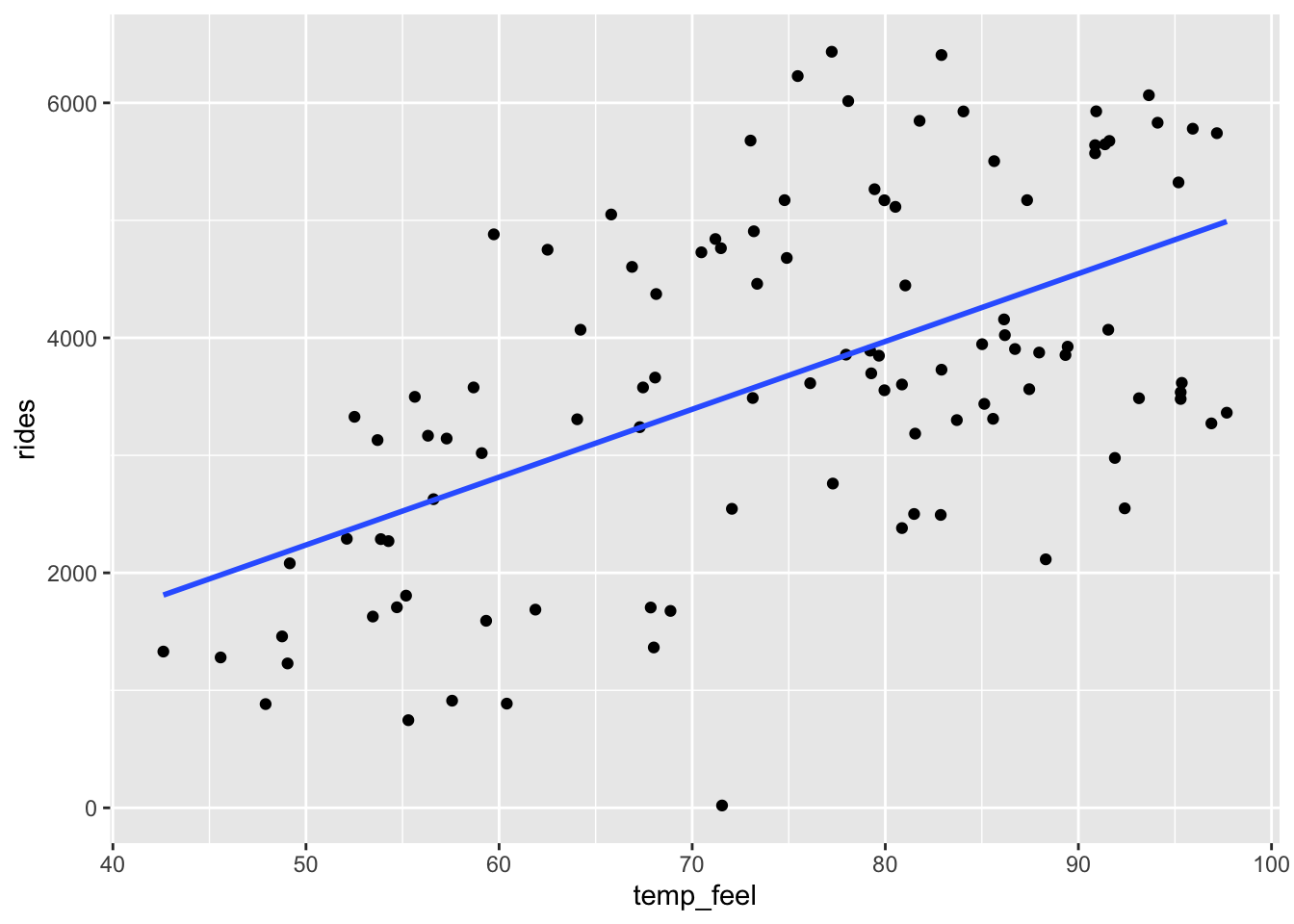
mondays %>%
  ggplot(aes(y = rides, x = windspeed)) +
  geom_point() +
  geom_smooth(method = "lm", se = FALSE)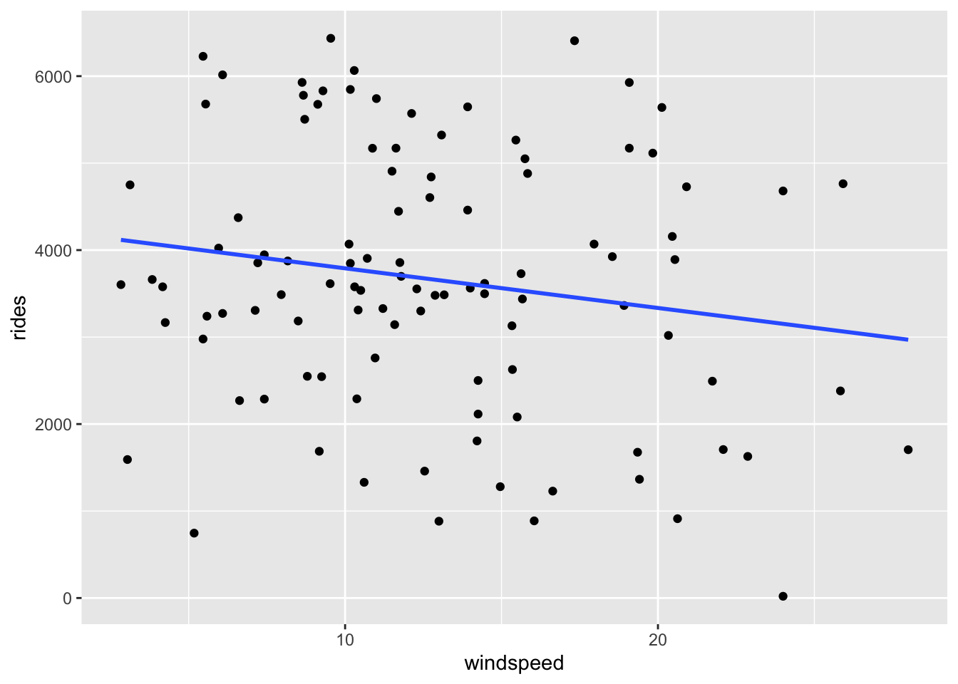
Part a
The \(R^2\) values for bike_model_1 and bike_model_2 are 0.3137 and 0.02911, respectively. Thus the model with the temp_feel predictor explains ~31% of the variability in ridership on Mondays. The model with the windspeed predictor explains only ~3%
# Fit the models
bike_model_1 <- lm(rides ~ temp_feel, data = mondays)
bike_model_2 <- lm(rides ~ windspeed, data = mondays)
# Obtain R-squared
summary(bike_model_1)
##
## Call:
## lm(formula = rides ~ temp_feel, data = mondays)
##
## Residuals:
## Min 1Q Median 3Q Max
## -3461.3 -883.3 -102.4 1020.9 2625.8
##
## Coefficients:
## Estimate Std. Error t value Pr(>|t|)
## (Intercept) -649.444 640.476 -1.014 0.313
## temp_feel 57.735 8.415 6.861 5.24e-10 ***
## ---
## Signif. codes: 0 '***' 0.001 '**' 0.01 '*' 0.05 '.' 0.1 ' ' 1
##
## Residual standard error: 1252 on 103 degrees of freedom
## Multiple R-squared: 0.3137, Adjusted R-squared: 0.307
## F-statistic: 47.07 on 1 and 103 DF, p-value: 5.243e-10
summary(bike_model_2)
##
## Call:
## lm(formula = rides ~ windspeed, data = mondays)
##
## Residuals:
## Min 1Q Median 3Q Max
## -3264.6 -986.9 -89.3 1420.3 2950.8
##
## Coefficients:
## Estimate Std. Error t value Pr(>|t|)
## (Intercept) 4246.61 362.00 11.731 <2e-16 ***
## windspeed -45.60 25.95 -1.757 0.0818 .
## ---
## Signif. codes: 0 '***' 0.001 '**' 0.01 '*' 0.05 '.' 0.1 ' ' 1
##
## Residual standard error: 1489 on 103 degrees of freedom
## Multiple R-squared: 0.02911, Adjusted R-squared: 0.01968
## F-statistic: 3.088 on 1 and 103 DF, p-value: 0.08184Part b
# Calculate correlation
mondays %>%
summarize(cor(rides, temp_feel), cor(rides, windspeed))
## # A tibble: 1 × 2
## `cor(rides, temp_feel)` `cor(rides, windspeed)`
## <dbl> <dbl>
## 1 0.560 -0.171
# Demonstrate the connection btwn correlation & R-squared
# R-squared = correlation^2
0.56^2
## [1] 0.3136
(-0.171)^2
## [1] 0.029241
Exercise 4: Calculating R-squared (Part 1)
Part a
rides = predicted + residual
# Don't worry about this code!
model_1_info <- mondays %>%
  select(rides) %>%
  mutate(predicted = bike_model_1$fitted.values, residual = bike_model_1$residuals)

# Check it out
head(model_1_info)
## # A tibble: 6 × 3
## rides predicted residual
## <dbl> <dbl> <dbl>
## 1 1229 2182. -953.
## 2 1280 1982. -702.
## 3 883 2117. -1234.
## 4 1330 1811. -481.
## 5 1459 2166. -707.
## 6 1592 2776. -1184.Part b
var(rides) = var(predicted) + var(residual)
model_1_info %>%
  summarize(var(rides), var(predicted), var(residual))
## # A tibble: 1 × 3
##   `var(rides)` `var(predicted)` `var(residual)`
##          <dbl>            <dbl>           <dbl>
## 1     2262666.          709695.        1552970.
Part c
# Calculate R-squared
# var(predicted) / var(rides)
709695 / 2262666
## [1] 0.3136543
# 1 - var(residual) / var(rides)
1 - 1552970 / 2262666
## [1] 0.3136548
Exercise 5: Calculating R-squared (Part 2)
We want the variance of the residuals to be close to 0. Essentially, we want all residuals to be close to 0 with little variation from 0.
We want the variance of the prediction to be close to the variance of the observed Y values. Essentially, we want the predictions to be as similar as possible to the observed values, hence to have similar characteristics (like variance).
Exercises 6 & 7
No solutions for these exercises. These require longer discussions, not discrete answers.
Exercise 8: Data drill
Part a
# How many hikes are in the data set?
nrow(peaks)
## [1] 46

# Show just the peak's name and its elevation for the first 6 hikes
peaks %>%
  select(peak, elevation) %>%
  head()
## # A tibble: 6 × 2
##   peak           elevation
##   <chr>              <dbl>
## 1 Mt. Marcy           5344
## 2 Algonquin Peak      5114
## 3 Mt. Haystack        4960
## 4 Mt. Skylight        4926
## 5 Whiteface Mtn.      4867
## 6 Dix Mtn.            4857

# Calculate the average hiking time
peaks %>%
  summarize(mean(time))
## # A tibble: 1 × 1
##   `mean(time)`
##          <dbl>
## 1         10.7

# Show data for the hikes that are at least 17 miles long
peaks %>%
  filter(length >= 17)
## # A tibble: 7 × 7
##   peak          elevation difficulty ascent length  time rating
##   <chr>             <dbl>      <dbl>  <dbl>  <dbl> <dbl> <chr>
## 1 Mt. Haystack       4960          7   3570   17.8  12   difficult
## 2 Mt. Skylight       4926          7   4265   17.9  15   difficult
## 3 Mt. Redfield       4606          7   3225   17.5  14   difficult
## 4 Panther Peak       4442          6   3762   17.6  13.5 moderate
## 5 Mt. Donaldson      4140          7   3490   17    17   difficult
## 6 Mt. Emmons         4040          7   3490   18    18   difficult
## 7 Cliff Mtn.         3960          6   2160   17.2  12   moderate

# Calculate the average hiking time for hikes that are more than 14 miles long
peaks %>%
  filter(length >= 17) %>%
  summarize(mean(time))
## # A tibble: 1 × 1
##   `mean(time)`
##          <dbl>
## 1         14.5

# Calculate the average hiking time for hikes with an "easy" rating
peaks %>%
  filter(rating == "easy") %>%
  summarize(mean(time))
## # A tibble: 1 × 1
##   `mean(time)`
##          <dbl>
## 1            8
Part b
# Construct a visualization of hike rating
peaks %>%
  ggplot(aes(x = rating)) +
  geom_bar()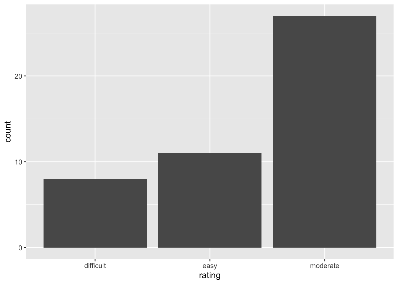
# Construct a visualization of hiking time
# a histogram or bar plot would also work
peaks %>%
  ggplot(aes(x = time)) +
  geom_density()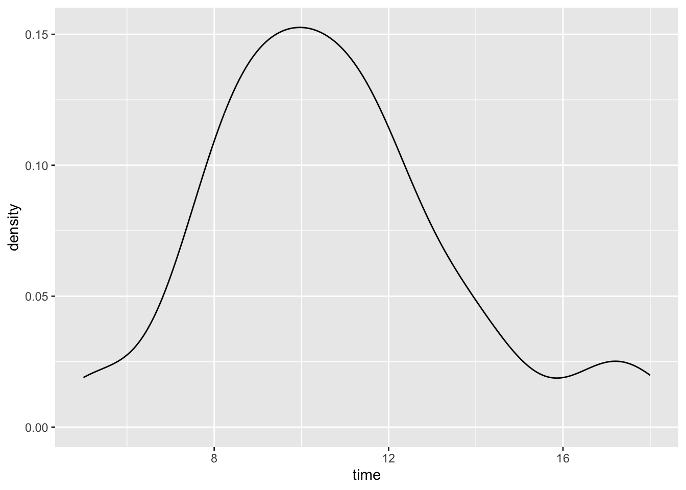
# Construct a visualization of the relationship of hiking time with length (distance)
peaks %>%
  ggplot(aes(y = time, x = length)) +
  geom_point()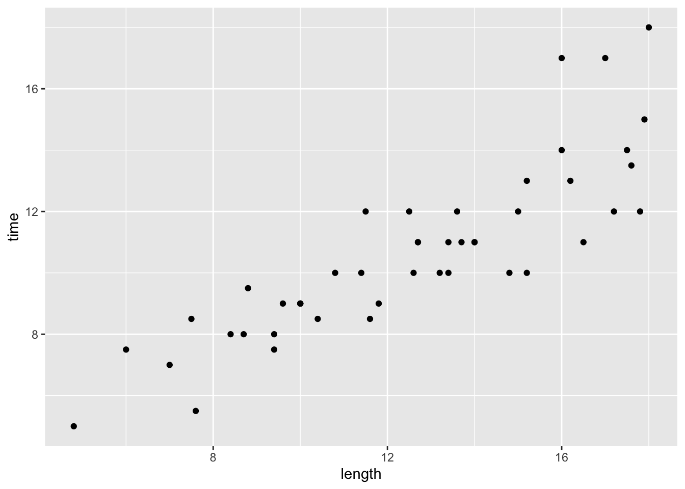
original data source =
HighPeaksdata in theStat2Datapackage; original image source = https://commons.wikimedia.org/wiki/File:New_York_state_geographic_map-en.svg↩︎