.png)
library(tidyverse)
elections <- read_csv("https://ajohns24.github.io/data/election_2024.csv") %>%
  mutate(repub_24 = round(100*per_gop_2024, 2),
         repub_20 = round(100*per_gop_2020, 2),
         repub_16 = round(100*per_gop_2016, 2),
         repub_12 = round(100*per_gop_2012, 2)) %>%
  select(state_name, state_abbr, county_name, county_fips, repub_24, repub_20, repub_16, repub_12)

head(elections)15 Sampling variation & the Normal model
Announcements etc
SETTLING IN
Find the qmd here: “15-sampling-normal-notes.qmd”.
Install the
gsheetlibrary by typing the following in your CONSOLE. Do NOT put this in your qmd:install.packages("gsheet")
WRAPPING UP
- Quiz 2 is Thursday during the first 60 minutes of class.
- Due next week:
- Tuesday: CP 13
- Thursday: Project milestone 1
Learning goals
- Recognize the difference between a population parameter and a sample estimate.
- Review the Normal probability model, a tool we’ll need to turn information in our sample data into inferences about the broader population.
- Explore the ideas of randomness, sampling distributions, and standard error through a class experiment. (We’ll define these more formally in the next class.)
Additional resources
Warm-up
Today marks a significant shift in the semester! Thus far, we’ve focused on exploratory analysis: visualizations, numerical summaries, and models that capture the observed patterns in our sample data. Today, we’ll move on to inference: using our data to make conclusions about the broader population from which it was taken.
Context
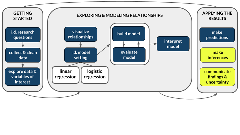
The elections dataset was compiled by data posted by Tony McGovern. This dataset includes the 2012, 2016, 2020, and 2024 presidential election results for the population of all 3000+ U.S. counties (except Alaska). (Image: Wikimedia Commons)

POPULATION PARAMETERS
Let Y be the Republican candidate’s (Trump’s) 2024 county-level vote percentage, and X be the Republican candidate’s (Mitt Romney’s) 2012 vote percentage. Then our goal will be to model the relationship of Y with X among all U.S. counties (except Alaska), our population of interest:
\[ E[Y|X] = \beta_0 + \beta_1 X \]
We refer to the \(\beta_0\) and \(\beta_1\) coefficients as population parameters. These are the “true”, underlying, fixed parameters that describe the “true” linear relationship between Y and X in the population of U.S. counties. NOTE: We’re putting “true” in quotes here to reflect the fact that some statisticians would view this relationship as constantly in flux, instead of “true” and “fixed”, with the elections providing 1 snapshot.
In this example, since we have data on all U.S. counties in the population of interest, we can actually obtain the “true” population parameters:
\[ E[Y|X] = \beta_0 + \beta_1 X = 9.699 + 0.957 X \]
population_model <- lm(repub_24 ~ repub_12, data = elections)
summary(population_model)
# The blue line is the population model
# The red dashed line shows a 1-to-1 relationship, for comparison
elections %>%
  ggplot(aes(y = repub_24, x = repub_12)) +
  geom_point() +
geom_smooth(method = "lm") +
geom_abline(intercept = 0, slope = 1, color = "red", linetype = "dashed")
SAMPLE ESTIMATES
NOW FORGET THAT YOU KNOW ALL OF THE ABOVE. Let’s pretend that we’re working within the typical scenario - we don’t have access to the entire population of interest, thus we don’t actually know the “true” population parameters \(\beta_0\) and \(\beta_1\). Instead, suppose we only have data on a sample of counties. We can then use the sample data to estimate the population parameters, denoted by putting a “hat” symbol, \(\hat{ }\), on top of the betas:
\[ E[Y|X] = \hat{\beta}_0 + \hat{\beta}_1 X \]
EXAMPLE 1: Intuition
To explore the nuances of using sample data to learn about a population, you will each take a random sample of 10 U.S. counties. You will use these counties to estimate the model of Y vs X.
Do you think that you will get the same sample of 10 counties as your neighbors?
If not, do you think that you will get the same coefficient estimates as your neighbors?
Below is a plot of the actual population model. How do you think the students’ sample model will compare? (Let’s draw.)
elections %>%
ggplot(aes(y = repub_24, x = repub_12)) +
geom_point() +
geom_smooth(method = "lm")
EXAMPLE 2: Random sampling
Use the sample_n() function to take a random sample of 2 U.S. counties:
# Try running the following chunk A FEW TIMES
elections %>%
  sample_n(size = 2, replace = FALSE)
Reflect:
How do your results compare to your neighbors’ results? How, if at all, do they change when you re-run your chunk?
What is the role of
size = 2? HINT: Remember you can look at function documentation by running?sample_nin the console!What is the role of
replace = FALSE? HINT: Remember you can look at function documentation by running?sample_nin the console!
EXAMPLE 3: Setting the seed
Now, “set the seed” to 155 and re-try your sampling:
# Try running the following FULL chunk A FEW TIMES
set.seed(155)
elections %>%
  sample_n(size = 2, replace = FALSE)
What changed?
EXAMPLE 4: Take your own sample of 50 counties
The underlying random number generator plays a role in the random sample we happen to get. If we set.seed(some positive integer) before taking a random sample, we’ll get the same results. This reproducibility is important:
- we get the same results every time we render our qmd
- we can share our work with others & ensure they get our same answers
- it wouldn’t be great if you submitted your work to, say, a journal and weren’t able to back up / confirm / reproduce your results!
Follow the chunks below to obtain and use your own unique sample.
# DON'T SKIP THIS STEP!
# Set the random number seed to the digits of your own phone number (just the numbers)
set.seed(___)

# Take a sample of 10 counties
my_sample <- elections %>%
  sample_n(size = 50, replace = FALSE)
my_sample
# Plot the SAMPLE model of Y vs X among YOUR sample data
# Compare it to the actual POPULATION model (red)
my_sample %>%
ggplot(aes(y = repub_24, x = repub_12)) +
geom_point() +
geom_smooth(method = "lm", se = FALSE) +
geom_smooth(data = elections, method = "lm", se = FALSE, color = "red", size = 0.5)# Model the relationship among your sample
my_model <- lm(repub_24 ~ repub_12, data = my_sample)
coef(summary(my_model))REPORT YOUR WORK
Log your intercept and slope sample estimates in this survey.
Exercises
Exercise 1: Using the Normal model
Before getting back to the experiment, let’s practice the concepts you explored in today’s video. First, run the following code which defines a shaded_normal() function which is specialized to this activity alone:
library(tidyverse)
shaded_normal <- function(mean, sd, a = NULL, b = NULL){
min_x <- mean - 4*sd
max_x <- mean + 4*sd
a <- max(a, min_x)
b <- min(b, max_x)
ggplot() +
scale_x_continuous(limits = c(min_x, max_x), breaks = c(mean - sd*(0:3), mean + sd*(1:3))) +
stat_function(fun = dnorm, args = list(mean = mean, sd = sd)) +
stat_function(geom = "area", fun = dnorm, args = list(mean = mean, sd = sd), xlim = c(a, b), fill = "blue") +
labs(y = "density") +
theme_minimal()
}Next, suppose that the speeds of cars on a highway, in miles per hour, can be reasonably represented by the Normal model with a mean of 55mph and a standard deviation of 5mph from car to car:
\[ X \sim N(55, 5^2) \]
shaded_normal(mean = 55, sd = 5)Part a
Provide the (approximate) range of the middle 68% of speeds, and shade in the corresponding region on your Normal curve. NOTE: a is the lower end of the range and b is the upper end.
shaded_normal(mean = 55, sd = 5, a = ___, b = ___)Part b
The area of the shaded region below reflects the probability that a car’s speed exceeds 60mph:
shaded_normal(mean = 55, sd = 5, a = 60)Use the 68-95-99.7 rule to estimate this probability.
Part c
The area of the shaded region below reflects the probability that a car’s speed exceeds 67mph:
shaded_normal(mean = 55, sd = 5, a = 67)Which of the following is the correct range for this probability? Explain your reasoning.
- less than 0.0015
- between 0.0015 and 0.025
- between 0.025 and 0.16
- greater than 0.16
Exercise 2: Z-scores
Inherently important to all of our calculations above is how many standard deviations a value “X” is from the mean. This distance is called a Z-score and can be calculated as follows:
\[ \text{Z-score} = \frac{X - \text{mean}}{\text{sd}} \]
For example, under the \(N(55, 5^2)\) speed settings in Exercise 1, if I’m traveling 40 miles an hour, my Z-score is -3. That is, my speed is 3 standard deviations below the average speed:
(40 - 55) / 5Part a
Consider 2 other drivers. Both drivers are speeding. Who do you think is speeding more, relative to the distributions of speed in their area? (Just give a quick answer without doing any formal calculations yet.)
- Driver A is traveling at 60mph on the highway where speeds are \(N(55, 5^2)\) and the speed limit is 55mph.
- Driver B is traveling at 36mph on a residential road where speeds are \(N(30, 3^2)\) and the speed limit is 30mph.
Part b
Calculate the Z-scores for Drivers A and B.
# Driver A
# Driver BPart c
Now, based on the Z-scores, who is speeding more? NOTE: The below plots might provide some insights.
# Driver A
shaded_normal(mean = 55, sd = 5) +
geom_vline(xintercept = 60) +
lims(x = c(18, 75), y = c(0, 0.15)) +
labs(title = "Driver A")
# Driver B
shaded_normal(mean = 30, sd = 3) +
geom_vline(xintercept = 36) +
lims(x = c(18, 75), y = c(0, 0.15)) +
labs(title = "Driver B")
Exercise 3: Sampling variation
Let’s return to the election experiment. Recall that our population model of the Republican vote in 2024 (Y) vs 2012 (X) is:
\[ E[Y|X] = \beta_0 + \beta_1 X = 9.699 + 0.957 X \]
To estimate this population model, each student took a sample of 10 counties. Let’s explore how our sample estimates of the population model varied from student to student:
# Import the experiment results
library(gsheet)
results <- gsheet2tbl('https://docs.google.com/spreadsheets/d/1xyLff_FVqN419CyrQfa4CO8uRjYC4oP-S9Sla3FA_lE/edit?usp=sharing')Plot each student’s sample estimate of the model line (gray). How do these compare to the assumed population model (red)?
elections %>%
ggplot(aes(y = repub_24, x = repub_12)) +
geom_abline(data = results, aes(intercept = sample_intercept, slope = sample_slope), color = "gray") +
geom_smooth(method = "lm", color = "red", se = FALSE)
Exercise 4: Sample intercepts
Let’s focus on just the sample estimates of the intercept parameter:
results %>%
ggplot(aes(x = sample_intercept)) +
geom_density() +
geom_vline(xintercept = 9.699, color = "red")Comment on the shape, center, and spread of these sample estimates and how they relate to the “true” population intercept of 9.699 (red line). What does this imply about the sample estimation procedure?
Exercise 5: Slope estimates
15.0.1 Part a
In Exercise 4, we constructed a density plot of the sample estimates of the intercept for each student. Suppose we were to construct a density plot of the sample estimates of the repub_12 coefficient (i.e. the slopes). Intuitively:
What shape do you think this plot will have?
Around what value do you think this plot will be centered?
15.0.2 Part b
Check your intuition:
results %>%
ggplot(aes(x = sample_slope)) +
geom_density() +
geom_vline(xintercept = 0.957, color = "red")15.0.3 Part c
Thinking back to the 68-95-99.7 rule, visually approximate the standard deviation among the sample slopes.
Exercise 6: Standard error
You’ve likely observed that the typical or mean slope estimate is roughly equal to the “true” population slope parameter of 0.957:
results %>%
summarize(mean(sample_slope))Thus the standard deviation of the slope estimates measures how far we might expect an estimate to fall from the (assumed) population slope parameter. That is, it measures the typical or standard error in our sample estimates:
results %>%
summarize(sd(sample_slope))Part a
Recall your sample estimate of the slope. How far is it from the population slope, 0.957?
Part b
How many standard errors does your estimate fall from the population slope? That is, what’s your Z-score?
Part c
Reflecting upon your Z-score, do you think your sample estimate was one of the “lucky” ones, or one of the “unlucky” ones? (How would you define “lucky”?)
Exercise 7: Work on the project!
Find project info here
I.d. a dataset (options are listed in the “Final project info & description” on Moodle)
Check out and maybe even start working on Milestone 1!
Solutions
## # A tibble: 6 × 8
## state_name state_abbr county_name county_fips repub_24 repub_20 repub_16
## <chr> <chr> <chr> <dbl> <dbl> <dbl> <dbl>
## 1 Alabama AL Autauga County 1001 72.7 71.4 73.4
## 2 Alabama AL Baldwin County 1003 78.6 76.2 77.4
## 3 Alabama AL Barbour County 1005 57.0 53.4 52.3
## 4 Alabama AL Bibb County 1007 81.9 78.4 77.0
## 5 Alabama AL Blount County 1009 90.2 89.6 89.8
## 6 Alabama AL Bullock County 1011 26.8 24.8 24.2
## # ℹ 1 more variable: repub_12 <dbl>
##
## Call:
## lm(formula = repub_24 ~ repub_12, data = elections)
##
## Residuals:
## Min 1Q Median 3Q Max
## -25.902 -4.172 0.352 4.462 35.645
##
## Coefficients:
## Estimate Std. Error t value Pr(>|t|)
## (Intercept) 9.699197 0.522156 18.57 <2e-16 ***
## repub_12 0.957318 0.008472 113.00 <2e-16 ***
## ---
## Signif. codes: 0 '***' 0.001 '**' 0.01 '*' 0.05 '.' 0.1 ' ' 1
##
## Residual standard error: 6.926 on 3098 degrees of freedom
## (69 observations deleted due to missingness)
## Multiple R-squared: 0.8048, Adjusted R-squared: 0.8047
## F-statistic: 1.277e+04 on 1 and 3098 DF, p-value: < 2.2e-16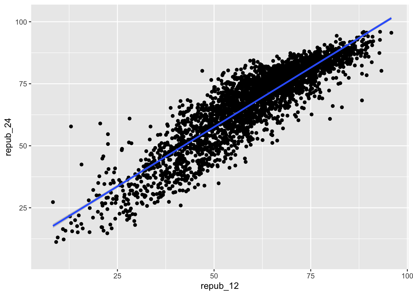
EXAMPLE 1: Intuition
will vary
EXAMPLE 2: Random sampling
# Try running the following chunk A FEW TIMES
sample_n(elections, size = 2, replace = FALSE)
## # A tibble: 2 × 8
## state_name state_abbr county_name county_fips repub_24 repub_20 repub_16
## <chr> <chr> <chr> <dbl> <dbl> <dbl> <dbl>
## 1 Kansas KS Atchison County 20005 67.7 66 62.2
## 2 Kentucky KY Ohio County 21183 79.4 77.1 76.4
## # ℹ 1 more variable: repub_12 <dbl>How do your results compare to your neighbors’? They’re different!
What is the role of
size = 2? It indicates that we want to sample 2 counties.What is the role of
replace = FALSE? It indicates that we want to sample without replacement. If we sample a county, we do not “replace” it, i.e. we cannot observe it again.
EXAMPLE 3: Setting the seed
The results are the same every time and for every student!
# Try running the following FULL chunk A FEW TIMES
set.seed(155)
sample_n(elections, size = 2, replace = FALSE)
## # A tibble: 2 × 8
## state_name state_abbr county_name county_fips repub_24 repub_20 repub_16
## <chr> <chr> <chr> <dbl> <dbl> <dbl> <dbl>
## 1 Tennessee TN Macon County 47111 86.7 85.3 83.6
## 2 Illinois IL Morgan County 17137 65.6 64.9 62.0
## # ℹ 1 more variable: repub_12 <dbl>
EXAMPLE 4: Take your own sample
# DON'T SKIP THIS STEP!
# Set the random number seed to the digits of your own phone number (just the numbers)
set.seed(5555)
# Take a sample of 50 counties
my_sample <- sample_n(elections, size = 50, replace = FALSE)
my_sample
## # A tibble: 50 × 8
## state_name state_abbr county_name county_fips repub_24 repub_20 repub_16
## <chr> <chr> <chr> <dbl> <dbl> <dbl> <dbl>
## 1 Oklahoma OK Le Flore County 40079 81.8 80.9 77.6
## 2 Colorado CO Fremont County 8043 68.0 68.5 68.9
## 3 Kansas KS McPherson Coun… 20113 69.6 69.0 67.6
## 4 Virginia VA Danville city 51590 39.0 38.3 38.7
## 5 Louisiana LA Iberville Pari… 22047 49.6 47.2 45.6
## 6 Colorado CO San Miguel Cou… 8113 24.0 22.1 23.9
## 7 New Jersey NJ Hunterdon Coun… 34019 52.4 51.0 54.6
## 8 Mississippi MS Adams County 28001 42.6 41.4 42.0
## 9 Texas TX Live Oak County 48297 84.6 83.1 80.8
## 10 Illinois IL Champaign Coun… 17019 37.2 36.9 37.3
## # ℹ 40 more rows
## # ℹ 1 more variable: repub_12 <dbl>
# Plot the SAMPLE model of Y vs X among YOUR sample data
# Compare it to the actual POPULATION model (red)
my_sample %>%
  ggplot(aes(y = repub_24, x = repub_12)) +
  geom_point() +
  geom_smooth(method = "lm", se = FALSE) +
  geom_smooth(data = elections, method = "lm", se = FALSE, color = "red", size = 0.5)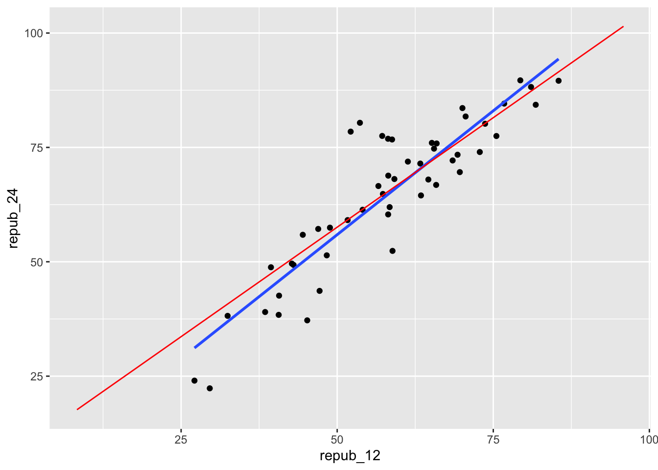
# Model the relationship among your sample
my_model <- lm(repub_24 ~ repub_12, data = my_sample)
coef(summary(my_model))
## Estimate Std. Error t value Pr(>|t|)
## (Intercept) 1.770079 4.46597198 0.396348 6.936048e-01
## repub_12 1.083084 0.07498002 14.444967 4.239871e-19
Exercise 1: Using the Normal model
- .
shaded_normal(mean = 55, sd = 5, a = 50, b = 60)
16% (32/2)
between 0.0015 and 0.025
15.1 Exercise 2: Z-scores
intuition
.
# Driver A
(60 - 55) / 5
## [1] 1
# Driver B
(36 - 30) / 3
## [1] 2- B, they are 2 standard deviations above the mean (the speed limit)
# Driver A
shaded_normal(mean = 55, sd = 5) +
geom_vline(xintercept = 60) +
lims(x = c(18, 75), y = c(0, 0.15)) +
labs(title = "Driver A")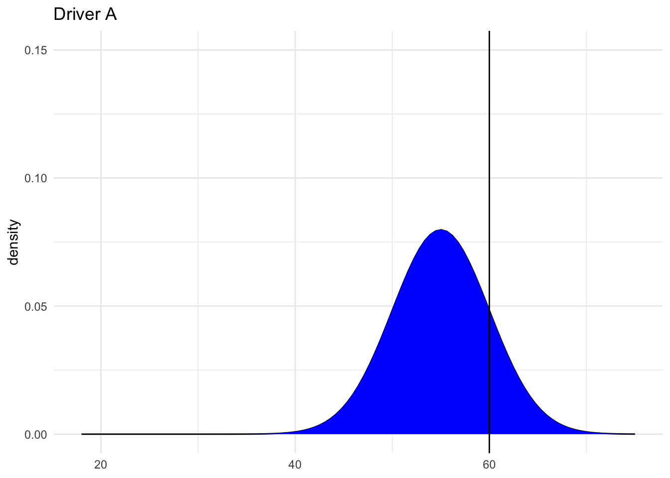
# Driver B
shaded_normal(mean = 30, sd = 3) +
geom_vline(xintercept = 36) +
lims(x = c(18, 75), y = c(0, 0.15)) +
labs(title = "Driver B")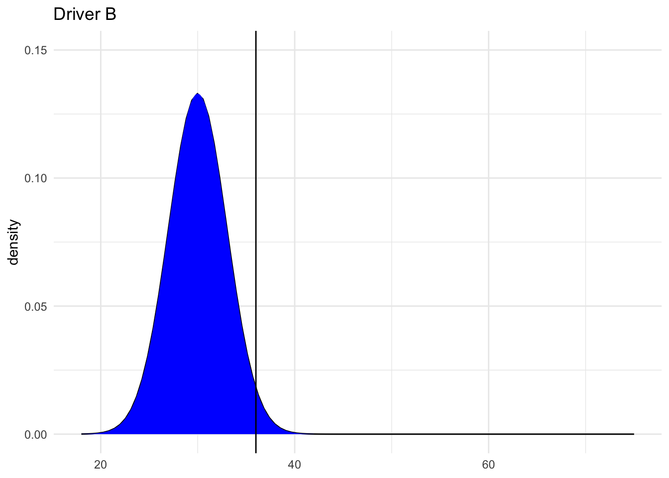
15.2 Exercise 3: Sampling variation
The sample estimates vary around the population model:
# Import the experiment results
library(gsheet)
results <- gsheet2tbl('https://docs.google.com/spreadsheets/d/1xyLff_FVqN419CyrQfa4CO8uRjYC4oP-S9Sla3FA_lE/edit?usp=sharing')
election %>%
ggplot(aes(y = repub_24, x = repub_12)) +
geom_abline(data = results, aes(intercept = sample_intercept, slope = sample_slope), color = "gray") +
geom_smooth(method = "lm", color = "red", se = FALSE)
## Error: object 'election' not found
Exercise 4: Sample intercepts
The intercepts are roughly Normal, centered around the true population intercept of 9.699, and range from roughly 1.832 to 17.688:
results %>%
  ggplot(aes(x = sample_intercept)) +
  geom_density() +
  geom_vline(xintercept = 9.699, color = "red")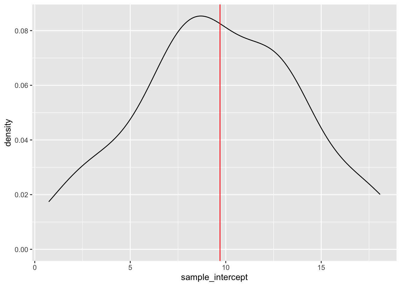
Exercise 5: Slope estimates
- intuition
- Check your intuition:
results %>%
ggplot(aes(x = sample_slope)) +
geom_density() +
geom_vline(xintercept = 0.9573, color = "red")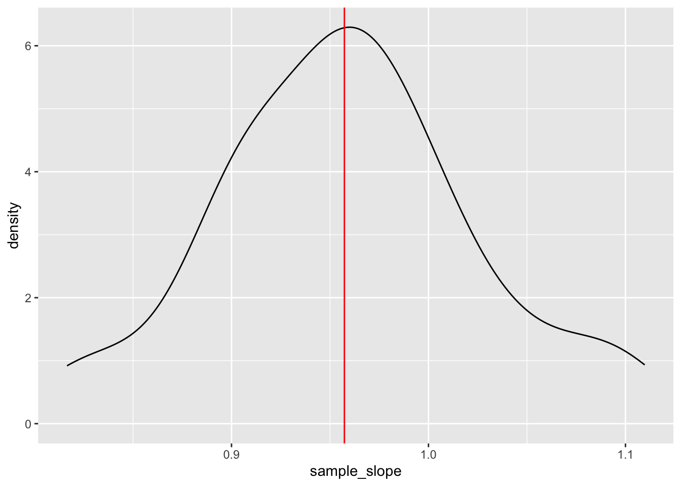
- Will vary, but should roughly be 0.07.
Exercise 6: Standard error
results %>%
  summarize(mean(sample_slope))
## # A tibble: 1 × 1
## `mean(sample_slope)`
## <dbl>
## 1 0.958
results %>%
  summarize(sd(sample_slope))
## # A tibble: 1 × 1
## `sd(sample_slope)`
## <dbl>
## 1 0.0659- For example, suppose my estimate were 1:
1 - 0.957
## [1] 0.043
For example, suppose my estimate were 1. Then my Z-score is (1 - 0.957) / 0.07 = 0.6142857
This is somewhat subjective. But we’ll learn that if your estimate is within 2 sd of the actual slope, i.e. your Z-score is between -2 and 2, you’re pretty “lucky”.