library(tidyverse)

# Load the cps data
cps <- read_csv("https://mac-stat.github.io/data/cps_2018.csv") %>%
  select(wage, age, industry, marital) %>%
  filter(age >= 18, age <= 34, wage < 250000)

# Load penguins data
# Get rid of Adelie penguins
# To get rid of an outlier, keep only penguins with bill lengths under 57mm
data(penguins)
penguins <- penguins %>%
filter(species != "Adelie", bill_len < 57)7 Intro to multiple linear regression
Announcements etc
SETTLING IN
- At your tables
- Put phones away (like in your backpack, not face down on the table).
- Sit where you want, but with people you didn’t sit with last week!
- Meet the people at your table and be ready to introduce them :)
- Download “07-mlr-intro-notes.qmd”, open it in RStudio, and save it in the “Activities” sub-folder of the “STAT 155” folder.
WRAPPING UP
- CP 6 due Tuesday.
- Quiz 1 Thursday.
- structure
- 60 minutes
- taken individually, using pen/pencil & paper
- content
- Unit 1 on Simple Linear Regression, Activities 1-6.
- Will not include questions about Transformations (Activity 5), but the review questions in Activity 5 are still relevant.
- You will not need to write R code, but will need to read & interpret R output.
- materials
- You can and should use a 3x5 index card with writing on both sides. These can be handwritten or typed, but you may not include screenshots or share note cards – making your own card is important to the review process. You are required to hand this in with your quiz.
- You can not use and will not need to use a calculator
- studying
- Find tips for studying and making an index card in the appendix of the online course manual.
- Slides from Sunday’s review session.
- structure
Color blind friendlier color palettes
The above setup chunk in this qmd includes code for using a more color blind friendly palette throughout this activity, without having to specify the palette anew for each ggplot(). When you render the doc to an html, the palette will be used. If you want to use the palette within the qmd (not just html), run the above chunk.
Learning goals
- Identify some limitations of simple linear regression, i.e. utilizing only one predictor.
- Understand the general goals behind multiple linear regression.
- Explore strategies for visualizing and interpreting multiple linear regression models of Y vs 2 predictors.
Additional resources
Today is a day to discover ideas. There are no readings or videos.
Warm-up
Before starting, load a couple datasets that we’ll use in this activity:
EXAMPLE 1: Review
The monthly U.S. Current Population Survey (CPS), run by the Census Bureau and Bureau of Labor Statistics (BLS), is the “primary source of labor force statistics” in the U.S.. It’s how the government tracks dynamics like wages and unemployment:
Above, we imported cps data from 2018. We limited the rows and columns of this dataset to study wages among 18-34 year olds that make under $250,000.
# Check it out
head(cps)
Let’s start by exploring the relationship of wage with job industry:
# What's the relationship of wage with job industry?
# Fix this visualization
cps %>%
  ggplot(aes(y = wage, x = industry)) +
  geom_point() +
  theme(axis.text.x = element_text(angle = 30, hjust = 1))
# Calculate the average wage in each industry
cps %>%
___(___) %>%
summarize(mean(___))# Build & summarize the linear regression model of wage by industry
cps_model_1 <- lm(wage ~ industry, cps)
coef(summary(cps_model_1))The resulting estimated model formula is…
E[wage | industry] = 27410 + 10242 industryconstruction + 8042 industryinstallation_production + 21332 industrymanagement - 2906 industryservice + 2676 industrytransportation
FOLLOW-UP
What’s the “reference level” of the
industrypredictor?Interpret the
(Intercept)coefficient.Interpret the
industryservicecoefficient.Which industry has the highest average wage? Predict the wage for somebody in this industry.
- This model can’t be represented by a line. So what does the model “look” like?!?
# NOTE: DO NOT BE DISTRACTED BY THIS CODE :)
# This is merely for demonstrating a concept
cps_model_1 %>%
  ggplot(aes(y = wage, x = industry)) +
  geom_boxplot() +
  geom_point(aes(x = industry, y = .fitted), color = "red") +
theme(axis.text.x = element_text(angle = 30, hjust = 1))- Does the relationship of wage with industry appear to be strong? Provide numerical and graphical evidence.
ANOVA & t-tests
A linear regression model of Y with 1 predictor X, where X is categorical, boils down to a set of average Y values, 1 for each category of X. This makes sense! For example:
- If 2 people are in the same job industry, and that’s all we know about them, their predicted wage should be the same.
- And it makes sense to predict that a person’s wage is at the average for their industry.
This type of analysis, essentially a comparison of means among different groups or categories, is very, very common. If you’ve taken AP stats: this type of model is the basis of things like “2-sample t-tests” and “ANOVA”.
Interpreting models with ONE categorical predictor
Let Y be a quantitative response X be a categorical predictor with categories (A, B, C, D). Then the linear regression model of Y by X is:
E[Y | X] = \(\beta_0\) + \(\beta_1\) XB + \(\beta_2\) XC + \(\beta_3\) XD
where…
- A is the reference category (by default because it’s the first alphabetically)
- intercept \(\beta_0\)
- contextual: the expected / average value of Y for category A
- technical: the expected / average value of Y when XB, XC, XD are all 0 (hence X is category A!)
- XB coefficient \(\beta_1\)
- not a slope!
- contextual: the difference of the expected / average value of Y for category B vs category A
- technical: the change in the expected / average value of Y when we increase XB by 1 from 0 to 1 (which corresponds to going from category A to B!)
- \(\beta_2\) and \(\beta_3\) are interpreted similarly
EXAMPLE 2: Motivation for multiple linear regression
Next, consider the model of wage by marital status:
# Build & summarize the model
wage_mod <- lm(wage ~ marital, data = cps)
coef(summary(wage_mod))
What do you / don’t you conclude from this model? How does it highlight the limitations of a simple linear regression model?
EXAMPLE 3: More motivation
Let’s explore Chinstrap and Gentoo penguins:
# Check it out
head(penguins)

# We took Adelies out of the data
penguins %>%
  count(species)
Our goal is to build a model that we can use to predict flipper lengths. First, consider a simple linear regression model of flipper_len by bill_len:
penguins %>%
  ggplot(aes(y = flipper_len, x = bill_len)) +
  geom_point() +
  geom_smooth(method = "lm", se = FALSE)
Thoughts? What’s going on here? How does this highlight the limitations of a simple linear regression model?
EXAMPLE 4: Even more motivation
Let’s build 2 separate models of flipper_len:
# Model flipper_len by bill_len
mod_bill <- lm(flipper_len ~ bill_len, data = penguins)
summary(mod_bill)
# Model flipper_len by species
mod_species <- lm(flipper_len ~ species, data = penguins)
summary(mod_species)The model of flipper_len by bill_len has an R-squared of 0.02881. The model of flipper_len by species has an R-squared of 0.7014. If we had to pick just 1 of these predictors, we would pick species – it explains more about the variability in flipper_len.
BUT what if we didn’t have to pick just 1 predictor?! Suppose we model flipper_len by both bill_len and species. What do you think is a reasonable range of possible values for the new R-squared?
Reflection: Why are multiple regression models so useful?
We can put more than 1 predictor into a regression model!
Descriptive viewpoint
Adding predictors to a model can help us better understand the isolated (causal) effect of a variable by holding constant potential confounders.Predictive viewpoint
Adding predictors to a model can help us better predict the response variable.
Multiple linear regression model formula
In general, a multiple linear regression model of \(Y\) with multiple predictors \((X_1, X_2, ..., X_p)\) is represented by the following formula:
\[E[Y \mid X_1, X_2, ..., X_p] = \beta_0 + \beta_1 X_1 + \beta_2 X_2 + ... + \beta_p X_p\]
Exercises
In the coming weeks, we’ll explore how to visualize, interpret, build, and evaluate multiple linear regression models. Today, we’ll focus on some foundations using a model of penguin flipper_len by just 2 predictors: bill_len (quantitative) and species (categorical).
Exercise 1: Visualizing the relationship
To explore the relationship of flipper_len with both bill_len and species, let’s start with a visualization. Modify the plot below to include information about species. THINK: How can you change each point / dot to indicate the corresponding penguin’s species?
penguins %>%
  ggplot(aes(y = flipper_len, x = bill_len)) +
  geom_point()
Exercise 2: Visualizing the model
Part a
We’ve learned that a simple linear regression model of flipper_len by bill_len alone can be represented by a line:
penguins %>%
  ggplot(aes(y = flipper_len, x = bill_len)) +
  geom_point() +
  geom_smooth(method = "lm", se = FALSE)
Reflecting on your plot of flipper_len by bill_len and species in Exercise 1, how do you think a multiple regression model of flipper_len using both of these predictors would be represented?
Part b
Check your intuition by modifying the code below to include species in this plot, as you did in Exercise 1.
penguins %>%
  ggplot(aes(y = flipper_len, x = bill_len, ___ = ___)) +
  geom_point() +
  geom_smooth(method = "lm", se = FALSE)
Exercise 3: Reflection
Your plot in Exercise 2 demonstrated that the multiple linear regression model of flipper_len by bill_len and species is represented by 2 lines. Let’s interpret the punchlines! For each question below, provide an answer along with evidence from the model lines that supports your answer.
Part a
What’s the relationship between flipper_len and bill_len, no matter a penguin’s species?
What’s your evidence?
Part b
Does the rate of increase in flipper_len with bill_len appear to differ between the two species?
What’s your evidence?
Part c
What’s the relationship between flipper_len and species, no matter a penguin’s bill_len?
What’s your evidence?
Part d
The formula for this linear regression model is represented by the below formula:
E[flipper_len | species, bill_len] = \(\beta_0\) + \(\beta_1\) bill_len + \(\beta_2\) speciesGentoo
Based on parts a-c:
Will \(\beta_1\) be positive or negative? Why?
Will \(\beta_2\) be positive or negative? Why?
Exercise 4: Model formula
Of course, there’s a formula behind the multiple regression model. We can obtain this using the usual lm() function.
# Build & summarize the model
penguin_mod <- lm(flipper_len ~ bill_len + species, data = penguins)
summary(penguin_mod)
Part a
Reflect on the code. In the lm() function, how did we communicate that we wanted to model flipper_len by both bill_len and species? (How is the lm() code different than when we used just 1 predictor?)
Part b
Complete the following model formula. (Was your answer in Exercise 3 part d correct?!)
E[flipper_len | bill_len, speciesGentoo] = ___ + ___ bill_len + ___ speciesGentoo
Exercise 5: Sub-model formulas
We now have a single formula for the model:
E[flipper_len | bill_len, speciesGentoo] = 127.75 + 1.40 * bill_len + 22.85 * speciesGentoo
And we observed earlier that this formula is represented by two lines: one describing the relationship between flipper_len and bill_len for Chinstrap penguins and the other for Gentoo penguins. Let’s bring these ideas together. Utilize the model formula to obtain the equations of these two lines, i.e. to obtain the sub-model formulas for the 2 species. Simplify these as much as possible by combining constants when relevant! Hint: Plug speciesGentoo = 0 and speciesGentoo = 1.
Chinstrap: E[flipper_len | bill_len] = ___ + ___ bill_len
Gentoo: E[flipper_len | bill_len] = ___ + ___ bill_len
# Put any scratch calculations here
Exercise 6: coefficients – physical interpretation
Reflecting on Exercise 5, let’s interpret what the model coefficients tell us about the physical properties of the two 2 sub-model lines. Choose the correct option given in parentheses:
The intercept coefficient, 127.75, is the intercept of the line for (Chinstrap / Gentoo) penguins.
The
bill_lencoefficient, 1.40, is the (intercept / slope) of both lines.The
speciesGentoocoefficient, 22.85, indicates that the (intercept / slope) of the line for Gentoo is 22.85mm higher than the (intercept / slope) of the line for Chinstrap. Similarly, since the lines are parallel, the line for Gentoo is 22.85mm higher than the line for Chinstrap at anybill_len.
Exercise 7: coefficients – contextual interpretation
Next, interpret each coefficient in context. What do they tell us about penguin flipper lengths?!
Part a
Interpret 127.75, the intercept of the Chinstrap line, in context.
Part b
Interpret 1.40, the slope of both lines, in context. For both Chinstrap and Gentoo penguins, the expected flipper length…
Part c
Interpret 22.85, in context. At any bill_len, we expect…
Exercise 8: Prediction
Now that we better understand the model, let’s use it to predict flipper lengths! Recall the model and visualization:
E[flipper_len | bill_len, speciesGentoo] = 127.75 + 1.40 * bill_len + 22.85 * speciesGentoo
penguins %>%
  ggplot(aes(y = flipper_len, x = bill_len, color = species)) +
  geom_point() +
  geom_smooth(method = "lm", se = FALSE)
Part a
Predict the flipper length of a Chinstrap penguin with a 50mm long bill.
127.75 + 1.40*___ + 22.85*___To check your work, mark your prediction on the plot using a red dot: Make sure it’s where it should be!
penguins %>%
  ggplot(aes(y = flipper_len, x = bill_len, color = species)) +
  geom_point() +
  geom_smooth(method = "lm", se = FALSE) +
  geom_point(aes(x = 50, y = ____), color = "red", size = 4)
Part b
Predict the flipper length of a Gentoo penguin with a 50mm long bill.
127.75 + 1.40*___ + 22.85*___To check your work, mark your prediction on the plot:
penguins %>%
  ggplot(aes(y = flipper_len, x = bill_len, color = species)) +
  geom_point() +
  geom_smooth(method = "lm", se = FALSE) +
  geom_point(aes(x = 50, y = ____), color = "red", size = 4)
Part c
Use the predict() function to confirm your predictions in Parts a and b.
# Confirm the calculation in part a
predict(penguin_mod,
        newdata = data.frame(bill_len = ___, species = "___"))

# Confirm the calculation in part b
predict(penguin_mod,
        newdata = data.frame(bill_len = ___, species = "___"))
Exercise 9: R-squared
Finally, recall that improving our predictions was one motivation to build a multiple linear regression model (using 2 predictors instead of 1). To this end, recall the R-squared values of the simple linear regression models that used just one predictor at a time:
# Model of flipper_len by bill_len
# R-squared = 0.02881
summary(mod_bill)

# Model of flipper_len by species
# R-squared = 0.7014
summary(mod_species)
Part a
What do you guess is the R-squared of penguin_mod, our multiple regression model that uses both bill_len and species as predictors? (We discussed this same question in the Warm-up, but your opinion may have changed!)
Part b
Check your intuition. Report the R-squared value of penguin_mod and discuss how it compares to the 2 simple linear regression models. Why might one be surprised about this result?
summary(penguin_mod)
Exercise 10: Challenge Part 1
In this activity, we explored the model of flipper_len by a quantitative predictor (bill_len) and a categorical predictor (species). Challenge yourself to anticipate what visualizations / models might be like with 2 quantitative predictors: bill_len and bill_dep.
Part a
First, let’s visualize the relationship of flipper_len with bill_len and bill_dep. To do so, start with the scatterplot of flipper_len and bill_len, and modify it. THINK: How might you change the points to reflect their corresponding bill_dep?
# Do NOT include a geom_smooth (which wouldn't make sense here)
penguins %>%
  ggplot(aes(y = flipper_len, x = bill_len)) +
  geom_point()
Part b
In Part a, you represented a 3D point cloud in 2D. BONUS (just for fun & for better understanding that this is a 3D relationship): Visualize this same data in something more like 3D:
# Don't worry about this code!
# It's specialized to this exercise and we'll rarely use it
library(plotly)
penguins %>%
  plot_ly(x = ~bill_len, y = ~bill_dep, z = ~flipper_len,
          type = "scatter3d")
Part c
We can think of your plot above as a 3D point cloud. And the estimated formula for the linear regression model is
E[flipper_len | bill_len, bill_dep] = 179.2 + 2.38 bill_len - 5.15 bill_dep
quant_model <- lm(flipper_len ~ bill_len + bill_dep, penguins)
coef(summary(quant_model))
QUESTION:
The model of flipper_len by bill_len and species is represented by 2 parallel lines. How would you draw / represent the model here?!
Part d
Challenge: Interpret the (Intercept) and bill_len coefficients. What physical meaning do they have, i.e. where do they come into the “drawing” of the model? What contextual meaning do they have?
Exercise 11: Challenge Part 2
Next, challenge yourself to anticipate what visualizations / models might be like with 2 categorical predictors: species and sex.
Part a
First, let’s visualize the relationship of flipper_len with species and sex. To do so, start with the side-by-side boxplots of flipper_len by species, and modify them.
penguins %>%
  ggplot(aes(y = flipper_len, x = species)) +
  geom_boxplot()
Part b
The estimated formula for the linear regression model is
E[flipper_len | species, sex] = 191.8 + 21.07 speciesGentoo + 8.39 sexmale
cat_model <- lm(flipper_len ~ species + sex, penguins)
summary(cat_model)
QUESTION:
The model of flipper_len by species alone would only produce 2 possible predictions, one for Chinstraps and one for Gentoos. What about the model here?! How many possible predictions would it make? HINT: Checking out the plot again might help.
Part c
Challenge: Interpret the (Intercept) and speciesGentoo coefficients. What physical meaning do they have, i.e. where do they come into the “drawing” of the model? What contextual meaning do they have?
Reflection
You’ve now explored your first multiple regression model! Thus you likely have a lot of questions about what’s to come. What are they?
Solutions
library(tidyverse)

# Load the cps data
cps <- read_csv("https://mac-stat.github.io/data/cps_2018.csv") %>%
  select(wage, age, industry, marital) %>%
  filter(age >= 18, age <= 34, wage < 250000)

# Load penguins data
# Get rid of Adelie penguins
# To get rid of an outlier, keep only penguins with bill lengths under 57mm
data(penguins)
penguins <- penguins %>%
  filter(species != "Adelie", bill_len < 57)
EXAMPLE 1: Review
# Check it out
head(cps)
## # A tibble: 6 × 4
##    wage   age industry   marital
##   <dbl> <dbl> <chr>      <chr>
## 1 75000    33 management single
## 2 33000    19 management single
## 3 43000    33 management married
## 4 50000    32 management single
## 5 14400    28 service    single
## 6 33000    31 management married

# What's the relationship of wage with job industry?
cps %>%
  ggplot(aes(y = wage, x = industry)) +
  geom_boxplot()
cps %>%
  ggplot(aes(x = wage, color = industry)) +
  geom_density()
# Calculate the average wage in each industry
cps %>%
  group_by(industry) %>%
  summarize(mean(wage))
## # A tibble: 6 × 2
##   industry                `mean(wage)`
##   <chr>                          <dbl>
## 1 ag                            27410.
## 2 construction                  37652.
## 3 installation_production       35452.
## 4 management                    48742.
## 5 service                       24504.
## 6 transportation                30087.

# Build & summarize the linear regression model of wage by industry
cps_model_1 <- lm(wage ~ industry, cps)
summary(cps_model_1)
##
## Call:
## lm(formula = wage ~ industry, data = cps)
##
## Residuals:
##    Min     1Q Median     3Q    Max
## -48742 -18504  -4504  10498 191258
##
## Coefficients:
##                                 Estimate Std. Error t value Pr(>|t|)
## (Intercept)                        27410       6488   4.225 2.46e-05 ***
## industryconstruction               10242       6859   1.493  0.13549
## industryinstallation_production     8042       6731   1.195  0.23225
## industrymanagement                 21332       6547   3.258  0.00113 **
## industryservice                    -2906       6532  -0.445  0.65642
## industrytransportation              2676       6828   0.392  0.69509
## ---
## Signif. codes:  0 '***' 0.001 '**' 0.01 '*' 0.05 '.' 0.1 ' ' 1
##
## Residual standard error: 29010 on 3163 degrees of freedom
## Multiple R-squared:  0.1223, Adjusted R-squared:  0.1209
## F-statistic: 88.12 on 5 and 3163 DF, p-value: < 2.2e-16E[wage | industry] = 27410 + 10242 industryconstruction + 8042 industryinstallation_production + 21332 industrymanagement - 2906 industryservice + 2676 industrytransportation
FOLLOW-UP
ag (it’s the first alphabetically and doesn’t appear in the model)
The average wage in the ag industry is $27410. Thinking of this a more technical way, 27410 is the average wage when all industry related predictors are 0, i.e. when the industry is ag.
The average wage in the service industry is $2906 lower than in the ag industry. Thinking of this a more technical way, increasing the
industryservicevariable by 1 unit from 1 unit (i.e. going from ag to service) is associated with a $2906 decrease in expected wages.management. it’s the biggest relative to ag.
27410 + 10242*0 + 8042*0 + 21332*1 - 2906*0 + 2676*0
## [1] 48742

# More simply we can drop all the 0 terms
27410 + 21332*1
## [1] 48742
6 separate predictions, 1 per category
No. There’s a lot of overlap in the boxplots (hence a lot of overlap in wage ranges in the different industries). And the R-squared is only 0.1223.
EXAMPLE 2: Motivation for multiple linear regression
# Build & summarize the model
wage_mod <- lm(wage ~ marital, data = cps)
summary(wage_mod)
##
## Call:
## lm(formula = wage ~ marital, data = cps)
##
## Residuals:
##    Min     1Q Median     3Q    Max
## -46145 -20093  -6145  11855 200907
##
## Coefficients:
##               Estimate Std. Error t value Pr(>|t|)
## (Intercept)    46145.2      921.1   50.10   <2e-16 ***
## maritalsingle -17052.4     1127.2  -15.13   <2e-16 ***
## ---
## Signif. codes:  0 '***' 0.001 '**' 0.01 '*' 0.05 '.' 0.1 ' ' 1
##
## Residual standard error: 29890 on 3167 degrees of freedom
## Multiple R-squared:  0.0674, Adjusted R-squared:  0.0671
## F-statistic: 228.9 on 1 and 3167 DF,  p-value: < 2.2e-16
It appears that single people make far less, on average. This is likely explained by other factors such as age and experience, which are ignored by this model. (For example, single people tend to be younger and younger people tend to have less experience thus lower wages.)
EXAMPLE 3: More motivation
# Check it out
head(penguins)
##   species island bill_len bill_dep flipper_len body_mass    sex year
## 1  Gentoo Biscoe     46.1     13.2         211      4500 female 2007
## 2  Gentoo Biscoe     50.0     16.3         230      5700   male 2007
## 3  Gentoo Biscoe     48.7     14.1         210      4450 female 2007
## 4  Gentoo Biscoe     50.0     15.2         218      5700   male 2007
## 5  Gentoo Biscoe     47.6     14.5         215      5400   male 2007
## 6  Gentoo Biscoe     46.5     13.5         210      4550 female 2007

# We took Adelies out of the data
penguins %>%
  count(species)
##     species   n
## 1 Chinstrap  67
## 2    Gentoo 122

penguins %>%
  ggplot(aes(y = flipper_len, x = bill_len)) +
  geom_point() +
  geom_smooth(method = "lm", se = FALSE)
There appear to be 2 groups of points, likely the 2 different species. Neither of these groups is well represented by this simple model.
EXAMPLE 4: Even more motivation
mod_bill <- lm(flipper_len ~ bill_len, data = penguins)
summary(mod_bill)
##
## Call:
## lm(formula = flipper_len ~ bill_len, data = penguins)
##
## Residuals:
##     Min      1Q  Median      3Q     Max
## -30.441 -10.998   3.015   8.942  19.881
##
## Coefficients:
##             Estimate Std. Error t value Pr(>|t|)
## (Intercept) 177.4971    13.6676  12.987   <2e-16 ***
## bill_len      0.6712     0.2850   2.355   0.0195 *
## ---
## Signif. codes:  0 '***' 0.001 '**' 0.01 '*' 0.05 '.' 0.1 ' ' 1
##
## Residual standard error: 11.91 on 187 degrees of freedom
## Multiple R-squared:  0.02881,    Adjusted R-squared:  0.02362
## F-statistic: 5.548 on 1 and 187 DF,  p-value: 0.01954

mod_species <- lm(flipper_len ~ species, data = penguins)
summary(mod_species)
##
## Call:
## lm(formula = flipper_len ~ species, data = penguins)
##
## Residuals:
##     Min      1Q  Median      3Q     Max
## -18.045  -5.045  -1.045   3.955  15.955
##
## Coefficients:
##               Estimate Std. Error t value Pr(>|t|)
## (Intercept)   196.0448     0.8065  243.07   <2e-16 ***
## speciesGentoo  21.0372     1.0039   20.96   <2e-16 ***
## ---
## Signif. codes:  0 '***' 0.001 '**' 0.01 '*' 0.05 '.' 0.1 ' ' 1
##
## Residual standard error: 6.602 on 187 degrees of freedom
## Multiple R-squared:  0.7014, Adjusted R-squared:  0.6998
## F-statistic: 439.2 on 1 and 187 DF,  p-value: < 2.2e-16
answers will vary! in general, we’d expect R-squared to be higher than in either of these models, thus higher than 0.7014.
Exercise 1: Visualizing the relationship
penguins %>%
  ggplot(aes(y = flipper_len, x = bill_len, color = species)) +
  geom_point()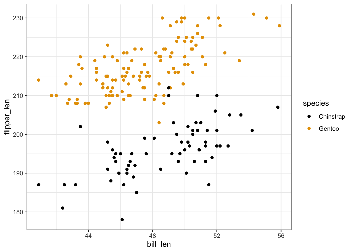
penguins %>%
  ggplot(aes(y = flipper_len, x = bill_len, shape = species)) +
  geom_point()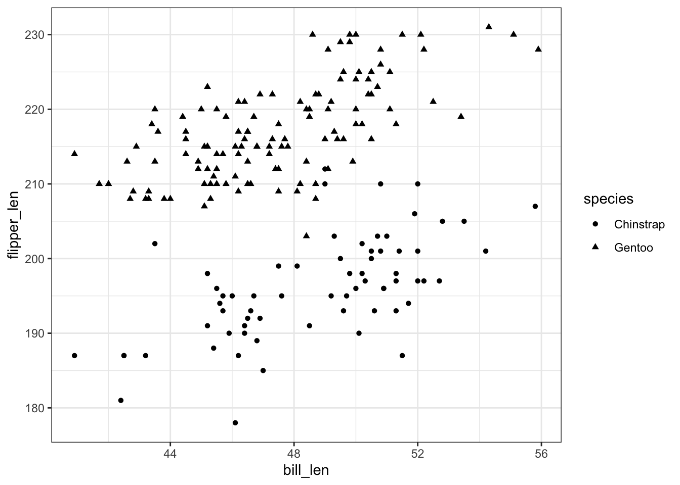
Exercise 2: Visualizing the model
will vary
penguins %>%
  ggplot(aes(y = flipper_len, x = bill_len, color = species)) +
  geom_point() +
  geom_smooth(method = "lm", se = FALSE)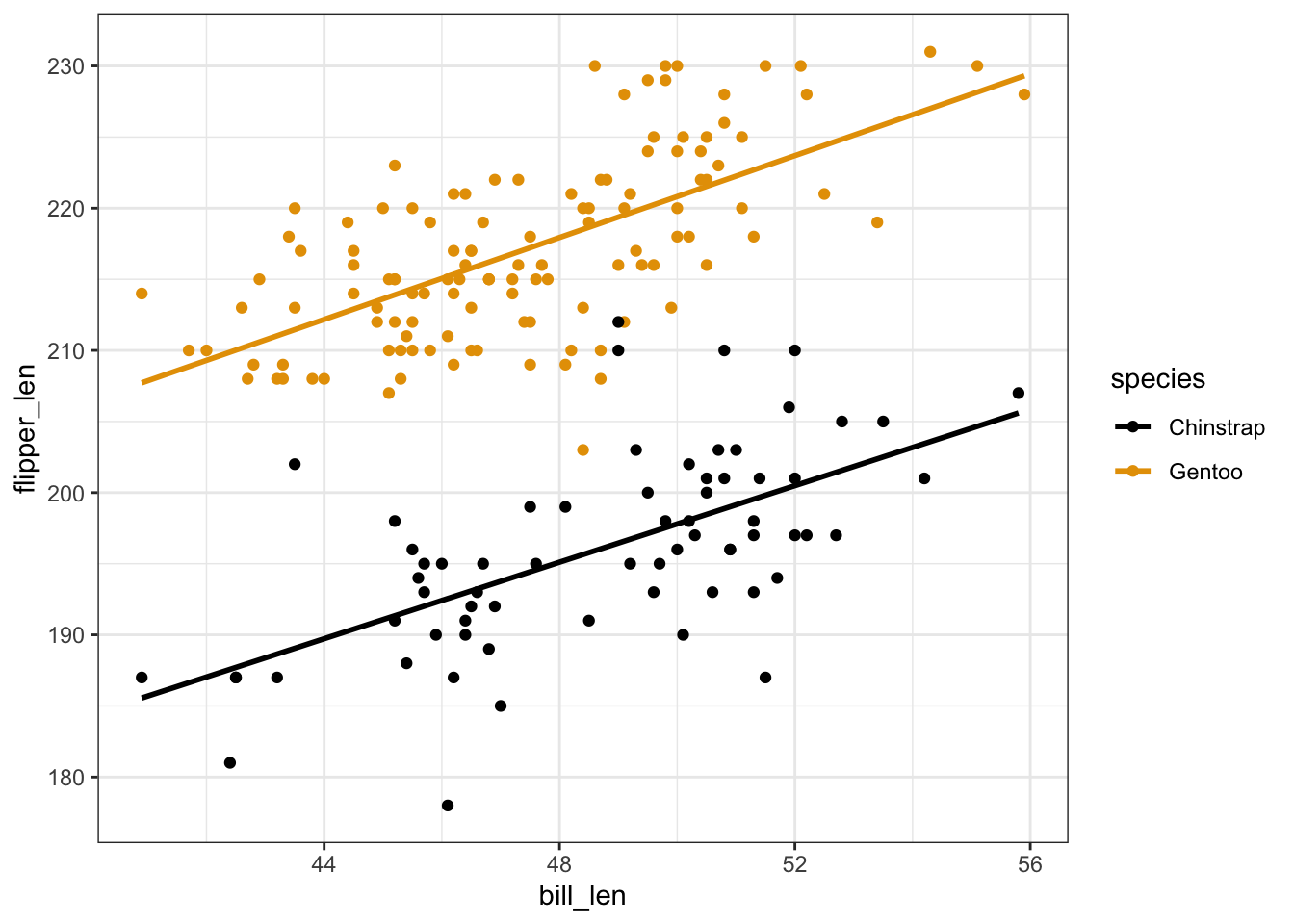
Exercise 3: Reflection
- Flipper length is positively associated with bill length. Both lines have positive slopes.
- No. The lines are parallel / have the same slopes.
- Gentoo tend to have longer flippers. The Gentoo line is above the Chinstrap line.
- Intuition.
Exercise 4: Model formula
# Build & summarize the model
penguin_mod <- lm(flipper_len ~ bill_len + species, data = penguins)
summary(penguin_mod)
##
## Call:
## lm(formula = flipper_len ~ bill_len + species, data = penguins)
##
## Residuals:
##      Min       1Q   Median       3Q      Max
## -15.4763  -3.2260  -0.1525   3.1581  15.5303
##
## Coefficients:
##               Estimate Std. Error t value Pr(>|t|)
## (Intercept)   127.7537     6.1175   20.88   <2e-16 ***
## bill_len        1.4024     0.1250   11.22   <2e-16 ***
## speciesGentoo  22.8480     0.7938   28.78   <2e-16 ***
## ---
## Signif. codes:  0 '***' 0.001 '**' 0.01 '*' 0.05 '.' 0.1 ' ' 1
##
## Residual standard error: 5.112 on 186 degrees of freedom
## Multiple R-squared:  0.8219, Adjusted R-squared:   0.82
## F-statistic: 429.3 on 2 and 186 DF,  p-value: < 2.2e-16
bill_len + species- E[flipper_len | bill_len, speciesGentoo] = 127.75 + 1.40 * bill_len + 22.85 * speciesGentoo
Exercise 5: Sub-model formulas
Chinstrap: E[flipper_len | bill_len] = 127.75 + 1.40 bill_len
Gentoo: E[flipper_len | bill_len] = (127.75 + 22.85) + 1.40 bill_len = 150.6 + 1.40 bill_len
Exercise 6: coefficients – physical interpretation
The intercept coefficient, 127.75, is the intercept of the line for Chinstrap penguins.
The
bill_lencoefficient, 1.40, is the slope of both lines.The
speciesGentoocoefficient, 22.85, indicates that the intercept of the line for Gentoo is 22.85mm higher than the intercept of the line for Chinstrap. Similarly, since the lines are parallel, the line for Gentoo is 22.85mm higher than the line for Chinstrap at anybill_len.
Exercise 7: coefficients – contextual interpretation
For Chinstrap penguins with 0mm bills (silly), we expect a flipper length of 127.75mm.
For both Chinstrap and Gentoo penguins, average flipper lengths increase by 1.40mm for every additional mm in bill length.
At any
bill_len, the average flipper length for Gentoo penguins is 22.85mm longer than that for Chinstrap penguins.
Exercise 8: Prediction
# a
127.75 + 1.40*50 + 22.85*0
## [1] 197.75
penguins %>%
  ggplot(aes(y = flipper_len, x = bill_len, color = species)) +
  geom_point() +
  geom_smooth(method = "lm", se = FALSE) +
  geom_point(aes(x = 50, y = 197.75), color = "red", size = 4)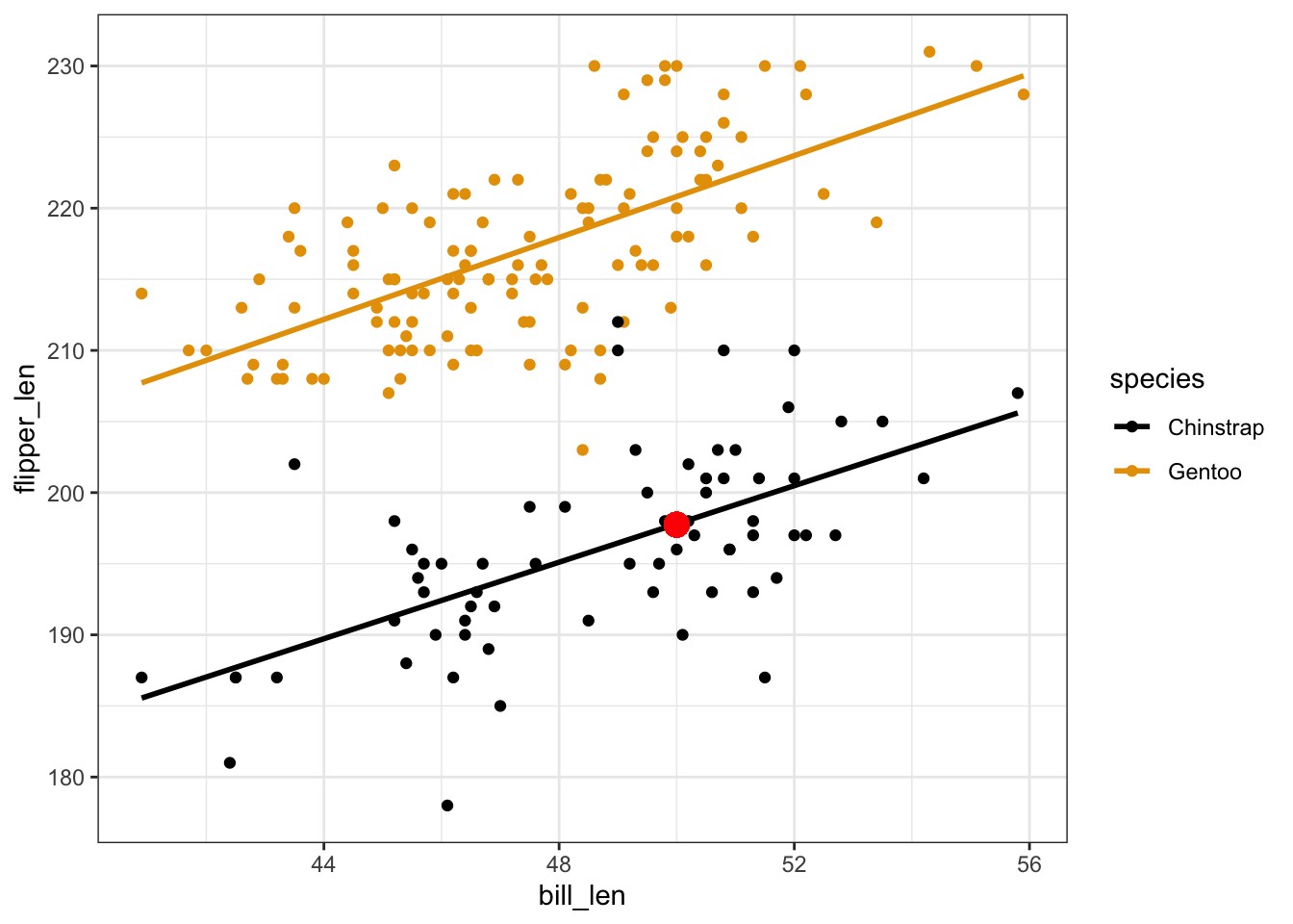
# b
127.75 + 1.40*50 + 22.85*1
## [1] 220.6
penguins %>%
  ggplot(aes(y = flipper_len, x = bill_len, color = species)) +
  geom_point() +
  geom_smooth(method = "lm", se = FALSE) +
  geom_point(aes(x = 50, y = 220.6), color = "red", size = 4)
# c
predict(penguin_mod,
        newdata = data.frame(bill_len = 50,
                             species = "Chinstrap"))
##       1
## 197.872
predict(penguin_mod,
        newdata = data.frame(bill_len = 50,
                             species = "Gentoo"))
##        1
## 220.7201
Exercise 9: R-squared
- will vary
- It’s higher than the R-squared when we use either predictor alone! It’s also higher than the sum of the R-squared values from the 2 simple linear regression models (i.e. as the informal saying goes, “the sum is greater than its parts”).
Exercises 10 & 11
No solutions! We’ll get into this topic in our next activity :)