22 Sampling distributions: play day!
22.1 Discussion
Let \((X_1,X_2,...,X_n)\) be an iid sample from some common model / population. We can summarize the behavior of such a sample using simple summary statistics such as:
\[\begin{split} X_{min} & = \text{ minimum of the sampled } X_i \\ X_{max} & = \text{ maximum of the sampled } X_i \\ \overline{X} & = \text{ sample mean } = \frac{\sum_{i=1}^n X_i}{n}\\ X_{sum} & = \text{ sample sum } = \sum_{i=1}^n X_i \\ \end{split}\]
EXAMPLE 1
Suppose the lifetime (in years) of a certain lightbulb brand can be modeled by \(Exp(1)\). Thus, on average, a lightbulb lasts \(1/1 = 1\) year.
You take a sample of 5 lightbulbs to put into a room and record their lifetimes, \((X_1,...,X_{5})\). Thus \((X_1,...,X_{5})\) is an iid sample from \(Exp(1)\). Check out the results:
set.seed(2000)
sample_1 <- data.frame(x = rexp(5, rate = 1))
sample_1
##           x
## 1 1.9590618
## 2 0.4328520
## 3 1.1414899
## 4 1.2574571
## 5 0.6266144

# Visual summary
ggplot(sample_1, aes(x = x)) +
  geom_histogram(color = "white") +
  lims(x = c(0,5))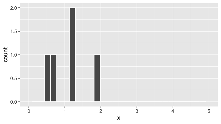
# Numerical summaries
sample_1 %>%
  summarize(min(x), max(x), sum(x), mean(x))
##     min(x)   max(x)   sum(x)  mean(x)
## 1 0.432852 1.959062 5.417475 1.083495
EXAMPLE 2
Pick another sample of 5 lightbulbs for a second room:
- Do you anticipate that the lifetimes of the 5 bulbs in
sample_2are the same as those insample_1? - Do you anticipate that the minimum and maximum lifetimes of the 5 bulbs in
sample_2are the same as those insample_1? - What about the mean?
Reveal the results to check your intuition:
sample_2
##            x
## 1 1.33508191
## 2 0.52132289
## 3 0.01772074
## 4 0.08114532
## 5 1.62638640

# Visual summary
ggplot(sample_2, aes(x = x)) +
  geom_histogram(color = "white") +
  lims(x = c(0,10))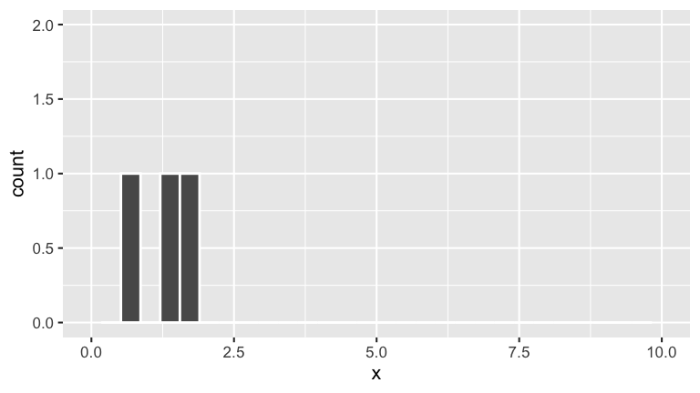
EXAMPLE 3
Repeat Example 2 for a third room at Mac. Do you expect the random sample of light bulbs in this room to have the same features as those in the first two rooms?
sample_3
##           x
## 1 0.7551818
## 2 1.1816428
## 3 0.1457067
## 4 0.1397953
## 5 0.4360686

# Visual summary
ggplot(sample_3, aes(x = x)) +
  geom_histogram(color = "white") +
  lims(x = c(0,10))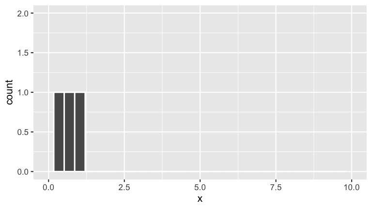
Sample statistics are RVs. Their models are “sampling distributions”.
Notice that the sample statistics \(X_{min}, X_{max}, X_{sum}, \overline{X}\) vary from sample to sample. Thus these statistics themselves are random variables!! They have underlying trends, variability, and models. These models are called sampling distributions - they describe how the sample statistics vary from sample to sample.
Lightbulb example
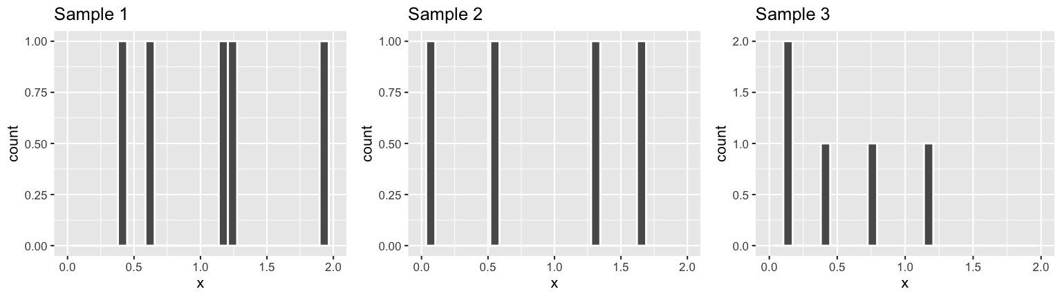
## # A tibble: 3 x 5
##   sample   min  mean   max   sum
##   <chr>  <dbl> <dbl> <dbl> <dbl>
## 1 1       0.43  1.08  1.96  5.42
## 2 2       0.02  0.72  1.63  3.58
## 3 3       0.14  0.53  1.18  2.66
22.2 Exercises
Directions
- The goal is to build intuition for sampling distributions via simulation before establishing any theory.
- The most important part of this activity is to take your time. When asked to check into your intuition before proceeding, be sure to do so. If you don’t, then you’ll miss the whole point!
- These exercises will be turned in as a checkpoint. They will be graded for completion (whether you tried each exercise), not correctness.
- You should hand in an html document that’s knit from the Rmd template provided in the Checkpoint 11 link on Moodle. Beyond that, there’s no strict format to what this document should look like. Take notes as best suits your learning and documention.
Getting started
The following RStudio code is included in your template. This loads the necessary packages and defines two functions that were written expressly for this activity. You can pick through the syntax later – for now, just focus on the big picture ideas that these functions help illuminate.
# Load packages
library(ggExtra)
library(ggplot2)
library(dplyr)

sim_data <- function(n, model){
  # This function simulates 1000 samples of size n from N(0, 1) or Exp(1)
  # For each sample, the sample values, min, max, mean are returned

  # Specify which model to simulate
  set.seed(2000)
  if(model == "norm"){x <- rnorm(n*1000)}
  if(model == "exp"){x <- rexp(n*1000)}

  # Sort these into 1000 samples of size n
  mat <- matrix(x, nrow = 1000, byrow = TRUE)
  data_sim <- as.data.frame(mat)

  # Calculate features of each sample
  x_min  <- apply(mat, FUN = min, MARGIN = 1)
  x_mean <- apply(mat, FUN = mean, MARGIN = 1)
  x_max  <- apply(mat, FUN = max, MARGIN = 1)
  x_sum  <- apply(mat, FUN = sum, MARGIN = 1)

  # Store these with the samples
  data_sim <- data_sim %>%
    mutate(x_min, x_max, x_mean)

  # Return the results
  data_sim
}

plot_samples <- function(data, plot_min = FALSE, plot_max = FALSE, plot_mean = FALSE){
  # Plot all samples with / without highlighting min, max, mean
  full_sim <- data
  data <- as.matrix(full_sim %>% dplyr::select(-c(x_min,x_max,x_mean)))
  n <- dim(data)[[2]]
  data <- c(t(data))
  data <- data.frame(x = data, y = rep(c(1:nrow(full_sim)), each = n))
  p <- ggplot(data, aes(x = x, y = y)) +
    geom_point(alpha = 0.5) +
    labs(x = "x", y = "sample")
  if(plot_min == TRUE){
    p <- p +
      geom_point(data = full_sim, aes(x = x_min, y = c(1:nrow(full_sim))), alpha = 1, color = "yellow")
  }
  if(plot_max == TRUE){
    p <- p + geom_point(data = full_sim, aes(x = x_max, y = c(1:nrow(full_sim))), alpha = 1, color = "red")
  }
  if(plot_mean == TRUE){
    p <- p + geom_point(data = full_sim, aes(x = x_mean, y = c(1:nrow(full_sim))), alpha = 1, color = "green")
  }
  ggExtra::ggMarginal(p, type = "histogram", margins = "x")
}
22.2.1 Sample minimum, maximum, & mean
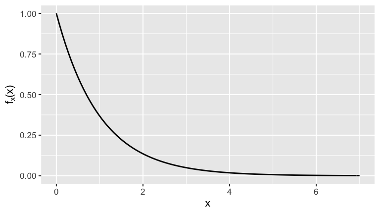
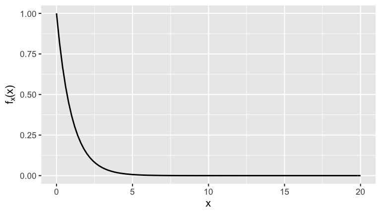
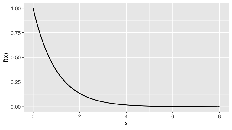
As in the examples above, suppose we take a sample of 5 lightbulbs and record their lifetimes, \((X_1,...,X_5)\), where the \(X_i\) are iid \(Exp(1)\). That is, the randomness in the lifetime of any single bulb is modeled by the pdf below:
To better understand how \(X_{min}\), \(\overline{X}\), and \(X_{max}\) can vary from sample to sample, we will simulate 1000 different iid samples of size 5, \((X_1,X_2,...,X_{5})\), from Exp(1). (This is like taking a sample of 5 lightbulbs for each of 1000 rooms and observing what happens in each room!) You can run this simulation using the sim_data() function:
Notice that there are 1000 rows:
Each row includes the lifetimes \((X_1,X_2,...,X_{5})\) for a sample of size 5 lightbulbs along with their corresponding \(X_{min}\), \(X_{max}\), and \(\overline{X}\). Check out the first 6 rows:
head(exp_sim_5)
##          V1        V2         V3        V4        V5      x_min    x_max
## 1 1.9590618 0.4328520 1.14148989 1.2574571 0.6266144 0.43285199 1.959062
## 2 1.1969166 0.6403742 0.22475878 2.0976608 2.2492503 0.22475878 2.249250
## 3 0.2322704 0.1476302 0.49786043 0.2936833 0.5813020 0.14763020 0.581302
## 4 0.1531366 1.5618467 0.08421314 0.3990414 2.3072369 0.08421314 2.307237
## 5 0.3509013 2.1942411 3.01525078 1.6256799 0.5369473 0.35090134 3.015251
## 6 2.5768158 0.2915262 0.04927670 0.1477283 3.1964847 0.04927670 3.196485
##      x_mean
## 1 1.0834950
## 2 1.2817921
## 3 0.3505493
## 4 0.9010949
## 5 1.5446041
## 6 1.2523663
We can also visualize the first 6 rows in one picture:
- The y-axis indicates which sample we’re taking. Thus here we see that y goes from 1 to 6 (where there’s no real meaning to the order).
- The observed lifetimes \(X\) of the 5 lightbulbs in each sample are marked along the x-axis.
- The histogram at the top summarizes the overall distribution of \(X\) across all samples.
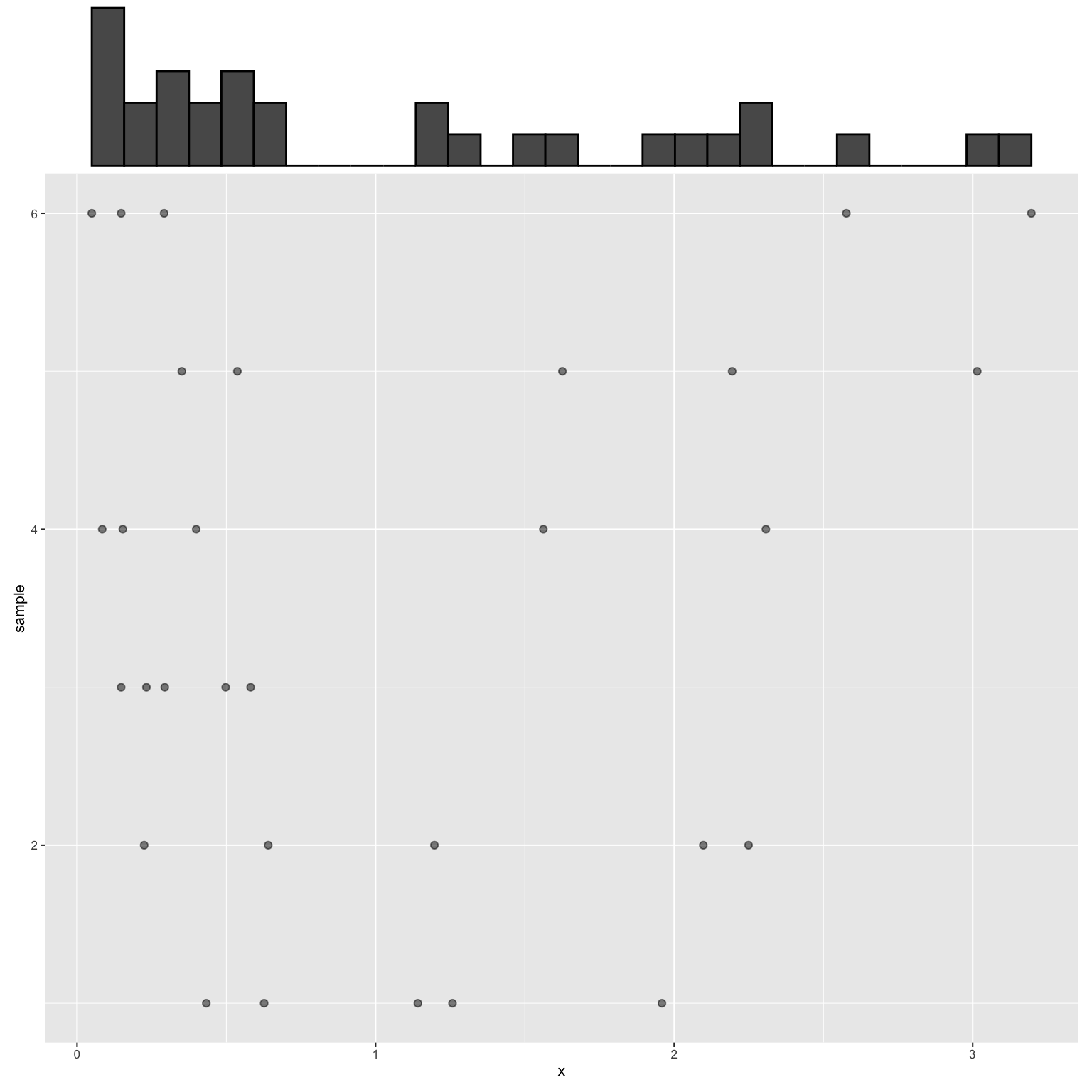
Next, check out all 1000 samples!
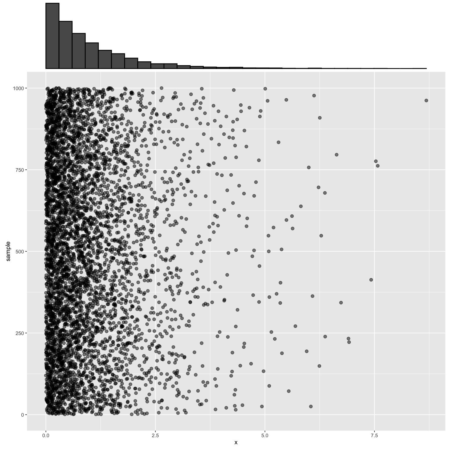
- Sample minimum: approximating the sampling distribution
We’ve seen that \(X_{min}\) (the shortest lifetime among 5 light bulbs) varies from sample to sample (or room to room in our case). In one sample, the minimum lifetime might be 1 year. In another, the minimum lifetime might be 0.5 years. Our goal in this exercise is to study the sampling distribution of \(X_{min}\), ie. the probability model that describes the variability in \(X_{min}\).In our simulation, we have 1000 observed values of \(X_{min}\), one from each room. In your visualization of our 1000 samples of \(n=5\) lightbulbs, highlight the minimum lifetime in each sample (in yellow). You should see 1000 yellow dots, each representing the observed \(X_{min}\) of the corresponding sample.
- Based only on your intuition and on what you see in the plot above, sketch (or describe) what you anticipate the pdf of the sampling distribution of \(X_{min}\), \(f_{X_{min}}(x)\), to look like. In doing so, think about:
- Center: What’s the typical value for \(X_{min}\), ie. what’s \(E(X_{min})\)?
- Spread: What’s the general range of plausible \(X_{min}\) values?
- Shape: Is \(X_{min}\) equally distributed across this range? Bell-shaped? Skewed?
- Center: What’s the typical value for \(X_{min}\), ie. what’s \(E(X_{min})\)?
To check your answer to part b, we can approximate the sampling distribution of \(X_{min}\) by plotting the collection of the 1000 observed \(X_{min}\) values. How close was your guess in part b to the reality here?
Sample minimum: studying features
Let’s examine features of the \(X_{min}\) sampling distribution. For comparison, recall the Exp(1) model from which the raw samples were drawn:
 Thus among individual lightbulbs:
\[\begin{split} E(X) & = 1 \;\; \text{(ie. the average lifetime across all bulbs is 1 year)} \\ Var(X) & = 1 \;\; \text{(ie. the variability in lifetimes from bulb to bulb)}\\ \end{split}\]- How does the pdf of \(X_{min}\) (as visualized in the previous exercise) compare to that of \(X\) (drawn directly above)?
We can approximate \(E(X_{min})\) and \(Var(X_{min})\) by calculating the mean and variance among the 1,000 simulated
x_minvalues.- In light of a and b, summarize how the behavior of \(X_{min}\) compares to that of \(X\). Do so in a way that tells us something about lightbulbs. Think about the following:
- How does \(E(X_{min})\) compare to \(E(X)\) and what does this mean?
- How does \(Var(X_{min})\) compare to \(Var(X)\) and what does this mean?
- How does the pdf of \(X_{min}\) (as visualized in the previous exercise) compare to that of \(X\) (drawn directly above)?
- Sample maximum: approximating the sampling distribution
\(X_{max}\) (the longest lifetime) also varies from sample to sample. In this exercise you’ll explore the sampling distribution of \(X_{max}\).- First check in to your intuition that you’ve been building throughout the above exercises. Before revisiting the simulated data, sketch (or describe) what you anticipate the pdf of the sampling distribution of \(X_{max}\), \(f_{X_{max}}(x)\), to look like. In doing so, think about:
- Center: What’s the typical value for \(X_{max}\)? (Is it bigger or smaller than it was for \(X_{min}\)?)
- Spread: What’s the general range of plausible \(X_{max}\) values? (Are they more or less spread out than plausible \(X_{min}\) values?)
- Shape: Is \(X_{max}\) equally distributed across this range? Bell-shaped? Skewed?
- Center: What’s the typical value for \(X_{max}\)? (Is it bigger or smaller than it was for \(X_{min}\)?)
In your visualization of our 1000 samples of \(n=5\) lightbulbs, highlight the maximum lifetime in each sample (in red). Roughly, what was the smallest maximum observed in any room? The largest? (Does your intuition in part a seem right?)
Approximate the sampling distribution of \(X_{max}\) by plotting the collection of the 1000 observed \(X_{max}\) values. (Was your intuition in part a right?)
- First check in to your intuition that you’ve been building throughout the above exercises. Before revisiting the simulated data, sketch (or describe) what you anticipate the pdf of the sampling distribution of \(X_{max}\), \(f_{X_{max}}(x)\), to look like. In doing so, think about:
- Sample maximum: studying features
- Approximate \(E(X_{max})\) and \(Var(X_{max})\) by calculating the mean and variance among the 1,000 simulated
x_maxvalues. - Summarize how the behavior of \(X_{max}\) compares to that of \(X_{min}\) and \(X\). Do so in a way that tells us something about lightbulbs.
- Approximate \(E(X_{max})\) and \(Var(X_{max})\) by calculating the mean and variance among the 1,000 simulated
- Sample mean: approximating the sampling distribution
\(\overline{X}\) (the average lifetime) also varies from sample to sample. In this exercise you’ll explore the sampling distribution of \(\overline{X}\).- Before revisiting the simulated data, sketch (or describe) what you anticipate the pdf of the sampling distribution of \(\overline{X}\), \(f_{\overline{X}}(x)\), to look like. In doing so, think about center, spread, and shape as well as how these features might compare to those of \(X_{min}\) and \(X_{max}\)
In your visualization of our 1000 samples of \(n=5\) lightbulbs, highlight the maximum lifetime in each sample (in green). (Does your intuition in part a seem right?)
Approximate the sampling distribution of \(\overline{X}\) by plotting the collection of the 1000 observed \(\overline{X}\) values. (Was your intuition in part a right?)
- Sample mean: studying features
- Approximate \(E(\overline{X})\) and \(Var(\overline{X})\) by calculating the mean and variance among the 1,000 simulated
x_meanvalues. - Summarize how the behavior of \(\overline{X}\) compares to that of \(X\). Do so in a way that tells us something about lightbulbs. For example:
- How does \(E(\overline{X})\) compare to \(E(X)\)? What does this mean?
- How does \(Var(\overline{X})\) compare to \(Var(X)\)? What does this mean?
- How does the shape of the sampling distribution for \(\overline{X}\) compare to that of \(X\)? What does this mean?
- Approximate \(E(\overline{X})\) and \(Var(\overline{X})\) by calculating the mean and variance among the 1,000 simulated
- Impact of sample size: intuition
In the exercises above, we’ve been studying the features of samples of \(n = 5\) lightbulbs. Suppose instead that there were \(n = 25\) lightbulbs in each room, ie. that we have a larger sample size. This sample size impacts the behavior of \(X_{min}\), \(\overline{X}\), and \(X_{max}\). Before simulating this scenario, check into your intuition.- Consider \(X_{min}\):
- Do you expect \(X_{min}\) to be smaller when \(n = 5\) or \(n = 25\)? Explain in the context of lightbulbs.
- Do you expect \(X_{min}\) to be more variable from sample to sample when \(n = 5\) or \(n = 25\)? Explain in the context of lightbulbs.
- On the same plotting frame, sketch (or describe) what you anticipate \(f_{X_{min}}(x)\) to look like when \(n = 5\) and when \(n = 25\).
- Repeat part a for \(X_{max}\).
- Repeat part a for \(\overline{X}\).
- Consider \(X_{min}\):
Impact of sample size: simulation
To better understand how \(X_{min}\), \(\overline{X}\), and \(X_{max}\) can vary from sample to sample when \(n = 25\), let’s simulate 1000 iid samples of size 25, \((X_1,X_2,...,X_{25})\), from Exp(1):Plot all 1000 samples of size \(n = 5\) and all 1000 samples of size \(n = 25\).
Plot the approximate sampling distributions of \(X_{min}\) for when \(n = 5\) and when \(n = 25\).
# Compare X_min
ggplot(exp_sim_5, aes(x = x_min)) +
  geom_histogram(color = "white", breaks = seq(0,8,by=0.2)) +
  labs(title = "X_min when n = 5") +
  lims(y = c(0,1000))
ggplot(exp_sim_25, aes(x = x_min)) +
  geom_histogram(color = "white", breaks = seq(0,8,by=0.2)) +
  labs(title = "X_min when n = 25") +
  lims(y = c(0,1000))
Plot the approximate sampling distributions of \(X_{max}\) for when \(n = 5\) and when \(n = 25\).
# Compare X_max
ggplot(exp_sim_5, aes(x = x_max)) +
  geom_histogram(color = "white", breaks = seq(0,8,by=0.5)) +
  labs(title = "X_max when n = 5") +
  lims(y = c(0,220))
ggplot(exp_sim_25, aes(x = x_max)) +
  geom_histogram(color = "white", breaks = seq(0,8,by=0.5)) +
  labs(title = "X_max when n = 25") +
  lims(y = c(0,220))
Plot the approximate sampling distributions of \(\overline{X}\) for when \(n = 5\) and when \(n = 25\).
# Compare means
ggplot(exp_sim_5, aes(x = x_mean)) +
  geom_histogram(color = "white", breaks = seq(0,8,by=0.2)) +
  labs(title = "Mean when n = 5") +
  lims(y = c(0,400))
ggplot(exp_sim_25, aes(x = x_mean)) +
  geom_histogram(color = "white", breaks = seq(0,8,by=0.2)) +
  labs(title = "Mean when n = 25") +
  lims(y = c(0,400))
Summarize your observations from parts a-d. Specifically: how does sample size \(n\) impact the sampling distributions of \(X_{min}\), \(X_{max}\), and \(\overline{X}\)? Why might this be intuitive?
22.2.2 Sample Sum
Let’s return to our simulation of Exp(1) samples of size \(n = 5\), (\(X_1,X_2,...,X_5\)). We’ve explored the minimum, mean, and maximum lifetimes of possible samples. Next, let’s explore the sum:
\[X_{sum} = X_1 + X_2 + \cdots + X_5 = \text{ the combined total lifetime of the 5 bulbs}\]
- Simulate the sum
- Recall that the expected lifetime of any one bulb is \(E(X) = 1\) year. Intuitively, what do you anticipate is the expected total lifetime of the 5 bulbs, \(E(X_{sum})\)?
Let’s simulate \(X_{sum}\). To this end, for each of our 1000 random samples of size \(n = 5\), record the observed sum:
- Construct a histogram of the 1000 observed values of
x_sum. Use the default settings for the axis limits. (This is an approximation of the sampling distribution of \(X_{sum}\).)
- Calculate the minimum, mean, and maximum \(X_{sum}\) value observed across the 1000 samples. (Does your answer to part a seem correct?)
Summarize your observations of how \(X_{sum}\) behaves from sample to sample.
- Recall that the expected lifetime of any one bulb is \(E(X) = 1\) year. Intuitively, what do you anticipate is the expected total lifetime of the 5 bulbs, \(E(X_{sum})\)?
- Challenge
- If \(X\) is the waiting time until a given lightbulb burns out, how can we think of \(X_{sum} = X_1 + X_2 + \cdots + X_5\) as a waiting time?
- It turns out that the sampling distribution of \(X_{sum}\) is described by a familiar probability model. Based on your answer to part a, what do you think this model is?
- If you had an idea in part b, see if you’re right! Simulate 1000 values from the model you named in part b and construct a histogram. Is this picture similar to what you saw in part c of the previous problem? NOTE: In the blanks below, fill in the appropriate model…
x = rnorm(1000, mean = ___, sd = ___)x = rexp(1000, rate = ___)x = runif(1000, min = ___, max = ___)x = rgamma(1000, shape = ___, rate = ___)(shape= \(s\) andrate= \(r\))
- If \(X\) is the waiting time until a given lightbulb burns out, how can we think of \(X_{sum} = X_1 + X_2 + \cdots + X_5\) as a waiting time?
- Moving on
If you completed these exercises in less than the usual 90 minute class period, you’re encouraged to move onto the next chapter!